

A lot has been said on the use of traditional 2D carousels, for example this piece on Smashing Magazine covers this subject. There’s no simple yes or no answer to the ‘should I use a carousel?’ question; it depends on the particular situation.
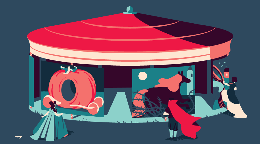
When I started researching this topic, I didn’t need a 3D carousel, but rather, I was more interested in the technical details on implementing it. The core employed techniques are of course from the CSS Transforms Module Level 1, but along the way a bunch of other front end development technologies will be applied, touching on various topics in CSS, Sass, and client-side JavaScript.
This CodePen displays different versions of the component I’ll be showing you how to build.
To illustrate the setup of the CSS 3D transforms, I’ll show you a CSS-only version of the component. Then, I’ll show you how to enhance it with JavaScript, developing a simple component script.
Key Takeaways
- Utilize CSS 3D transforms and JavaScript to create an interactive 3D rotating carousel, allowing for a more dynamic presentation of images or content on a webpage.
- Construct the carousel by arranging images in a circular 3D space, using a polygon approximation based on the number of images, and control the visibility and navigation through JavaScript enhancements.
- Implement responsive design for the carousel by using media queries and percentage-based sizing in CSS, ensuring it adapts to different screen sizes and device orientations.
- Enhance user interaction by adding navigation controls through HTML and JavaScript, enabling users to manually cycle through carousel items.
- Explore advanced customization options such as autoplay functionality, transition effects, infinite looping, and adding text or different shapes, providing flexibility to tailor the carousel to specific design needs.
The Markup for the Carousel
For the markup, the images inside the component are wrapped inside a <figure> element, which provides a basic skeleton:
<div class="carousel">

  <figure>

    <img src="..." alt="">

    <img src="..." alt="">

    ...

    <img src="..." alt="">

  </figure>

</div>
This will be our starting point.
The Carousel Geometric Structure
Before looking into the CSS, let’s have an overview of the plan that will be developed in the following sections.
The <img> elements should be arranged around the circle delineated by the carousel. This circle can be approximated by its circumscribed regular polygon and the images placed on its sides:
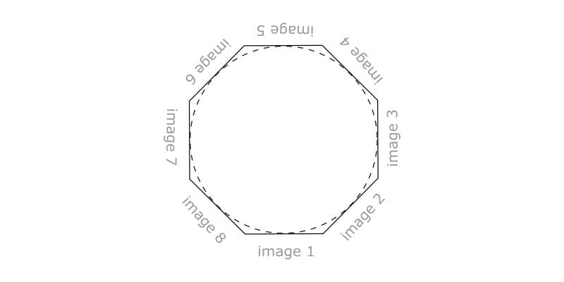
So, the number of sides of such a polygon is the same as the number of images in the carousel: with three images, the polygon is an equilateral triangle; with four images it is a square; with five a pentagon; and so on:
See the Pen Regular Polygons by SitePoint (@SitePoint) on CodePen.
What if there are fewer than three images in the carousel? The polygon cannot be defined and the following procedure cannot be applied as it is. Anyway, the case of only one image is rather useless; two images are slightly more probable, and they could be placed on two diametrically opposed points on the circle. For simplicity, these special cases aren’t handled and at least three images are assumed. However, the relative code modifications would not be hard.
This imaginary reference polygon will be positioned in 3D space, perpendicular to the plane of the viewport and with its center pushed back into the screen at a distance equal to its apothem, the distance of a side of the polygon from its center, as illustrated in this top down view of the carousel:
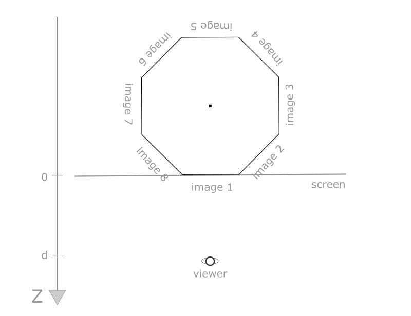
This way, the side that is currently facing the viewer will be on the screen plane at z = 0, and the front image, not being affected by the perspective foreshortening, will have its ordinary 2D size. The d letter in the picture represents the value for the CSS perspective property.
Building the Carousel Geometry
In this section I’ll show you the key CSS rules, which I’ll go through step by step.
In the following code snippets, some Sass variables are used to make the component more configurable. I’ll use $n to denote the number of images in the carousel and $item-width to specify the width of an image.
The <figure> element is the containing box for the first image and the reference element around which the other images are positioned and transformed. Supposing, just for now, that the carousel had only one image to showcase, I can start with the sizing and the alignment:
.carousel {

  display: flex;

  flex-direction: column;

  align-items: center;

   > * {

     flex: 0 0 auto;

  }
  .figure {

    width: $item-width;

    transform-style: preserve-3d;

    img {

      width: 100%;

      &:not(:first-of-type) {

        display: none /* Just for now */

      }

    }

  }

}
The <figure> element has the prescribed carousel item width and it has the same height of the images (they can have different sizes but they must have the same aspect ratio). In this way, the carousel container height adapts itself based on the height of the images. Also, <figure> is horizontally centered in the carousel container.
The first image doesn’t need additional transformations because it is already in its target position, i.e., on the front face of the carousel.
The carousel can be turned in 3D space by applying a rotation transform to the <figure> element. This rotation has to be around the center of the polygon, so I’ll change the default transform origin of <figure>:
.carousel figure {

  transform-origin: 50% 50% (-$apothem);

}
This value is negated because in CSS the positive direction of the z-axis is off the screen, toward the viewer. The parentheses are needed to avoid Sass syntax errors. The computation of the polygon apothem will be explained later.
Having translated the reference system of the <figure> element, the whole carousel can be turned with a rotation on its (new) y-axis:
.carousel figure {

  transform: rotateY(/* some amount here */rad);

}
I will return to the details of this rotation later.
Let’s proceed with the transformations for the other images. With absolute positioning the images are stacked inside <figure>:
.carousel figure img:not(:first-of-type) {

  position: absolute;

  left: 0;

  top: 0;

}
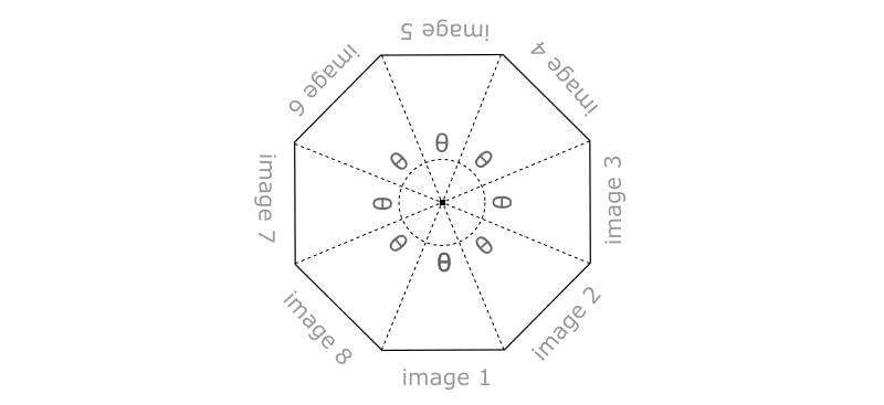
The z-index values are ignored because this is only a preliminary step for the following transformations. In fact, now each image can be rotated on the y-axis of the carousel by a rotation angle that depends on the polygon side on which the image is assigned. First, as done with the <figure> element, the default transform origin of the images is modified, moving it to the center of the polygon:
.img:not(:first-of-type) {

  transform-origin: 50% 50% (-$apothem);

}
Then the images can be rotated on their new y-axis by an amount given by ($i - 1) * $theta radians, where $i is the index (starting from one) of the image and $theta = 2 * $PI / $n, with $PI representing the mathematical constant pi. Therefore, the second image will be rotated by $theta, the third by 2 * $theta, and so on, up to the last image that will be rotated by ($n - 1) * $theta.
This relative arrangement of the images will be preserved during the rotations of the carousel (that is, the rotation about the modified y-axis of <figure>) thanks to the hierarchical nature of the nested CSS transforms.
This per-image rotation amount can be assigned using the Sass @for control directive:
.carousel figure img {

  @for $i from 2 through $n {

    &:nth-child(#{$i}) {

      transform: rotateY(#{($i - 1) * $theta}rad);

    }

  }

}
This is using the for...through construct rather than for...to because with for...to the last value assigned to the index variable $i would be n-1 instead of n.
Note the two instances of Sass’s #{} interpolation syntax. In the first instance it’s used for the index of the :nth-child() selector; in the second instance it’s used to set the rotation property value.
Computing the Apothem
The computation of the polygon’s apothem depends on the number of sides and the width of a side, that is, on the $n and $item-width variables. The formula is:
$image-width / (2 * tan($PI/$n))
where tan() is the tangent trigonometric function.
This formula can be derived with a bit of geometry and trigonometry. In the pen source, this formula is not implemented as written because the tangent function is not readily available in Sass, so a hardcoded value is used instead. The formula will be fully implemented in the JavaScript demo instead.
Spacing the Carousel Items
At this point the carousel images are “sewn” side by side, forming the required polygonal shape. But here they are tightly packed, while often in 3D carousels there is space between them. This distance enhances the perception of a 3D space because it allows you to see the back-facing images on the rear of the carousel.
It is possible to optionally add this gap between the images by introducing another configuration variable, $item-separation, and using it as the horizontal padding for each <img> element. More precisely, taking half of this value for the left and right padding:
.carousel figure img {

  padding: 0 $item-separation / 2;

}
The final result can be seen in the following demo:
See the Pen Carousel Items Spaced by SitePoint (@SitePoint) on CodePen.
The images are made translucent with the opacity property to better illustrate the carousel structure, and the flex layout on the carousel root element was used to vertically center it in the viewport.
Rotating the Carousel
To facilitate testing of the carousel rotation, I’m going to add a UI control to navigate back and forth between the images. See the CodePen demo for the HTML, CSS and JavaScript implementing this control; here I’ll describe only the code relating to the rotation.
We use a currImage integer variable to indicate which image is at the front of the carousel. When the user interacts with the previous/next buttons, this variable is incremented or decremented by one unit.
After having updated currImage, the carousel rotation is performed with:
figure.style.transform = `rotateY(${currImage * -theta}rad)`;
(Here and in the following snippets, ES6 template literals are employed to interpolate expressions in strings; feel free to use the traditional ‘+’ concatenation operator if you prefer)
where theta is the same as before:
numImages = figure.childElementCount;

theta =  2 * Math.PI / numImages;
The rotation is by - theta because to navigate to the next item a counter-clockwise rotation is needed and such rotation values are negative in CSS transforms.
Note that the currImage value is not constrained to the [0, numImages – 1] range, but instead it can grow indefinitely, both in the positive and in the negative direction. In fact, If the image on the front is the last one (so currImage == n-1), and the user clicks the next button, if we reset currImage to 0 to advance to the first carousel image, there would be a transition of the rotation angle from (n-1)*theta to 0 and this would turn the carousel in the opposite direction across all the previous images. A similar issue would happen when clicking the prev button when the front image is the first one.
To be picky, I should even check for potential overflows of currentImage, because the Number data type cannot take arbitrarily large values. These checks are not implemented in the demo code.
And here is the rotating carousel:
See the Pen 3D Rotating Carousel (before enhancements) by SitePoint (@SitePoint) on CodePen.
Enhancing with JavaScript
Having seen the basic CSS that lies at the core of the carousel, now JavaScript can be used to enhance the component in several ways, such as:
- Arbitrary number of images
- Images with percentage widths
- Multiple carousel instances on the page
- Per-instance configurations, such as the gap size and the back-face visibility
- Configuration using HTML5 data-* attributes
First I remove from the style sheet the variables and rules related to the transform origins and the rotations, because these will be done using JavaScript:
$item-width: 40%; // Now we can use percentages

$item-separation: 0px; // This now is set with Js

$viewer-distance: 500px;
.carousel {

  padding: 20px;
  perspective: $viewer-distance;

  overflow: hidden;
  display: flex;

  flex-direction: column;

  align-items: center;

  > * {

    flex: 0 0 auto;

  }
  figure {

    margin: 0;

    width: $item-width;
    transform-style: preserve-3d;
    transition: transform 0.5s;
    img {

      width: 100%;

      box-sizing: border-box;

      padding: 0 $item-separation / 2;
      &:not(:first-of-type) {

        position: absolute;

        left: 0;

        top: 0;

      }

    }

  }

}
Next in the script is a carousel() function that takes care of the initialization of an instance:
function carousel(root) {

  // coming soon...

}
The root argument refers to the DOM element that holds the carousel.
Usually this function would be a constructor, to generate one object for each carousel on the page, but here I am not writing a carousel library, so a simple function will be sufficient.
To instantiate several components on the same page, the code waits that all the images are loaded, registering a listener on the window object for the load event, and then invokes carousel() for each element with the carousel class:
window.addEventListener('load', () => {

  var carousels = document.querySelectorAll('.carousel');
  for (var i = 0; i < carousels.length; i++) {

    carousel(carousels[i]);

  }

});
carousel() executes three main tasks:
- The navigation setup. This is the same code presented in the second CodePen demo
- The transforms setup
- Register a window resize listener to keep the carousel responsive, adapting it to the new viewport size
Before examining the transform setup code, I’ll go through some key variables and how they are initialized based on the instance configuration:
var

  figure = root.querySelector('figure'),

  images = figure.children,

  n = images.length,

  gap = root.dataset.gap || 0,

  bfc = 'bfc' in root.dataset

;
The number of images (n), is initialized based on the number of child elements of the <figure> element. The separation between the slides (gap), is initialized from the HTML5 data-gap attribute, if set. The backside visibility flag (bfc), is read using HTML5’s dataset API. This will be used later to determine if the images on the back of the carousel should be visible or not.
Setting the CSS Transforms
The code that sets the CSS transforms-related properties is encapsulated in setupCarousel(). This nested function takes two arguments. The first is the number of items in the carousel, that is, the n variable introduced above. The second parameter, s, is the length of the side of the carousel polygon. As I mentioned earlier, this is equal to the width of the images, so it is possible to read the current width of one of them with getComputedStyle():
setupCarousel(n, parseFloat(getComputedStyle(images[0]).width));
In this way, image widths can be set with percentages values.
To keep the carousel responsive, I register a listener for the window resize event that calls setupCarousel() again with the (eventually)modified size of the images:
window.addEventListener('resize', () => {

  setupCarousel(n, parseFloat(getComputedStyle(images[0]).width));

});
For the sake of simplicity I am not debouncing the resize listener.
The first thing that setupCarousel() does is compute the apothem of the polygon, using the passed parameters and the previously discussed formula:
apothem = s / (2 * Math.tan(Math.PI / n));
Then this value is used to modify the transform origin of the figure element, to obtain the new rotation axis of the carousel:
figure.style.transformOrigin = `50% 50% ${-apothem}px`;
Next, the styles for the images are applied:
for (var i = 0; i < n; i++) {

  images[i].style.padding = `${gap}px`;

}
for (i = 1; i < n; i++) {

  images[i].style.transformOrigin = `50% 50% ${- apothem}px`;

  images[i].style.transform = `rotateY(${i * theta}rad)`;

}
if (bfc) {

  for (i = 0; i < n; i++) {

    images[i].style.backfaceVisibility = 'hidden';

  }

}
The first cycle assigns the padding for the space between the carousel items. The second cycle sets the 3D transforms. The last cycle handles the back-faces if the related flag was specified in the carousel configuration.
Finally, rotateCarousel() is called to take the current image to the front. This is a little helper function that, given the index of the image to show, rotates the figure element on its y-axis to move the target image to the front. It is also used by the navigation code to go back and forth:
function rotateCarousel(imageIndex) {

  figure.style.transform = `rotateY(${imageIndex * -theta}rad)`;

}
Here is the final result, a demo where several carousels are instantiated, each one with a different configuration:
See the Pen 3D Rotating Carousel with CSS and JavaScript by SitePoint (@SitePoint) on CodePen.
Sources and Conclusion
Before concluding, I just wanted to give credit to a few sources used for researching this tutorial:
If you have any questions or comments on the code or the way the carousel functions, please free to leave them below.
Frequently Asked Questions (FAQs) on Building a 3D Rotating Carousel with CSS and JavaScript
How Can I Make My 3D Rotating Carousel Responsive?
Making your 3D rotating carousel responsive involves using media queries in your CSS. Media queries allow you to apply different styles for different devices based on their screen size. You can adjust the size and position of the carousel elements to fit smaller screens. Also, consider the touch events for mobile devices, as they don’t have hover states like desktops.
Can I Add More Slides to the Carousel?
Yes, you can add more slides to the carousel. In the HTML structure, you can add more list items within the unordered list. Each list item represents a slide. Remember to adjust the rotation degree in the CSS for each slide to position them correctly in the 3D space.
How Can I Add Navigation Buttons to the Carousel?
Navigation buttons can be added to the carousel using HTML and JavaScript. In your HTML, add two buttons for previous and next navigation. In your JavaScript, add event listeners to these buttons. When clicked, they should update the carousel’s rotation to show the previous or next slide.
Can I Use Images Instead of Solid Colors for the Slides?
Absolutely, you can use images for the slides. Instead of setting a background color in your CSS, you can set a background image for each slide. Ensure the images are of the right size and resolution for the best visual effect.
How Can I Add Autoplay Functionality to the Carousel?
Autoplay functionality can be added using JavaScript. You can use the setInterval function to automatically update the carousel’s rotation after a certain period. Remember to clear the interval when the user interacts with the carousel to prevent unexpected behavior.
Can I Add Transition Effects to the Carousel?
Yes, you can add transition effects to the carousel using CSS. The transition property allows you to animate changes in CSS properties over a specified duration. You can apply it to the transform property to animate the rotation of the carousel.
How Can I Make the Carousel Loop Infinitely?
Making the carousel loop infinitely involves a bit of JavaScript. When the carousel reaches the last slide, you can reset its rotation to the first slide. This gives the illusion of an infinite loop.
Can I Add Text Over the Slides?
Yes, you can add text over the slides. In your HTML, you can add a text element within each list item. In your CSS, position the text element relative to the slide and style it as needed.
How Can I Add a Fade Effect to the Carousel?
A fade effect can be added using CSS. You can use the opacity property in conjunction with the transition property to animate the fade effect. Adjust the opacity of the slides based on their position in the carousel to create the desired effect.
Can I Use a Different Shape for the Carousel?
Yes, you can use a different shape for the carousel. The shape of the carousel is determined by the transform property in your CSS. By adjusting the values of the transform property, you can create a carousel in the shape of a cube, a cylinder, or any other 3D shape.