Create a Futuristic Translucent Interface in Photoshop
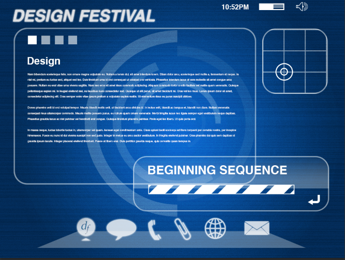
Interface design has become a hot topic lately. It comes as no surprise considering it’s a vital part of how we interact with software or equipment. Imagining intuitive, futuristic interfaces can be a challenge; the only limit is your own creativity. Futuristic interfaces are often portrayed in movies as clear-screen overlays designed in the likeness of the head-up displays (HUD) found commonly in the cockpits of most airplanes. In this tutorial, you will learn how to create this kind of futuristic interface.
Key Takeaways
- Interface design is vital for interaction with software or equipment, and creating a futuristic interface in Photoshop is a creative challenge that involves imagining intuitive, clear-screen overlays similar to head-up displays (HUD) in airplane cockpits.
- The process involves creating a new document, setting the size, selecting a color, and creating layers with specific measurements and adjustments, while using tools like the rounded rectangle tool, the noise and blur filters, and the motion blur option.
- The design of the interface includes creating a radar grid, adding a sheen over certain areas, creating a menu at the bottom of the screen, adding tech-style glow to the menu, and adding more interface elements for realism.
- The finishing touches to the futuristic interface include adding depth with a dark blue radial gradient, creating a new document with a circle frame shape for a futuristic feel, and incorporating this into the original interface document. The final product is a futuristic interface that is reminiscent of those seen in futuristic films and modern machinery.
Step 1
Create a new document. Set the size to 1024 x 768 pixels. Hit Shift + Delete to bring up the fill options. Choose “Color” and select #0078ff. You should have a blue background layer.
Step 2
Next, create a new layer above this one, and go to “Filter” > “Noise” > “Add Noise.” Bump it all the way up to 400 and click “OK.” Then, go to “Filter” > “Blur” > “Motion Blur.” Set it to a strict horizontal blur (at 0°), and bump it up as high as it will go. Set the Blend Mode to “Overlay.” Then, go back to “Filter” > “Noise” > “Add Noise” and set it to about 20%. Lower the opacity of the layer to 15%.
Step 3
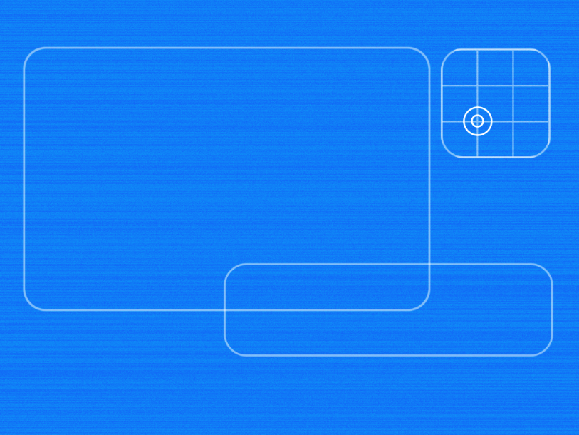
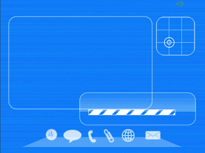
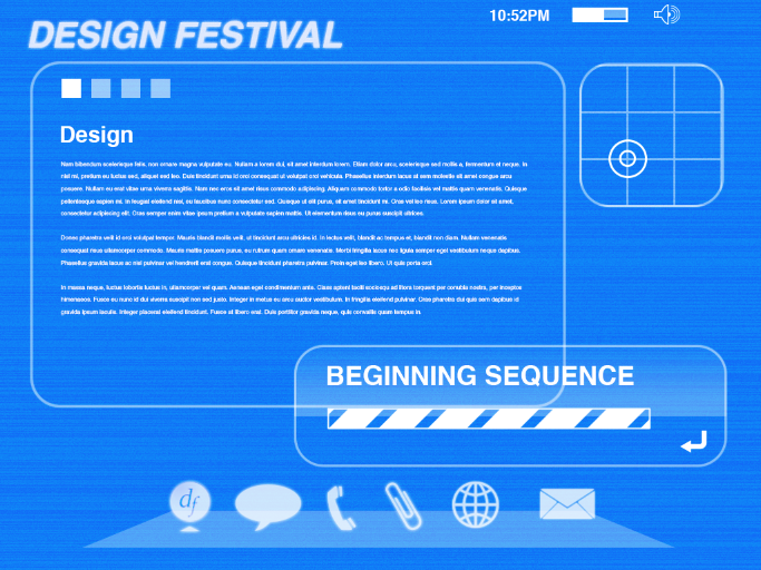
Next, we have to design the basic layout of the interface itself. Select the rounded rectangle tool and draw a large window that will be the main window for the interface. Make sure the stroke is set to white. If you aren’t using CS6, you can add a stroke via the layer styles menu. Draw two more after that, making one medium sized and one square at the top right of the menu. It should look like the example below.
Step 4
Next, we need to add a radar grid. There is a built-in grid via the Custom Shape Tools. It creates a 3 x 3 grid. Clip it to the layer with the small rounded square. Select the ellipse tool with a white stroke and draw a large circle and a small circle inside of it to simulate a radar blip.
Step 5
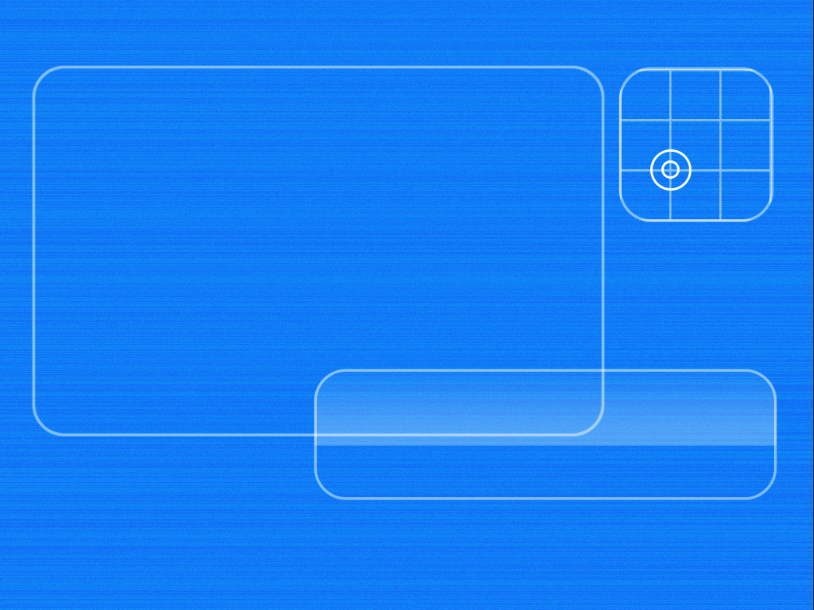
We are going to create a sheen over the medium rectangle to differentiate it from the main window. Create a new layer, select the rectangular marquee tool, and draw a rectangle over half of the medium rounded rectangle. Fill it with white. Command/Ctrl + click the rounded rectangle layer’s layer icon to load it as a selection (while the rectangular marquee layer is still selected), then hit Command/Ctrl + Shift + “I” to invert the selection. Then, hit the Delete key to delete the excess. Then, create a layer mask and on the mask draw a black to white gradient, fading out the top of the rectangle.
Step 6
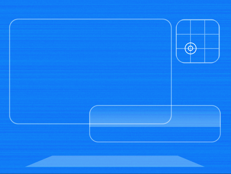
Now, we will create the menu at the bottom of the screen. Create a new layer and select the rectangular marquee tool. Draw a rectangle that is roughly 80% of the width of your document, centered. Fill it with white, then hit Command/Ctrl + “T” to transform the rectangle. Right-click on the rectangle and choose Perspective. Drag either of the top corners inward, and drag the bottom ones outward, creating a platform-like shape for our menu. Set the opacity to 30%.
Step 7
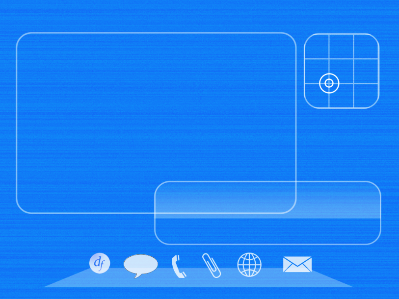
The next portion of our menu is subjective, due to the icons that you will use, but most of the ones that I will be using can be found in the default custom shapes menu under the custom shape tool. With white as your color, I chose the DesignFestival logo, the chat bubble, a phone shape (I removed the background), a paper clip icon, a network icon, and a letter icon for email. I set the opacity to 80%.
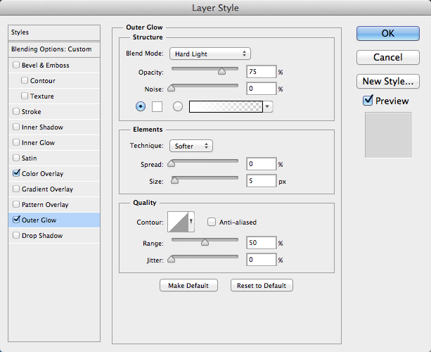
We need to add a tech-style glow to our menu, so double-click any layer of one of your menu’s icons to bring up the layer styles options. If your icon is taken from something else, such as your logo, and it’s dark, hit Command/Ctrl + “I” to invert it. Then, in the layer styles options, choose “Color Overlay,” and set the blend mode to “Soft Light.” Make sure that it is set to 100% opacity.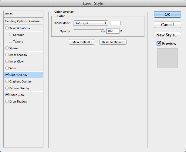
Next, Select Outer Glow. Choose white as the color, and choose “Hard Light” as the blend mode. Set the opacity to 75% and the size to around 5px.
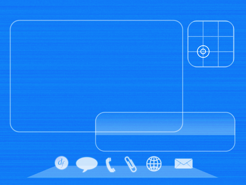
Instead of doing this over and over again for each icon, right-click on the icon that you just finished styling, choose “Copy Layer Style,” and then choose “Paste Layer Style” on the other icon layers. Repeat this for all of the icons. The menu should look similar to the example below:
Step 8
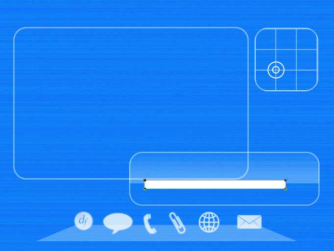
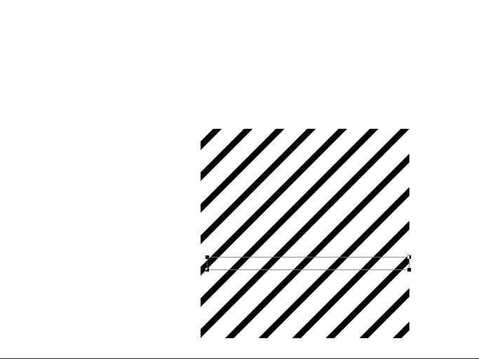
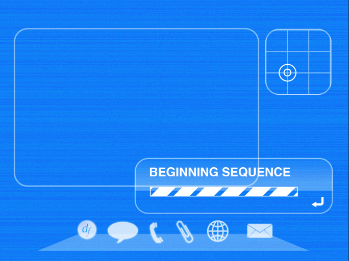
We need to add a few more interface elements to make this look more realistic. Select the rectangular shape tool and draw a thin rectangle shape with a white fill in the medium rounded rectangle. Select the Tile 2 diagonal lines shape and make a new layer mask. Hold shift and draw a black mask over the area where you just drew the rectangle. Create a new layer below and use the path selection tool to make the selection of the rectangle active. Select a 2px hard brush and in the Paths Panel, choose “Stroke Path with Brush.”
Step 9
Select the type tool, choose Helvetica Bold, and type your message. It can be whatever you want, just make sure it is short enough to fit within the window. Select Arrow 20 from the custom shape tools and draw a small arrow in the bottom-right corner. Hit Command + “T” to transform it, and while holding shift, rotate it until the arrow points to the left, much like a “back” button.
Step 10
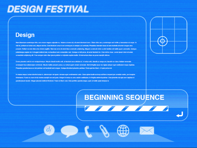
Select the text tool and choose Helvetica Bold Oblique at 48pt. Type the main header of your page and align it to the left edge of the main window. Select Helvetica Regular and type the headline for your main window’s text in 30pt size. Then, lower the size to around 8-10pt and create your body text. I am using dummy “lorem ipsum” text.
Step 11
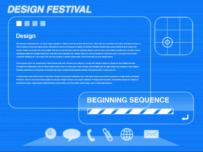
Create a new layer and select the rectangular marquee tool. Draw a 30px square and fill it with white. Hit Command/Ctrl + “J” to duplicate the layer. While holding shift, hit the right arrow key twice to bump it over. Repeat this process twice more, so that you have four squares. You can select the last three square layers and hit the “6” key to lower the opacity for all three layers to 60%.
Step 12
Select the type tool and choose 20pt Helvetica Bold. Type in the time, as you would find on most interfaces. Then, select the rectangle tool and draw a rectangle with no fill, but with a white stroke. Select the rectangular marquee tool and draw a rectangle over the top two thirds of the rectangle that you just made. Fill it with white, and lower the opacity to 40%. Then, create a new layer and draw another rectangle, but this time make it over the left two thirds of the rectangle. Fill it with white also, but leave it at 100% opacity.
Step 13
Select the volume shape from the custom shape tools and draw a volume control in the top right of the screen. We also need to know which application at the bottom is active. Create a new layer and select the rectangular marquee tool. Draw a small white square. Hit Command+ “T” to transform the square, holding shift to rotate it 45 degrees. Then, draw a rectangle over the bottom half of the diamond, giving you a wide triangle. Copy the layer style from one of the icon layers and paste it to the triangle layer. Place it under the active app. if this case, it is the one for DesignFestival.
Step 14
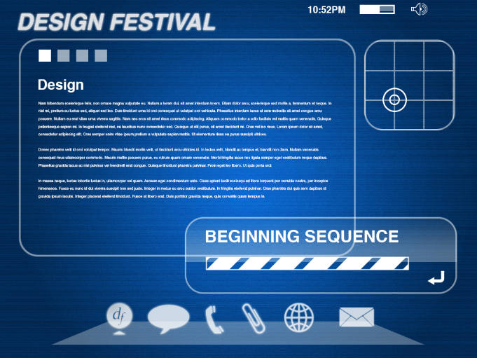
The light blue is okay, but let’s add some depth to our interface. Create a new layer above your original noise layer, and select a dark blue(#011b9e) for your background color. Make white your foreground color and select a radial gradient. Draw a layer circular gradient with white in the center and dark blue on the outside. Change the blend mode to “Luminosity.”
Step 15
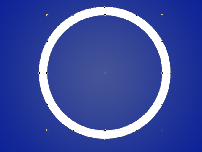
To add to the futuristic feel to the design, our next effect will be easier to create in a new document. Create a new document at 1024 x 768 pixels and fill it with a dark color, such as blue or black. Select the circle frame shape from the custom shape menu and draw a large circle in the center of the canvas. Use the direct selection tool, hold shift, and click on the four anchor points on the inside circle. Hit Command + “T” to transform the inner circle path and hold shift while dragging the corner handle outward, to make the circle shape thinner.
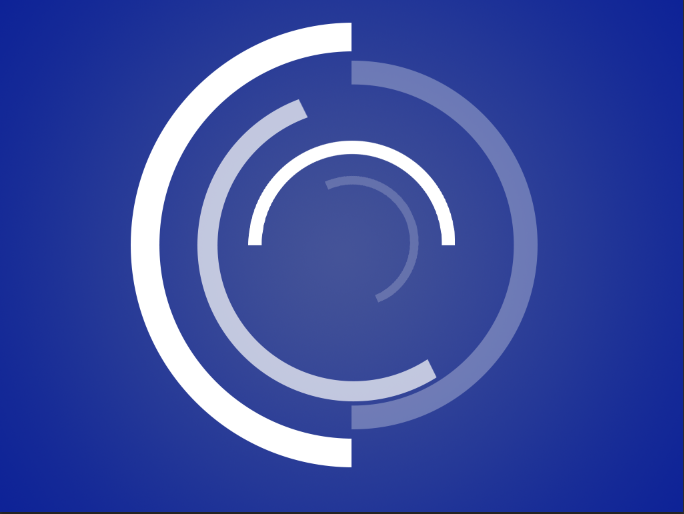
Next, click the layer mask icon to create a new layer mask. Use the rectangular marquee tool to draw a selection over half of the circle and fill it with black to hide half the circle. Right-click on the layer and choose “Rasterize Layer.” Right-click on the layer mask icon, and hit “Apply Layer Mask.”
Hit Command/Ctrl + “J” to duplicate the layer. Hit Command/Ctrl + “T” to transform the duplicate. Click and drag the rotate symbol to the center handle anchor. Drag the corner handle inward to shrink the circle and rotate it around, opposite of the large circle. Repeate the process, working your way inward with multiple half-circles. Use alternating opacities to vary the effect.
Select all of the circle layers, but not the background layer. Go to “Layer” > “New” > “Group from Layers.” Drag the layer group to your original interface document. Place this layer just above the gradient layer. Lower the opacity of the circle group to 20%.
Your futuristic interface is all done!
Conclusion
With a lot of layers, a few gradients, and some masking techniques, we were able to create a futuristic interface fairly quickly. We integrated a few common UI elements, and created a few uncommon ones to give the whole piece a futuristic look and feel. We used custom shapes found in the default custom shape tool options. Combined with a few glow effects, we were able to simulate a futuristic interface found in futuristic films and modern machinery.
Frequently Asked Questions about Creating a Futuristic Translucent Interface in Photoshop
What are the basic requirements for creating a futuristic translucent interface in Photoshop?
To create a futuristic translucent interface in Photoshop, you need a working knowledge of Photoshop and its tools. You should be familiar with layers, blending modes, gradients, and the pen tool. Additionally, you need a computer with Photoshop installed and a creative mind to visualize and design the interface.
Can I use other software apart from Photoshop to create a futuristic translucent interface?
Yes, you can use other graphic design software to create a futuristic translucent interface. However, this tutorial is specifically designed for Photoshop. Other software may not have the exact same tools or features, so the process may differ.
How can I add more depth to my futuristic translucent interface in Photoshop?
Adding depth to your interface can be achieved by using gradients and shadows. By applying gradients to your shapes, you can create a sense of depth and three-dimensionality. Shadows, on the other hand, can give the illusion of elements floating above the surface.
What if I don’t have the specific font used in the tutorial?
If you don’t have the specific font used in the tutorial, you can use any other font that suits your design. The key is to ensure that the font complements the overall design of your interface.
How can I make my futuristic translucent interface more interactive?
To make your interface more interactive, consider adding animations or transitions. Photoshop allows you to create simple animations which can be exported as GIFs or video files. However, for more complex interactions, you might need to use additional software like Adobe XD or After Effects.
Can I use this tutorial to create interfaces for mobile applications?
Yes, the principles and techniques taught in this tutorial can be applied to create interfaces for mobile applications. However, you might need to adjust the dimensions and layout to fit the smaller screen size of mobile devices.
How can I add more colors to my futuristic translucent interface?
You can add more colors to your interface by using different color gradients. Photoshop allows you to create gradients with multiple colors. You can also adjust the opacity of your shapes to allow the colors to blend and create new shades.
What should I do if my interface doesn’t look as good as I expected?
If your interface doesn’t look as good as you expected, don’t be discouraged. Graphic design is a process of trial and error. Try adjusting the colors, gradients, or shapes, or even start from scratch. With practice, you’ll get better.
Can I sell the interfaces I create using this tutorial?
Yes, you can sell the interfaces you create. However, make sure that you’re not infringing on any copyrights, especially if you’re using fonts, images, or other resources that are not free for commercial use.
How can I improve my Photoshop skills to create better interfaces?
Improving your Photoshop skills requires practice and learning. Try experimenting with different tools and techniques, follow tutorials, and don’t be afraid to make mistakes. You can also take online courses or attend workshops to learn from professionals.
James George is a professional web developer and graphic designer. James is an expert in design, and a professional web developer, with a special interest in WordPress. Founder of Design Crawl, James has been a professional designer since 2005.
