The Unbearable Inaccessibility of Slideshows
Key Takeaways
- Slideshows on many organizational websites are often inaccessible, primarily due to overlooked accessibility requirements amidst numerous guidelines.
- Mainstream web development toolkits like Bootstrap and Foundation do not inherently meet accessibility standards for slideshows, necessitating significant modifications for compliance.
- Accessible slideshows must allow users to control movement, such as pausing or stopping the slideshow, to comply with WCAG2’s non-interference requirements.
- Visibility and operability of slideshow controls across different input methods (keyboard, mouse, touch) are critical, yet often inadequately implemented in typical web designs.
- Proper focus order and valid coding practices are essential for creating accessible slideshows, ensuring that content changes do not disrupt the user’s navigation flow.
- Providing meaningful alternatives and ensuring all controls and content are accessible without reliance on style sheets or scripts are necessary to accommodate all users, including those using assistive technologies.

Slideshow. Slider. Carousel. Whatever you call them, they’re ubiquitous on organizational home pages across the web. And almost all of them are inaccessible.
Sometimes they are inaccessible because people just don’t care about accessibility. But in most cases there are just so many accessibility requirements that need to be addressed that a couple of them get missed. And that can be disastrous for accessibility.
Unfortunately none of the mainstream toolkits like Bootstrap, Foundation or Slick Carousel get the accessibility right by default, so if you want an accessible slideshow, you need to make substantial changes.
In this article, we are going to look at all the accessibility requirements that need to be addressed to create an accessible slideshow. In the next article, we’ll be providing guidance and actual code to make an accessible slideshow.
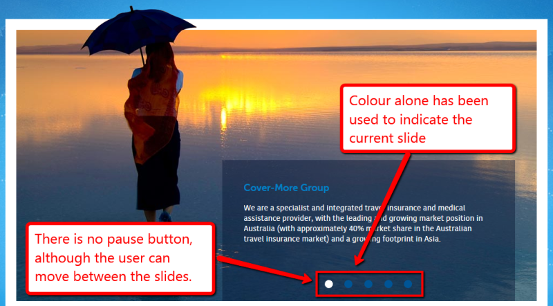
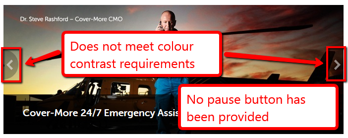
There are two main types of slideshows that we often see. The first one (Figure 1) has circles to indicate the slides and provides a method of moving between slides. The second one (Figure 2) has arrows at the left and right edge of the slideshow to allow users to choose the next or previous slide.


The biggest problem with these slideshows is that they cannot be paused by the user. The next most serious problem is that neither is keyboard accessible. In the first example the keyboard skips the slideshow entirely.
In the second example the arrows are not keyboard accessible, but the link within the two slides in the slideshow is. This means that the keyboard focus disappears when it is focused on a slide not currently visible.
We have released two slideshows recently. Energy Rating (www.energyrating.gov.au) was built with Bootstrap (with some heavy modifications). AccessibilityOz ( www.accessibilityoz.com.au) has an accessible slideshow that was also based on Bootstrap (with even heavier modifications).
There are five principles that need to be met to create an accessible slideshow:
- Allow the user to stop all movement
- Provide visible controls accessible to the keyboard, mouse and touch
- Provide a valid and understandable focus order through the slideshow
- Valid coding and style sheets
- Provide a meaningful alternative to the slideshow
Principle 1: Allow the user to stop all movement
One of the reasons marketing departments like slideshows is because there’s movement on the page, which draws the viewer’s attention to that area.
Allowing users to control the movement of a slideshow is one of the four “non-interference” clauses in WCAG2. These four success criteria apply to all content on the page – even content that is classified as inaccessible by the owner.
The specific success criterion is 2.2.2: Pause, Stop Hide : For any moving, blinking or scrolling information that (1) starts automatically, (2) lasts more than five seconds, and (3) is presented in parallel with other content, there is a mechanism for the user to pause, stop, or hide it unless the movement, blinking, or scrolling is part of an activity where it is essential.
And I don’t think anyone can argue that a slideshow is essential!
As WCAG2 says, “the intent of this Success Criterion is to avoid distracting users during their interaction with a Web page”. It is not sufficient to pause the movement when it receives focus. It must be able to be completely stopped by the user, via the keyboard, mouse or touch (on a mobile device).
The easiest solution is to provide a link that stops the movement. We’ll talk more about the best way to implement this in the Controls section under Principle 2.
One more thing on movement: if you can at all avoid using an animated slide or fade in/out effect then do so. Transition effects are one of the biggest accessibility issues in a slideshow as both slides must exist in the DOM at the same time. If you can avoid transitions then your slideshow will be much easier to make accessible.
Principle 2: Provide visible controls accessible to the keyboard, mouse and touch
Far too often the controls on a slideshow are very small, or quite low-contrast compared to the content they overlay. And focus / hover is often not too obvious either. There are four requirements to think about here:
- A. Are there controls to stop, start and move between slides?
- B. Are the controls highly visible (large enough to be seen and meet colour contrast requirements)?
- C. Is the focus/hover indication sufficiently different to the default state while also having enough contrast with the content?
- D. Can the controls be manipulated by the mouse, the keyboard and touch?
A. Are there controls to stop, start and move between slides?
As mentioned in Principle 1, it is absolutely essential that users be able to stop all movement in the slideshow, via the mouse, the keyboard or touch alone. Also necessary is the ability for users to restart a slideshow if they have stopped it. It is not an actual requirement that users be able to move between slides, but it’s a good idea.
B. Are the controls highly visible (large enough to be seen and meet colour contrast requirements)?
We see problems with this requirement on a lot of slideshows. Either the controls are teeny-tiny or the controls are overlaid on the content and colour contrast is entirely dependent on the underlying slide. There are a number of solutions to this, including having a solid background behind the control which provides the contrast, and using a solid border around the control which provides the contrast.
C. Is the focus / hover indication sufficiently different to the default state while also having enough contrast with the content?
We mostly see focus indicators only appear on mouse hover (and not keyboard focus) and often it consists of only a slight colour change of the controls. It is important that if you are going to use a colour change you need to meet colour contrast requirements.
An even better solution is to change the shape of the control on focus, like we have on the AccessibilityOz slideshow (see Figure 3 and 4). But remember it needs to appear on keyboard focus too!


D. Can the controls be manipulated by the mouse, the keyboard and touch?
Most slideshows controls are completely inaccessible to the keyboard. All the controls that make up the slideshow need to be made accessible by keyboard alone. If the controls are done using buttons or links then they should be implicitly keyboard accessible unless you muck around with TABINDEX.
We see far fewer mobile-accessible slideshows because there are a number of additional accessibility requirements in making a slideshow accessible on a mobile device.
Firstly, there must be an obvious method to pause the slideshow (it’s not sufficient to pause the slideshow on touch). Providing an actual pause button is necessary.
However, it is important that this button is large enough for people to tap easily (at least 7 – 10 mm). If the user can swipe to see the next slide, this needs to be indicated visually on the slideshow. And all actions; swipe, scroll and touch, must be triggered on the removal of touch, not on the initiation of touch (ie. when the user removes their finger from the device, not when the user first touches the device).
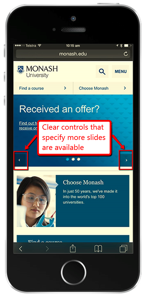
Monash University provides a good example of this.
On the Monash desktop site, the slideshow has a pause button, but in the mobile version the slides don’t move automatically so there is no pause button (see Figure 5). However there are clear controls to move between slides, that also inform the user that there is more content in the slideshow.

Griffith University is another great example of proper controls on the desktop and the mobile. On the desktop there is the option to move between slides and play the slideshow (the slideshow is paused by default).
In the mobile site, the slideshow moves by default but there is a clear pause button as well as controls to move between slides (Figure 6). Underneath the slideshow is a great example of indicating that there is more content with the addition of arrow controls.

Principle 3: Provide a valid and understandable focus order through the slideshow
Focus order is an important accessibility requirement. The best way to explain it is that the order that items receive focus when tabbing through items, should match the underlying HTML (ie the site with style sheets disabled), which should match the visual order of the page.
However there is an additional requirement, which is that when you make a change to the page, it only changes content after the current focus. So a slideshow with an arrow on the right fails this requirement as change occurs prior to the current focus. There is an exception to this, and that is if the user is warned about the content change; we will be talking about this in the next article.
So there are three requirements here: you want the focus order to match up with the visual layout. You want the controls to come before the content, or at least to have the “pause” control before anything else. And you need to make sure that activating a control doesn’t change content before the current focus.
This is a place where some compromise is inevitable, but in general try to put things like a pause/play button and position indicators at the top of the slideshow and have them come before the content in the tab-focus order.
If, however, you’ve used HTML elements which don’t usually accept keyboard focus (such as LI elements) you’ll need to explicitly add them to the keyboard focus order (tabindex=“0” will generally suffice). You will also then need to add a JavaScript handler to accept keystrokes in addition to whatever you’ve assigned to the click event.
Principle 4: Valid coding and stylesheets
This brings us to proper coding and stylesheet usage of your slideshow. As I mentioned, we will be covering this in a future article, but these are the important things to know. The slideshow does not need to function with style sheets disabled, but all the content needs to be available.
Most of our clients just show one slide after the other. It’s not pretty, but it’s accessible.
One of the things you must be very careful to avoid is slideshow movement when style sheets are disabled. Often what we see are all the slides displayed, one after the other, and then the first slide disappears, and all the slides move up, then the next slide disappears, and all the other slides move up, etc.
This can be apparent to screen reader users; they read a slide then when they go back to try and find it, it is gone. The other thing we often see is overlapping content when style sheets are disabled.
Hidden structural labels should also be included in the slideshow, but we will talk more about that in the next article.
If there is any text on the slideshow it needs to increase when the user increases text size in the browser. On a mobile device, your slideshow needs to support pinch zoom.
Principle 5: Provide meaningful alternatives
The sad truth is that no matter how much effort you put in to this, there are going to be some edge cases – combinations of older browsers and assistive technology – where your spiffy slideshow simply won’t be accessible.
So you’ll need to provide an alternative to the slideshow, assuming for a moment that there is any meaningful content in it. And, quite frankly, if there is no meaningful content in your slideshow then you should get rid of your slideshow .
The simplest way to provide an alternative is to have the text from each slide repeated in a “screen-reader only” section along with any links. Then include a “skip past the slideshow” link. This is done by creating a “screen-reader only” class.
An additional trick worth considering is to not apply this class directly in your HTML, but to instead apply it with JavaScript right before enabling the slideshow code. This way if there’s no JavaScript (and thus no slideshow) the alternative will be visible.
It’s important (and an accessibility requirement) that this alternative displays at the site of the slideshow and not elsewhere on the page. Also remember that the controls reliant on JavaScript should not be visible in the case where JavaScript is disabled.
It is necessary that the alternative is equivalent to the slideshow. Therefore if you have links in your slideshow to areas in your site, you need to replicate these links in the alternative.
In some cases the images in the slideshow will need to have valid ALT attributes. If the images are purely decorative (as in the AccessibilityOz example) then you can use alt=“”. However if the images do convey information then they need a valid ALT attribute.
Conclusion
So now you understand why it is so difficult to make an accessible slideshow! I hope these principles have helped, and watch out for our next article when we’ll provide you with some real code.
Frequently Asked Questions (FAQs) about Accessible Slideshows
What is an accessible slideshow?
An accessible slideshow is a digital presentation that is designed to be easily navigated and understood by all users, including those with disabilities. This includes people with visual impairments, hearing impairments, cognitive disabilities, and motor disabilities. Accessible slideshows are designed with features such as alt text for images, captions for audio and video, keyboard navigation, and clear, simple language.
How do I make my slideshow accessible?
Making a slideshow accessible involves several steps. First, ensure that all images have alt text that describes the image for those who can’t see it. Second, if your slideshow includes audio or video, provide captions or transcripts. Third, make sure your slideshow can be navigated using only the keyboard, for those who can’t use a mouse. Finally, use clear, simple language and provide explanations for any complex content.
What is alt text and why is it important?
Alt text is a short description of an image that is read aloud to visually impaired users by screen readers. It’s important because it allows these users to understand the content of the image, even if they can’t see it. Without alt text, they would miss out on this information.
How do I add captions to my slideshow?
Adding captions to your slideshow depends on the software you’re using. In general, you’ll need to create a text file with the captions, timed to match the audio or video. Then, you’ll upload this file to your slideshow. Some software also allows you to type in captions directly.
Why is keyboard navigation important?
Keyboard navigation is important because some users, particularly those with motor disabilities, can’t use a mouse. They rely on the keyboard to navigate digital content. If your slideshow can’t be navigated with the keyboard, these users won’t be able to access it.
How can I make my slideshow’s language clear and simple?
To make your slideshow’s language clear and simple, avoid jargon and complex sentences. Break up information into small, manageable chunks. Use bullet points or numbered lists where appropriate. And always provide explanations for any complex or technical content.
What is a transcript and why is it important?
A transcript is a written version of the audio content in your slideshow. It’s important because it allows users who are deaf or hard of hearing to access this content. It also helps users who have trouble processing audio content, and those who prefer to read.
How do I create a transcript for my slideshow?
Creating a transcript for your slideshow involves typing out all the audio content, including dialogue and important sound effects. You can do this yourself, or hire a transcription service. Once the transcript is complete, you can add it to your slideshow or provide it as a separate document.
Can I use automated tools to make my slideshow accessible?
Yes, there are automated tools that can help make your slideshow accessible. These tools can generate alt text, captions, and transcripts, and check for keyboard accessibility. However, they’re not perfect and should be used in conjunction with manual checks.
What are the benefits of making my slideshow accessible?
Making your slideshow accessible has several benefits. It ensures that all users, including those with disabilities, can access your content. It can also improve your SEO, as search engines favor accessible content. Finally, it’s the right thing to do, ensuring that everyone has equal access to information.
Gian Wild has been working in accessibility since 1998. She worked on the very first Australian accessible web site and was the accessibility consultant for the Melbourne 2006 Commonwealth Games. For six years she was actively involved in the W3C Web Content Accessibility Guidelines Working Group. Gian Wild is the Director of AccessibilityOz.


