

Continuing on from the last article in this series on color, Red, Yellow, and Blue, or CMYK, we’re now going to take an in-depth look at color schemes — lots of examples to follow.
Currently, we know enough about colors to talk about their values, intensities, psychological associations, temperatures, and locations on the traditional color wheel. That’s all well and good, but how do we find multiple colors that work together? This is where color schemes come in handy. Color schemes are the basic formulae for creating harmonious and effective color combinations. Six classic color schemes exist:
- monochromatic
- analogous
- complementary
- split complementary
- triadic
- tetradic (also called double complementary)
In order to employ any of these classic color schemes, we must start with a color. Consider the subject of the website you’re working on, and choose a base color that suits the site’s purpose. Of course, this choice may be out of your hands. Sometimes, you’ll have to work within a company’s rules, perhaps adhering to seemingly inane and eccentric color guidelines. Let’s assume that the site you’re designing is for a proud family of hoity-toity circus monkeys. These circus monkeys still believe they have a royal lineage, so they have requested that we incorporate a regal purple into the design. Silly monkeys … but you know what they say: “the client is always right.”
Key Takeaways
- Color schemes are essential for creating harmonious and effective color combinations in design, with six classic types: monochromatic, analogous, complementary, split complementary, triadic, and tetradic.
- Monochromatic color schemes involve various tints and shades of a single color, adding depth and unity to the design, as seen in examples like the Solid Giant website.
- Analogous color schemes use colors adjacent on the color wheel, providing a cohesive look but requiring careful balance to avoid overwhelming the viewer.
- Complementary color schemes, which pair colors opposite each other on the color wheel, are effective for creating vibrant and eye-catching designs but can be challenging to balance correctly.
- Exploring variations of traditional color schemes, such as adding contrasting colors or adjusting saturation, can infuse originality and freshness into your design while maintaining a solid foundational palette.
A Monochromatic Color Scheme
When we talked about the value of color earlier, we talked about tints and shades. A monochromatic color scheme—like the one shown in Figure 1, “A monochromatic monkey”—consists of a single base color and any number of tints or shades of that color.

Fig. 1, “A monochromatic monkey”
Monochromatic Color Scheme Examples
Hot pink is a super-saturated color that packs a powerful punch when paired with black and white. This is obviously what Indiana-based web agency Solid Giant was going for with the monochromatic color scheme you see in Figure 2, “The Solid Giant website contrasts color effectively”. Each section of this single-page, scrolling site alternates between a textured white background and a pink one that’s as bright as the “superawesome” copy on the home page.

Fig. 2, “The Solid Giant website contrasts color effectively”
Another example of saturated, monochromatic design can be found in the personal site of author, speaker, and user experience designer Aarron Walter. Each page of the site features a different monochromatic color scheme. The darkening content rows you see on Aarron’s home page in Figure 3, “Aarron Walter’s site features a different color scheme for each page” are the result of a clever use of RGBA transparency. Each row of content has a transparent black background. When the page loads, JavaScript assigns an incrementally higher alpha (opacity) value to each block, creating a rich monochromatic color scheme for each page.

Fig. 3, “Aarron Walter’s site features a different color scheme for each page”
Changing Color Schemes
Many websites use different color schemes for each section of content. This approach can add richness and character to the content, but may also produce some identity issues. If you’re going to use multiple color schemes within a single site, be sure to keep the logo, menu, and overall layout of the site consistent to avoid confusion.
Art in My Coffee is a Tumblr blog created by Jina Bolton and designed by Meagan Fisher, which catalogs latte art from all around the world. It’s no surprise, then, that the site features a monochromatic color scheme based around creamy tints of tasty brown coffee, as you can see in Figure 4, “Art in My Coffee—featuring colors directly drawn from the site’s subject matter”. If you know that the photos and content of your site will feature lots of the same color, it’s a terrific idea to follow Meagan’s lead and design your color scheme around the content.

Fig. 4, “Art in My Coffee—featuring colors directly drawn from the site’s subject matter”
The site for New Zealand’s Black Estate Vineyard in Figure 5, “Black Estate wines—living up to its name” features a special breed of monochromaticism. Yes, I just made that word up. Any set of colors that consists solely of black, white, and shades of gray is known as an achromatic color scheme. The word achromatic literally means “without color.” Just because the overall scheme of the site has no color, it doesn’t mean the content has to be colorless as well. Because of the dark background, ample use of “white” space, and lack of surrounding color, the vibrant photographs pop off the page, giving life and light to the design.

Fig. 5, “Black Estate wines—living up to its name”
An Analogous Color Scheme
An analogous color scheme consists of colors that are adjacent to one another on the color wheel. If our color wheel were a delicious pie (mmm, pie!), then an analogous color scheme would be a fairly large slice. The key to creating a good analogous scheme is to remember that your eyes are bigger than your appetite. As a rule of thumb, avoid having a slice that’s bigger than one-third of the whole, or you’re bound to make users sick. Returning to our hoity-toity monkeys in the design shown in Figure 6, “An analogous monkey”, we’ve taken their regal purple and warmed it up with some orange tones.

Fig. 6, “An analogous monkey”
Analogous Color Scheme Examples
The playful illustrations on the home page for Forrst deepen the metaphor of this designer/developer community. While you’re snickering at the park ranger’s SpongeBob-like legs or the “Log In” pun in Figure 7, “Lost in the Forrst”, note the rich analogous color scheme. From the teal sky to the orangey browns, the colors of this design are contained within a one-third wedge of our color wheel pie.

Fig. 7, “Lost in the Forrst”
Blinksale, shown in Figure 8, “Blinksale’s site is professional without being staid”, is a hosted web application that creates, manages, and sends CSS-formatted and plain-text invoices. It’s also an excellent example of what a creative analogous color scheme can do for a business website. It crumples up those preconceived notions of how corporate websites should look, and tosses them into a cool sea of colors ranging from blue-green to yellow. Be sure to note how color contrast makes their call to action the first thing you see. The perspective lines of the screenshot on the right also take advantage of continuance, constantly guiding your eyes back toward that sign-up button.

Fig. 8, “Blinksale’s site is professional without being staid”
While Blinksale’s home page is designed to dazzle and amaze, the Zappos home page (Figure 9, “Zappos gets down to business”) gets straight down to business. This is achieved by relying on a solid analogous color scheme of blues and greens. The brightly colored search button at the top of the page stands out because it introduces a completely different hue from the rest of the site. One might even say it complements the blues on the page … but what does that mean? Read on to find out.

Fig. 9, “Zappos gets down to business”
A Complementary Color Scheme
Complementary color schemes like the one featured in our updated hoity-toity illustration—shown in Figure 10, “A funky complementary monkey”—consist of colors that are located opposite each other on the color wheel. Placing red-violet and yellow-green together is uncommon, but the monkeys insisted that I keep some of their royal purple in the picture. Sheesh … these clients are a bunch of primates.

Fig. 10, “A funky complementary monkey”
Complementary Color Scheme Examples
The University of Florida is my wife’s undergraduate alma mater, and the school’s orange and blue team colors provide a strong foundation for a complementary color scheme. Some people may be put off by the stark contrast of complementary color schemes found on its athletics website (seen in Figure 11, “The University of Florida Athletics website uses bold complementary colors”), but when the colors represent the business or entity for which you’re designing, you can’t go wrong.

Fig. 11, “The University of Florida Athletics website uses bold complementary colors”
Pittsburgh’s Sprout Fund Spring Program website in Figure 12, “The Sprout Fund Spring Program uses complementary colors to a more organic effect” proves that complementary color schemes don’t have to be as bold as UF’s orange and blue. By toning down the saturation, this red and green design looks very natural and earthy, helping support the message of biodiversity. The beautiful illustrations and artistic textures really make this design sing.

Fig. 12, “The Sprout Fund Spring Program uses complementary colors to a more organic effect”
I’m really unsure why so many musicians insist on having all-Flash websites, and then never update them—but I digress. Regardless of the publishing platform, the website for musician Zach Hendricks is a beautiful textbook example of a complementary color scheme, as you can see in Figure 13, “Zach Hendricks: a textbook example of complementary colors”. It’s impossible to choose complementary colors without pairing cool with warm, and the designers of this site were well aware of that. The city skyline and bright round sun glow hot against the cool teal water. If you wanted to experiment with this exact color scheme, the secret formula is right there in the overlapping circles of the logo. To this site’s credit, there’s a non-Flash fallback for those of us trying to access it via iPhone or iPad.

Fig. 13, “Zach Hendricks: a textbook example of complementary colors”
Common Complementary Pitfalls
Since complementary colors are so different from each other in many ways, they can cause an effect known as simultaneous contrast when placed together: this is when each color makes the other appear more vibrant and dominant. This is actually what makes complementary color schemes so successful at moving visitors’ eyes around a composition. However, it can be horribly painful when complementary colors are used in a foreground–background relationship, as they are in Figure 14, “Beware of simultaneous contrast!”.

Another common pitfall is to choose colors that aren’t directly opposite one another on the color wheel, yet aren’t close enough to be analogous colors. These combinations are known as discordants because the colors will often clash with one another, causing viewer discord. In fact, 1980s fashion was all about discordant colors. Seeing a discordant color scheme these days tends to bring back fond memories of that geometric “designer series” of Trapper Keeper binders I loved so dearly at school—one’s depicted in Figure 15, “A discordant Trapper Keeper cover”.

Fig. 15, “A discordant Trapper Keeper cover”
As this example shows, this pitfall can be made workable if it’s used intentionally. Discordant colors are whizbang combinations that really appeal to children, teens, and tweens, so using them for youth-oriented sites or products is worth considering. They can also be used sparingly in more grown-up designs to create greater emphasis than can be achieved with just a simple complementary combination. For an example of this type of color scheme, check out Bulls+Arrows in Figure 16, “The Bulls+Arrows site makes great use of colors that clash”. The site features several randomly loading background images, each with a color scheme of its own. This particular image pairs bright red with a blue-green that’s just far enough from complementary to give this design an edgy look.

Fig. 16, “The Bulls+Arrows site makes great use of colors that clash”
Split-complementary, Triadic, and Tetradic
Split-complementary, triadic, and tetradic color schemes sound technical, but they’re just simple variations of a basic complementary color scheme.
To create a split-complementary color scheme, use the two colors adjacent to your base color’s complement. For example, take the left-most color scheme shown in Figure 17, “Split-complementary color scheme examples”. Red is the base color here, so instead of using green to form a complementary scheme, we’ll use the two colors adjacent to green, chartreuse (yellow-green) and aquamarine (blue-green), to form a three-color split-complementary scheme. Note that, since you’re using your base color with two discordant colors, this type of color scheme can look juvenile and extreme, but that may be just the effect you want.

Fig. 17, “Split-complementary color scheme examples”
For a triadic color scheme, we just push our split-complements out one more notch on each side, so that all the colors are equally spaced on the color wheel. Starting with red as our base color again, we select yellow rather than chartreuse, and instead of aquamarine, we select blue. This divides the color wheel into thirds, hence the tri prefix in triadic. In this example, which is the left-most scheme in Figure 18, “Triadic color scheme examples”, we have the three primaries (red, yellow, and blue) making up our color scheme. If you turned the scheme clockwise one notch, you’d have chartreuse (yellow-green), violet (blue-purple), and vermilion (red-orange), as shown in the middle example in Figure 18, “Triadic color scheme examples”.
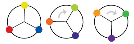
Fig. 18, “Triadic color scheme examples”
Knowing that triadic color schemes involve three colors, you have probably deduced from your extensive knowledge of the Greek language (okay, so maybe you haven’t) that a tetradic color scheme involves four colors. A tetradic color scheme combines any complementary color scheme with another complementary color scheme. The left-most example in Figure 19, “Tetradic color scheme examples” is a tetradic color scheme that combines orange and blue with yellow and purple.

Fig. 19, “Tetradic color scheme examples”
The website for River City Church in Jacksonville, Florida (shown in Figure 20, “The adventurous River City Church”) is an excellent example of a tetradic color scheme. Notice that there are exactly four colors in this design besides black and white. We have the complements orange and blue, paired with pink and green. Finding pure examples of the six classic color schemes I’ve described above is a difficult task. That’s because sometimes designers make one up from scratch, or it’s because they use a slight variation on one of these themes. In the section “Other Variants” below, we’ll discuss a few options.

Fig. 20, “The adventurous River City Church”
Other Variants
Although most designers are aware of the standard color schemes, the combinations can tend to feel basic and uninspired. However, if you treat the color wheel like a dartboard, and pick whatever colors you land on, you’re likely to come up with some truly awful combinations—trust me, I’ve tried it. Rather than taking that risk, there are other ways to tweak the classic color schemes to create a fresh combination. Once you have a handle on monochromatic, analogous, and complementary color relationships, try experimenting with some of the following:
Monochromatic with mo’ pop — Rather than just using tints and shades of your base color, try incorporating pure gray, black, and white. This will create more contrast, and more “pop” within a monochromatic color scheme.
Analo-adjust — Adjust the saturation of one of the colors in your monochromatic scheme up and adjust the others down. A highly saturated color will stand out when placed among muted colors. There should be no analo-guessing which one is the saturated color.
Mono-split-complement — If you have a good thing going with a split-complement color scheme but want to add some depth, try using a few tints and shades of your base color in the design.
Obviously, I just made those names up, but you’ll notice that all three variants are similar to the main traditional schemes. It’s easy to tweak the traditional color schemes a little for more character, but remember that the color scheme you choose is the foundation from which you’ll build your website’s color palette. It’s important to build on a firm foundation, or the rest of your design could come tumbling down.
Next week we’ll return to a shorter post, looking at color palettes and how to create them; stay tuned.
The Principles of Beautiful Web Design
This article is from Jason Beaird’s The Principles of Beautiful Web Design book (second edition is out now!). Be sure to lookout for further articles from the book here on Design Festival.
Frequently Asked Questions about Color Schemes
What is a color scheme and why is it important?
A color scheme is a combination of colors used in a range of design applications, from interior design to graphic design. It’s important because it creates aesthetic balance and can influence mood and perception. For instance, a well-chosen color scheme can make a room feel more relaxing or a website more user-friendly.
How do I choose a color scheme for my design project?
Choosing a color scheme involves understanding the basics of color theory, including the color wheel and color relationships. You should also consider the mood you want to evoke, the message you want to convey, and the context in which the colors will be used.
What is a discordant color scheme?
A discordant color scheme, also known as a clash color scheme, uses colors that are opposite each other on the color wheel. This creates a vibrant and energetic effect, but it can be challenging to balance without causing visual discomfort.
What is a double complementary color scheme?
A double complementary color scheme involves two pairs of complementary colors. It’s a rich and complex scheme that can create a lot of visual interest, but it requires careful handling to ensure harmony and balance.
What is a tetrad color scheme?
A tetrad color scheme uses four colors arranged into two complementary pairs. This scheme offers more color variety and can create a vibrant and dynamic effect, but it’s important to balance the colors well to avoid visual chaos.
How can I use color schemes in interior design?
In interior design, color schemes can be used to create different moods, highlight architectural features, and bring cohesion to a space. For instance, a monochromatic scheme can create a soothing atmosphere, while a complementary scheme can add energy and contrast.
How can I use color schemes in graphic design?
In graphic design, color schemes can help to convey a message, guide the viewer’s eye, and create a consistent brand identity. For example, a triadic color scheme can create a balanced and harmonious design, while an analogous scheme can evoke a certain mood or emotion.
What are some common mistakes to avoid when choosing a color scheme?
Common mistakes include choosing too many colors, not considering the effect of lighting on colors, and not considering the psychological effects of colors. It’s also important to test your color scheme in different contexts to ensure it works well.
How can I learn more about color theory and color schemes?
There are many resources available online, including articles, tutorials, and courses. You can also learn by experimenting with different color schemes in your own design projects and observing the effects.
Can I use software or tools to help choose a color scheme?
Yes, there are many color scheme generators and tools available online that can help you choose and visualize color schemes. These tools can be a great starting point, but it’s also important to understand the basics of color theory and to consider the specific needs of your project.

