

First impressions are everything. How you look and how you present yourself can determine how you are perceived. The same goes for our design work. The impression that our work gives depends on a myriad of different factors. One of the most important factors of any design is color. Color reflects the mood of a design and can invoke emotions, feelings, and even memories. If you haven’t gone back to the basics of color theory lately, you might find some insights that you’ve overlooked.
Figuring out which colors work well with others isn’t just a matter of chance. There is actually a science behind which colors work well together. Different color combinations fit into different categories, and can be broken down easily. Let’s start with the absolute basics and move on to more advanced color combinations.
Key Takeaways
- Color plays a significant role in design by reflecting the mood and invoking emotions, feelings, and memories. Understanding the basics of color theory can lead to more effective and impactful designs.
- The color wheel model is a fundamental tool for understanding color combinations. It includes primary, secondary, and tertiary colors, and helps in choosing color combinations that work well together, set the right mood, and create the right amount of contrast.
- Different types of color schemes include complementary, analogous, triadic, split complimentary, square, and tetradic. Each scheme creates a unique level of contrast and harmony, influencing the overall impact of the design.
- Colors have different meanings and connotations, influencing their effect in a design. For example, warm colors like red, orange, and yellow often evoke feelings of warmth, energy, and passion, while cool colors like blue, green, and purple are associated with calmness, tranquility, and peace. Understanding these associations can help in conveying specific moods or emotions in design work.
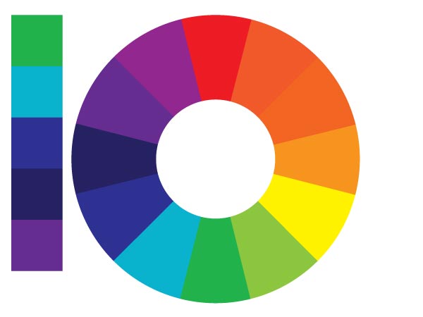
Primary Colors
Colors start out with the basis of all colors, called the Primary Colors. These are red, yellow, and blue. If we are talking about screen colors, such as for web devices and monitors, red green, and blue (RGB) are the basic colors which make up all colors found on screen devices.
Secondary Colors
If you evenly mix red and yellow, yellow and blue, and blue and red, you create the secondary colors, which are green, orange and violet. Combining these colors in projects can make for a lot of contrast.
Tertiary Colors

Tertiary colors are made when you take the secondary colors and mix them with the primary colors. These are red-violet, blue-violet, blue-green, yellow-green, red-orange, and yellow-orange.
So, now that you know how colors are made, you can understand how the color combinations on the color wheel model work. Understanding the principles of color combinations will help you to choose combinations that work well together, set the right mood, and create the right amount of contrast within your design work. Next are the basic color combinations derived from the color wheel.
Complimentary Colors
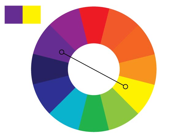
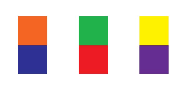
Complimentary colors are colors that are opposite each other on the color wheel. Examples would be blue and orange, red and green, Yellow and purple, etc. Complementary color schemes create a high amount of contrast, but can create a lot of visual vibration when they are used at full saturation.
Analogous Colors

Analogous colors are colors that are next to each other on the color wheel. It is a good idea to choose a set of analogous colors that create a sense of variety. A good example would be blue-green, blue, and blue-violet or yellow-green, yellow, and yellow-orange.
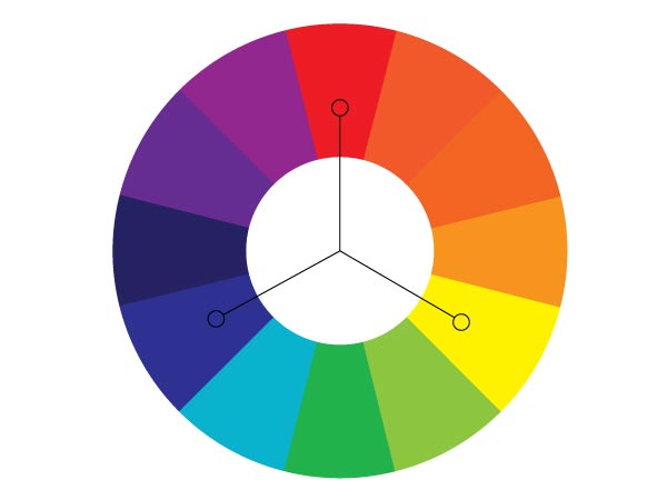
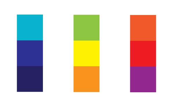
Triads
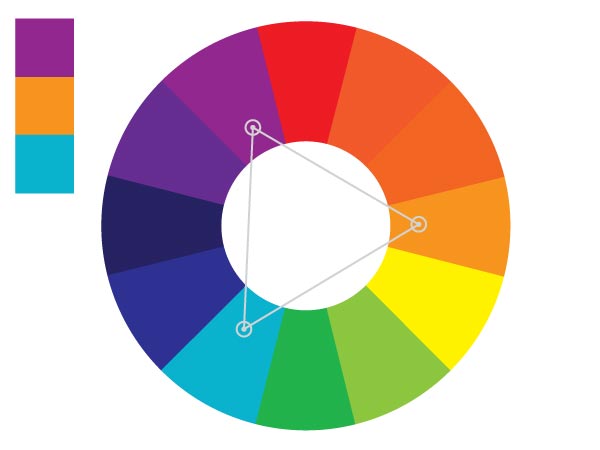
A triad of colors is a set of colors that are evenly spaced around the color wheel. A triad has a nice variety of colors, but is also well balanced. In the examples above, blue-violet and yellow-green create a lot of contrast.
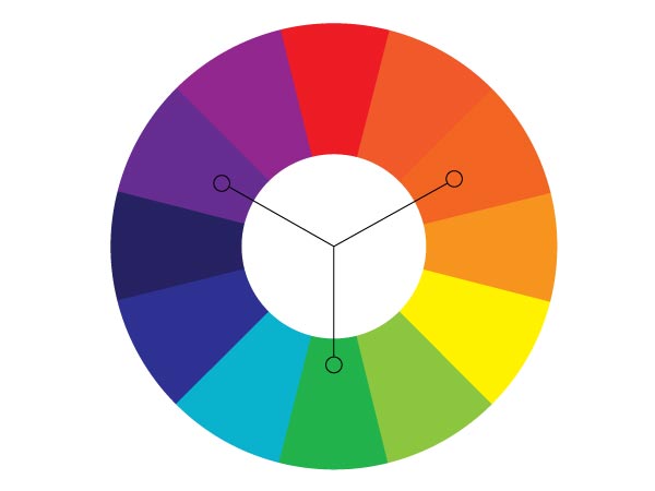
Split Complimentary Colors

Split complimentary colors take a color and — instead of choosing the color directly across from it on the color wheel — it takes the two on either side of it. In the example above, we chose yellow. The opposite color on the color wheel is purple, but instead we choose blue-violet and red-violet, which creates a lot of contrast and make for some highly cooperative colors.
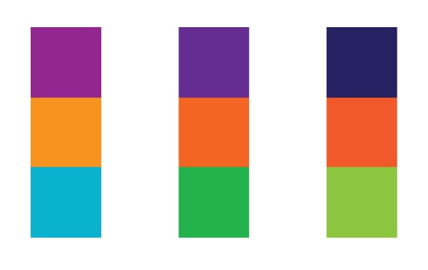
Square Colors
The square color model takes four colors evenly spaced around the color wheel. In the example above, the colors are blue, orange, red-violet, and yellow-green. This color scheme is really nice and would work well with one strong color and muted versions of the other colors.
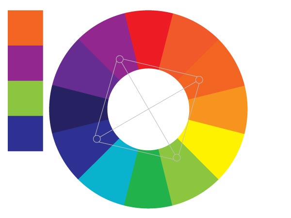
Tetradic Colors

Tetradic color schemes are built by creating a rectangle on the color wheel. Select two opposites on the color wheel and then select another color two spaces over and its compliment across the color wheel.
Tints and Shades

A tint of a color is when you take a color, such as blue in the example above, and add white to it. A shade is a hue that has black added to it. You can create a monochromatic color scheme buy using tints and shades of the same hue.
Warm Colors

Warm colors create a sense of warmth and heat in an image or a design. When you see warm colors, you think of the sun, heat, fire, and love (passion). Red is the color of blood, which is warm, and orange and yellow go along with summer. Adding an orange photo filter to an image instantly makes it look warmer and happier.
Cool Colors
Cool colors carry connotations of cool climates, winter, death, sadness, ice, night, and water. Cool colors can be associated with calmness, tranquility, trust, cleanliness. Purple is associated with royalty, because they are supposed to be reserved.
Color Meaning
Red
Red is the color of love and passion. Boxes of candies are red on valentines day. Some are pink, which is a tint of red. Red is also the color of anger and blood. Red, orange and yellow are all found in fire. Red can also mean danger. Stop signs are red, which get our attention and tell us to be careful and look before we proceed. Red is dominant, and when combined with colors such as black, can create a very masculine look. Red commands attention and can set a serious tone.

Orange
Orange represents warmth, but isn’t aggressive like red is. Orange can portray a fun atmosphere because it is energetic and creates a sense of warmth without associated connotations of danger and blood, as with the color red. Orange can be associated with health, such as vitamin C, which is commonly found in oranges.

Yellow
Yellow is associated with the sun and warmth. When used with orange, it creates a sense of summer fun. Yellow can be associated with thirst, and can be found on the walls of many refreshment shops. Yellow can also be associated with cowardice and fear, which comes from the old expression of someone being “yellow.” When combined with black, it can gain a lot of attention. A good example outside of design would be a taxi. The combination gets a lot of attention.

Green
Green is the color of money, so in our culture it is associated with wealth. Since most plants are green, it is also associated with growth and health. It is used to show that products are natural and healthy, it also connotes profit and gain. Combined with blue, green further perpetuates health, cleanliness, life, and nature.

Blue
Depending on the tint and shade of blue, it can represent different feelings, thoughts, and emotions. In imagery, dark shades of blue can give a sense of sadness. An expression that goes along with this is “singing the blues” when someone is sad. Light blue is the color of the sky and of water, which can be refreshing, free, and calm. Blue skies are calming and tranquil. Water washes away dirt and cleans wounds. Blue can represent freshness and renewal, such as when rain washes away dirt and dust. The calmness of blue promotes relaxation.

Purple
Associated from the color of the robes of royalty, purple relates to royalty. Purples with more red can be associated with romances, intimacy, softness, and comfort. Purple can give a sense of mystique as well as luxury. A good example would be the wine website shown below.

White
White can be associated with sterility, due to doctors wearing white and most hospitals being white. Because most artistic depictions of religious figures are completely colorless, white represents “good” and holiness. White can represent cleanliness, such as clean linens and clean laundry. It can represent softness due to cotton and clouds. It can reference mental health due to the white coats and uniforms, white walls, etc. White is great for connoting health and cleanliness, as shown in the optical website shown below.

Black
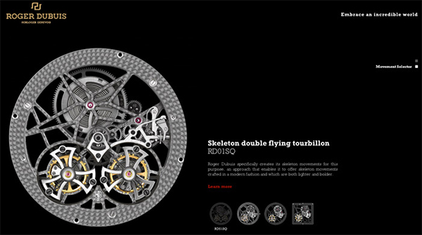
Black is mostly associated with death, especially in the United States. It can represent decay — due to rot — based on how food breaks down and turns black. Black can represent evil, because it is the opposite of white, which often represents good. It can represent anxiety due to darkness and the unknown. A lot of black in an image can suggest depression and despair, as well as loneliness. However, despite all of the negative connotations, when combined with other colors, such as gold, it can represent luxury. Combined with silver or grey, it can represent sophistication, such as in the timepiece website shown below.
Conclusion
It is essential to understand color as a designer. Everything that you design should take color into serious and careful consideration. The color choices that you make can create a drastic effect on the mood of your work. The right combination can gain attention and convey the right message visually, further driving the message into your viewers’ minds. The emotional side of design is extremely lucrative, and if you aren’t carefully considering your color choices, you should from now on. Your clients will see better results, and your message will have added clarity and strength. Color makes as much of a connection with people as imagery does.
How do you consider the color choices in your design work? Do you have a process of picking out the best colors for your work?
Frequently Asked Questions on Color Theory
What is the significance of complementary colors in design?
Complementary colors are pairs of colors that, when combined, cancel each other out. This means they produce a grayscale color when combined. They are located directly opposite each other on the color wheel. Complementary colors are useful in design because they create a strong contrast, making each color stand out more vividly. This can be used to draw attention to specific elements in a design, or to create a balanced, harmonious color scheme.
How can I effectively use yellow in my designs?
Yellow is a bright and vibrant color that can bring energy and warmth to your designs. It’s often associated with happiness, optimism, and creativity. To use yellow effectively, consider its intensity. A bright, pure yellow can be overwhelming if used in large amounts, so it might be best used as an accent color. Pairing yellow with its complementary color, purple, can create a striking contrast. Alternatively, using different shades of yellow can create a monochromatic color scheme that’s pleasing to the eye.
What colors pair well with purple?
Purple is a versatile color that can be paired with a variety of other colors. Its complementary color is yellow, which can create a vibrant contrast. Purple also pairs well with other cool colors like blue and green, creating a calming and harmonious color scheme. For a more dramatic effect, consider pairing purple with warm colors like red or orange.
How can I understand the opposite of a color?
The opposite of a color, also known as its complementary color, is the color that is directly across from it on the color wheel. For example, the opposite of red is green, the opposite of blue is orange, and the opposite of yellow is purple. Complementary colors create strong contrast and can make each other appear brighter when placed side by side.
How does the color wheel help in choosing color combinations?
The color wheel is a useful tool for understanding how different colors relate to each other. It can help you choose color combinations that are harmonious and pleasing to the eye. For example, colors that are next to each other on the color wheel (analogous colors) often work well together. Colors that are directly across from each other on the color wheel (complementary colors) create strong contrast and can make each other appear brighter.
What are the different types of color schemes?
There are several types of color schemes that can be used in design. Monochromatic color schemes use different shades, tints, and tones of a single color. Analogous color schemes use colors that are next to each other on the color wheel. Complementary color schemes use colors that are directly across from each other on the color wheel. Triadic color schemes use three colors that are evenly spaced around the color wheel.
How can I use color to convey a specific mood or emotion?
Colors can have a strong impact on our emotions and perceptions. For example, red is often associated with passion and intensity, while blue is often seen as calming and trustworthy. By understanding the psychological effects of color, you can use color in your designs to evoke specific moods or emotions. For example, if you want to create a calming environment, you might use a color scheme based on cool colors like blue and green.
What is the difference between warm and cool colors?
Warm colors include red, orange, and yellow, and are often associated with energy, brightness, and action. Cool colors include blue, green, and purple, and are often associated with calm, relaxation, and peace. Using a mix of warm and cool colors can create a balanced and harmonious design.
How can I use color to improve readability in my designs?
Color can play a big role in readability. High contrast between text and background can make your content easier to read. For example, black text on a white background is a common choice for readability. However, too much contrast can be harsh on the eyes, so it’s important to find a balance. Using color to highlight important information can also improve readability.
How can I use color to create a sense of depth in my designs?
You can use color to create a sense of depth in your designs by using darker colors for foreground elements and lighter colors for background elements. This creates a sense of distance, as darker colors appear to be closer and lighter colors appear to be further away. You can also use gradients, or gradual transitions between colors, to create a sense of depth.