Last week we took a look at the warm and vibrant orange in design. Today we’re staying on the same side of the color wheel with the color yellow. Just like orange and red, yellow is a warm color. It has connotations of nature, sunshine and spring and is generally considered to be a happy and hopeful color. Having said that, it can be a difficult color to work with and does not seem to be as popular in web design as the other colors we’ve looked at.
Yellow is a high visibility color, hence its use in health and safety equipment and hazard signs. This high visibility is obviously eye-catching, but possibly too eye-catching on screen. Yellow sitting on a white backround is extremely hard on the eye. As mentioned yellow has many positive connotations, but it does also have associations with cowardice and deceit, “yellow-bellied” and “yellow journalism”.
Using Yellow
There are several shades of yellow, ranging from cream to lemon to golden. Yellow works extremely well as a companion to darker colors. It can brighten up a dark design enormously and can have a similar effect to red and orange in terms of catching the eye without being as bold. Yellow and blue are a popular combination, the yellow perking up more subdued blues and creating high contrast. Purple is the complementary color to yellow and it is also a high contrast combination. For more earthy color schemes, mix yellow with brown and moss and olive green. Combined with light green and orange, yellow creates a citrus or fruity palette. Black and yellow can be combined to create an industrial look.
Yellow in logo design
Here’s a few internationally recognized logo designs featuring yellow:



 Yellow In Web Design
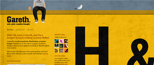
Below you’ll find a selection of web site using yellow either as a main background color or to highlight particular areas of the site.
Gareth Dickey
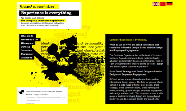
 I-amonline.com
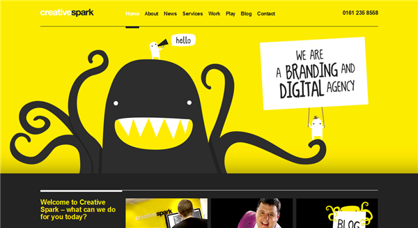
 Creative Spark
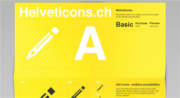
 Helveticons
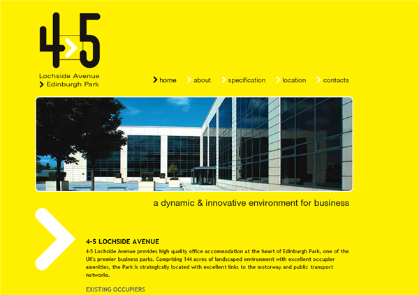
 4-5 Lochside Avenue
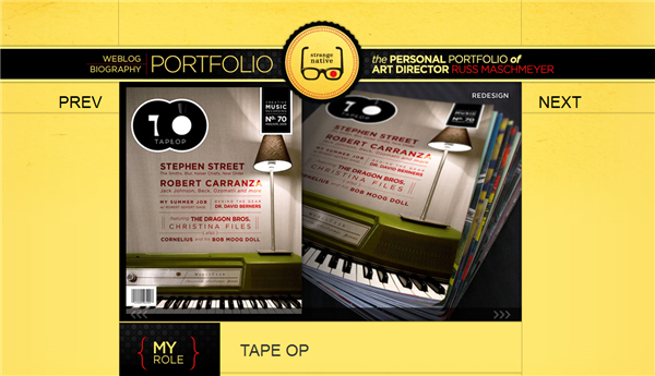
 Strange Native
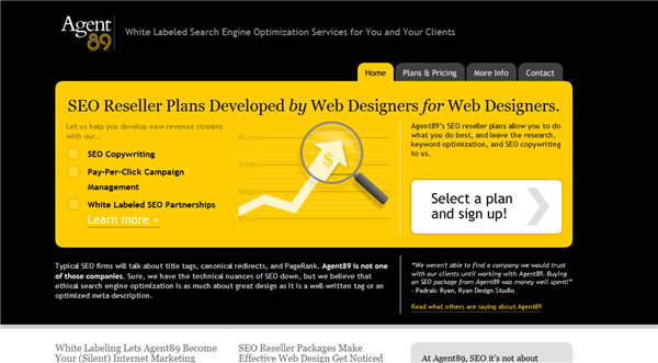
 Agent 89
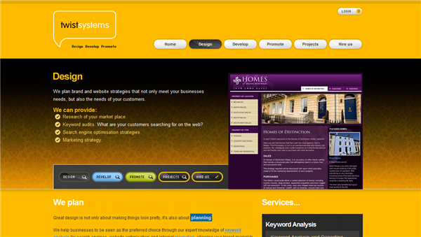
 Twist Systems
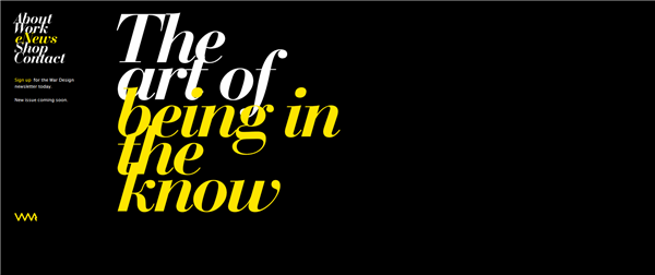
 Ward Design
 Design Charts
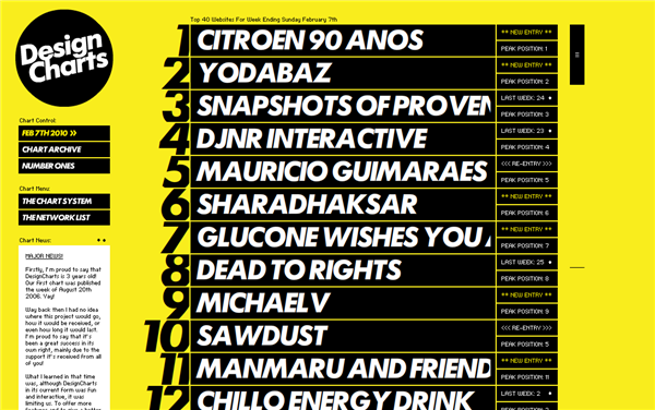 What do you think of the color yellow in design? Is it a color you like or avoid? Have you seen any well designed yellow sites that you really like?
Frequently Asked Questions about Yellow in Design
What emotions does the color yellow evoke in design?
Yellow is often associated with happiness, optimism, and creativity. It’s a vibrant and energetic color that can stimulate mental activity and generate muscle energy. However, it’s worth noting that too much yellow can be overwhelming and lead to feelings of anxiety or fear. Therefore, it’s crucial to use it strategically in design to evoke the desired emotional response.
How can I effectively use yellow in my design?
Yellow can be used in various ways in design. It can serve as a bold statement color, especially in logos or headlines, to grab attention. Alternatively, it can be used as an accent color to highlight important elements or information. Remember, the key is to balance it with other colors to prevent it from being too overpowering.
What colors complement yellow in design?
Yellow is a versatile color that pairs well with many other colors. For a harmonious look, you can pair it with colors close to it on the color wheel, like orange or green. For a more contrasting and vibrant look, consider pairing it with its complementary color, purple. Other popular combinations include yellow and gray, yellow and blue, or yellow and black.
What does yellow symbolize in different cultures?
The symbolism of yellow varies across different cultures. In Western cultures, it’s often associated with happiness, warmth, and energy. In Eastern cultures, it’s seen as a sacred and imperial color. Understanding these cultural associations can help you use yellow more effectively in your designs.
How does the shade of yellow impact its meaning in design?
The shade of yellow can significantly impact its perceived meaning. Lighter shades like lemon yellow are often seen as more cheerful and youthful, while darker shades like mustard yellow can convey a sense of antiquity and richness. Therefore, it’s important to choose the right shade of yellow that aligns with your design’s intended message.
What industries commonly use yellow in their branding?
Many industries use yellow in their branding due to its attention-grabbing and energetic qualities. These include the food industry, children’s products, travel and tourism, and creative industries. However, it’s less commonly used in industries like finance or law, where more conservative colors are preferred.
How does yellow affect the readability of text in design?
Yellow can be challenging to read when used as a text color, especially against a light background. Therefore, it’s often recommended to use yellow for larger text elements like headlines or to use it against a dark background to ensure sufficient contrast and readability.
Can the use of yellow in design influence consumer behavior?
Yes, the use of yellow in design can influence consumer behavior. Its vibrant and energetic qualities can stimulate mental activity and encourage communication. This can make it an effective color for call-to-action buttons or promotional materials.
What are some common mistakes to avoid when using yellow in design?
One common mistake is using too much yellow, which can be overwhelming and cause discomfort. Another mistake is using yellow text on a light background, which can lead to readability issues. It’s also important to consider cultural associations and ensure that the use of yellow aligns with your target audience’s perceptions.
How can I experiment with different shades of yellow in my design?
There are many online tools and resources available that can help you experiment with different shades of yellow. These include color palette generators, color wheel tools, and design software. You can also draw inspiration from nature, art, or other designs to find unique and appealing shades of yellow.
Jennifer Farley is a designer, illustrator and design instructor based in Ireland. She writes about design and illustration on her blog at Laughing Lion Design.

