Last week, I wrote about the earthy color brown in design. This week we’re looking at the more flamboyant color pink. While red is linked with passion, pink is associated with love and romance. It is a stylish color and while generally considered feminine, it’s not just for girls! Are you man enough to wear Pink? Pink is a trendy and playful and is surprisingly popular in web design.
Think of the use of pink in everyday language and you can see how it is perceived as mostly a positive color. A healthy person is sometimes referred to as “In the pink”, content and happy people are described as “tickled pink”.
Using Pink In Design:
There are of course, many different shades and hues of pink. Ranging from light pinks, into orange-pinks, into deep pinks, the color has names such as fuchsia, rose, salmon, flesh, coral and hot pink. There is a pink for every occasion.
You can create soft and delicate color palettes using light pink with pastel purples. Pink combined with black or dark grey can look sophisticated. Pink and blue is playful and fun, while dark pinks combined with burgundy can create a more serious tone. Salmon pink and moss green produce a natural, earthy combination.
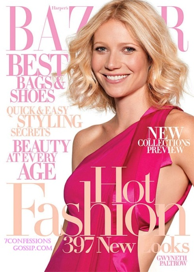
Magazine covers are a great place to see pink palettes in action. In this Harper’s Bazaar cover, Gwyneth Paltrow is wearing a dark pink dress. The type is all set in one typeface, but the bright pink matches text matchers her lipstick. Salmon pink and white text add to the palette.
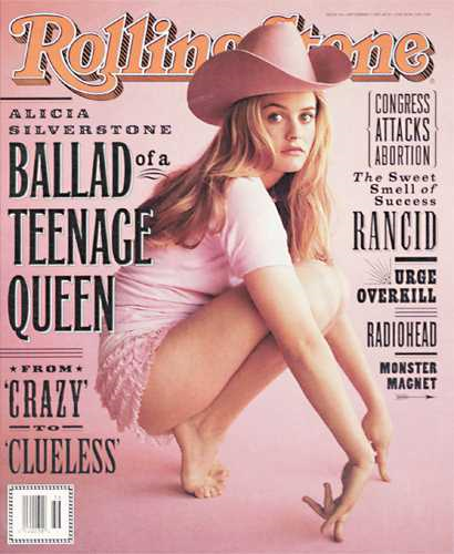
On the Rolling Stone cover below, Alicia Silverstone’s clothes are almost the same color as the background. The pink is very soft. However, the black type and choice of typeface stops it from going into pink girly overkill.
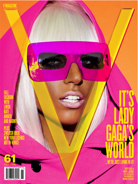
There’s quite a sixties vibe going on with this cover of V Magazine. Lady Gaga’s hot pink clothes and ehm, glasses combined with the bright yellow text and bright orange background are very much in your face and leap off the page.
Famous Logos And Branding Using Pink
As with the brown logos last week, I found it hard to think of more than a handful really well known logos using pink as a major color. One logo which came to mind quickly is the disaster that is the London 2012 logo. It must be working so. Please feel free to add the list.
Pink In Web Design
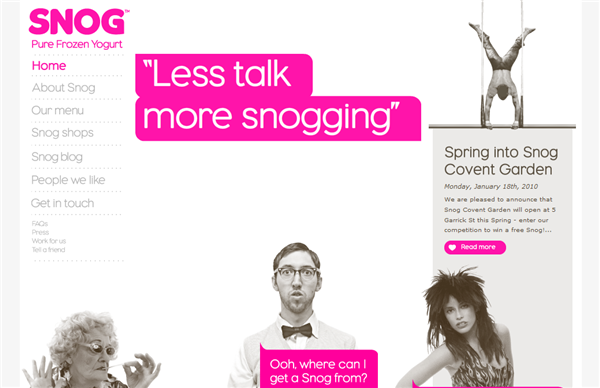
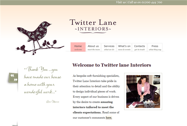
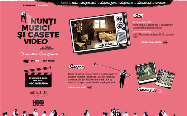
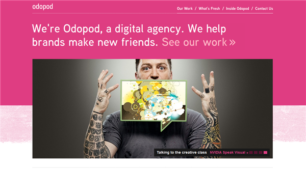
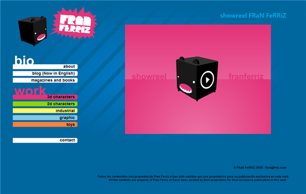
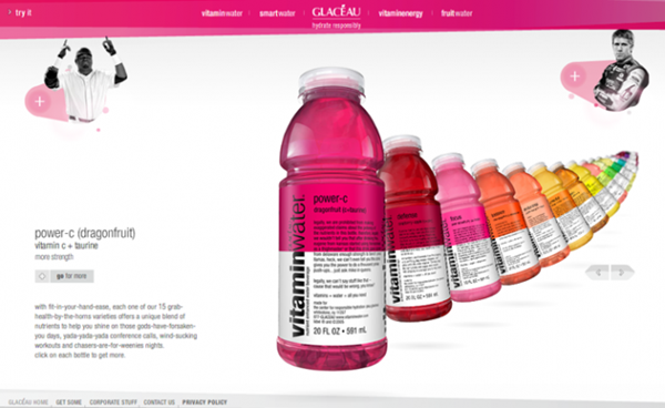
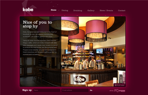
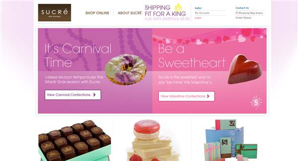
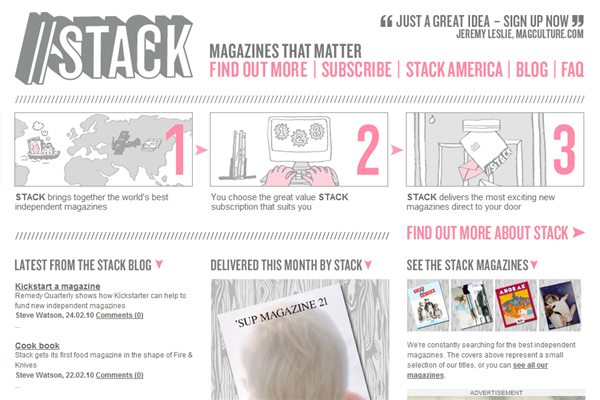
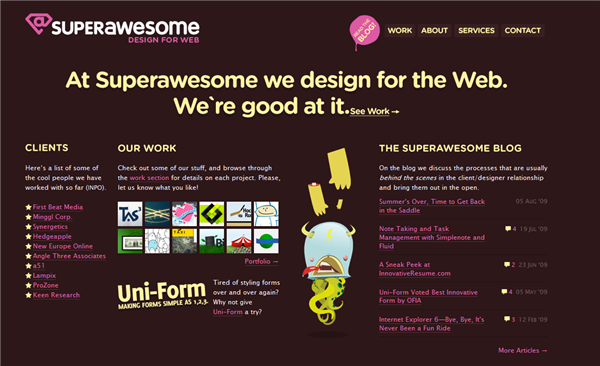
I’ve picked out ten sites that I thought were doing a great job in pink. These sites either use pink to highlight important areas of the web site, or use it as an eye-catching background color.
What do you think about pink? Is pink your color or something that makes you want to run away from a site? Any other pink sites that you like?
Frequently Asked Questions about Pink in Design
What are the different shades of pink used in design?
There are numerous shades of pink used in design, each with its unique characteristics and implications. Some of the most common ones include hot pink, which is vibrant and energetic, often used to grab attention; baby pink, which is soft and delicate, often used in designs intended to evoke feelings of innocence and sweetness; and salmon pink, which is a warm and inviting shade often used in designs that aim to create a sense of comfort and familiarity. Other popular shades include fuchsia, rose, and coral, each with their unique applications and connotations in design.
How does the color pink affect the psychology of viewers?
The color pink has a significant impact on viewers’ psychology. It’s often associated with femininity, love, and romance, making it a popular choice for designs related to these themes. However, pink can also evoke feelings of calmness and tranquility, especially in its lighter shades. On the other hand, brighter, more vibrant shades of pink can be energizing and exciting. Understanding these psychological effects can help designers use pink more effectively in their work.
What are the RGB and Hex codes for different shades of pink?
RGB and Hex codes are used to precisely define colors in digital design. For example, the RGB code for hot pink is (255,105,180), and its Hex code is #FF69B4. Baby pink has an RGB code of (244,194,194) and a Hex code of #F4C2C2. These codes allow designers to ensure consistency in their use of color across different platforms and mediums.
How can I use pink effectively in my designs?
Using pink effectively in design involves understanding its psychological effects and choosing the right shade for your specific project. For instance, if you’re designing something intended to be calming and soothing, a light, pastel pink might be a good choice. If you’re aiming for something more energetic and attention-grabbing, a brighter shade like hot pink could be more effective. It’s also important to consider color combinations – pink can work well with a variety of other colors, including white, gray, and certain shades of blue and green.
What are some common misconceptions about using pink in design?
One common misconception about using pink in design is that it’s only suitable for feminine or childish designs. While pink is often associated with these themes, it’s a versatile color that can be used in a wide range of contexts. Another misconception is that pink is always soft and delicate – in reality, brighter shades of pink can be bold and impactful. Understanding these misconceptions can help designers use pink more effectively and creatively.
How does the use of pink vary in different cultures?
The use and interpretation of pink can vary significantly across different cultures. In Western cultures, pink is often associated with femininity and romance, while in some Asian cultures, it’s associated with good health and life. Understanding these cultural differences can be crucial when designing for an international audience.
What are some famous brands that use pink in their logo or branding?
Many famous brands use pink in their logo or branding. For example, Victoria’s Secret uses a distinctive shade of pink in its branding to convey a sense of femininity and luxury. Lyft, the ride-sharing company, also uses pink in its logo to stand out from competitors and create a friendly, approachable image.
What are some good color combinations with pink?
Pink is a versatile color that can be paired with a variety of other colors. For a soft, romantic look, try pairing pink with white or cream. For a more modern, edgy look, try combining pink with black or dark gray. Pink also pairs well with many shades of blue and green for a fresh, vibrant look.
How does lighting affect the appearance of pink in design?
Lighting can significantly affect how pink appears in design. Under bright light, pink can appear more vibrant and intense, while under softer light, it can appear more subdued and delicate. This is important to consider when designing for different mediums and environments, as the lighting conditions can change how the final design is perceived.
How can I use pink in web design?
Pink can be used in web design in a variety of ways. It can be used as a background color to create a warm, inviting feel, or as an accent color to draw attention to specific elements on the page. Pink can also be used in typography or graphics to add a touch of color and visual interest. As with any color, it’s important to use pink in a way that aligns with the overall design and branding of the website.
Jennifer Farley is a designer, illustrator and design instructor based in Ireland. She writes about design and illustration on her blog at Laughing Lion Design.
