
Up until not too long ago, creating artistic effects on your web graphics could be done only by using complex image editors like Photoshop or GIMP. How cool would it be to mix two or more background colors, or two images, into one new digital art piece straight from your CSS?
This is exactly what you can do with the CSS3’s background-blend-mode and mix-blend-mode properties. In this post I will focus on the capabilities of the mix-blend-mode property and how you can leverage these capabilities in your projects.
But first, let’s examine blend modes more closely.
Key Takeaways
- The CSS mix-blend-mode property allows for the blending of two or more background colors or images, creating artistic effects directly from your CSS, without the need for complex image editors like Photoshop or GIMP.
- Blend modes are used in compositing operations of graphical elements, determining how the pixels on a layer interact with the visible pixels on the layers below it. The mix-blend-mode property blends with every visual element layered below it.
- The CSS3 mix-blend-mode property can blend images, including SVG images, as well as other HTML elements. It can be used to produce inventive visual effects by blending text with images, adding texture and personality to the text.
- The mix-blend-mode property is not animatable according to the Compositing and Blending specification. However, a workaround can be to blend an image with a background color and then animate the background-color property, or create a duplicate of the element and animate the duplicate’s opacity value.
What are Blend Modes?
Blend modes come into play in compositing operations of graphical elements. Compositing is just a technical word for layering two or more images to combine them into a single image. A layer’s blend mode determines how the pixels on that layer interact with the visible pixels on the layers below it.
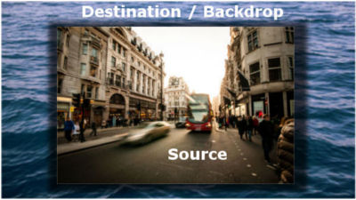
When compositing two elements, the bottom one is called destination and the top one is called source. The overlapping content behind the top element is where the blending occurs, and it’s called backdrop.
Blend modes such as overlay, multiply, screen, etc., achieve different results according to some mathematical formula that we don’t need to master in order to create visually interesting composited elements. If you’d like to dive deeper into how each blend mode works, this Ultimate Guide to Photoshop Blend Modes by Pye is a must-read.
The simple blend mode available to pure CSS has been the opacity property: full opacity on the top element hides the overlapping regions of the bottom element; less than full opacity reveals the element below.
This can accomplish some pleasant results, but nothing as sophisticated as Photoshop-like blend modes — until the W3C Compositing and Blending specification arrived.
This spec introduces three properties, background-blend-mode, mix-blend-mode, and isolation, and makes possible the use of sixteen CSS blend modes.
The default blend mode value is normal, which doesn’t apply any blending. If all you want to blend are background colors or background images, try out the background-blend-mode property. To find out a few neat tricks about this property, head over to Chaining Multiple Blend Modes by Robin Rendle.
Let’s now take a look at the mix-blend-mode property and how the isolation property can help when blending HTML elements.
The mix-blend-mode Property
The exciting thing about the CSS3 mix-blend-mode property is that you can quickly blend images, including SVG images, as well as other HTML elements.
How to Apply Blending to SVG
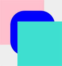
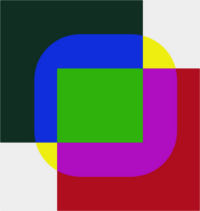
Here’s how to apply the difference blend mode to a basic SVG graphic.
The HTML:
<svg width="467" height="462">

  <rect x="80" y="60" width="250" height="250" rx="1" fill="pink" />

  <rect x="140" y="120" width="250" height="250" rx="80" fill="blue" />

  <rect x="180" y="180" width="250" height="250" rx="1" fill="turquoise" />

</svg>
The CSS:
rect {

  mix-blend-mode: difference;

}
What the SVG graphic looks like without applying any blend mode:
… and what it looks like with the difference blend mode applied:
Here’s the CodePen demo:
See the Pen SVG with Difference Blend Mode by SitePoint (@SitePoint) on CodePen.
How to Blend HTML Elements
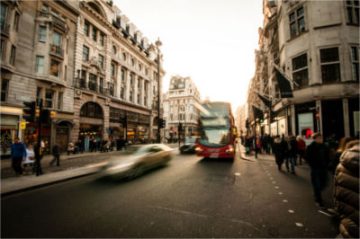
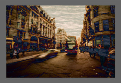
Blending two or more HTML elements can lead to subtle artistic results. For instance, layering this cityscape image (the source):
… on top of this sea image (the destination/backdrop):

… while applying the hard-light blend mode to the source and the difference blend mode to the destination, achieves this result:
Here’s the CSS that accomplishes the blending:
/* destination/backdrop image */

.box img {

  mix-blend-mode: multiply;

}
/* source image */

.box .top-img {

  mix-blend-mode: difference;

}
When using this technique, ensure the edges of the blended image don’t show through to spoil the effect.
You can produce some inventive visual effects by blending text with images. Instantly the text acquires texture and personality. As an example of how to do this using the CSS mix-blend-mode property, here’s the previous example with some text layered on top of the surreal watery cityscape:
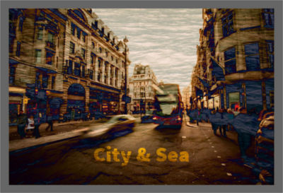
The text is blended on the images using this CSS snippet:
.box h1 {

  mix-blend-mode: overlay;

}
Visit the live demo and experiment with different blend modes:
See the Pen NqRxmZ by SitePoint (@SitePoint) on CodePen.
When Isolation Comes into Play
There may be times when you come up with an attractive visual effect that blends images, colors, and text, but the background of what is behind the mixed elements spoils your entire design.
This happens because the mix-blend-mode property blends with every visual element layered below it. Here’s a case in point.
Let’s say you have an HTML structure similar to this:
<body>

  <div>

    <img src="path/image.jpg" alt="example">

    <h1>City</h1>

  </div>

</body>
An img and h1 element are nested inside a div element, contained inside the body.
Next, in your CSS document, apply a background image to the body and the mix-blend-mode property to the image and the heading, like this:
body {

  background: url(path/pattern.png);

}
div img {

  mix-blend-mode: multiply;

}
div h1 {

  mix-blend-mode: overlay;

}
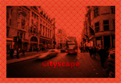
Depending on the background image (mine is a decidedly loud) and your chosen colors and blend mode, you could end up with a result similar to this:
However, what you’re really after is something closer to this:
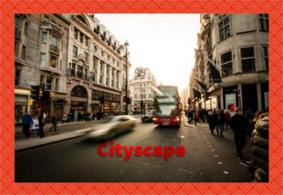
Your goal is to have text and image nicely blending together, but without any interference from the page background. Here’s how you can do this.
The trick lies in understanding the concept of a stacking context. Think of stacking contexts in terms of a chest of drawers. Each drawer is self-contained and separate from other drawers. Inside each drawer are placed layers of different items.
In the above example, the div containing the image and the heading is inside the same stacking context as the body element. To keep the page background out of the blending, the right move is to detach the div element from the body. You do this by creating a new stacking context on the div which, much like a self-contained drawer, will keep its items separate from their surroundings.
You can do the job in different ways, but CSS offers the handy isolation property just for this. The default value is auto. Using the isolate value instead creates a new stacking context.
Try commenting out the isolation property on the div element in the demo and check the result for yourself:
See the Pen Text/Image blend with mix-blend-mode by SitePoint (@SitePoint) on CodePen.
Is the mix-blend-mode Property Animatable?
The Compositing and Blending specification makes this point very clear: the mix-blend-mode property can’t be animated. One alternative is to use CSS filters instead, which are animatable properties.
A second approach is to blend an image with a background color and then animate the background-color property. Check out Fading effects using blend modes by Ion Rosca for some amazing results using this technique.
Alternatively, as a workaround, you could fake the animation of the mix-blend-mode property on an element by creating a duplicate of the element and animating the duplicate’s opacity value. This technique is inspired by Dave Lunny’s CSS-only solution to animating CSS3 gradients.
Let’s say you’d like gradually to change the blend mode of an h1 element on a hover state, here’s what you could do:
The HTML:
<div class="box">

  <h1>Hover to Animate Me</h1>

</div>
The key CSS declarations:
.box {

  background: url(path/image.jpg) no-repeat;

  mix-blend-mode: luminosity;

}
/* original h1 element with hard-light blend mode */

.box h1 {

  position: relative;

  mix-blend-mode: hard-light;

}
/* duplicate of h1 element with multiply blend mode */

.box h1:before {

  content: "Hover to Animate Me";

  display: block;

  opacity: 0;

  position: absolute;

  top: 0;

  left: 0;

  bottom: 0;

  right:0;

  mix-blend-mode: multiply;

  transition: opacity .5s linear;

}
/* hovering on the image transitions the duplicate's opacity to 1 */

.box:hover h1:before {

  opacity: 1;

}
In the code block above we do the following:
- Duplicate the
h1element using a pseudo-element (alternatively, you can choose to embed the duplicate directly in the HTML document) - Place the duplicate on top of the original using absolute positioning
- Hide the pseudo-element by setting its
opacityvalue to 0 - Apply different blend modes to the original element and the pseudo-element
- Finally, transition the
opacityof the pseudo-element to a value of 1 on hover. This shows the duplicate and hides the originalh1element with a subtle animation effect.
Check out the live demo to see this solution in action:
See the Pen Animating CSS mix-blend-mode by SitePoint (@SitePoint) on CodePen.
Browser Support
The CSS mix-blend-mode property is supported by the latest version of all major desktop browsers except Internet Explorer. Note that although caniuse.com indicates that Opera has no support, this is not correct and will likely be fixed soon.
Lack of support, however, shouldn’t let this stop you from using mix-blend-mode right now. Blending elements achieves an enhanced visual effect that gracefully degrades to the default appearance in non supporting browsers – access to information for your users is not at stake.
Tools and Resources
Experimenting with CSS is fun. That’s why I’ve set up a small interactive demo that lets you select from all the CSS blend modes available, change a few background colors on the body element, and toggle the isolation property to isolate the background from the image.
If you’d like to upload your own image to see the effect of applying each blend mode to it, I warmly recommend you try out the CSS Blender tool by Sara Soueidan.
Here are some relevant links if you want to look more into this powerful CSS feature:
- Compositing and Blending Level 1
- Compositing and Blending Level 2
- Compositing And Blending In CSS by Sara Soueidan
- Getting to Know CSS Blend Modes by Shwetank Dixit
- CSS Blend Modes could be the next big thing in Web Design by Bennett Feely
- CSS Compositing & Blending by the Adobe WebKit team.
Conclusion
Here I’ve offered a quick introduction on how to apply blend modes to SVG and HTML elements using the mix-blend-mode property. Now you can add sophisticated visual effects to your web designs by CSS alone, no professional-grade image manipulation software required. This by itself is no small feat.
Feel free to experiment with the live demos, expand on them, and start enhancing your web creations with this cool CSS3 property.
I look forward to your feedback!
Frequently Asked Questions (FAQs) about CSS Mix-Blend-Mode Property
What is the CSS Mix-Blend-Mode Property?
The CSS mix-blend-mode property is a powerful tool that allows you to control the blending of an element with its backdrop. It’s a way to create interesting visual effects by blending the colors of overlapping elements. The property takes different values such as ‘multiply’, ‘screen’, ‘overlay’, ‘darken’, ‘lighten’, etc., each providing a unique blending effect.
How does the ‘multiply’ value work in the mix-blend-mode property?
The ‘multiply’ value in the mix-blend-mode property multiplies the colors of the element and its backdrop. The resulting color is usually darker. In the context of RGB colors, black is the neutral color for multiply, meaning any color multiplied by black results in black.
Can I use the mix-blend-mode property to create a color filter effect?
Yes, you can use the mix-blend-mode property to create a color filter effect. By overlaying a semi-transparent element with a certain color over an image and setting the mix-blend-mode to ‘multiply’ or ‘screen’, you can achieve a color filter effect.
Why is my mix-blend-mode not working?
If your mix-blend-mode is not working, it could be due to several reasons. One common issue is the lack of a backdrop for the element. The mix-blend-mode property blends an element with its immediate backdrop, so if there’s no backdrop, there’s nothing to blend with. Another reason could be browser compatibility issues. Not all browsers fully support the mix-blend-mode property.
How can I create a darken effect using mix-blend-mode?
To create a darken effect, you can use the ‘darken’ value in the mix-blend-mode property. This value compares each pixel of the element with the corresponding pixel of the backdrop and selects the darker one.
What is the difference between ‘multiply’ and ‘screen’ in mix-blend-mode?
The ‘multiply’ and ‘screen’ values in the mix-blend-mode property have opposite effects. While ‘multiply’ tends to result in darker colors, ‘screen’ tends to result in lighter colors. In the context of RGB colors, black is the neutral color for multiply, and white is the neutral color for screen.
Can I use multiple mix-blend-mode properties on the same element?
No, you can’t use multiple mix-blend-mode properties on the same element. If you try to do so, the last property declared in your CSS will override the others.
Is mix-blend-mode supported in all browsers?
The mix-blend-mode property is supported in most modern browsers, including Chrome, Firefox, Safari, and Edge. However, it’s not supported in Internet Explorer.
How can I use mix-blend-mode to create a duotone effect?
To create a duotone effect, you can overlay two semi-transparent elements with different colors over an image and set the mix-blend-mode of one to ‘multiply’ and the other to ‘screen’. This will blend the colors of the two elements with the image, resulting in a duotone effect.
What is the ‘normal’ value in mix-blend-mode?
The ‘normal’ value in the mix-blend-mode property is the default value. It means that no blending is applied, and the element appears as it would without any mix-blend-mode property.