
Key Takeaways
- With the Polymer library, one can create a custom element for a credit card payment form, keeping the top layer of markup clean and semantic by handling complexities beneath the face of the custom element.
- The Polymer library provides a bunch of useful callback methods to inject custom behavior at different stages in the lifecycle of the creation of a custom element.
- The behavior of a custom element could depend on an external JavaScript library. For instance, the jquery.payment library by Stripe can be used to improve the payment experience by formatting the credit card number and expiry date.
- While Chrome and Opera fully support web components, IE, Firefox, and Safari are still lagging behind. To enable support for these browsers, the webcomponents.js polyfill needs to be included.
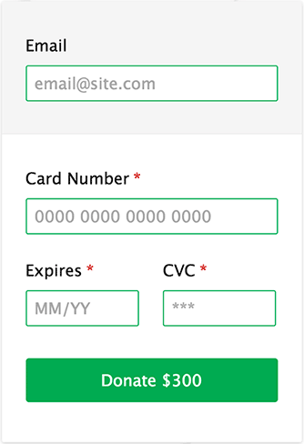
In this article, we’ll be creating a custom element for a credit card payment form using the Polymer library. The final form is going to look something like this,
The markup that defines this payment form is as trivial as this:
<credit-card amount="$300"></credit-card>
Predictably, there is an additional layer of abstraction hidden beneath the face of this custom element that takes care of all the complexities accompanying a typical credit card payment form. Using a custom element helps in isolating any potential future problems and keeps the top layer of markup clean and semantic.
Our credit card payment form will be composed of:
- An email address
- A credit card number
- An expiry date
- A CVC number
If you have never used the Polymer library before or need to brush up on your knowledge on the basic concepts of web components, then you can first read my previous articles on SitPoint:
- An Introduction to Web Components and Polymer (Tutorial)
- Building a Pull-Quote Custom Element with Polymer
These articles should bring you up to speed with the minimal knowledge required to understand this article.
Basic project setup
Before we begin creating our custom element, we will quickly set up the project folder by installing Polymer and all the required dependencies via Bower.
$ bower install --save Polymer/polymer
This will install the Polymer library and the web component polyfills inside the bower_components folder.
bower_components/

├── core-component-page

├── webcomponentsjs

└── polymer
Note that since moving to v0.5.0, the platform.js polyfill has been renamed to webcomponents.js and is now being separately maintained.
Designing the markup
The basic approach for creating a custom element is to first decide on how we are going to use it in our markup, then work our way backwards to create the template of the custom element. In this case, we intend to use our custom element by specifying the amount to be paid using the amount attribute of the <credit-card> tag,
<credit-card amount="$300"></credit-card>
We’ll get this started by creating a credit-card.html file in the root of our project folder and import the polymer.html file that is required to define the custom element.
<link rel="import" href="bower_components/polymer/polymer.html">
We’ll declare our new <credit-card> element using the name attribute of <polymer-element>:
<polymer-element name="credit-card">

  <template>

    <!-- More to come -->

  </template>

</polymer-element>
All the necessary styles and markup needed to design our custom element will sit inside the <template> tag. I have used standard form controls along with appropriate labels for accessibility.
<template>

  <form>

    <fieldset name="personalInfo">

      <label for="email">Email</label>

      <input type="email" id="email"

             placeholder="email@site.com">

    </fieldset>
    <fieldset name="cardInfo">

      <label for="cardNum" required>Card Number</label>

      <input type="tel" id="cardNum"

             placeholder="0000 0000 0000 0000">
      <label for="cardExp" required>Expires</label>

      <input type="tel" id="cardExp" placeholder="MM/YY">
      <label for="cardCVC" required>CVC</label>

      <input type="tel" id="cardCVC" placeholder="***">

    </fieldset>
    <input type="submit" value="Donate {{amount}}">

  </form>

</template>
There’s nothing unusual in the HTML above, except the following line:
<input type="submit" value="Donate {{amount}}">
The values inside the {{ }} are called Polymer expressions. These provide a hook to bind data that’s specified in the Light DOM (while using the custom element) into the Shadow DOM (custom element’s template). In this case, I’m referring to the value specified in the amount attribute of the <credit-card> tag:
<credit-card amount="$300"></credit-card>
And this will be translated to:
<input type="submit" value="Donate $300">
One last thing about defining attributes on a custom element is that you also need to declare them at the top of the primary element before you can use them. This is done as follows:
<polymer-element name="credit-card" attributes="amount">
While specifying multiple attributes on the same custom element, you can either separate them via a space or comma.
Styling the custom element
The styles can be defined either within the template tag like this:
<template>

  <style>

    /* ... */

  </style>

</template>
Or we could write them in a new CSS file and then import the file using the link tag.
In an attempt to make our setup more modular and scalable to handle future enhancements, we’ll use the second approach by creating a new CSS file, credit-card.css, which will contain all the necessary styles for our custom element.
<template>

  <link rel="stylesheet" href="credit-card.css">

  <form>

    [...]

  </form>

</template>
This article focuses primarily on the functional aspect of the custom element, not the design. Styling is pretty standard as long as you are aware of the following points:
- By default, all custom elements are set as
display: inline. Hence, in this case, we had to explicitly declare our element asdisplay: block. :hostrefers to the custom element itself and has the lowest specificity. This allows users to override your styles from the outside.
Registering the element
Registering the element allows it be recognized as a custom element by a supporting browser. Typically, an element can be registered directly by calling the Polymer() constructor,
Polymer([ tag-name, ] [prototype]);
Where:
tag-namematches thenameattribute on<polymer-element>. This is optional unless the<script>tag that calls Polymer is placed outside the<polymer-element>tag.[prototype]contains the public properties and methods used to define the behavior of custom element.
The simplest way to invoke Polymer is to place an inline script inside your <polymer-element> tag:
<polymer-element name="tag-name">

  <template>

    [...]

  </template>

  <script>Polymer();</script>

</polymer-element>
For elements that don’t require custom properties or methods, you can use the noscript attribute:
<polymer-element name="tag-name" noscript>

  [...]

</polymer-element>
For the sake of brevity, we’ll register our custom element by explicitly using the tag name in the following way:
<script>

  Polymer('credit-card', {

    /* More to come */

  });

</script>
Using JavaScript libraries with Custom Elements
In a practical setup, the behavior of a custom element could depend on an external JavaScript library. This section will take you through a basic example of using external JavaScript files in conjunction with your custom element.
Let’s improve the payment experience for our users by:
- Formatting the credit card number into groups of 4 digits with the total length being no longer than 16 digits.
- Formatting the expiry date as
MM/YY.
We’ll use the excellent jquery.payment library by Stripe that solves these usability issues and in turn needs the jQuery library to work. In nutshell, we’ve got two scripts to be included right before the closing <polymer-element> tag, as we do not really need any JavaScript while loading the custom element.
<polymer-element name="credit-card" attributes="amount">

  <template>

    [...]

  </template>

  <script src='//cdnjs.cloudflare.com/ajax/libs/jquery/2.1.3/jquery.min.js'></script>

  <script src='//cdnjs.cloudflare.com/ajax/libs/jquery.payment/1.2.1/jquery.payment.min.js'></script>

  <script>

    Polymer('credit-card', {});

  </script>

</polymer-element>
The Polymer library provides a bunch of usefull callback methods to inject custom behavior at different stages in the lifecycle of the creation of a custom element:
created– An instance of the element is created.ready– An instance of the element was inserted into the DOM.detached– An instance of the element was removed from the DOM.attributeChanged– An attribute of the element was added, removed, or updated.
More info about the lifecycle methods is available in the API developer guide
<script>

Polymer('credit-card', {

  ready: function() {

    var cardNum = this.$.cardNum,

        cardExp = this.$.cardExp,

        cardCVC = this.$.cardCVC,

        creditCard = this.$.creditCard,

        $cardNum = jQuery(cardNum),

        $cardExp = jQuery(cardExp),

        $cardCVC = jQuery(cardCVC),

        $creditCard = jQuery(creditCard);
    /* Formatting input fields */

    $cardNum.payment('formatCardNumber');

    $cardExp.payment('formatCardExpiry');

    $cardCVC.payment('formatCardCVC');
    /* Card validation on Form submission */

    $creditCard.submit(function(e){

      var cardExpiryVal = $cardExp.payment('cardExpiryVal'),

        cardType = jQuery.payment.cardType($cardNum.val()),

        isValidNum = jQuery.payment.validateCardNumber($cardNum.val()),

        isValidExp = jQuery.payment.validateCardExpiry(cardExpiryVal),

        isValidCVC = jQuery.payment.validateCardCVC($cardCVC.val(), cardType);
        if (isValidNum && isValidExp && isValidCVC) {

          /* Success */

        }

        else {

          /* Validation failed */

        }

    });

  }

});

</script>
Polymer provides a convenient way to automatically find nodes inside the Shadow DOM using this.$.id. $ of course is a shorthand alias for jQuery. Hence, to avoid any potential conflicts, we have used the identifier jQuery throughout the code. Alternatively, if you want to find nodes using a class name instead of an ID, then you’ve got two options:
Access the Shadow DOM directly using:
this.shadowRoot.querySelector('.classname');
Or add an identifier (#container) to the custom element and then use:
this.$.container.querySelector('.classname');
Using the Custom Element
Include the credit-card.html file in your document and then using the custom element is as simple as writing:
<head>

  <link rel="import" href="credit-card.html">

</head>

<body>

  <credit-card amount="$300"></credit-card>

</body>
Chrome and Opera now fully support web components in their latest versions. IE, Firefox, and Safari, however, are still lagging behind. To enable support for these browsers, you need to include the webcomponents.js polyfill as well:
<head>

  <!-- Load platform support before any code that touches the DOM. -->

  <script src="bower_components/webcomponentsjs/webcomponents.min.js"></script>

  <link rel="import" href="credit-card.html">

</head>
Check out the complete code along-with the demo on Plunker. I’ve also set up a project repository on Github for the credit card custom element.
Conclusion
This isn’t a functional credit card payment form and far from even complete. However, the demo should be good enough to give you a jump start to build your own design components in the form of custom element using the Polymer library.
Frequently Asked Questions about Building a Credit Card Form with Custom Element Polymer
What is a custom element in Polymer?
A custom element in Polymer is a reusable, encapsulated HTML element that you can define and use in your web applications. It allows you to create your own tags with their own functionality and design, which can be used across different projects. This is particularly useful when building complex web applications, as it promotes code reusability and maintainability.
How do I create a credit card form using Polymer?
To create a credit card form using Polymer, you first need to install Polymer CLI and initialize a new project. Then, you can create a new custom element for your form. This element should include input fields for credit card information such as card number, expiry date, and CVV. You can use Polymer’s two-way data binding feature to capture and validate user input.
How can I validate user input in my credit card form?
Polymer provides a set of built-in validators that you can use to validate user input. For example, you can use the “required” attribute to ensure that a field is not left empty, and the “pattern” attribute to check if the input matches a specific pattern. For credit card numbers, you can use the Luhn algorithm to check if the number is valid.
How can I style my credit card form?
Polymer uses Shadow DOM to encapsulate styles, which means that your styles won’t leak out to the rest of the page and styles from the rest of the page won’t affect your element. You can use CSS to style your form, and you can also use CSS variables to make your styles more flexible and reusable.
How can I handle form submission in Polymer?
You can handle form submission in Polymer using event listeners. You can add an event listener to the “submit” event of your form, and then define a function that will be executed when the form is submitted. This function can include validation logic and actions to be taken upon successful submission, such as sending the data to a server.
Can I use Polymer with other JavaScript frameworks?
Yes, Polymer is designed to be interoperable with other JavaScript frameworks. You can use Polymer elements in a React or Angular application, for example. This allows you to leverage the strengths of different frameworks and libraries in your projects.
How can I test my Polymer elements?
Polymer provides a set of tools for testing your elements. You can use the Polymer CLI to run tests in multiple browsers, and you can use the “test-fixture” element to isolate your elements and test them in a clean environment.
How can I ensure that my credit card form is secure?
Ensuring the security of your credit card form is crucial. You should always use HTTPS to protect data in transit, and you should sanitize and validate user input to prevent injection attacks. You should also consider implementing additional security measures such as tokenization or encryption.
Can I use Polymer to build mobile apps?
Yes, Polymer is suitable for building mobile apps. It is lightweight and efficient, and it allows you to create reusable components that can be used across different platforms. You can also use Polymer with tools like Cordova or Electron to build hybrid or desktop apps.
Where can I find more resources to learn about Polymer?
The official Polymer website is a great place to start. It provides a comprehensive guide to the library, including tutorials, API documentation, and examples. You can also find many tutorials and articles on websites like SitePoint, CodePen, and Stack Overflow.