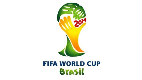
Just when you thought you’d had enough football (or maybe not enough, in some cases) FIFA, the international football organization revealed the logo design for the next world cup which will take place in Brazil in 2014.
The new design entitled “Inspiration”, was the winning submission, chosen from 25 entries. The judging panel included famous Brazilians, model Gisele Bundchen and author Paulo Coelho. The logo was designed by Sao Paolo based agency Africa. Brazil President Luiz Inacio Lula da Silva spoke at the unveiling and said “Brazilians are confident, and love the challenge of presenting a beautiful World Cup”.
The logo is a representation of the World Cup trophy formed by three linked hands in the national colors of Brazil, yellow and green with the year of the tournament appearing in a bright red hand-drawn typeface. While the red certainly stands out, the Brazilian flag is yellow, green and blue. The style of the hands is very loosely drawn. They look like they have been drawn very quickly using the Pen tool in Photoshop or Illustrator.
As with almost every major logo launch, there has been much online debate and a certain amount of criticism about its execution. Some commentators have mentioned that a logo for a football competition shouldn’t feature hands wrapped around the ball. Others have referred to it as cheap clipart with the fingers on the hands resembling an alien’s fingers.
Here’s the video to go with the official launch of the logo:
What do you think of the logo? An amateur-looking Photoshop job, or a brightly colored homage to the country that has won five World Cup competitions in the past?
(And congratulations to Spain for winning the tournament!)
Frequently Asked Questions about the Brazil 2014 World Cup Logo
What was the inspiration behind the Brazil 2014 World Cup Logo?
The Brazil 2014 World Cup Logo was inspired by the vibrant culture, history, and natural beauty of Brazil. The logo, named “Inspiration”, is a stylized representation of three victorious hands lifting the World Cup trophy. It signifies unity and the human desire to reach and achieve goals. The yellow and green colors used in the logo are a nod to the national flag of Brazil, symbolizing the country’s passion for football.
Who designed the Brazil 2014 World Cup Logo?
The Brazil 2014 World Cup Logo was designed by a Brazilian agency called Africa. The agency was chosen by FIFA and the Local Organising Committee (LOC) after a rigorous selection process involving some of the best agencies in Brazil. The design was selected for its ability to capture the essence of the country and the spirit of the tournament.
What does the Brazil 2014 World Cup Logo represent?
The Brazil 2014 World Cup Logo represents unity, passion, celebration, and the aspiration to achieve greatness. The three hands lifting the World Cup trophy symbolize the collective effort of people coming together to reach a common goal. The vibrant colors represent the lively and diverse culture of Brazil.
How was the Brazil 2014 World Cup Logo received by the public?
The Brazil 2014 World Cup Logo received mixed reactions from the public. While some praised it for its vibrant colors and symbolic representation of unity and aspiration, others criticized it for its simplistic design. However, it was widely recognized as a symbol of the tournament and became a significant part of the World Cup’s branding.
How does the Brazil 2014 World Cup Logo compare to previous World Cup logos?
Compared to previous World Cup logos, the Brazil 2014 World Cup Logo stands out for its vibrant colors and symbolic representation. While previous logos have used symbols and images related to the host country, the Brazil 2014 logo took a more abstract approach, using the image of hands lifting a trophy to represent unity and aspiration.
What was the process of creating the Brazil 2014 World Cup Logo?
The process of creating the Brazil 2014 World Cup Logo involved a rigorous selection process by FIFA and the Local Organising Committee. Several Brazilian agencies submitted their designs, and the design by Africa was chosen for its ability to capture the essence of the country and the spirit of the tournament.
What are some interesting facts about the Brazil 2014 World Cup Logo?
One interesting fact about the Brazil 2014 World Cup Logo is that it was the first World Cup logo to be designed by a Brazilian agency. Another interesting fact is that the logo was unveiled in Johannesburg, South Africa, marking the first time a World Cup logo was unveiled in a country other than the host nation.
How does the Brazil 2014 World Cup Logo reflect the culture of Brazil?
The Brazil 2014 World Cup Logo reflects the culture of Brazil through its vibrant colors and symbolic representation. The yellow and green colors are a nod to the national flag of Brazil, symbolizing the country’s passion for football. The three hands lifting the World Cup trophy represent the unity and collective effort that is a significant part of Brazilian culture.
How was the Brazil 2014 World Cup Logo used in the tournament’s branding?
The Brazil 2014 World Cup Logo was used extensively in the tournament’s branding. It was featured on all official documents, tickets, and merchandise related to the World Cup. It was also prominently displayed at all the stadiums and other venues associated with the tournament.
What is the legacy of the Brazil 2014 World Cup Logo?
The legacy of the Brazil 2014 World Cup Logo lies in its symbolic representation of unity and aspiration. Despite mixed reactions, the logo has become a recognizable symbol of the tournament and continues to be associated with one of the most memorable World Cups in history.
Jennifer Farley is a designer, illustrator and design instructor based in Ireland. She writes about design and illustration on her blog at Laughing Lion Design.
