An interesting couple of posts in the past week by Morten Hjerde, in which he compiles Norwegian usage data (mobile phones with color screens, support for Java and a web browser). In his posts, Hjerde:
- charts mobile screen size trends and declares that small phone screens (smaller than 240 x 320) are dead and can be ignored,
- recommends 240 x 320 as the target size to develop for, and
- encourages user interface designers to begin thinking of how to design for wide-screen mobile displays, as that is the direction that mobiles are headed.
He suggested that:
It is obvious that 240 x 320 (also called QVGA) is on a roll. It is by far the most common and it is growing rapidly. If you develop, this should be your target screen size.

Looking a bit further into the future, the iPhone may not be the only phone on the market but everyone agreed when it was released that it raised the bar for a mobile web experience.
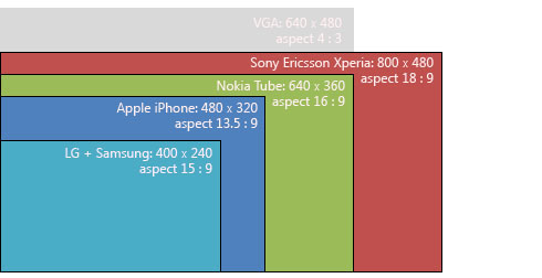
The competition is just now starting to catch up, which means developers have more and more pixels to play with. Hjerde previewed the screen dimensions of some more recent models, and included a couple that were due to be released this year:
What is pretty clear is the trend towards widescreen and landscape orientation for high-end phones. QVGA and larger phones are getting automatic screen rotation. Landscape is often preferred for media consumption and handheld movie consumption has been “promising” for quite some time.
Here are the takeaways:
- 240 x 320 (aka QVGA) is the new baseline screen size, both for feature phones and smartphones.
- Future mobile devices will eventually be able to display more pixels than the 640 x 480 pixels of that stalwart of CRT monitors, the VGA display — the forthcoming Sony Ericsson Xperia will have screen dimension of 800 x 480!
The usual disclaimer of “test your own user data” applies, as patterns in Norway are not directly applicable to the rest of the world. But interesting stuff nonetheless!
PS. If you’re not sure where to start with mobile web design, check out Brian Suda’s recent article here on SitePoint: Designing for the Mobile Web.
 Matthew Magain
Matthew Magain is a UX designer with over 15 years of experience creating exceptional digital experiences for companies such as IBM, Australia Post, and sitepoint.com. He is currently the Chief Doodler at Sketch Group, Co-founder of UX Mastery, and recently co-authored Everyday UX, an inspiring collection of interviews with some of the best UX Designers in the world. Matthew is also the creator of Charlie Weatherburn and the Flying Machine.


