
It would seem like a win as an app maker to have a large number of downloads — and to some extent it is — but that sense of victory and accomplishment slowly diminishes once you realize the downloads are not being converted into active users.
That initial excitement disappears when you realize there is not much value to an applying dormant.
The good news is this is avoidable. There are multiple approaches to creating an app that appeals to users and keeps them coming back, but it is necessary to determine what it is specifically that makes an app stand out in such a competitive market.
Surely solid development plays a role, but finding a well-developed app is not exactly difficult.
So, what is it then?
If you test out enough top apps, you will begin to decipher a pattern among them: fantastic user experience (UX) design. The best apps go beyond basic appeal and transport users into a preternatural state of clairvoyance. A state where each tap is intuitive and never requires a second guess.
There are a lot of factors that go into excellent mobile UX design and an equal amount of ways it could go wrong.
We will take a look at some of these factors and help you avoid all of the common errant UX pitfalls, most notably failure to retain users and obtain conversions, so you– and more importantly, your users – can get the most out of your app and maintain engagement.
Mistake #1: Skipping the Test
You know your app – inside and out. You conceived of it, designed it, developed it, launched it, and marketed it. You innately understand its purpose and precisely how to operate it… but that is just you.
What happens when others attempt to use your app and it is not as obvious?
One of the easiest – and most damaging – mistakes an app creator can make is not having others, be they family, friends, or a test group, test your app first. They have a resource you can never have again — new eyes.
Have them share their thoughts throughout the initial interaction to get an idea of what works and what they are thinking. This is a valuable lesson in learning how to optimize for your users rather than yourself.
When you are ready to test your app, take into account three key elements: network environment, device targets, and testing types (functional, performance, security, and compliance.) For more information on app testing, you can learn here.
Mistake #2: Assuming a User Knows How to Navigate Your App
It is best to begin at the onboarding experience, where users will form their first impression of the app. Because first impressions mean so much in a competitive market like that of the app world, it is crucial you optimize UX for the initial encounter.
You cannot just assume that a user knows how your app works and therefore must provide some guidelines and tutorials for the introductory session. The onboarding process is important for retaining your users, and if it does not work well it is likely users will quit your app and not return to it.
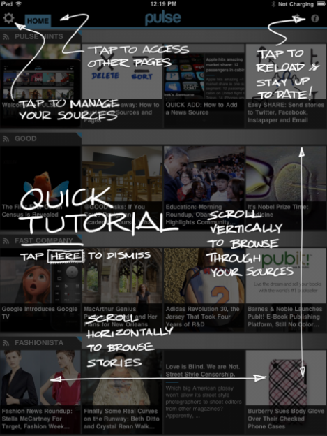
Inline hinting is traditionally used for someone new to an app. Whenever a user reaches a new point of exploration, some text appears inline explaining what is happening or what action needs to take place in order to advance. It is discreet enough to not interrupt the session, but prominent enough to help out when necessary.
Also popular are tutorials in which a screen overlay appears over the app, guiding you either throughout each step or with a quick account of what takes place at each juncture.
Mistake #3: Confusing Mobile UX for Web UX
It may seem obvious to some, but not everyone realizes that the mobile experience is going to differ vastly from the web. Users interact with mobile devices in a completely different way and designers need to take this into account when creating an app.

Clearly UI contributes to great UX. Some of the UI constraints that affect an app should be taken into consideration when designing for an app.
One important factor is screen size. There is a lot less real estate to work with and without a mouse to navigate and an abundance of screen space, a user is required to interact using their fingers. Successful apps almost always utilize a minimal UI design, meaning only what is necessary for usage should appear and clutter on the screen should be avoided at all costs.
Consider how icons are used to represent buttons, how a virtual keyboard should show up on-screen whenever it is needed, and how help and error messages should appear.
User behavior is another consideration. When designing your app UX, take into account that unique gestures – pinches, swipes and taps – are required on mobile devices and that a percentage of your desktop users may not be familiar with.
If something is typically clickable on a desktop website, be aware that it might be expected that a similarly designed app will yield similar expectations.
Mistake #4: Neglecting to Create an Optimized Checkout Process
The last place you would want any difficulty with your app is at the checkout point. If a customer or user is prepared to make a purchase – whether it is an item of clothing or bonus points to advance in a game – it is imperative the experience is uncomplicated and unflawed.
Having too many steps until the purchase point is one potential problem, as are unclear navigation and flow, and call-to-action buttons that are not prominent enough.
For a smooth process, offer multiple payment options, such as the ability to connect to a PayPal account, and be sure to avoid any technical problems at this most critical step to prevent a user from leaving your app without paying.
Mistake #5: Not Properly Monitoring Your UX
Everything mentioned until now essentially leads to this point, which cannot only help you locate the problem but also solve it.
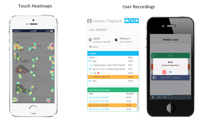
Analytics solutions, such as Google Analytics and Flurry, provide insights that reveal basic information, such as metrics and numbers. Using a visual app analytics tool such as Appsee (disclosure: I’m Community Manager for Appsee), can help you measure, understand, and improve your UX.
All of these tools grant you the ability to see your app through users’ eyes, understand the reasoning behind the actions they take, and identify which UX issues are leading to your app’s abandonment.
Insights such as these can sometimes be difficult to obtain from standard analytics services, such as Google Analytics, which just focus on key metrics and numbers more than behaviour.
Visual mobile analytics tools that give you the ability to playback video from actual app user sessions and analyze touch heatmaps can help you identify problem areas
This can help you you can pinpoint problem areas with your app – perhaps users are getting stuck on a particular screen, or your app is taking too long to load – and correct them without all the guesswork.
Delivering a great mobile UX design should be your goal if you want your app to stand out. Avoiding all of these common mistakes and implementing the tips listed above gives you a reliable way to determine the sort of difficulties your app may face and what it will take to optimize its UX design to keep your users coming back.
 Robin Schwartz
Robin Schwartz is the Community Manager at Appsee App Analytics. She has been working in Hi Tech for over 9 years and loves working in the Mobile space. She can be reached on LinkedIn and invites you to follow along as she posts for her company’s blog on everything mobile.