


The following is a short extract from our recent book, Jump Start Sass, available for free to SitePoint Premium members. Print copies are sold in stores worldwide, or you can order them here. We hope you enjoy this extract and find it useful.
Architecture has always been one of the major pain points in CSS development. Without any variables, control directives, macros, or object inheritance, CSS code tends to be long and repetitive-a single ever-growing file. While it’s technically possible to split plain CSS into multiple files that reference each other with @import, the additional HTTP requests make that a poor solution. As you’ve seen, Sass has an answer for every piece of the architecture puzzle-but what’s the best way to put it all together?
Ask ten experts, and you’ll receive ten different answers-most of them involving (or aided by) Sass. OOCSS, SMACSS, Atomic Design, ITCSS, and BEM are all popular systems for CSS architecture, but there are many more. If you’re using a front-end framework such as Bootstrap or Foundation, there might be some architectural opinions already built in.
These are all solid systems, none of which were designed with your project in mind. CSS architecture is hard, so it’s a mistake to trust any one-size-fits-all solution. There is no “right” answer that works for every team on every project. We’d recommend learning them all, and then mashing together the best parts to create a system that works well for you.
Let’s start with a broad discussion of the building blocks, and then look at the ways we can fit them together.
Key Takeaways
- Utilize Sass’s enhanced @import rule to consolidate multiple files during compilation, reducing the number of HTTP requests and streamlining the CSS delivery process.
- Embrace modular architecture by breaking down CSS into logical units using partials, which are organized in folders and combined into a master file for efficient management and scalability.
- Explore different CSS architectural methodologies such as OOCSS, SMACSS, and BEM, understanding that no one system fits all; adapt and blend these systems to suit specific project needs.
- Leverage the power of Sass variables, mixins, and functions to maintain a consistent style across your project, improving readability and maintainability of your code.
- Consider future developments in Sass, such as modular imports in Sass 4, which aim to provide more control and flexibility in managing stylesheets and reducing global conflicts.
- Apply principles from various design systems like Atomic Design to structure your CSS files, ensuring that components are reusable and maintainable across different contexts and projects.
- Keep your Sass architecture organized by categorizing styles into specific folders such as base, components, and utilities, each serving distinct roles within the project infrastructure.
Multiple Files and Folders
Breaking your code into multiple files is one key advantage to using a preprocessor, and forms the basis of any architecture. With Sass, there’s no harm in breaking your code into the smallest logical units and organizing it into multiple files and folders. We recommend taking full advantage of it.
Sass has bestowed new power on the CSS @import rule, allowing you to combine Sass and CSS files during compilation so they can be sent to the browser as one single file. This is the only place where Sass has stepped on the toes of an existing CSS directive, so it behaves differently in Sass than it did in CSS.
CSS Imports
As mentioned, the CSS @import directive allows you to reference one CSS file from another. Importing is handled by the browser and requires additional HTTP requests-since the importing file has to be parsed before the @import directive is discovered. If you have a chain of files importing each other, those imports will happen in sequence, blocking the document from rendering until all the CSS has loaded. For that reason, most people avoid CSS imports entirely.
Using CSS imports, you can reference another CSS file using relative or absolute paths, even adding a media query rule for conditional imports. Even though Sass provides different functionality under the same at-rule, there are various cases in which Sass will fall back to the vanilla CSS output, such as when:
-
an imported file has a
.cssextension -
a filename begins with
http://orhttps:// -
the filename is a
url(..)function -
@importhas any media queries
The following will compile to standard CSS imports, even in Sass:
@import 'relative/styles.css';

@import 'http://absolute.com/styles.css';

@import url('landscape.css') screen and (orientation: landscape);
Sass Imports and Partials
Sass imports look similar to CSS imports, but the imported files are compiled into one single output file, as though their contents (including variables, mixins, functions, and placeholders) were copied and pasted into place before compilation. This type of Sass import will only work on files with .sass or .scss extensions, but you can leave the extension off when importing (as long as there are no similarly named files). In fact, we recommend dropping the extension whenever you can, for simplicity. It’s also possible to import multiple files in one command, or import files into a nested context:
// Import an explicit file relative to the current directory

@import 'path/to/explicit.scss';
// Import a file with either the .sass or .scss extension

@import 'implicit';
// Import multiple files...
@import 'path/to/emory.scss', 'miko', 'path/to/gracie';
// Import a file into a nested context...

// (imagine the file copied and pasted into this context)

.latte {

  @import 'espresso';

}
The most common use of Sass importing is for partial files—Sass files that are not compiled on their own but are for importing into other files. If you want a Sass file to remain uncompiled until it’s imported, add an underscore (_) to the start of the filename. Sass files that start with _ won’t compile on their own, but can be imported into other files. When importing partials, Sass allows you to leave the _ off, which is similar to leaving off an extension. For example:
// _authors.scss

.miriam { background: blue; }
// jumpstartsass.scss

@import 'authors'; // Shorthand for importing '_authors.scss'
// jumpstartsass.css (compiled CSS)

.miriam { background: blue; }
Running Sass in this directory (sass --update .) compiles jumpstartsass.scss to jumpstartsass.css; however, it won’t create an _authors.css file, since it has a leading underscore.
Sass partials form the basis of any Sass architecture. Because all Sass imports are handled at compile time and never interrupt the browser, it’s perfectly safe (and recommended) to use as many partials as necessary, compiling them into a single stylesheet for production. For the sake of being organized we recommend breaking out partials liberally, sorting them into folders, and importing them all back into one single master file for compilation. A common Sass directory for a project might look like this:
sass/

|

|– config/

|   |– _colors.scss      # Color palettes

|   |– _webfonts.scss    # Webfont information

|   …                    # Etc.

|

|– layout/

|   |– _navigation.scss  # Navigation

|   |– _banner.scss      # Site Banner

|   …                    # Etc.

|

|– modules/

|   |– _calendar.scss    # Calendar widget styles

|   |– _contact.scss     # Contact form styles

|   …                    # Etc.

|

|– patterns/

|   |– _buttons.scss     # Buttons

|   |– _dropdown.scss    # Dropdown

|   …                    # Etc.

|

|- main.scss             # The primary Sass file to be compiled
After organizing all your partials, they can be imported into the single primary main.scss file for compilation:
// Primary Sass File: main.scss

@import 'config/colors';

@import 'config/webfonts';
@import 'patterns/buttons';

@import 'patterns/dropdown';
@import 'layout/navigation';

@import 'layout/banner';
@import 'modules/calendar';

@import 'modules/contact';
Components and Organization
We’ve advised you to use partials, folders, and imports—but what’s really important is how to use them efficiently. This is where everyone’s opinions differ, and your mileage may vary.
Most CSS and Sass organization systems are based on some concept of user interface “components” or discrete pieces that can be put together to form a complete project. Components can be any size or shape, but they should focus on doing one task independently, and in a reusable way. A button, a drop-down, a calendar, and a search form are all examples of components that can be reused at different places across a project. Thinking about your project as a collection of components will help you towards having an organized and maintainable architecture, whether you’re using Sass or plain CSS.
Because of the way CSS works, the order of your code will also affect its meaning: later code has priority in the cascade over the code before it. Some of the popular branded architectures (the ones you know by name) try to eliminate this feature of the cascade entirely, but I use it as a guide—organizing code from the most general to the most specific—so the priority override makes sense. Code that we want applied generally across the site should come first, growing slowly in specificity and detail as we move towards more unique components and special cases.
I first learned of this approach from Natalie Downe’s wonderful CSS Systems talk in 2008 before I’d ever used Sass. Her architecture at the time started with elements (h2, ol, ul, and so on) grouped by “type”, followed by classes grouped by the “effect” created, and finally IDs grouped by the “component” they affect. These days it’s common practice to avoid IDs altogether, and break elements into smaller pieces, but the concept remains the same: global defaults first, followed by site-wide patterns and broad layouts, and finally, more specific modules, themes, and overrides.
Sass projects include another category of site-wide defaults not found in CSS: code with no output at all—such as variables, functions, and mixin definitions. Many people (myself included) break that code into its own set of partials, to be imported anywhere it might be useful. I have a complete folder just for site-wide Sass helpers and configuration that don’t result in output. Those files act as a single, definitive, and reusable configuration that defines the boundaries of a project. By ensuring your configuration is output-free, you can import it anywhere without worrying about duplicated or unwanted styles.
Here are some guidelines for thinking about architecture:
-
Break your code into the smallest logical component partials.
-
Organize your partials into grouped folders based on specificity.
-
Import those partials into one master file in order of specificity.
However, many variations do exist on the specific ways people implement those ideas.
You may also find that a lot of the branded systems developed by and for massive companies with large-scale needs don’t always translate to smaller teams and products. Every project has different requirements, so you should never assume that the best solution for InstaFace or MyPinBook is going to be the best solution for you.
Object-oriented CSS (OOCSS)
OOCSS is one of the original front-end architectures, and the initial inspiration for adding the @extend directive to Sass. A project from Nicole Sullivan, it places a strong emphasis on finding the right granularity for CSS objects, a theme that comes up in most of the systems we’ll look at here.
Sullivan argues that rather than trying to match back-end objects, a CSS object should look for more granular design patterns that might be used across a variety of content types. A prime example is what she calls the media object—a fixed-size media element (such as an image or video) alongside fluid content such as text.
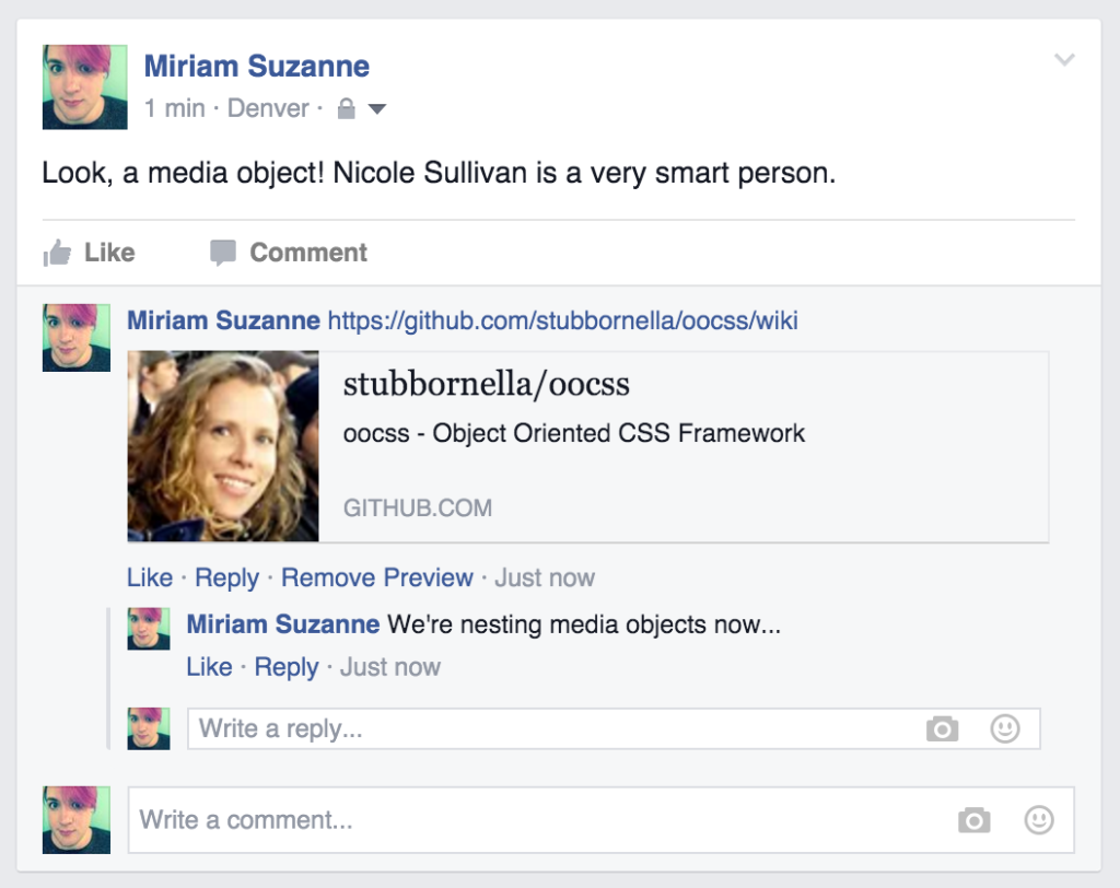
If you look at Facebook, which Sullivan helped refactor, you’ll see one media-object design used across the site to display a wide range of back-end objects—from stories and comments, to notifications, advertisements, and profile details. By defining objects at a granular level, a small amount of CSS can be used to style large swathes of the application.
At its best, OOCSS is a powerful tool for simplifying CSS and perfecting the performance of large-scale applications. But taken to extremes, the OOCSS approach can leave you with a mess of single-purpose utility classes (such as .padding-left-10px) that couple your HTML and CSS too tightly, and eliminate any maintainability you might get from more semantic code. You’ll have to find the right balance for each project.
Whatever else you do, the two main principles of OOCSS are worth keeping in mind (indeed, committing to memory) while you work out your own architecture:
-
Separate structure and skin. By having multiple design skins (colors, backgrounds, borders, and so on) that you can mix and match with structural objects, it’s possible to achieve more visual variety with less code. In practice, this also means decoupling styles from the base semantics of HTML tags. By styling classes (
.primary-header) instead of tags (h2), you have more flexibility to keep HTML meaningful, while applying consistent styles wherever they’re appropriate. -
Separate container and content. OOCSS objects should not be dependent on their location or context, but be reusable and able to fill whatever container they are given. This ensures that an object will look the same in any context, without developers having to guess what a given element or class will do in different situations.
There is no organizational structure built into OOCSS, but there is a framework available on GitHub that provides a number of common objects, as well as documentation on customizing the framework to your needs.
Atomic Design
Atomic Design is also driven by questions of granularity. Initially devised by Brad Frost, an atomic project is broken down into five stages: atoms, molecules, organisms, templates, and pages. The idea is to style the stages in order, starting granular and working outwards, with each stage building on the one before.
According to Atomic Design, atoms can be abstract information such as color palettes, fonts, and typographic scales; they can also be default styles for tags such as form labels, buttons, and paragraphs. Since I can never remember the scientific terms, I break these two ideas down further and refer to the former as “configuration” or “settings” (having no output on their own), and the latter “base” or “initial” styles (having output).
Atoms can be put together to form molecules. Combine an image with a paragraph and button (all atoms), and you have a simple product-listing molecule. Molecules are small components that do one task well. Group a number of these molecules together, and you have an organism (in this case, a gallery of products). Organisms are larger grouped components that form a section of the interface. Your site banner might also be an organism, combining a logo, navigation, and search form. I call these next two stages “patterns” and “components,” but it’s recommended that you work with your team to find terms you all understand clearly.
At this point, the developers of Atomic Design abandon their biochemical analogy, and move to templates. Templates combine the smaller molecules and organisms into actual layout structures. If you run a news site, you might have a list template and a detail template for your articles. Each specific instance of a template is called a page. The home page and archive page of your news site may both use the article-list template, but they have different content. Pages are the most specific combination of all the other stages.
A standard Atomic Design directory will be organized into these five stage-based folders:
sass/

|

|– atoms/

|   |– _colors.scss

|   |– _buttons.scss

|   …

|

|– molecules/

|   |– _navigation.scss

|   |– _search.scss

|   …

|

|– organisms/

|   |– _banner.scss

|   |– _gallery.scss

|   …

|

|– templates/

|   |– _list.scss

|   |– _detail.scss

|   …

|

|– pages/

|   |– _home.scss

|   |– _archive.scss

|   …

|

|- main.scss
Atomic Design also provides a framework called Pattern Lab. As with OOCSS, avoid confusing the framework with the design system philosophy. You can apply the philosophy anywhere, but the tools are still available if you need them. Frameworks can be a great way to keep code consistent across a large team or project, but always remember that you know your project better than Brad Frost, Nicole Sullivan, or the authors of this book. If there’s a conflict between your needs and the framework you’re using, always put your project first.
Block, Element, Modifier (BEM)
BEM is a system developed by the Yandex team. This is a much more extensive system, with its fingers in every aspect of your code—from JSON data structures, to templates, as well as CSS.
The BEM CSS architecture is built around the three ideas in its title. Blocks are components of any size, and can be nested inside each other. The header block might contain a logo block, a navigation block, and a search block. Blocks are reusable, independent, and mobile—so they can be put anywhere on the page, and repeated as often as necessary. Elements are the constituent parts that belong to a specific block. A menu block might be made up of four tab elements. Modifiers are flags on blocks or elements that change their appearance, behavior, or state.
The most immediately recognizable aspect of BEM syntax is an intricate naming convention that uses long class names instead of nesting selectors. Rather than targeting .block .element, you would target .block__element. There are variations on the exact syntax, but the formal documentation allow hyphens (-) within a block, element, or modifier name; double underscore (__) between block and element names; and single underscore (_) before a boolean (true/false) modifier, or between a key-value modifier name and its given value.
Here’s an example straight from the BEM documentation that defines a form block with a _login boolean modifier, a _theme_forest key-value modifier, and two elements:
<form class="form form_login form_theme_forest">

  <input class="form__input">

  <input class="form__submit form__submit_disabled">

</form>
A related Sass partial would look like this:
.form {}

.form_theme_forest {}

.form_login {}

.form__input {}

.form__submit {}

.form__submit_disabled {}
When BEM naming became popular, people started using the Sass parent selector (&) to automatically generate their BEM class names with less repetition in the code:
.form {

  border: 1px solid black;
  &__submit {

    background-color: green;
    &_disabled {

      background-color: gray;

    }

  }

}
.form {

  border: 1px solid black;

}

.form__submit {

  background-color: green;

}

.form__submit_disabled {

  background-color: gray;

}
On the surface, this works great—but it comes at the cost of searchability. If another developer has to find the .form__submit_disabled Sass in order to make a change, searching your Sass files for .form__submit_disabled will fail to return any results.
The BEM file structure goes beyond CSS and Sass, organizing all assets (JavaScript, CSS, images, and so on) into shared directories by block. Elements and modifiers have their own subdirectories using the same underscore-driven naming conventions:
blocks/

|- input/

|  |- _type/

|  |  |- input_type_search.css

|  |

|  |- __box/

|  |  |- input__box.css

|  |

|  |- input.css

|  |- input.js

|

|- button/

|  |- button.css

|  |- button.js

|  |- button.png
Scalable and Modular Architecture for CSS (SMACSS)
SMACSS is a book, workshop, and philosophy by Jonathan Snook. Like Atomic Design, this architecture uses five categories for organizing your CSS, except that they aren’t organized from small to large. Detailed naming patterns are provided to help keep class names consistent. It’s one of the most popular brand-name architectures, and may even be the most comprehensive.
The five categories here are base, layout, module, state, and theme. Base rules define the default style of elements, which work similarly to the atoms of Atomic Design. Layout styles are used to break the document into sections that can contain modules, the individual components of a design. State rules define different JavaScript-dependent states for a module or layout; that is, how does it change when it is active or inactive, collapsed or expanded? Most sites have no need for themes, but they can be used to describe multiple style options for the same modules.
In order to help keep CSS and HTML modules small and mobile, SMACSS pays special attention to what Snook calls the depth of applicability. You may know of the Sass “inception rule,” which states that you should never nest selectors more than three layers deep. That rule helps to keep selectors short (no more than three layers), but the depth of applicability is a bit different. Rather than counting the number of layers, it counts the total DOM distance between the first and last layers.
Let’s look at a simple example. Since .mammalia > .primates > .hominidae > .sapiens > .rollsman > .erin has a depth of six, the same basic selector written as .mammalia .sapiens .erin would still have a depth of six. By shortening the selector, we’ve lowered the specificity (a good thing!), but we still have a large depth of applicability. The problem with so much depth is that it makes our CSS more dependent on a particular HTML structure. This is generally solved by keeping our HTML and CSS components small and independent from their containers.
Hugo’s 7-1
Hugo uses a variation of SMACSS for organizing Sass partials. He calls it the “7-1” system, because it uses seven folders of partials and one master file to pull them all together.
The base/ folder contains broad standards across a site—such as a reset, default styles for common HTML tags, common animations, and basic typography. The layout folder includes everything one might need for laying out the structure of a site; for example, boilerplate-like headers, footers, and navigation, as well as your grid system and layout helpers. The components folder is organized into partials by component; the pages folder contains any page-specific styles; and a themes folder holds any theme-related styles (if your project has multiple themes).
7-1 also includes an abstracts folder for Sass tools and helpers, which is organized into partials for global variables, functions, mixins, and placeholders. Nothing in this folder should output any CSS if compiled on its own.
Hugo leaves the possibility of organizing these partials by topic (typography, colors, etc.) rather than type (variables, mixins, functions) for larger projects, but I recommend that across the board. The topic is always the more important distinction in my mind. Placeholders are the only type that I treat in any special way, because their output remains in the location they are defined—while variables, functions, and mixins create output where they are used.
Finally, there is a vendors folder for third-party libraries, frameworks, and toolkits such as Normalize, Bootstrap, jQueryUI, FancyButtonsOMG, and so on. These are often kept separate so as to not edit them should they need upgrading later.
Put it all together, and you have a Sass directory similar to this:
sass/

|

|– base/

|   |– _reset.scss       # Reset/normalize

|   |– _typography.scss  # Typography rules

|   …                    # Etc.

|

|– components/

|   |– _buttons.scss     # Buttons

|   |– _carousel.scss    # Carousel

|   |– _cover.scss       # Cover

|   |– _dropdown.scss    # Dropdown

|   …                    # Etc.

|

|– layout/

|   |– _navigation.scss  # Navigation

|   |– _grid.scss        # Grid system

|   |– _header.scss      # Header

|   |– _footer.scss      # Footer

|   …                    # Etc.

|

|– pages/

|   |– _home.scss        # Home specific styles

|   |– _contact.scss     # Contact specific styles

|   …                    # Etc.

|

|– themes/

|   |– _theme.scss       # Default theme

|   |– _admin.scss       # Admin theme

|   …                    # Etc.

|

|– utils/

|   |– _variables.scss   # Sass Variables

|   |– _functions.scss   # Sass Functions

|   |– _mixins.scss      # Sass Mixins

|   |– _helpers.scss     # Class & placeholders helpers

|

|– vendors/

|   |– _bootstrap.scss   # Bootstrap

|   |– _jquery-ui.scss   # jQuery UI

|   …                    # Etc.

|

`– main.scss             # Main Sass file
Inverted Triangle CSS (ITCSS)
ITCSS is a new architecture that is just starting to gain attention. This system from Harry Roberts does a great job defining the problem of CSS architecture and proposing a solution that comes directly out of the CSS language. Rather than working around inheritance and specificity, Roberts puts them at the center of his methodology.
ITCSS organizes all your Sass and CSS based on three metrics: reach, specificity, and explicitness—visualized as an inverted triangle, as shown below:
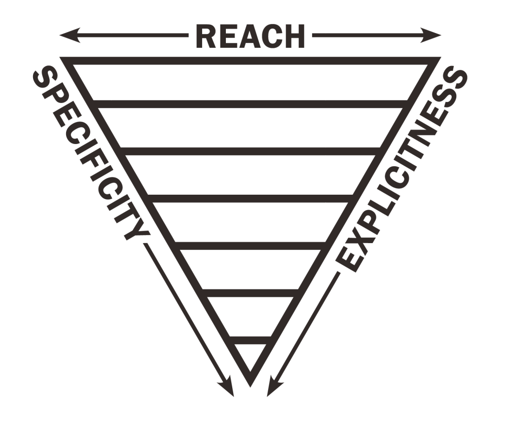
Code should be organized from least to most explicit, starting with general catch-all rules (such as a reset) and moving up to more explicit styles (such as .contact-form). Similarly, code is organized from broadest to narrowest reach—so that styles affecting more HTML come early in the code, and styles with a more localized application come later. Finally, code is organized from lowest to highest specificity, so that later code can always override earlier code.
With those metrics in mind, the triangle is broken down into seven layers. Each layer is more specific, explicit, and narrow-reaching than the layer before it, as shown here:
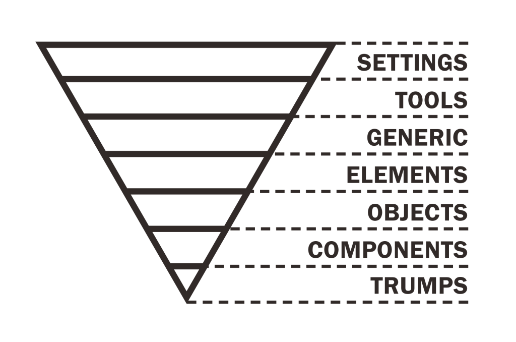
Figure 9.3. ITCSS’s layers
Let’s explore what these layers are in detail. Settings contains global Sass configuration that can be accessed anywhere in the project, such as font sizes, colors, and other project configuration. Tools are global functions and mixins that are helpful across the project and not specific to one component. Generic is the first layer with CSS output of its own, which includes browser resets or normalization, global box-sizing, and any other broad-scoped rules. The elements layer provides default styles for bare HTML elements such as links and paragraphs. It’s similar to the generic layer, except that it provides a more opinionated style.
ITCSS objects are similar to OOCSS objects, and are defined in class-based selectors. They define reusable patterns that have a consistent structure no matter what content or cosmetic style is applied, just like the OOCSS media object does. Components are recognizable pieces of an interface, such as a contact form or a product listing. After the initial setup, this is where the majority of a project’s feature-building work takes place. Finally, trump styles can be used to override any other layer. Trumps should be used sparingly, and have as narrow a scope as possible.
All these layers can be organized into groups of partials. Roberts uses a multilevel file-naming convention (layer-name.partial-name.scss), but we’d recommend using folders instead. The results could look like this:
@import "settings/global";

@import "settings/colors";
@import "tools/functions";

@import "tools/mixins";
@import "generic/box-sizing";

@import "generic/normalize";
@import "elements/headings";

@import "elements/links";
@import "objects/wrappers";

@import "objects/grid";
@import "components/site-nav";

@import "components/buttons";

@import "components/carousel";
@import "trumps/clearfix";

@import "trumps/utilities";

@import "trumps/ie8";
Miriam’s Mix-n-Match
All that is well and good, but I’m writing this chapter and I think my own architecture is way cooler than anything else we’ve discussed. I’m yet to give it a name, but I will as soon as I decide to tour the universe giving workshops to all my adoring fans. A girl can dream, right?
To tell you the truth, I love parts of all these systems—especially ITCSS. I take what works for my team, and make adjustments as needed from one project to the next. For me, it all starts with one rule: follow the cascade. In practice, it looks a lot like ITCSS or Atomic Design (though I find the latter’s biochemical metaphor confusing). I use the same metrics, but break down the categories in slightly different ways.
I start with Sass config files that have no output but define all the parameters of a design: colors, fonts, sizes, media-queries, z-indexes, and so on. In my case, it’s almost entirely Sass map variables accessed with a powerful set of functions and mixins I take from project to project: OddBird’s Accoutrement toolkits. Chris Sauvé refers to this approach as a “Sass Central Nervous System”—a consistent system for maintaining and accessing abstract meta-patterns and style guidelines. Ours look something like this:
// Accoutrement Config

// -------------------
$colors: (

  // base color palette

  'brand-blue': hsl(195, 100%, 43%),

  'brand-red': hsl(0, 100%, 50%),

  'brand-pink': hsl(330, 100%, 45%),
  // color style guide

  'background': hsl(0, 0%, 100%),

  'text': 'brand-blue' ('shade': 80%),

  'action': 'brand-pink',

  'focus': 'brand-blue',

);
$sizes: (

  // base font size

  'body-text': 22px,
  // type sizes

  'rhythm': 'body-text' ('minor-third': 2),

  'h1': 'body-text' ('minor-third': 3),

  'h2': 'body-text' ('minor-third': 2),

  'h3': 'body-text' ('minor-third': 1),
  // other

  'corners': 3px,

  'page': 30rem,

);
$fonts: (

  // hosted web font

  'body': (

    'name': 'CenturyOldStyle',

    'stack': ('Baskerville', 'Palatino', 'Cambria', 'Georgia', 'serif'),

    'regular': 'CenturyOldStyle-regular', // webfont file names...

    'italic': 'CenturyOldStyle-italic',

    'bold': 'CenturyOldStyle-bold',

  ),
  // web-safe font stack

  'code': (

    'name': 'Consolas',

    'stack': ('Menlo', 'Monaco', 'Lucida Console', 'Liberation Mono', 'DejaVu Sans Mono', 'Bitstream Vera Sans Mono', 'Courier New', 'monospace', 'serif')

  ),

);
The toolkit layer is prebuilt, and moves with us from project to project. It includes functions and mixins that put our configuration to work: automating @font-face imports, font-stacks, and typographical rhythms, as well as applying our color palette. It also helps with accessible color contrasts, and automatically generates a visual style guide, so we can see the fonts, colors, and sizes in action.
The next level up is what I call initial styles—resets, web font imports, global defaults, and so on. This is the first layer of code with actual CSS output, and it’s a thin layer. At this point we’re not styling any real patterns, just trying to establish a slightly more beautiful and branded version of the browser defaults.
From there I often establish the site layout, adding patterns as needed. The layout partials are similar to Hugo’s, describing all the primary structures of the site. Patterns are design objects, similar to objects in OOCSS and ITCSS. They’re not related to specific content, and might be used anywhere, for anything. For example, buttons and form elements are always some of my first design patterns on a project.
Patterns are abstract, and have no real meaning until they’re used in a component—the actual bits of user interface that appear on a site. Components should follow all the rules described earlier in the chapter: reusable, repeatable, and able to fit in any container. What others systems call page and theme styles are usually defined either as layout templates or components that just happen to be full screen. Any vendor code that I use will come through a packaging system such as npm, and live outside my visible Sass directory:
sass/

|

|– config/

|   |– _colors.scss      # Color palettes

|   |– _fonts.scss       # Font palettes

|   …                    # Etc.

|

|– initial/

|   |– _init.scss        # reset/normalization

|   |– _root.scss        # global defaults (mostly :root, html, body)

|   |– _webfonts.scss    # @font-face imports

|   …                    # Etc.

|

|– layout/

|   |– _navigation.scss  # Navigation

|   |– _banner.scss      # Site Banner

|   …                    # Etc.

|

|– patterns/

|   |– _buttons.scss     # Buttons

|   |– _dropdown.scss    # Dropdown

|   …                    # Etc.

|

|– components/

|   |– _calendar.scss    # Calendar widget styles

|   |– _contact.scss     # Contact form styles

|   …                    # Etc.

|

|- main.scss             # The primary Sass file to be compiled
Lately, I’ve also included a styleguide folder, and an extra styleguide.scss root Sass file to be compiled separately. These files contain any styleguide-specific components not required by the main app—styles for the color palette, font specimens, and so on.
Modular Imports in Sass 4
As this chapter was being written, the core Sass designers, Natalie Weizenbaum and Chris Eppstein, were working out the details for modular imports, the major new feature that is driving plans for Sass 4. The specifics are still in flux, but the direction they’re going in is exciting, so it’s worth giving you a sneak peak at what they’ve done so far.
Modular imports are a move away from the CSS @import syntax towards one that is more powerful and Sass-specific. Where Sass imports currently work as though the entire imported document has been cut and pasted into place, modular imports provide a lot more control for the developer—inspired by best practice in languages such as Python and Dart. It will probably look a little like this:
@use 'path/to/sitepoint/author' as 'miriam';
.sitepoint {

  @include miriam.write('Jump Start Sass');

  -webkit-paycheck: miriam.money('millions');

}
Okay, there may not be a -webkit-paycheck property coming anytime soon, but the rest looks good. So what’s it all about, and why do we need it?
Locality
With the current Sass import system, variables, mixins, and functions live in a global namespace across all files; conflicts are common. It’s impossible to tell by looking at a single Sass file what already exists in that global space; however, with modular imports, nothing is made global unless I explicitly request it. The @use directive will be visible at the top of any importing file, giving me a complete list of available APIs and the power to namespace each however I see fit.
If you @use 'example/grids' as 'grid' at the top of a file, and the example/grids.scss file contains a span() mixin and a gutter() function, then they become available in your file as grid.span() and grid.gutter() (the . syntax is still under discussion). The same will be possible with variables, so a $columns variable would be available to as $grid.columns.
// example/grids.scss

@mixin span(…) { … }

@function gutter(…) { … }

$columns: 12;
// my-file.scss

@use 'example/grids' as 'grid';
.column {

  @include grid.span(5 of $grid.columns);

  margin-bottom: grid.gutter();

}
Sass will default to using the filename as a prefix if none is provided, and also allow you to remove the prefix when you need to. It’s still not clear if prefixing will work with placeholder selectors.
In addition to using a file with or without a given prefix, it might be possible to use an entire file as a mixin, so you can apply the code of that file anywhere you want—even in a nested context. The syntax is still under consideration, but it would make the entire CSS contents (that are not wrapped in a mixin) available to you as a single mixin.
Encapsulation
Modular imports will also give developers—especially library authors—more power over their public API. Currently, when you load a Sass library such as Susy, you gain access to pages and pages of undocumented functions that you’ll never use. I’ve done my best to hide those functions behind long names like _susy-valid-column-math, but they still clutter the global namespace unnecessarily. With encapsulation, you’ll have control over which mixins, functions, variables, and (possibly) placeholders should be made public. Adding - or _ to the start of a name will define it as private.
There is also talk of a @forward directive that would allow authors to pass the API from one module along as part of another. If you wanted to build a Susy flexbox extension, for example, you could tell your extension to forward the Susy API along to your users.
All of this, of course, is still in the works, and likely to change before it becomes available later in the year. I can’t wait to see how it turns out—in what ways it changes Sass architecture, and helps the Sass ecosystem.
Wrapping Things Up
We’ve taken a fairly in-depth look at architecture for your Sass projects. We started off by discussing @import, and seeing how you can use it to split your project code into small logical units and organizing it across multiple files, partials and folders. This forms the basis of any projects architecture. We then moved on to discuss a whole range of architecture options; which you choose will depend on your own projects and preferences. Finally we looked at future options for modular imports that should be in Sass 4.
Frequently Asked Questions about Architecture in SASS
What is the importance of architecture in SASS?
The architecture in SASS is crucial as it provides a structured way of writing CSS. It helps in organizing your stylesheets into a more manageable and maintainable system. This is particularly beneficial for large projects where multiple developers are involved. A well-structured SASS architecture makes it easier to understand the code, reduces the chances of errors, and enhances the efficiency of the development process.
How can I structure my SASS projects effectively?
Structuring your SASS projects effectively involves organizing your stylesheets into different folders and files based on their functionality. This could include base, layout, components, and utilities. The base folder contains the foundational styles, layout contains styles for major sections of the site, components include styles for reusable modules, and utilities contain helper classes and mixins.
What is the role of variables in SASS architecture?
Variables in SASS architecture play a significant role in maintaining consistency across your stylesheets. They allow you to store values that you want to reuse throughout your project, such as colors, fonts, or margins. This makes your code more readable and easier to maintain, as you can make changes in one place and have them apply throughout your project.
How can I use mixins in SASS?
Mixins in SASS are a way of reusing a group of CSS declarations. You can define a mixin with the @mixin directive and include it in your code with the @include directive. This can be particularly useful for vendor prefixes, complex CSS3 properties, or sets of styles that you want to reuse throughout your project.
What is the purpose of the partials in SASS?
Partials in SASS are used to break down your stylesheets into smaller, more manageable pieces. A partial is a SASS file named with a leading underscore. The underscore lets SASS know that the file is only a partial file and that it should not be generated into a CSS file. Partials can be imported into other SASS files, allowing you to modularize your CSS and help keep things easier to maintain.
How can I use nesting in SASS?
Nesting in SASS allows you to nest your CSS selectors in a way that follows the same visual hierarchy of your HTML. Be aware, though, that excessive nesting can lead to more complex and less readable code, so it’s important to use it judiciously.
What is the difference between SASS and SCSS?
SASS (Syntactically Awesome Stylesheets) and SCSS (Sassy CSS) are both preprocessor scripting languages that are interpreted into CSS. The key difference between the two lies in their syntax. SASS follows a strict indentation syntax and doesn’t use semicolons or brackets, whereas SCSS closely resembles the syntax of CSS.
How can I use the @import rule in SASS?
The @import rule in SASS allows you to import SASS files into other SASS files. This makes it possible to split your stylesheets into smaller, more manageable pieces. When the SASS file is processed, it takes the file that you want to import and combines it with the file you’re importing into so you can serve a single CSS file to the web browser.
What are the benefits of using SASS over traditional CSS?
SASS offers several advantages over traditional CSS. It provides features like variables, nesting, mixins, inheritance, and others that make writing CSS more powerful and efficient. It also helps in organizing your stylesheets in a more structured and maintainable way.
How can I compile my SASS files into CSS?
To compile your SASS files into CSS, you need a SASS compiler. There are several options available, including command-line tools like Dart Sass and GUI applications like Koala. Once you’ve installed a SASS compiler, you can run it on your SASS files to generate the corresponding CSS.