An Introduction to User Journey Maps

This tutorial introduces user journey maps: what they are, and what they’re useful for. It’s the first in a series of five tutorials that cover all the ins and outs of user journey maps, from the different types of journey map and how to use them, how to conduct user research for mapping, how to run mapping workshops, and how to use your maps effectively.
Imagine you want to buy a gift for your friend online. You might start by looking for some inspiration. What does this person like? You might use search engines, but maybe also inspiration boards. Or maybe some of those “top ten gifts for X” articles that are popular, especially around Xmas. You finally arrive on a website that offers the kind of things that inspire you. You go through categories, maybe use the search. You find the right gift, you go through the checkout process. The experience was good and quite simple. You buy it. Then you wait. And it never arrives. After a couple of days you try to contact the shop. It takes them more than a few days to answer. Eventually, after a lot of back and forth with them by email and over the phone, they find out what was going wrong. They agree to send you another one. But sadly, it doesn’t arrive on time for the birthday. You might have had a decent — maybe even good — experience on the website. But how about the overall experience?
When building websites and services, designers need to understand that whole experience. And to do that, we have one very powerful tool: user journey maps. A user journey map is a visual document that will show the whole experience of a user in a chronological way. It documents user goals, phases in the journey, tasks, pain points, sometimes feelings. It helps teams build products by showing a global view. This brings stakeholders and teams together on the same page. It helps brainstorm opportunities to improve the product and solve those pain points. And it lists touch points and channels, which helps break down different gaps you might have in your organization. In my example here, maybe there were organizational issues between the team building the site and the support team, which led to the support being late.
Let’s start our journey of discovering user journey maps with a big overview. In this first part, we’ll focus on what user journeys are and what to include in them. We’ll see an example of how a user journey map was used on one of my previous projects. Finally, we’ll see some of the benefits of such a tool, but also things you need to be careful about.
What Is a User Journey Map?
A user journey map helps document and visualize the step-by-step experience someone has with a product or service, from the beginning to the end. It lists the different actions users take to accomplish their goal.
Note: you may also come across user journey maps described by other names, such as “experience maps” or “user experience maps”.
Those actions are arranged in chronological order, often presented as a timeline. The beginning of the journey is on the left, and the end on the right, with all the steps in between. It helps designers (and stakeholders) get a global overview of the whole journey.
The following image shows an example of the Miro customer journey map template.
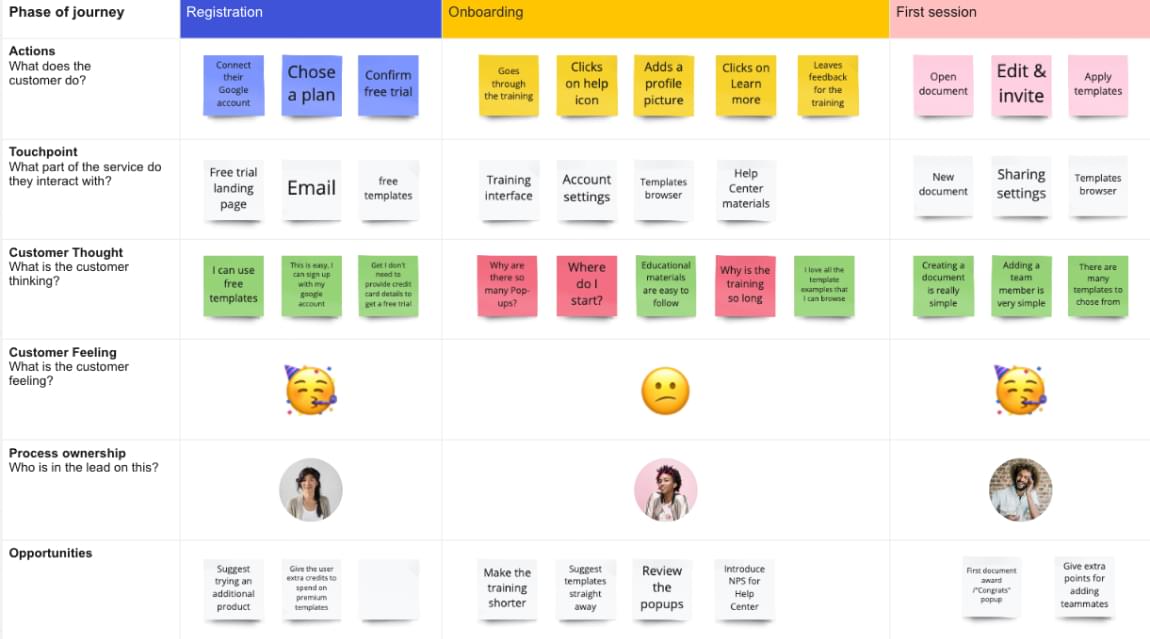
To build a user journey map, you need data. So you’ll start by conducting user research: interviews, observation, task analysis, and so on. You want to identify and understand those actions in a chronological way. The map is then built as a document that will synthesize this research.
The image below shows an eExample of the Wikipedia Experience Translator journey.
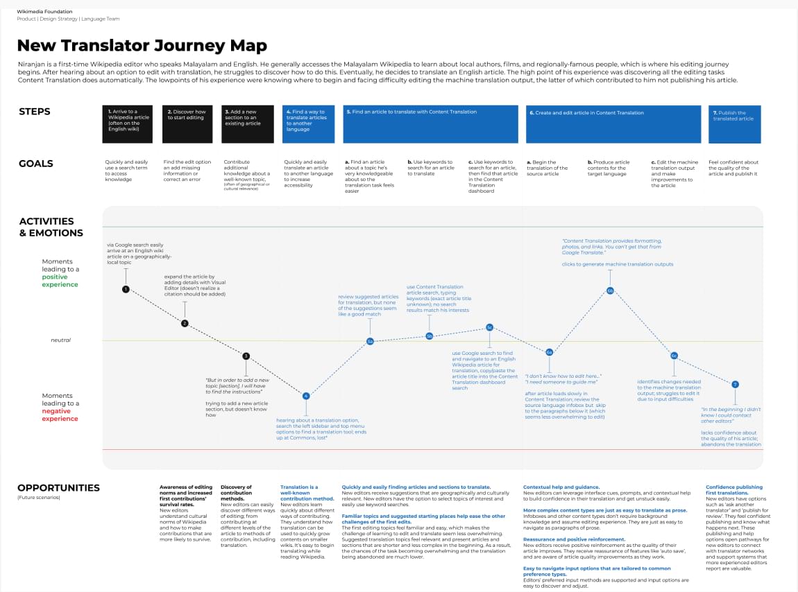
This tool comes from the field of marketing, where you might hear it called a “customer journey map” or sometimes “customer map”. The concept is close: map the user customer experience in a chronological way.
What to Include in a User Journey Map
You might have noticed that the maps above are different. There’s no “one size fits all” rule for building a journey map. It depends on your product or service, the experience, and what you discover during research. Here a few things that are usually part of the map:
- Scope: what is the map about, and how big? Do we list the whole experience, or a small part of it?
- User goal: what is the user trying to accomplish?
- Journey phases: what are the big steps a user is going through to pursue this goal? Even if your core experience is an app or website, interactions before and after this can be interesting to capture.
- User actions or tasks: for each step or phase, what do the users need to do?
- Pain points: what annoys the user here? Are there any frictions?
- Opportunities: how might we improve this?
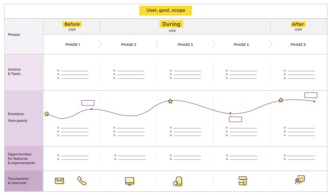
We’ll go into more details for each of those points in Part 3 of this series.
Depending on what you discover during your research, you might find any of the following:
- Emotions: how does the user feel during this phase?
- Triggers: what pushes users to take that decision at that specific step?
- Obstacles or barriers: what prevents the user from going to the next step?
- Knowledge gap: what kind of information is required to complete this step? What does the person need to know?
- Touchpoints and channels: is the user interacting with the product on their phone? With customer support? What channel in the company is responsible for this part?
- Effort: how hard (or easy) is it to do business with you?
If you want to go further, the Nielsen Norman Group has a “Journey Mapping 101” article with more information on the components.
The Utility of a User Journey Map: a Real-world Example
A few years ago, I was working on a product in the automobile industry. The product was a mobile app and a desktop dashboard to help car dealerships save time on extra repairs.
Let’s say you bring your car to the dealership, because there’s an issue with the lights. You leave it with the mechanics. They take a look. And they discover that you also have a problem with the breaks. They need to change them too. Extra repairs!
Most of the time, the mechanics report this to the service desk. Then, the service desk tries to reach out to you to ask you if you agree to repair those breaks too. (I hope so! Security first!) This takes time. Maybe you’re at work and they can’t reach you. During all this time, the car is waiting on the deck and the mechanics are waiting for a decision.
The tool I worked on helps streamline this process. The mechanics have an iPhone app. They take pictures of the car when it arrives (mostly for insurance to show that this scratch was there before). When they discover the breaks are damaged, they take a picture, or a small video to show this to you. That information is then sent from the iPhone, via the web app, to the service desk. The service desk turns this into an invoice and sends it to the customer.
The customer (that’s you) then gets a link in an SMS. When you open the link, you see the pictures, the video, the invoice for the extra brake repairs. You can digitally sign it, accept the extra work, and then they can start the extra repair.
The reason I’m able to describe this whole process precisely is because we did user research on this. We went to the dealerships and talked to mechanics and service desks. Then we built a map of this whole experience.

Most of the experience was quite nice. People were happy with the app; it worked nicely. But we discovered two interesting pain points along the way:
- At the end of the “sending pictures to the front desk” step, people were unhappy because it sometimes took time. They were stuck in the last step, waiting for pictures to be sent, and couldn’t start a new process with a new car. They had to keep the phone unlocked and the app in the foreground, as otherwise it wouldn’t synchronize.
- There was also some frustration after the use of the app. Sometimes the client replied quickly, but the front desk was super busy. So it took them some time to go to the mechanics to tell them they could start the extra repairs.
For the second pain point, some smart mechanics found a workaround. They went to the history in the app and refreshed the page until they saw that the status was “accepted” (or rejected). Smart, but not efficient.
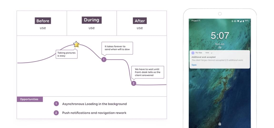
Once we mapped the whole process and understood those major pain points, we were able to find some opportunities.
- The first issue was solved with background synchronization. This way, users weren’t stuck on the last step until all the pictures were synchronized.
- For the second issue, we proposed push notifications to the mechanics’ phones when the client accepted or rejected the extra repairs.
Better understanding the whole journey step by step helped us identify those pain points. And more importantly, it helped us bring interesting features to our users.
The Benefits of User Journey Maps
There are many benefits of conducting user research on the whole experience and building user journey maps. In the example above, I already showed you how it helped to:
- identify major user pain points during the whole journey
- find feature opportunities to improve apps and services around those pain points
There are many other benefits and reasons why you should build such maps:
- They give a visual overview of the user experience over time, and of user steps. So they help you see the global picture, and get everyone on the team — from designers to stakeholders — on the same page. Visual tools are often powerful tools, especially during meetings with stakeholders.
- They are a communication tool that will help make better product decisions based on actual user needs.
By visualizing the customer journey, you can plan better. Aim to create a consistent customer experience that is relevant across all channels. — pragm.co
- They help map and break down different gaps you might have in your organization or product: gaps between siloed departments; gaps between different channels in the company; gaps between what the user knows and what they need to know (knowledge gap); gaps between stakeholder perceived experience and actual user experience. Once those gaps are identified, it’s easier to solve them.
- They help other people get a better understanding of the actual journey of real users, building a more user focused culture in the process.
- They help build better omni channel experiences. Because again, they map the whole story, not just a small part.
Potential User Journey Map Pitfalls
User journey maps are as good as the user data used to build them. They’re a visual way to present the key findings of some user research. This means that, if you start with poor research and inaccurate data, you’ll end up with inaccurate maps.
Avoid building them into the echo chamber of your conference rooms. With zero research and only stakeholder (or marketing) input, all you’ll manage to do is to build a “map of all the biases and assumptions we have about our journeys”. In Part 2 of this series, I’ll explain how this “map of assumptions” could still be a good starting point for kickstarting some research. You need to involve your users and customers to build and verify the map in order for this to be useful.
There’s also a good chance you won’t have a one-size-fits-all journey. You’ll end up with different user journey maps for different personas. And that’s perfectly fine. Don’t try to fit everything in one clumsy big map. Prefer building a network of multiple little ones, around specific user goals and personas. This also means that you need some data on who your users are. A generic, one-size-fits-all persona won’t do the trick.
Another common mistake is to focus the map too much on the company touchpoints and processes. Again, this is about the experience of the user. Starting with listing your touchpoints and channels is tempting. It sounds easy, and you know them well. But again, be careful with echo chambers. The map should be built around user experience, and the phases to accomplish their goals — not your internal company process, because it might not reflect how users actually use the product or service.
Last but not least, user journey map building isn’t a situation of “build once and you’re done”. Your product changes over time, so user experience will change and evolve. User journey maps are documents that need to be often revisited and be kept up to date. More on that in Part 5.
Conclusion
A user journey map is a powerful tool in a designer’s toolbox. It’s a versatile tool with many benefits.
But be careful when using user journey maps. Build them based on real user data. And avoid echo chambers and a focus on your internal company process. It’s as much about channels and touchpoints as it is about the whole experience a user has with the product and service. And this is what you need to map, in order to build useful accurate journey maps.
We’ve only scratched the surface so far, and we’ve only looked at one type of map. In Part 2, I’ll present alternative types of maps and what you can do with them.
Did you find this tutorial useful? We hope so! Please check out the full series of User Journey Map tutorials on SitePoint Premium. You can also get the whole series as an eBook on Amazon.
FAQs About User Journey Maps
What is a user journey map?
A user journey map is a visual representation that outlines the steps and experiences a user goes through while interacting with a product or service. It provides insights into user behavior, emotions, and touchpoints across the entire lifecycle.
Why is a user journey map important?
User journey maps help businesses and designers understand the user’s perspective, identify pain points, and optimize the overall user experience. They provide a holistic view of the user’s interactions, aiding in the improvement of products and services.
What elements are typically included in a user journey map?
A user journey map typically includes stages (phases of the user’s experience), touchpoints (interactions with the product or service), user actions, emotions, and potential pain points. It may also incorporate personas to represent different user types.
How do you create a user journey map?
Creating a user journey map involves research, data collection, and visualization. Start by defining user personas, identify touchpoints, and map out the stages of the user journey. Use this information to create a visual representation, considering user emotions and key insights.
When in the product development process should a user journey map be created?
User journey maps are valuable throughout the product development lifecycle. However, it is often beneficial to create them during the early stages to inform design decisions. They can also be updated as the product evolves or when significant changes are made.
How can user journey maps be used to improve the user experience?
User journey maps can uncover pain points and areas for improvement in the user experience. By addressing these issues, businesses can enhance user satisfaction, streamline processes, and ultimately create more user-friendly products or services.
Stéphanie is a User Researcher and Designer who focuses on building user-centered, inclusive and accessible products and services. She spent the last 11+ years helping her clients in different industries (banking, financial, automotive, healthcare, press, travel, etc.) deliver successful projects to their audience, all the way from strategy to the final product.
Published in
·Canvas & SVG·Design·Design & UX·HTML & CSS·HTML5·Illustration·Technology·January 21, 2015
Published in
·AngularJS·Animation·App Development·Design·Mobile·Mobile Web Development·August 1, 2014


