
Key Takeaways
- Drop shadows are a common design technique used to create the illusion of depth in a two-dimensional space. They are controlled via certain parameters to create varying degrees of intensity and softness to simulate realistic shadows.
- In Photoshop, drop shadows can be manipulated through parameters such as angle, distance, spread, size, and quality/contour to create different looks. The light source and shadow can have a drastic effect on the appearance of any object.
- Drop shadows can also be applied to web elements using CSS styles. The box-shadow property can be applied to div elements and the text-shadow property to text elements. The parameters are controlled with CSS and include settings for offset, blur, spread, and color.
- Understanding light sources and how light and shadow create the illusion of depth is fundamental to creating realistic depth in design work. With little effort, flat designs can be transformed into depth-filled designs that appear to jump off the page.
One of the most common design challenges across many mediums is creating depth when three dimensions are not available. Flat designs can be boring and monotonous. To combat this, it is our job to create designs that jump off the page. For years, designers have been creating the illusion of depth by using a common technique called drop shadows. Drop shadows place a pseudo-shadow behind a design element such as an object or type. This false shadow is controlled via certain parameters to create varying degrees of intensity and softness to simulate realistic shadows. Using this technique makes design elements appear to hover over the page, jumping out and garnering extra attention.
Drop shadows can be created in applications such as Photoshop, and they’re also rendered on the web using CSS styles. We will take a look at both, and how you can use the different parameters and techniques to create many different kinds of drop shadows.
Drop Shadows in Photoshop
Drop shadows can be created in Photoshop using layer styles. Open Photoshop and create a new document. I will use a bold sans serif font, “Franchise,” created with a medium grey. Type a word or a message for this tutorial. In the “Layers” panel, double-click the text layer. The layer styles menu will pop up. Select “Drop Shadow,” and we will experiment with different settings to create different looks.

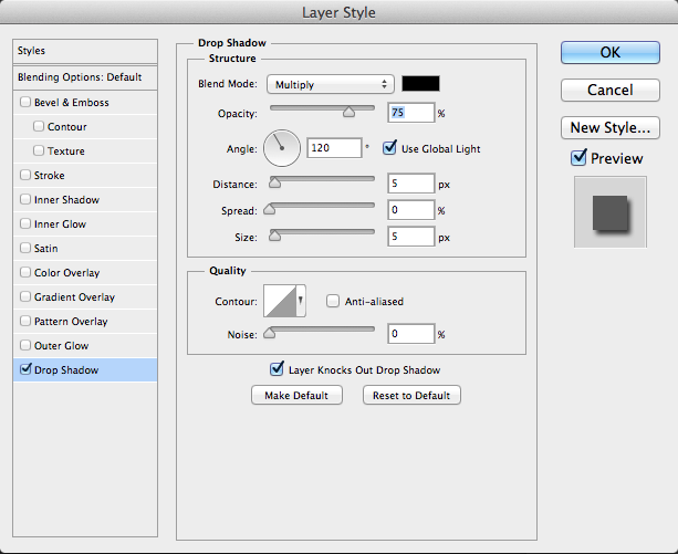
Angle
The default blend mode is “Multiply,” and the opacity is set to 75%. You can increase it to 100% for a more intense shadow. Angle is a very important setting, because it determines the entire look of the drop shadow. The angle that you choose determines the light source, and the shadow will be on the opposite side. Above, the angle of the light source is 120° which is the top-left. The shadow ends up on the bottom right edges. If you change the angle to 90° which is directly above the text, the shadow will be on the bottom edges of the text.

If you have multiple objects that are placed throughout your design in Photoshop, it may be a good idea to uncheck “Use Global Light.” Otherwise, if you change the light source angle within an object, it will update the other objects in the same Photoshop document that have drop shadows applied to them.
Distance
Distance is another major determinant in how a drop shadow will look. The higher the distance value that you choose, the farther away the object will look from the surface below. If you set the distance to 0, it will appear to be very close. Below, I set the distance to 13px and increased the opacity to 100%. This creates an intense shadow that makes the text look like it is floating above the background.
Spread
Spread controls how far the base shadow spreads, which makes the shadow take on yet another dimension. This can make a shadow look more sharp and intense, and it goes as far as your size setting’s boundaries. You use Spread in conjunction with size to control how far the shadow stretches and blurs.
Size
The size refers to the size of or the amount of blur applied to the drop shadow. The example shown above has a size setting of 18px. The illusion is that the grey surface is raised. Combine this with the 20% spread and the 13px distance setting gives the illusion that the text may be thicker than a flat two-dimensional surface. The shadow settings trick the eye, leaving you unsure as to the depth of the shadows and the surface hidden by them.

If you lower the size value to 0, there is no blur, so the shadow is crisp and harsh instead of soft and diffused. This gives the illusion that the light source is closer and more intense than if the size setting were increased.

Taking away the spread value altogether completely softens the shadow. There is no intensity to the shadow and it is much more subtle.
Quality/Contour
The Quality of the drop shadow determines the shape of the drop shadow, which allows you to achieve some very interesting results. In the example below, I changed the Contour to “Sawtooth,” which gives the text an appearance of a gloss edge with a shine. Using settings like these will be very helpful with effects involving glass and other reflective surfaces.

Combining the ring setting with 1px of distance will give the text the look of a bevel edge, with a small highlight at the bottom. Different angles of light and shadow can have a drastic effect on the look of any object.

Drop Shadows on the Web
You can apply drop shadows to elements on the web as well. You can apply them to div elements with the box-shadow property and to text elements with the text-shadow property. They are built upon the same principles of Photoshop’s drop shadow layer styles, but you control the parameters with CSS instead.
The CSS
#container{

width:575px;

height: 440px;

background:#0FF;

-moz-box-shadow: 2px 2px 7px 4px #222;

-webkit-box-shadow: 2px 2px 7px 4px #222;

box-shadow: 2px 2px 7px 4px #222;

}
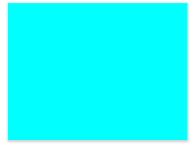
The basis behind the CSS is fairly simple. The first value of box-shadow determines the horizontal offset. This dictates how many pixels to the right or the left the shadow is offset. The second value is the vertical equivalent. This controls how far upward or downward the shadow is offset. Setting both values to 0px will ensure that the shadow is perfectly centered.
The third value is the blur setting, and this determines how hard or soft the shadow will be. Setting the value to 0px will create a crisp, hard shadow, while increasing the blur amount will create a soft, subtle shadow. The fourth value determines the spread, or how large or intense the shadow is.
The text-shadow CSS property works just like box-shadow, but there is no value for the spread.
Shadow Colors
Occasionally, you may want to work with shadows that aren’t a flat black. Inserting a hex color value into your CSS is one way to exert control over your shadow colors, but there is another way to decide the colors besides the hex value. You can also use the RGBa method, where you use a combination of red, green, and blue values to determine the color of the shadow, and “a” stands for alpha transparency. You would determine the alpha by using a range of numbers from .1(for 10% opacity) to 1 (for 100%). Below is a sample of what the RGBa method will look like if you decide to use it.
box-shadow: 2px 2px 7px 4px (35, 35, 35, .5);
Conclusion
Drop shadows can add a lot of depth and interest in your designs. They’re very, very often, but they’re studied very rarely. With little effort, you can transform your work from flat, two-dimensional canvas into depth-filled designs that appear to come off of the page. Understanding light sources and how light and shadow create the illusion of depth is one of the fundamentals to creating realistic depth in your work.
Do you have any tips for creating great drop shadows in your work? Do you have any tricks for adding dimension to your work using drop shadows. Share them in the comments section below.
Frequently Asked Questions (FAQs) about Drop Shadows
What is the purpose of using drop shadows in web design?
Drop shadows are a popular design tool that can add depth and dimension to a webpage. They create a sense of realism by mimicking the way light naturally casts shadows. This can make elements on a webpage appear to be lifted off the page, creating a 3D effect. Drop shadows can also be used to highlight specific elements on a page, drawing the viewer’s attention to them. They can help to separate elements from each other, improving readability and usability.
How can I create a drop shadow effect using CSS?
CSS provides a filter function called ‘drop-shadow’ that can be used to create a drop shadow effect. The syntax for this function is ‘drop-shadow(offset-x offset-y blur-radius spread-radius color)’. The ‘offset-x’ and ‘offset-y’ values determine the horizontal and vertical distance of the shadow from the element. The ‘blur-radius’ value determines the bluriness of the shadow, and the ‘spread-radius’ value determines the size of the shadow. The ‘color’ value specifies the color of the shadow.
What are some best practices for using drop shadows in web design?
When using drop shadows, it’s important to keep them subtle and not overuse them. Too many shadows or overly dark shadows can make a webpage look cluttered and confusing. It’s also important to use consistent lighting. The direction and angle of the shadows should be consistent throughout the webpage to maintain a sense of realism. Finally, drop shadows should be used to enhance the content of the webpage, not distract from it.
What is the difference between a drop shadow and a box shadow in CSS?
Both drop shadows and box shadows in CSS create a shadow effect, but they are used in different ways. A drop shadow is applied to an element’s entire box, including any transparent areas, while a box shadow is only applied to the element’s background. This means that a drop shadow can create a shadow around complex shapes, while a box shadow can only create a shadow around a rectangle.
Can I use drop shadows in responsive web design?
Yes, drop shadows can be used in responsive web design. They can help to create a sense of depth and separation between elements on a webpage, which can be especially useful on smaller screens. However, it’s important to test the design on different devices and screen sizes to ensure that the shadows look good and don’t interfere with the readability of the content.
How can I control the opacity of a drop shadow in CSS?
The opacity of a drop shadow in CSS can be controlled using the ‘rgba’ color value. The ‘rgba’ value allows you to specify the red, green, blue, and alpha (opacity) components of the color. The alpha component is a number between 0.0 (completely transparent) and 1.0 (completely opaque).
What are some common mistakes to avoid when using drop shadows?
Some common mistakes to avoid when using drop shadows include using too many shadows, using overly dark or large shadows, and not using consistent lighting. These mistakes can make a webpage look cluttered and confusing, and can distract from the content. It’s also important to avoid using drop shadows to try to fix bad design. If an element on a webpage is not readable or usable without a shadow, it’s likely that there are other design issues that need to be addressed.
Can I animate a drop shadow in CSS?
Yes, you can animate a drop shadow in CSS using keyframe animations or transitions. This can create a dynamic, interactive effect that can help to engage viewers. However, it’s important to use animation sparingly and not let it distract from the content of the webpage.
How can I create a multi-layered drop shadow effect in CSS?
A multi-layered drop shadow effect can be created in CSS by applying multiple drop shadows to the same element. This can be done by specifying multiple ‘drop-shadow’ functions in the ‘filter’ property, separated by commas. Each ‘drop-shadow’ function will create a separate shadow, and the shadows will be layered on top of each other in the order they are specified.
Can I use drop shadows to create a neumorphic design effect?
Yes, drop shadows can be used to create a neumorphic design effect. Neumorphism is a design trend that uses subtle shadows and highlights to create a soft, extruded plastic look. This can be achieved using drop shadows with a very small offset and blur radius, and a color that is slightly darker or lighter than the background color.