5 Ways to Make Data Visually Interesting
As a developer, sometimes it’s just too easy to dump tabular data onto a web page and call it “good.” You know, just make a simple table, give it some basic CSS to spruce it up, and you’re done, right? Wrong. If you’re a thoughtful designer, then you recognize that the data is on the page to prove a point, and it’s your job to make that otherwise tedious data interesting and compelling.
We live in an age of abundant data. Some might call it the “information overload era.” That’s why turning that data into actionable information is really important. So, how do we take massive amounts of data and create interesting, engaging information? The following are a few places to start. While most of these are a bit technical, you can check out the last tip along with the examples at the end to gather inspiration for the design side of data.
Customizing Tables with “While” Loops
I know I was just making fun of developers who just dump data into a table and call it good to go, but there are some powerful ways to still use tables that require more than slapping on some CSS and walking away. I am always making dynamic data sets using PHP “while” loops. It’s easy to generate tables this way, but not always so easy to make them look good and engage users.
The nth Child CSS Pseudo-Class
I regularly have to use PHP or some other scripting language to generate a huge list of tabular data. One of the easiest ways to make your tables visually appealing when dealing with dynamic data is to use the nth-child CSS call. Here’s an example of the CSS:
[sourcecode language=”html”]
.SomeClass tr:nth-child(odd){background-color: #ccc;}
.SomeClass tr:nth-child(even){background-color: #fff;}
[/sourcecode]
When you code your table, here’s what it would look like:
[sourcecode language=”html”]</pre>
<table class=”SomeClass”>
<tbody>
<tr>
<th>First Name</th>
<th>Last Name</th>
</tr>
<tr>
<td>Billy</td>
<td>Joel</td>
</tr>
<tr>
<td>Joey</td>
<td>Sams</td>
</tr>
<tr>
<td>Sammy</td>
<td>Bills</td>
</tr>
</tbody>
</table>
<pre>
[/sourcecode]
Now, just style away using this pseudo-class technique. Be aware that IE doesn’t support this pseudo-class, but there are some jQuery workarounds. The simplest way I’ve found to make this work is to add another set of CSS classes like this:
[sourcecode language=”html”]
/*CSS for IE to use the pseudo class nth-child */
.SomeClass tr:nth-child(odd){background-color: #ccc;}
.SomeClass tr:nth-child(even){background-color: #fff;}
[/sourcecode]
Then, use this jQuery to make it work:
[sourcecode language=”html”]
<script type=”text/javascript” src=”https://ajax.googleapis.com/ajax/libs/jquery/1.8.3/jquery.min.js”></script>//Call the jQuery from the Google CDN or wherevs<script type=”text/javascript”>// <![CDATA[
$(document).ready(function() {
$(“.SomeClass tr:nth-child(even)”).addClass(“even”);
$(“.SomeClass tr:nth-child(odd)”).addClass(“odd”);
});
// ]]></script>
[/sourcecode]
I put all the above code in the header section of my HTML document.
Sortable Columns
I also like to make my columns sortable. This makes it easy for users to quickly manipulate and arrange the data for their purposes and understanding.
You can’t just check a box and make tables sortable, though. You’re going to have to reach for jQuery or some other JavaScript to make it work. I use a simple library called TableSorter that allows me to add a class to the table, and I’m done.
- Download the JS library from TableSorter.com
- Add the reference in your HTML (see their documentation)
- Add the class to your table.
Remember that you can always have several classes for any HTML element; just use:
[sourcecode language=”html”]
<table class=”firstClass secondClass nthClass etcClass”></table>
[/sourcecode]
Check out the Pager.js code at TableSorter.com that makes it easy to page through table results. If you’ve got excessively large tables, then you’ll like how easy it is to implement.
Filter Columns
Lastly, I’ve grown very fond of the ability to use filters with tables. As much as we hate to admit it, human brains have limited active memory, so focusing on certain selections or aspects of data can make for a stronger impact and a better understanding of the information. If you’re familiar with Excel, the user can opt to filter a column and then either select from a list or use a search feature to filter out the data they’re looking for.
There are lots of robust filter packages already built and ready for use. I like the PicNet Table Filter as it’s easy to hook into dynamic tables, which I use very frequently.
If you’re looking for a more robust table set, check out Flex Grid, which has just about everything you could ever want. It’s not as easy to tie into dynamic tables, but it does a great job even if you do want to take the time to develop a full-blown system.
Interesting Layouts
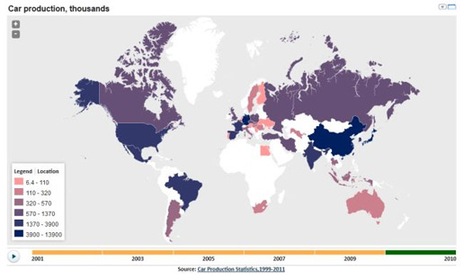
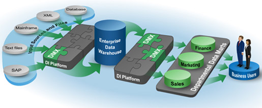
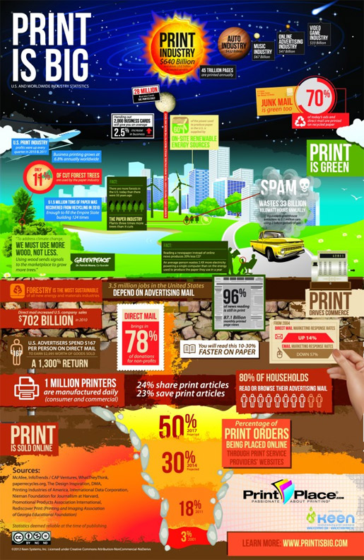
For those less interested in the developer side of data formatting, you can simply create a layout that is a bit out of the ordinary. Rather than a plain-Jane line chart or pie graph, use an infographic or incorporate graphic characters into your data. You could also make use of dynamic chart libraries if the data that you’re working with is constantly in flux. The following are some of my favorite examples of data that the designers made interesting enough to display as wall art:

by NYCEDC. Browse more data visualization.

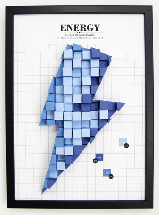
Physical 3D paper graph by Siang Ching
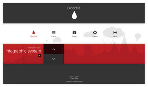
Interactive infographic system by Martin Liveratore

Information graphics in context by Peter Orntoft

Tattoo infographics by Paul Marcinkowski

Lunar Tides physical infographic by Daniel O Comite
Do you have any tales of interesting data? Have you ever been tasked with turning an enormous amount of data into actionable, visual designs?
Tara Hornor has a degree in English and has found her niche writing about marketing, advertising, branding, graphic design, and desktop publishing. She is a Senior Editor for Creative Content Experts, a company that specializes in guest blogging and building backlinks. In addition to her writing career, Tara also enjoys spending time with her husband and two children.


