Key Takeaways
- Always provide clear instructions on login screens, such as what the username is and where to find it, or what the ‘remember me’ checkbox does, to avoid user confusion.
- Balance security with usability by providing enough information for users to recover from login errors, but not so much that it can be exploited by hackers. Implement measures such as time delays and penalty periods to deter hacking attempts.
- Keep login processes simple and straightforward. Avoid unnecessary fields or steps, ensure password reset options are easily accessible, and adjust the keyboard type based on the input required.

In the first part of this article, we outlined how following three little rules can make account management less painful.
To quickly recap those rules:
- 1. Don’t make the user guess
- Almost every service on the web handles account management slightly differently. As a result, you have to be explicit about the requirements for your service. Otherwise, you’re just being cruel.
- 2. Balance security with usability
- Often, security folk will insist on an approach that compromises the user experience. This is foolish, because poor usability will lead to workarounds, and workarounds in turn lead to weakened security. Instead, aim for a design that is both secure and usable.
- 3. Keep it simple
- Account management is one of your biggest potential barriers to usage. Make the barrier practically invisible through a simple, seamless, pain-free design.
In that first part, we showed how to apply these rules to improve the process of creating new accounts. Now let’s take a look at using those same rules to improve the experience of logging in.
The Login Process
Rule #1: Don’t make the user guess
Log in screens are usually relatively minimal, with a field for a username and another for password. Minimal doesn’t always equal simple, though, especially if you hide information that helps explain things to users.
- If the username is an identifier that the user didn’t create — e.g. an electricity account number — tell users what the username is and where they can get it (e.g. “at the top right corner of your bill”).
- If the username is an email address, tell users.
- If the password is a numeric pin, tell users.
- If space allows, instead of “Remember me” use “Remember username on this computer”. (“Remember me” doesn’t really tell the user what will happen.)
Example: What not to do
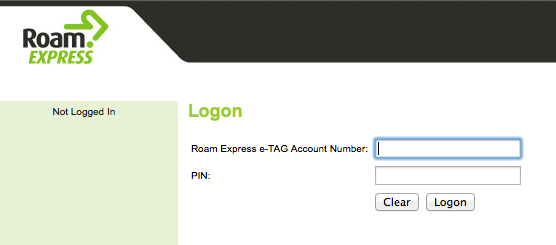
Roam Express, a provider of electronic tags for paying road tolls, doesn’t tell you where you could find your tag number.
Example: A better approach
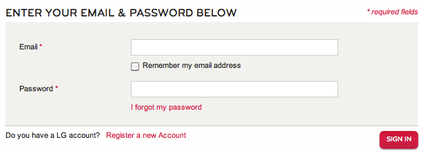
LG do better, being specific about the username being an email address, and what the “remember me” checkbox will do.
Rule #2: Balance security with usability
With logging in, the main challenge security versus usability challenge relates to how you deal with incorrect attempts. The more information you can give the (legitimate) user, the more able they are to recover and log in correctly. However, this information can also be used by black-hat hackers to ascertain usernames and passwords.
The solution is to:
- give a moderate amount of information (e.g. tell the user when log in has failed and, if you can, whether the problem was with the username or the password);
- give users at least two and preferrably three attempts — typos are easy to make; and
- apply time limits and penalties, rather than locking people out altogether.
Time limits and penalties are best described by Thomas Baekdal in his article The Usability of Passwords:
All you need to do is to prevent automatic hacking scripts from working effectively. What you need to do is this: 1. Add a time-delay between sign-in attempts. Instead of allowing people to sign-in again and again and again. Add a 5 second delay between each attempt. It is short enough to not be noticeable (it takes longer than 5 seconds to realize that you have tried a wrong password, and to type in a new one). And, it forces the hacker to only be able make sign-in requests 1 every 5 seconds (instead of 100 times per second). 2. Add a penalty period if a person has typed a wrong password more than, say, 10 times, of something like 1 hour. Again, this seriously disrupts the hacking script from working effectively.
Example: A better approach
Uber tell you which of your two credentials you’ve gotten wrong.

Rule #3: Keep it simple
You’d think, given how small a log in form is, they must all be simple. Alas, you’d be wrong! Have a look at how these services overcomplicated the process.
Example: What not to do
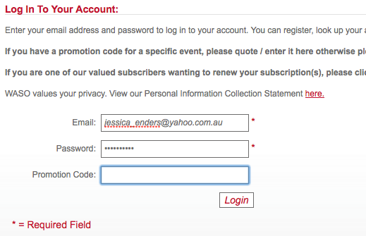
The West Australian Symphony Orchestra asks for a promo code at log in.
Example: What not to do
The Co-op Bookshop used to make logging in way more difficult than it needed to be. They hid the password field until after the email address had been entered and validated (using the tab key, no less!). (Thankfully, after a recent redesign, they’ve moved to a more standard approach for log in.)
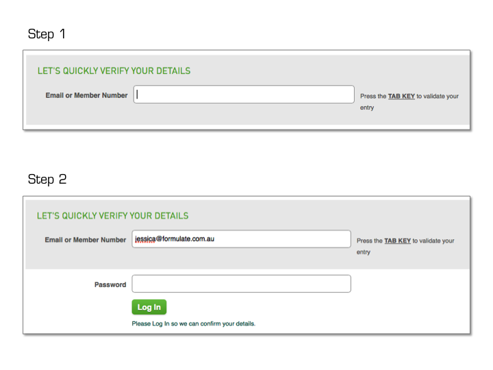
The two examples above show the addition of needless fields or steps, something you should definitely avoid. What else can you do to keep login simple?
- Make sure the log in call-to-action is easy to find, whenever users might want it. The top right hand corner is a common location.
- Enable self-service and immediate reset of user passwords (and also usernames, if chosen by the user). Resetting should require sufficient identification (ideally two-factor authentication rather than security questions, which are hard to implement well). Do not send passwords “in the clear” e.g. via email — especially permanent passwords — as email can be intercepted or hacked. This is why resetting is preferable to recovery.
- If the username is an email address and user is on a mobile or tablet, switch to the device’s email input-optimised keyboard. Similarly, switch to a numeric keyboard for passwords that are pins. See Touch Keyboard Types for more information.
- You most definitely do not need a “clear” or “reset” button on a log in (or registration) form (see above Roam Express example of what not to do)!
- Put “Forgot username” and “Forgot password” links in close proximity to their respective fields.
- Don’t worry too much about “log in” versus “sign in”, there are pros and cons to both. For instance, some argue “log in” is technical jargon, but then “sign in” is more easily confused with “sign up”. Pick one approach and stick with it; in this case consistency matters much more than the specific choice of words. Oh and note that “login” is a noun (e.g. “What’s your login?”) whereas “log in”/”sign in” are verbs (e.g. “Please log in to your account”). See “Login Is Not a Verb”.
Example: What not to do
Computershare put the forgot username/password links not only a long way away from the corresponding fields but also outside the prominent blue login box (which almost guarantees they won’t be seen).

Example: A better approach
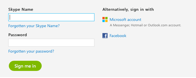
Unlike Computershare, Skype put the forgot username link (“Forgotten your Skype Name?”) immediately below the username field, which is ideal. The same is done for the forgot password link.
Example: What not to do
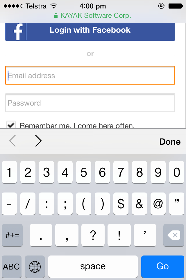
Travel site Kayak doesn’t adjust the keyboard when entering an email address via mobile.
Example: A better approach
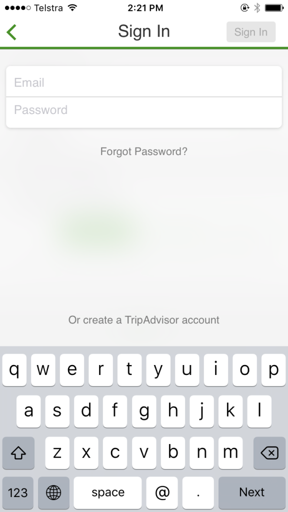
Tripadvsor adjusts the keyboard when entering an email address via mobile.
So that’s it. For painless registration and log in:
- Don’t make the user guess;
- Balance security with usability; and
- Keep it simple.
Any ways for implementing these rules that I’ve not covered here? Let us know in the comments.
Otherwise, go forth and create great account management experiences!
Frequently Asked Questions (FAQs) about Account UX Login Screens
What are the key elements to consider when designing a user-friendly login screen?
The key elements to consider when designing a user-friendly login screen include simplicity, clarity, and security. The login form should be simple and straightforward, with clear fields for username and password. It should also provide clear error messages if the user enters incorrect information. Security is another crucial aspect. Users should feel that their information is safe. Therefore, include features like password visibility toggle and two-factor authentication.
How can I make my login screen more engaging?
To make your login screen more engaging, consider incorporating interactive elements such as animations or dynamic feedback. Also, use a clean and attractive design that aligns with your brand’s identity. Personalized greetings or messages can also enhance user engagement.
What are some common mistakes to avoid when designing a login screen?
Some common mistakes to avoid when designing a login screen include cluttered design, unclear error messages, and lack of security features. Also, avoid complex processes that require users to remember too much information or take too many steps to log in.
How important is mobile optimization for login screens?
Mobile optimization is crucial for login screens as a significant number of users access websites and apps on their mobile devices. A mobile-optimized login screen ensures a seamless and user-friendly experience across all devices.
How can I improve the security of my login screen?
You can improve the security of your login screen by implementing features like two-factor authentication, password strength indicators, and secure password recovery options. Also, ensure that your system encrypts user passwords.
How can I make my login process faster and more efficient?
To make your login process faster and more efficient, consider implementing social media login options. This allows users to log in with their existing social media accounts, reducing the need to remember additional usernames and passwords.
What role does user feedback play in designing a login screen?
User feedback is invaluable in designing a login screen. It helps identify areas of improvement and user preferences, ensuring a more user-friendly and efficient login process.
How can I design a login screen that aligns with my brand identity?
To design a login screen that aligns with your brand identity, incorporate your brand colors, logo, and style into the design. This not only enhances the aesthetic appeal but also reinforces your brand identity.
What are some best practices for designing a sign-up page?
Some best practices for designing a sign-up page include keeping the form simple and short, providing clear instructions, and offering social media sign-up options. Also, ensure that the sign-up process is secure and that users are informed about how their information will be used.
How can I ensure that my login screen is accessible to all users?
To ensure that your login screen is accessible to all users, consider implementing features like text-to-speech for visually impaired users and easy navigation for those with motor disabilities. Also, use clear and simple language to cater to users of all literacy levels.
Jessica Enders has suffered from a life long condition known as a love of designing forms and other transactional interfaces. She is attempting to minimise the adverse symptoms by running her own form design business, Formulate Information Design.
