
There’s a big difference between following best practices and following conventions. Best practices align your design work with business and branding goals while still allowing for distinctiveness and creativity. Following conventions, however, often yields ordinary results that fail to provide unique appeal — the designer’s main responsibility.
The following dramatically-unconventional web designs are quintessential examples that achieve greater organizational goals in unique, distinctive, and unusual ways. Their deliberate rejection of commonplace conventions fortifies their efforts to make their projects truly stand apart. Take a look at these ten wildly-unconventional web designs.
Parallax.JS
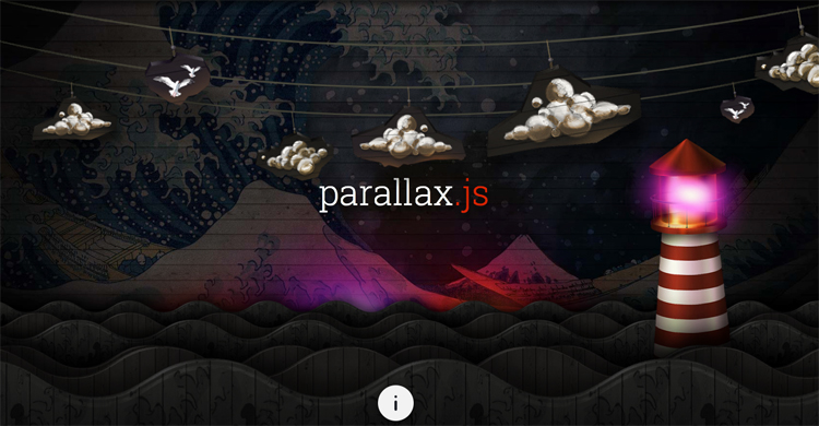
It isn’t often that you see a site that works in the way that Parallax.JS works. The brainchild of Matthew Wagerfield and Claudio Guglieri, the site is absolutely beautiful with such a variated color palette. All the objects move on the page (except for the background and with the integrated parallax.js), the page orientation will alter the layers and scenes whether you are on your mobile device or your desktop computer.
Red Fish Apparel
The large photographic image being used as the background for your website is by no means a new trend, but with Red Fish Apparel it works wonderfully by featuring such bold colors. The creative capture makes this website stand out, not to mention the abstract patterns and textures found in both the solid sections of the background.
Akiyoshi Ishigami
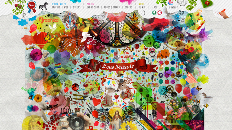
Designers often worry about cramming too much into a limited amount of space, but sometimes more truly is better. Ishigami’s colorful site proves that by not only adding more elements, but more color as well. While the site may not fit everyone’s aesthetic preferences, it really does show you that pushing boundaries and bending rules can yield interesting and creative results.
Miagui
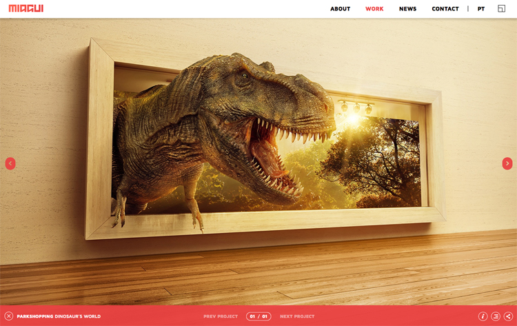
If you want to make your website stand out, sometimes making your images stand out (both literally and figuratively) is a great idea. It isn’t often that you see a large dinosaur on a website, let alone one posed in such a fashion. Captivating imagery is paramount in your web design, and this particular example fosters ferocious appeal.
Madwell
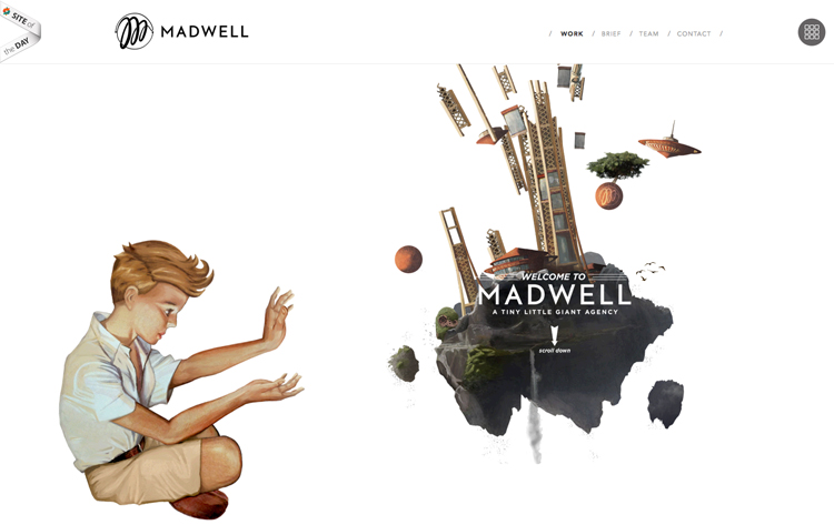
Illustrations are a common occurrence on artist’s websites, but they’re rarely this distinctive. Believe it or not, you don’t have to be an artist in order to make use of illustrations on your site as Madwell has shown us. The drawing has a magical quality that embodies Madwell’s mission of bringing small ideas to life. The drawing is a perfect size for the design and concept.
Axel Aubert
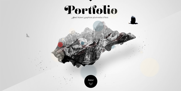
Personally, I have never seen a website that functions and moves like Axel Aubert’s. A completely beautiful site, Aubert offers a great of example of how you can reject typical portfolio conventions and build a full-blown website that features creative use of motion and coding.
Shri Hanuman Chalisa
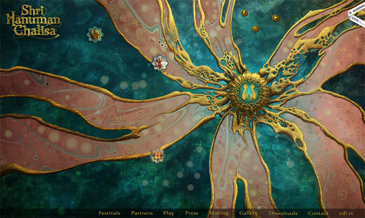
If you want to use a large background, you don’t always have to go the route of using big, beautiful photography. Sometimes you can go the route of using big, beautiful artwork just like the Shri Hanuman Chalisa site has. The color palette is attractive and really pops out at you thanks to the flower-like shape. If you want a simple site with a lot of distinctive personality, this site offers strong inspiration.
Sketcha
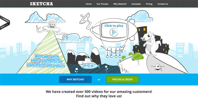
Sometimes, distinctive design can come to you quite simply. It’s the impression that your site exudes that matters more than how much coding went into it. While Sketcha’s drawings may seem juvenile to some, it really does give the site a lot of character, making it appear welcoming and friendly, which is a coveted quality for any business or organization.
Designer Atlas
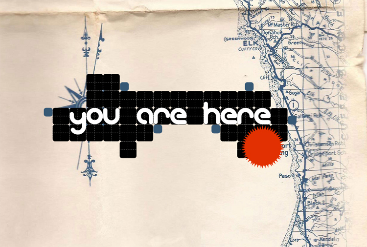
Minimalistic websites are nothing new to the design community, and with simplicity as your goal, you can’t help but be strangely attracted to the simplistic design of Designer Atlas. The site compensates with its delicate approach by featuring a background with a compass and map, which aligns with the name. Big, bold colors pull you in and garner attention.
Edita’s Casting
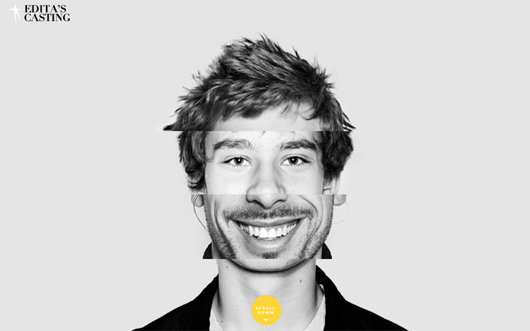
To some, there is nothing more creative than adding some dynamic elements to your site that move or change when the elements interact. Edita’s site is a worth example of this dynamism. With an interesting collage of images in the middle that make up a person’s profile, you will find yourself constantly clicking away on this site.
Do you have any unconventional designs to include? When do you break from widely-used conventions?
Frequently Asked Questions about Unconventional Web Designs
What makes a web design unconventional?
Unconventional web design refers to a design approach that deviates from the traditional norms and standards of web design. It often involves unique layouts, unusual navigation, bold color schemes, and innovative use of multimedia elements. The goal is to create a unique user experience that stands out from the typical websites, making the site memorable and engaging for the users.
Why should I consider an unconventional web design?
Unconventional web designs can help your website stand out in a crowded digital space. They can create a unique user experience, making your site more memorable and engaging. This can lead to increased user engagement, longer site visits, and potentially higher conversion rates. However, it’s important to balance creativity with usability to ensure your site remains user-friendly.
Are unconventional web designs suitable for all types of websites?
While unconventional web designs can make a website stand out, they may not be suitable for all types of websites. Websites that require a straightforward user journey, such as e-commerce sites or news portals, may benefit more from a conventional design. Unconventional designs are often more suited to creative industries, portfolio sites, or brands looking to make a strong visual impact.
How can I ensure my unconventional web design is still user-friendly?
Balancing creativity with usability is key when designing an unconventional website. Ensure that your navigation is intuitive, even if it’s not in a traditional layout. Use clear visual cues to guide users through your site. Test your design on various devices to ensure it’s responsive and accessible. Lastly, always consider your target audience and their needs when designing your site.
What are some examples of unconventional web designs?
Unconventional web designs can take many forms. Some examples include asymmetrical layouts, parallax scrolling, bold typography, unusual navigation menus, and immersive multimedia experiences. Our article features 10 wildly unconventional web designs for your inspiration.
Can unconventional web designs affect SEO?
While unconventional web designs can create a unique user experience, they can potentially impact SEO if not implemented correctly. For instance, heavy use of multimedia can slow down your site speed, a key factor in SEO. Also, if your site structure is too complex, it may be difficult for search engine bots to crawl. Therefore, it’s important to work with a knowledgeable web designer who understands the balance between design and SEO.
How can I get started with unconventional web design?
Start by researching and gathering inspiration from various sources. Sketch out your ideas and think about how you can incorporate unconventional elements into your design. Consider working with a professional web designer who has experience in creating unconventional designs. Remember, the goal is to create a unique user experience without sacrificing usability.
What are the challenges of unconventional web design?
Some challenges of unconventional web design include ensuring usability, maintaining site speed, and ensuring the design is responsive and accessible on all devices. It can also be more time-consuming and costly to create compared to traditional designs. However, with careful planning and execution, these challenges can be overcome.
Can I use templates for unconventional web design?
While templates can provide a quick and easy way to create a website, they may not offer the flexibility and uniqueness that an unconventional web design requires. Custom designs often allow for more creativity and individuality, helping your site to stand out from the crowd.
How can I measure the success of my unconventional web design?
Success can be measured through various metrics such as user engagement, bounce rate, time spent on the site, and conversion rates. User feedback can also provide valuable insights into how well your design is received. Remember, the goal of an unconventional design is to create a unique and memorable user experience.