Designers spend countless hours making careful color, typography, and layout choices, but despite those worthy efforts, nothing draws the eye as powerfully and dependably as motion. Proven evolutionary and behavioral psychology demonstrates our instinctual draw to visible elements that move and change. Despite vast technological advances, the human mind still works as it always has — with a visual penchant for dynamism and motion. With this reliable principle in mind, why shouldn’t we add some animation to our web design and Internet marketing efforts?
Adding animation to your design is a great way to make it stand apart and command attention. Below are 10 websites that have masterfully integrated animation to their designs. Hopefully they will serve as a testament to the attractive power of motion, as well as a source of inspiration for your next project.
Blue Acorn
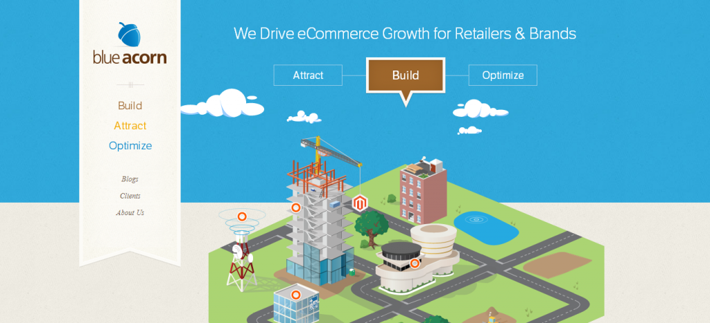 Clean web design is perfect platform for adding animation, no matter how big or small the animation is. Blue Acorn’s website is an exemplary combination of simplicity and motion. The animation takes place in the center of the screen, and by simply clicking on one of the three callouts, you see a city come to life by dropping down into place.
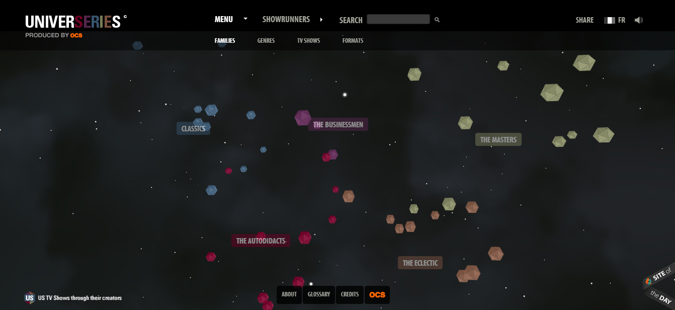
Universeries
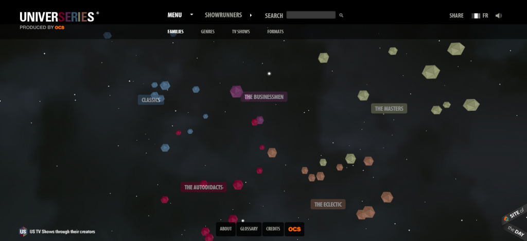 If you want to add animation to your web design, make sure that it serves a clear purpose and isn’t just there as a superficial addition. Universeries’ subtle yet creative animation is a true enhancement to the design, and not a superfluous frill.
Flip-Universum
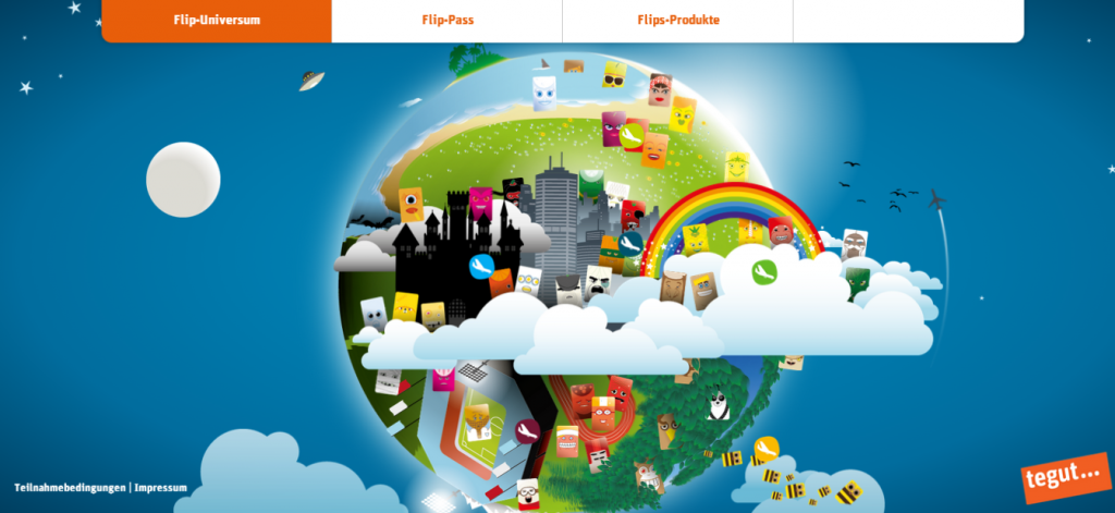 The web is an abstract medium with vast potential for animation, allowing you to escape the conventions of reality and delve into the creative. Flip-Universum’s site doesn’t look like your typical website, and with its stylized cartoon look, and the simple parallax type animation works wonderfully.
Quechua
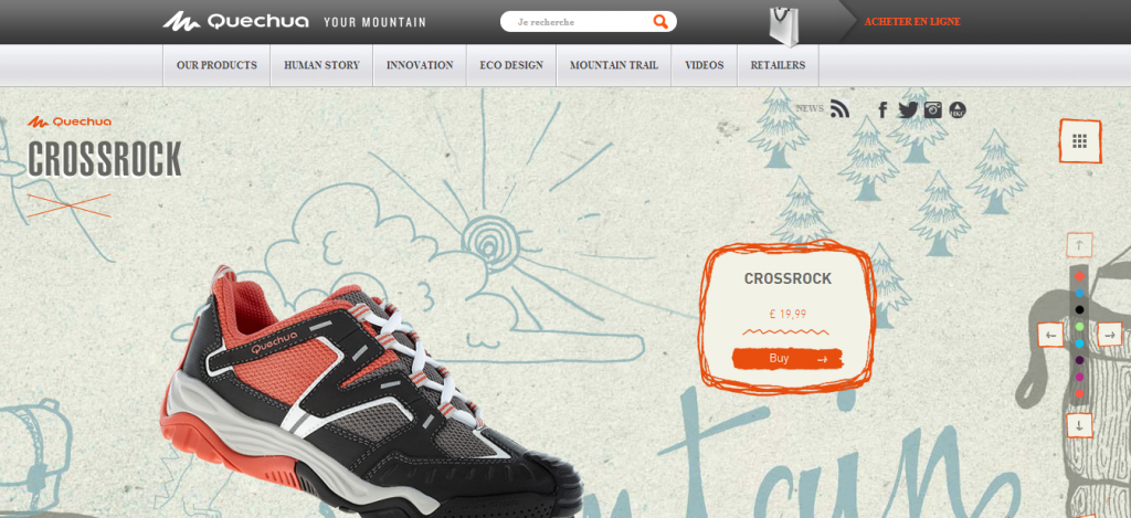 Mixing design elements is a great way to make your site stand out among the millions already on the Internet. Quechua’s CrossRock 2013 site not only mixes photography with animated elements, but it includes texture and drawings that appear to be drawn by hand. The animation is simple and balanced throughout the site.
Blacknegative
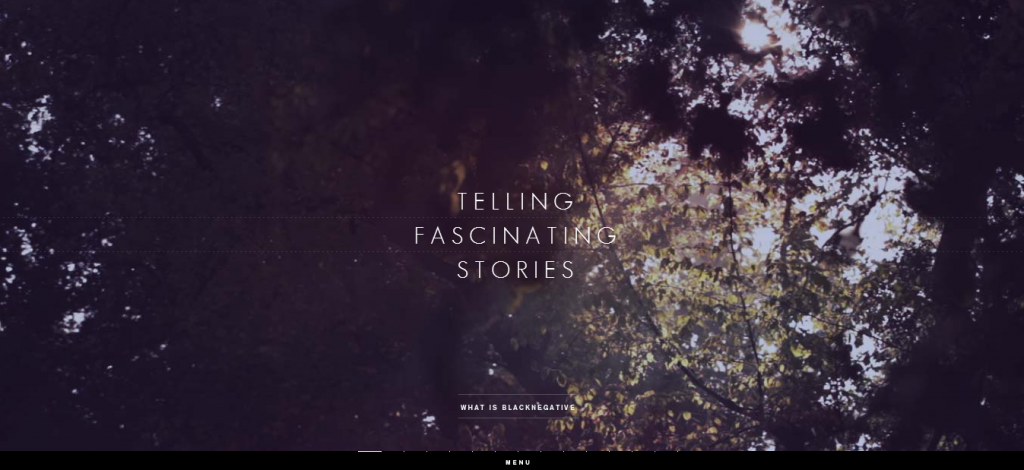 Another site that doesn’t overstate their use of animation, Blacknegative at first seems like a normal site that utilizes a horizontal layout instead of a vertical one. But, the site is cleverly constructed, adding some form of animation on every page. Some are less noticeable than others but, the elements of motion are ever-present.
Denise Chandler
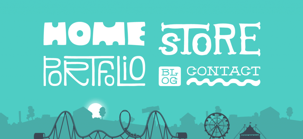 It isn’t necessary to add animation to every single page of your site. Sometimes, just adding animation to the home page serves as a more delicate implementation. Denise Chandler’s creatively-designed website does just that. The animations of a ferris wheel and roller coaster are strategically placed so that you see them but aren’t distracted by its looping animation.
Kikk Festival
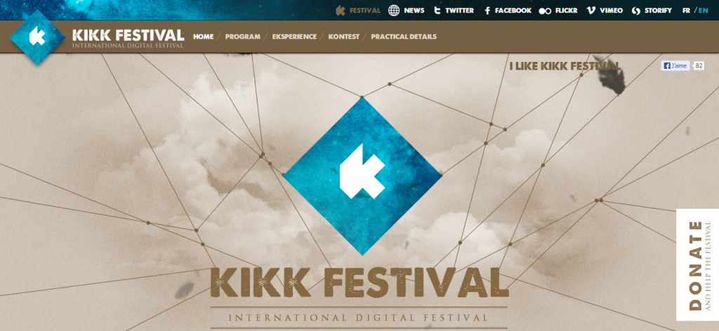 Kikk Festival’s website and the animation employed is as simple as you can get when it comes to integrating an unimposing looping animation that doesn’t interfere with the user experience. The animation is just various sized feathers floating down from the sky. The use of perspective with the feathers is a great addition that adds depth and variety.
Metal Junk
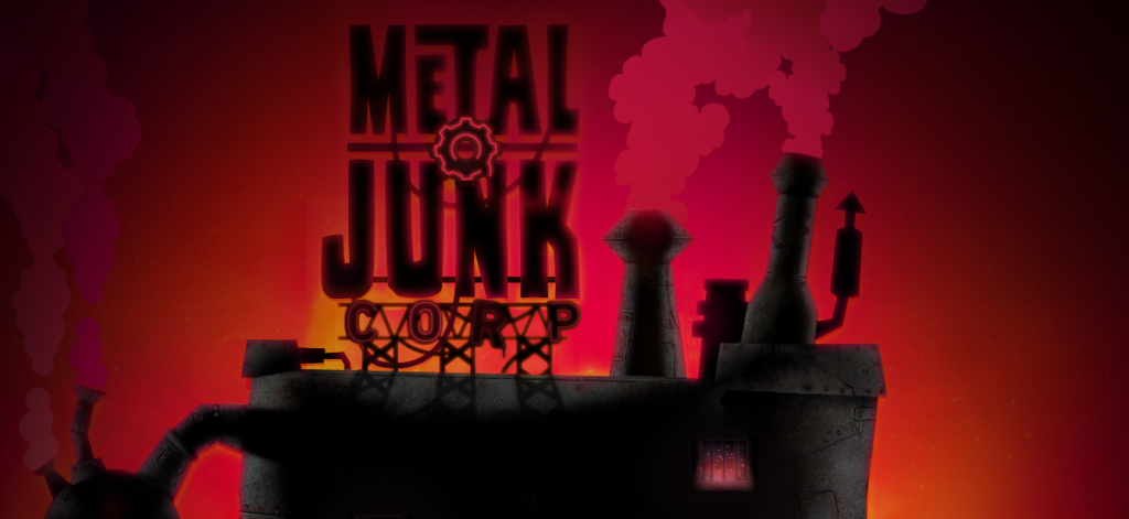 There is no better opportunity to add animation to your site than when your site deals with games or cartoons. Metal Junk takes advantage of this immediately. From the animated loading icon to the actual home page, the animation is great. Pair that with the awesome color scheme and you have a great design.
Wondros
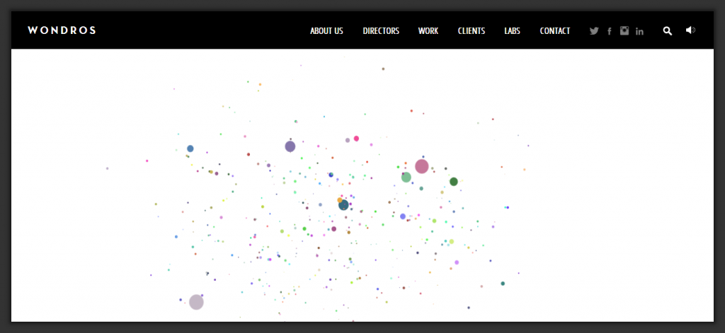 It’s not often that the animation on a site takes the name of the company into consideration, and whether accidental or intentional, Wondros does and did just that. The constant moving particle dots create various shapes and even a legible “W” to represent the site and brand itself. The animation isn’t mind-blowing, but it is a great touch.
Cube Slam
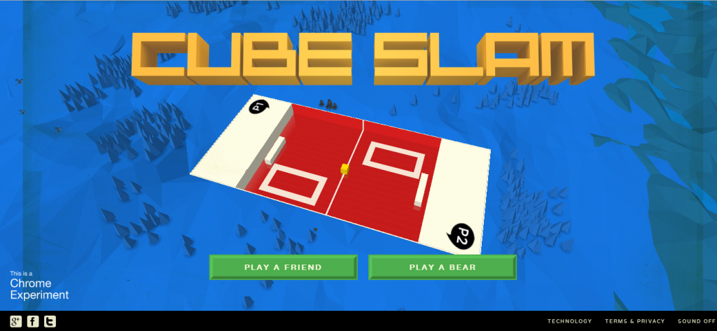 It’s a very brave move when you decide to have your animation dominate the majority of your website, but Cube Slam achieves this by designing the site around a retro video game look. You might be taken aback at first, but it’s hard to deny the draw of both the animation itself and the interactivity.
Do you have any motion-driven sites to share? Do you consider animation a sound technique for increasing design appeal, or is it a cumbersome frill that’s bogged down in browser compatibility problems, plugins, and other technical challenges?
Frequently Asked Questions about Websites with Creative Moving Elements
What are the benefits of using moving elements in web design?
Moving elements in web design, also known as animations, can significantly enhance the user experience. They can make a website more engaging, interactive, and visually appealing. They can also guide users’ attention to specific parts of the page, making it easier for them to navigate the site. Moreover, animations can help to explain complex concepts or processes in a simple, easy-to-understand way. They can also add a touch of creativity and uniqueness to a website, making it stand out from the competition.
How can I incorporate moving elements into my website?
There are several ways to incorporate moving elements into your website. You can use CSS animations, JavaScript libraries, or HTML5 Canvas. You can also use animation tools like Adobe After Effects or web design platforms that support animations, like Elementor. The choice depends on your technical skills, the complexity of the animations you want to create, and the resources you have at your disposal.
Are there any best practices for using animations in web design?
Yes, there are several best practices for using animations in web design. First, animations should enhance the user experience, not distract or annoy users. Therefore, they should be subtle, smooth, and not too fast or slow. Second, animations should be used sparingly. Too many animations can make a website look cluttered and confusing. Third, animations should be responsive, meaning they should work well on all devices and screen sizes.
Can animations affect the loading speed of my website?
Yes, animations can affect the loading speed of your website. Complex animations can make a website slower, especially on mobile devices. Therefore, it’s important to optimize your animations for performance. This can be done by using efficient animation techniques, compressing animation files, and using a content delivery network (CDN) to deliver animations faster.
What are some examples of websites with creative moving elements?
There are many websites with creative moving elements. Some examples include the School of Motion, which uses animations to teach motion design; Elementor, which uses animations to showcase its web design capabilities; and Made by Shape, which uses animations to enhance its portfolio of web design projects.
How can I learn to create animations for web design?
There are many resources available for learning how to create animations for web design. You can take online courses on platforms like Udemy or Coursera, read tutorials and guides on websites like CSS-Tricks or Smashing Magazine, or watch video tutorials on YouTube. You can also practice by creating your own animations and getting feedback from other web designers.
Are there any tools or software that can help me create animations for web design?
Yes, there are many tools and software that can help you create animations for web design. Some popular ones include Adobe After Effects, CSS3, JavaScript libraries like GreenSock or Anime.js, and web design platforms that support animations like Elementor or Webflow.
Can animations improve the SEO of my website?
Animations can indirectly improve the SEO of your website. While they don’t directly affect SEO, they can enhance the user experience, which is a ranking factor in Google’s algorithm. If animations make your website more engaging and easier to use, they can increase the time users spend on your site, reduce the bounce rate, and increase the conversion rate, all of which can improve your SEO.
What are the trends in web design animations?
Some of the current trends in web design animations include micro-animations, which are small, subtle animations used to guide users or provide feedback; parallax scrolling, which creates a sense of depth by making the background move slower than the foreground; and storytelling animations, which use animations to tell a story or explain a concept.
Can I use animations in email marketing?
Yes, you can use animations in email marketing. They can make your emails more engaging and memorable. However, not all email clients support animations, so it’s important to use them sparingly and provide a fallback for email clients that don’t support them.
 Gabrielle Gosha
Gabrielle is a creative type who specializes in graphic design, animation and photography.
