

Key Takeaways
- Web prototyping for touch gestures allows developers to create a working model of a web page with interactive elements, including touch gestures. This can be achieved using HTML, CSS, and jQuery.
- The wipetouch.js framework is a simple and responsive tool for enabling swipe gestures on mobile browsers. It can be used to create a prototype that demonstrates sliding animations and other touch gestures to stakeholders on tablet devices.
- While prototyping tools will likely incorporate touch gestures in the future, using simple code and frameworks such as wipetouch.js can provide a solid foundation for demonstrating touch gestures and basic animations on touch devices.
The working process of many web designers involves using a wireframe, a static outline of page layout that can be filled with design elements, perhaps drawn from a Photshop comp.
Developers, however, need to build functionality not available in a static wireframe. A web prototype is more like a working model that allows a developer to experiment with how things work on a web page.
In this article, you’ll learn how to create a web prototype with touch gestures using simple and easy HTML, CSS and jQuery.
Prototyping for Touch
For a recent project, I wanted to incorporate a facility to allow appropriate screens to respond to touch gestures. I designed a static wireframe and then thought to build a rich web prototype to run on tablet devices to demo to the stakeholders.
Considering it was a just a prototype and wasn’t going to be used for actual development, and given that I have a limited knowledge of programming (a common problem for designers), I was looking for an easy JavaScript framework for allowing swipe gestures to work on mobile browsers, specifically tablets and iPads.
The main requirement would be to show the primary navigation bar with sliding animation when the user swipes their finger from left to right. I started Googling, and tried various frameworks from jQuery mobile to hammer.js. All the frameworks I tried were either too complex to use or not very responsive on mobile browsers.
Finally, I tried another framework called wipetouch.js, and it worked the way I wanted. It is very simple and easy to use and the swipe gesture is very responsive in platforms like iOS and Android.
Note: the demo is primarily made for iPad and tablets but it runs well on desktop browsers, too. For desktop, in place of swipe, the user can slide the mouse pointer. To see the result, open the link on your iPad or Android tablet, then swipe the finger from left to right, right to left and top to bottom.
Files used for this exercise
- index.html for html
- style.css for styling
- common.js for JavaScript
- jquery.wipetouch.js – a framework used for swipe gesture
- and link to jQuery files
Images used in this exercise
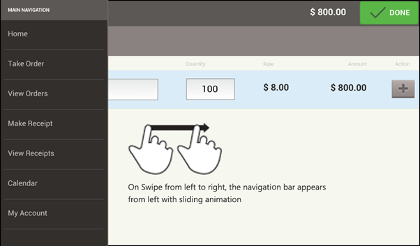
Swipe from Left to right:
Showing the left menu bar with sliding animation

Swipe from right to left:
Showing the right bar with sliding animation
Swipe from top to bottom:
In this example, I wanted to use a swipe down gesture to add the product without tapping on the + icon, because swiping is easier and quicker than tapping on a small icon.
But, as this touch gesture has a problem of discoverability, the icon to add the product is there in case the user is not aware of this gesture.

Getting Started
Note: To make the article easy and clean, I will only explain the code used to slide the left menu on swipe from left to right. For right and top menu, the code is pretty much same (and is provided in the actual demo source files).
Step 1 – Link JavaScript and jQuery files
First we’ll link the required jQuery files and wipetouch.js framework for this prototype in the HTML page. We’ll use jQuery for showing the sliding animation and wipetouch.js for the swipe gestures. Common.js is the JavaScript file used for this assignment.
<script src="https://ajax.googleapis.com/ajax/libs/jquery/1.5/jquery.min.js"></script>

<script src="https://ajax.googleapis.com/ajax/libs/jqueryui/1.8/jquery-ui.min.js"></script>

<script src="jquery.wipetouch.js"></script>

<script src="common.js"></script>
Filename – index.html
Download wipetouch.js
Step 2 – Add Images
In HTML, we will add the left_menu.png image and give it an ID. We will use this ID in the CSS and JS files.
<img src="images/left_menu.png" width="262" height="600" id="menuLeft">
Filename – index.html
Step 3 – CSS Code
In CSS, we will position the image on the page from where we want the sliding animation to start.
/* Set Position of Left bar */
#menuLeft {
    position:absolute;
    left:0;
    top:0px;
    z-index:99;
}
Filename – style.css
Step 4 – Hide the #menuLeft when page loads
$("#menuLeft").hide();
Filename – common.js
Here menuLeft is the ID applied to left_menu.png.
Step 5 – Show the navigation bar with sliding animation when user swipes from left to right
wipeRight: function(result) {
    $("#menuLeft").show("slide", { direction: "left" }, 1000);
}
Filename – common.js
Here wipeRight is the function from wipetouch.js that is triggered when the user swipes the finger from left to right.
On this swipe action, we show the menuLeft image with sliding animation from the left direction.
Step 6 – Slide back the image on tap
Now we need to slide same image back the when user taps on the image.
$("#menuLeft").click(function () {
    $("#menuLeft").hide("slide", { direction: "left" }, 1000);
});
On tapping on the image, it slides back to be hidden.
Note: To make the article easy and clean, I have only explained the code used to slide the left menu on swipe from left to right. For swiping from right to left and swiping from top to bottom, the code is pretty much same and given in actual demo source files.
In Conclusion
No doubt the available prototyping tools will soon cover touch gestures, but right now this solution does the trick. I hope this demo provides a good base for you to build a prototype to show touch gestures and basic animation on touch devices using easy simple code.
Please let me know if you have any suggestions for improvements. Please share your thoughts, opinions and ideas in the comments section below.
Further Reading
http://www.netcu.de/jquery-touchwipe-iphone-ipad-library
Another nice demo created using touchwipe.js to slide show on swipe
http://eightmedia.github.com/hammer.js/
Another very popular JS framework for mobile devices
http://www.appliness.com/multitouch-with-hammer-js/
A nice demo created using hammer.js to show drag and drop
Frequently Asked Questions on Web Prototyping for Touch Gestures
How can I detect a finger swipe through JavaScript on iPhone and Android?
Detecting a finger swipe through JavaScript on iPhone and Android involves listening for touch events. These events include ‘touchstart’, ‘touchmove’, and ‘touchend’. When a user touches the screen, the ‘touchstart’ event is fired, followed by ‘touchmove’ events as the finger is moved, and finally the ‘touchend’ event when the finger is lifted. By comparing the positions at ‘touchstart’ and ‘touchend’, you can determine the direction of the swipe.
What is a simple swipe with vanilla JavaScript?
A simple swipe with vanilla JavaScript involves detecting the start and end points of a touch event, and then comparing these to determine the direction of the swipe. This can be done using the ‘touchstart’, ‘touchmove’, and ‘touchend’ events. The ‘touchstart’ event gives the initial position, the ‘touchmove’ event gives the current position as the finger moves, and the ‘touchend’ event gives the final position.
How can I use touch events in JavaScript?
Touch events in JavaScript are used to handle user interactions with a touch-enabled device. These events include ‘touchstart’, ‘touchmove’, ‘touchend’, and ‘touchcancel’. You can add event listeners for these events to an element using the ‘addEventListener’ method. The event object passed to the event handler contains information about the touch event, such as the list of touch points and the type of event.
How can I detect touch swipe gestures in HTML5?
Detecting touch swipe gestures in HTML5 involves listening for touch events and determining the direction of the swipe based on the change in position. This can be done using the ‘touchstart’, ‘touchmove’, and ‘touchend’ events. The ‘touchstart’ event gives the initial position, the ‘touchmove’ event gives the current position as the finger moves, and the ‘touchend’ event gives the final position.
What is the difference between touch events and mouse events?
Touch events and mouse events are both used to handle user interactions, but they are triggered by different actions. Mouse events are triggered by actions with a mouse, such as clicking, moving the mouse, or scrolling the wheel. Touch events, on the other hand, are triggered by actions on a touch-enabled device, such as touching the screen, moving the finger on the screen, or lifting the finger from the screen.
How can I simulate touch events for testing?
You can simulate touch events for testing using tools like Chrome’s DevTools. In the DevTools, you can enable the device mode, which allows you to simulate different devices and touch events. You can also use JavaScript to create and dispatch custom touch events.
How can I handle multi-touch events?
Multi-touch events can be handled in a similar way to single touch events. The event object passed to the event handler contains a ‘touches’ property, which is a list of all the current touch points. By iterating over this list, you can handle each touch point individually.
How can I prevent the default touch behavior?
You can prevent the default touch behavior by calling the ‘preventDefault’ method on the event object in the event handler. This can be useful if you want to implement custom touch behavior, such as a custom swipe gesture.
How can I detect the direction of a swipe?
The direction of a swipe can be detected by comparing the start and end positions of the touch event. If the end position is greater than the start position, the swipe was to the right (for horizontal swipes) or down (for vertical swipes). If the end position is less than the start position, the swipe was to the left (for horizontal swipes) or up (for vertical swipes).
How can I handle touch events in a cross-browser compatible way?
Handling touch events in a cross-browser compatible way can be challenging due to differences in how browsers implement touch events. However, libraries like Hammer.js provide a unified API for handling touch events across different browsers. Alternatively, you can use feature detection to check if touch events are supported and fall back to mouse events if they are not.