Typography: Readability & Legibility (Part 2)
Last week we looked at the major factors which can affect the readability of text. This week we’re looking at legibility. As a quick refresher on the difference between the two:
- Readability is whether an extended amount of text—such as an article, book, web page—is easy to read.
- Legibility is whether a small burst of text such as a sign or a headline is instantly recognizable.
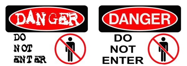
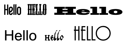
Unless text is perfectly legible, it takes longer to read it. The situations where it’s most important for text to be legible is where information is scanned quickly or skimmed through by the reader. And we all know most people skim through web pages, glance at signs and headlines and scan catalogs. So if you’re designing anything like that you need to make sure the text is legible otherwise information will be missed or simply ignored. If you’re running from a burning building or trying to find your way using road signs, it’s vital that they should be instantly recognizable. The sign below on the left is not ideal. Word RecognitionA major factor which influences legibility is the word or words themselves. Some words lend themselves to almost any typeface and people will understand it, while more unusual or less frequently used words need to be clear and legible.
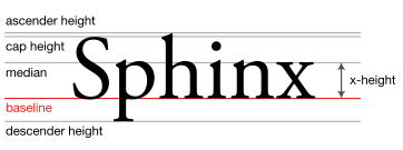
 Avoid very small or very large x-heightsVery large x-heights in typefaces decrease legibility. The x-height is defined as the distance between the baseline and the mean line in a typeface. This is generally considered to be the height of the letter x in any font (it also includes the letters u, v, w, and z.)
 Image Credit: WikipediaFor example in some typefaces if the x-height is too large, then the letter i can barely be differentiated from the letter l. A very small x-height also decreases legibility. Our eyes find it distracting when the body of the letter is too small compared to the ascenders and the cap height.
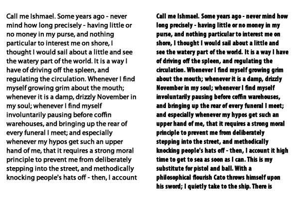
 Lowercase lettersAs mentioned in the post on readability, TEXT SET IN ALL CAPS IS THE LEAST LEGIBLE BECAUSE OUR EYES RECOGNISE WORDS BY THEIR SHAPE AS WELL AS THE LETTERS THEY INCLUDE. ALL CAPS MEAN EACH WORD IS THE SAME SHAPE. You might have found that you read the last two sentences ever so slightly slower than the rest of this post. All caps are suitable for very short sentences or headlines.Another Problem Occurs When You Use Title Case In Sentences. Title Case Is A Mixture Of Upper And Lower Case And Is Suitable For Titles Only Because It Is Too Hard To Read.Avoid extra heavy or condensed fontsIn the paragraphs below, the paragraph on the left is easy to read set in Myriad Pro Regular. The paragraph on the right is also Myriad Pro but the style is Condensed Bold and it’s much harder work to get through the full paragraph.
 To sum up, text needs to be most legible where it will be scanned or skimmed over very quickly. Some guidelines to make type most legible:
- Use typefaces with average x-heights
- Use lowercase letters with capitals where appropriate
- Avoid condensed or slanted type
- Add extra letter space in very small point sizes and less letter spacing in larger sizes
These are of course just guidelines. Even if you break these rules and go for unusual typefaces, the type is still readable but it just might take longer to read. It really depends on the project you’re working on, but if you’re aware of some of the issues it can help you choose your typefaces.What else would you add to the list?
Frequently Asked Questions (FAQs) about Typography, Readability, and Legibility
What is the difference between legibility and readability in typography?
Legibility and readability are two distinct concepts in typography. Legibility refers to the clarity of typeface and how easily individual characters or letters can be distinguished from each other. It is influenced by factors such as font size, spacing, and contrast. On the other hand, readability refers to how easily blocks of text, such as sentences or paragraphs, can be read and understood. It is influenced by factors such as line length, line spacing, and text organization.
How does font size affect legibility and readability?
Font size plays a crucial role in both legibility and readability. A font size that is too small may make individual characters hard to distinguish, reducing legibility. Similarly, if a block of text is set in a small font size, it may strain the reader’s eyes, reducing readability. Therefore, it’s important to choose a font size that is appropriate for your audience and the medium of your text.
How does line spacing affect readability?
Line spacing, also known as leading, significantly impacts readability. If lines of text are too close together, it can make the text block appear dense and intimidating, discouraging readers. On the other hand, too much space between lines can disrupt the reader’s vertical rhythm, making it harder to move from one line to the next. Optimal line spacing makes the text more inviting and easier to read.
What is the role of contrast in legibility?
Contrast, specifically color contrast, is a key factor in legibility. High contrast between text color and background color makes individual characters stand out more clearly, enhancing legibility. Conversely, low contrast can make text hard to distinguish, especially for readers with visual impairments. Therefore, it’s important to choose color combinations that provide sufficient contrast.
How does text organization affect readability?
Text organization greatly influences readability. Well-organized text helps guide the reader’s eye and makes the content easier to understand. This can be achieved through the use of headings, subheadings, bullet points, and paragraphs. Disorganized text, on the other hand, can be overwhelming and difficult to follow, reducing readability.
What is the impact of font style on legibility?
Font style can significantly impact legibility. Some font styles, such as serif and sans serif, are generally considered more legible than others, such as script or decorative fonts. This is because the characters in serif and sans serif fonts are more distinct and easier to recognize at a glance.
How does line length affect readability?
Line length, or the number of characters per line, can significantly impact readability. If a line of text is too long, the reader’s eye will have a hard time focusing on the text and following the line to the end. If it’s too short, the eye will have to travel back to the beginning of the next line too frequently, disrupting reading flow. An optimal line length enhances readability by making the text comfortable to read.
What is the role of white space in readability?
White space, or negative space, plays a crucial role in readability. It helps separate individual elements such as text blocks, images, and other components, making the layout easier to understand. Adequate white space can make a page appear clean and organized, improving the overall reading experience.
How can I improve the legibility of my text?
There are several ways to improve the legibility of your text. Choose a clear, easy-to-read font style and size. Ensure there is sufficient contrast between your text color and background color. Use proper spacing between characters, words, and lines. Also, consider the medium and viewing conditions where your text will be displayed.
How can I enhance the readability of my content?
To enhance the readability of your content, organize your text well using headings, subheadings, bullet points, and paragraphs. Choose an appropriate line length and line spacing. Use a font size that is comfortable to read. Also, make good use of white space to separate different elements and make your layout easy to understand.
Jennifer Farley is a designer, illustrator and design instructor based in Ireland. She writes about design and illustration on her blog at Laughing Lion Design.

