

Key Takeaways
- Avoid auto-playing music or sounds on your website as it can be irritating and disruptive to users, especially those who are browsing multiple tabs.
- Interfering with browser behavior, such as resizing the window or automatically opening links in new pages, disempowers the user and can lead to frustration and confusion.
- Websites should strive for good legibility and readability, avoiding issues such as too small text, insufficient line spacing, poor contrast, and inappropriate text length.
- A clear, consistent, and visually pleasing hierarchy is essential to aid in the “scannability” of content, especially since most users skim and browse rather than reading entire pages online.
I guess the longer alternate title for this article is: “or why I’ll most likely leave your website in the first few seconds of the page having rendered… and how to avoid this behavior in your users.”
I’ve covered getting type on the web, legibility & readability, and more niche topics like quotation styling exhaustively so it’s time for something a little lighter before I continue next week in jumping back into the thick of things.
Most seasoned web users have a number of pet peeves that will likely ensure we leave whatever site we’ve stumbled on. While we spend more time dealing with a poor website (and swearing under our breath) the more vital and hard-to-find that information is elsewhere, everyone has a threshold where we throw our hands into the air and give up.
If you’re a veteran of the web you probably know how to avoid or on-the-fly improve the quality of the web page you’re on, but most users — including those who rarely use the web or even a computer in general and may have a higher tolerance for egregious design and usability — will give up, or importantly, go elsewhere.
These peeves can loosely be delineated into two broad categories:
- Disempowerment of the user
- Inhibiting atrocious design and typography
Let’s get straight into them:
1. Music from the Get-go
(AKA: If I find out where you live…)
I think is probably the worst of the lot, and overly exacerbated when using a tabbed browser.

You’re browsing, opening a number of new tabs and suddenly one of the new pages you haven’t even gotten to yet starts emitting sounds. Immediately you scramble in great annoyance trying to locate the offending tab. Of course thanks to the poor design the player controls are either incredibly difficult to locate or just omitted entirely, forcing you to close en masse the recently opened tabs because you can’t figure out which one is the culprit.
I almost always listen to music while working online so this one is right up there as number one for me.
Unless you want people to burn you in effigy, don’t auto-play anything.
2. Interfering With Browser Behavior
Again most annoying when using a tabbed browser, you open a new tab and suddenly your window jolts and everything is resized. Worst of all is when a website or web application does this again and again each time you load a new page within the site after having sized the window back to the dimensions you liked.
A related grievance that still retains popularity is vulgar use of target="_blank" in the automatic opening of a link in a new page. As Jakob Nielsen notes:
“Designers open new browser windows on the theory that it keeps users on their site. But even disregarding the user-hostile message implied in taking over the user’s machine, the strategy is self-defeating since it disables the Back button which is the normal way users return to previous sites. Users often don’t notice that a new window has opened, especially if they are using a small monitor where the windows are maximized to fill up the screen. So a user who tries to return to the origin will be confused by a grayed out Back button.”
(Emphasis mine.)
Anything that disempowers the user from their own environment should be reconsidered with great skepticism; is this really necessary? Will we get a batch of hate mail asking us to not do this? Could this potentially disrupt or confuse users? I’d wager the likely answer is yes, and if it is, don’t do it.
3. A “Launch” Homepage
No. Just no. This is when a website first loads up an entry page with some kind of graphic (often animated) and a number of obscure “continue” or “enter” links which require visual location and pressing to continue to any actual content.
Any website that does this just created an extra step and thus an extra hurdle and barrier for all of its users to get through who enter via the homepage.
Flash websites are absolutely notorious for this, and for the most part I just won’t bother; good-bye; Ctrl + W.
4. Poor Legibility & Readability
Not quite as annoying as the preceding two, but passively frustrating because we can’t read anything — at least not comfortably and at length. Common examples:
- Too small: probably the most utmost common of all typographic errors — here the text is just too small to read without causing strain. The trend in setting text at stupidly small sizes is thankfully been largely binned, and was worsened back in the earlier days of Internet Explorer as it could not resize the text size of a page if it was set in pixels (which was and is still the prevalent method of sizing on the web).
- Little or no leading whatsoever: lines seem to melt into another because of meager if not a complete lack of vertical spacing — incredibly difficult to read.
- Too long or too short measures: either the measure is too long and the eye can’t find the next line or it’s rapidly zig-zagging down the column after just a few words. To overcome this the user has to resize the browser window or up the font size, and that might not do it either depending on how things have been sized.
- Poor contrast: this is rampant on sites where a designer has decided that light gray text on a stark-white background looks sleek or “modern”; even “better” if at 10 pixels apparently. This is ridiculously troublesome to many users because it isn’t easily remedied by mashing Ctrl and + to up the font-size — changing the font color of a rendered page requires the use of web development plugins.
There is a reason services like Readability exist: there are just simply too many websites whose designers have given little to no consideration to the legibility and readability of their text. As much as I like good services like Readability, in an ideal world the legibility and readability functionality it provides should be made redundant (the quick saving and storing of to-read pieces is of course very nice). Let’s strive to make the text we put online equally as enticing and comfortable to read as the best periodicals and page-turner novels.
But What About Fonts?
You’ll note I’ve omitted mentioning font selection entirely. A site can feature a great range of fonts, each with good and bad aesthetic properties and it can still retain legibility and readability. The above are concerns are far more prevalent and in need of addressing first — as Jeff Croft states: “typography is more than picking a ‘cool’ font.”
5. Poor or Lacking Visible Hierarchy
Continuing with typography—books have title pages, indexes, chapter headings, headings, sub headings, tables and diagrams with labels, emphasis, footers and footnotes, glossaries and so on. This is an information hierarchy supported by good typography and a solid grid, and is very much applicable to web design yet oft forgotten.
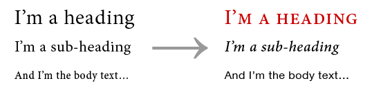
The colors might be on the mark, the text might be legible and the CSS and markup might be valid but the content can still seem dumped with little or no delineation between the various content types on the page; a blockquote looks like its neighboring referencing paragraphs, headings just look like a bolded or italicised single line, and so on.
Good content needs a solid, consistent, — and for extra merit — pleasing visual hierarchy to aid in “scannability”. Most of us aren’t reading complete pages online; we skim and browse, searching for that single section, or paragraph or even line of information that we want (think phone numbers, dates, email addresses, and so on).
Closing
There are of course many more annoyances (breaking content up over multiple “pages”, not loading textual content at all unless JavaScript is permitted, a complete lack of whitespace, blatant violation of basic design conventions, Flash-only websites, no context “click here” links, senseless setting of Comic Sans, …), but upon quick reflection the above would probably be my top five.
What are your top five peeves in web design?
Addendum on JavaScript
Years of browsing the web with these annoying design choices haunting me (in addition to security provided) have led me to defacto block all JavaScript (even first-party scripts from the root domain I am visiting).
I do this using a Firefox plugin called NoScript. It allows me to set up whitelists on the go while browsing offering me a simple yet fine-tuned and more secure browsing environment on the web (JavaScript is of course the number one avenue malicious websites use to track and exploit the browser into running malicious code).
If you’re interested in plugins and such, I’ve written on how I browse the web.
Frequently Asked Questions about Web Design Peeves
What are the most common mistakes in web design?
The most common mistakes in web design include poor navigation, cluttered layout, excessive use of pop-ups, slow loading times, and lack of mobile optimization. These mistakes can frustrate users and lead to a high bounce rate. It’s crucial to prioritize user experience in web design to keep visitors engaged and encourage them to return.
How does poor navigation affect a website’s performance?
Poor navigation can significantly impact a website’s performance. If users struggle to find the information they need, they are likely to leave the site and not return. This can lead to a high bounce rate, which can negatively affect the site’s search engine ranking.
Why is a cluttered layout a web design peeve?
A cluttered layout can overwhelm users and make it difficult for them to find the information they need. It can also slow down the loading time of the site, which can frustrate users and lead to a high bounce rate. A clean, organized layout is more user-friendly and can improve the overall user experience.
How do pop-ups affect user experience?
Excessive use of pop-ups can significantly disrupt the user experience. They can be annoying and distracting, and can lead to users leaving the site. It’s important to use pop-ups sparingly and ensure they provide value to the user.
Why is mobile optimization important in web design?
With the increasing use of mobile devices to access the internet, mobile optimization has become a crucial aspect of web design. A site that is not optimized for mobile can be difficult to navigate on a small screen, which can frustrate users and lead to a high bounce rate.
How can slow loading times affect a website?
Slow loading times can significantly impact a website’s performance. Users are likely to leave a site if it takes too long to load, which can lead to a high bounce rate and negatively affect the site’s search engine ranking.
What is a high bounce rate and why is it bad?
A high bounce rate indicates that a large percentage of visitors leave a site after viewing only one page. This can be a sign that the site is not engaging or user-friendly, and can negatively affect the site’s search engine ranking.
How can I improve the navigation of my website?
Improving website navigation can be achieved by ensuring that all important pages are easily accessible from the homepage, using clear and descriptive labels for navigation elements, and including a search function for users to easily find the information they need.
How can I reduce the loading time of my website?
Reducing website loading time can be achieved by optimizing images, minimizing the use of heavy scripts and plugins, and using a reliable hosting service. It’s also beneficial to use a content delivery network (CDN) to ensure fast delivery of content to users.
How can I make my website more mobile-friendly?
Making a website more mobile-friendly can be achieved by using responsive design, which automatically adjusts the layout of the site to fit the screen size of the device. It’s also important to ensure that all elements of the site, including navigation and forms, are easy to use on a small screen.

