

We commonly quote and reference the words of others. Language conventions, style guides and typographic distinction are used to subtly (and sometimes not so subtly) distinguish a quotation from the other semantic elements on the page. This article examines the typography of quotations.
Key Takeaways
- Inline quotations and block quotations are marked up differently on web pages, using the ‘q’ and ‘blockquote’ elements respectively. The use of quotation punctuation helps to distinguish quoted material.
- A variety of characters are used in quoting conventions across different languages, with the initial quote often indented using a quote indentation bar or an em dash.
- Typography can enhance quotations, with inline quotations requiring minimal additional styling. Blockquotes, however, benefit from additional lead space, alignment adjustments, and potentially a change in background or text color.
- CSS can be used to automatically add quotation marks, create hanging punctuation, and display the source of a quote. This allows for a clean, simple, and effective approach to enhancing the typography of quotations.
Distinguishing Elements and Characters
In web pages we “mark up” quotations in two ways: inline quotations (those that appear within a block of copy), and separate block quotations (e.g. an entire paragraph or a list, or a mixture thereof). Respectively, we use the q and blockquote elements for these.
Although all fairly similar we use linguistic conventions to signify that something is being quoted, generally by enclosing quoted material with quotation markers. Quotation punctuation is used also for other purposes (for emphasis, to denote irony, et cetera) but this extended usage is even more varied, sometimes contentious and quite beyond the typographic concerns at hand.
Common punctation markers:
| Description | Character | Unicode ref. | HTML ref. |
|---|---|---|---|
| Single curved quote, left | ‘ | U+2018 |
‘ |
| Single curved quote, right | ’ | U+2019 |
’ |
| Double curved quote, left | “ | U+201C |
“ |
| Double curved quote, right | ” | U+201D |
” |
| Low single curved quote, left | , | U+201A |
‚ |
| Low double curved quote, left | „ | U+201E |
„ |
| Double angle quote, left | « | U+00AB |
« |
| Double angle quote, right | » | U+00BB |
» |
| Single angle quote, left | ‹ | U+2039 |
‹ |
| Single angle quote, right | › | U+203A |
› |
With just these ten characters we can cater for the quoting conventions of over 50 languages, including English, just about every European language, as well as Japanese, Korean, Chinese, Russian, Hebrew, Thai, Vietnamese, and more. There is only one more character needed to accommodate for an additional quoting convention, whereby the initial quote is indented with a quote indentation bar (“―”; U+2015; ―) or alternatively an em dash (—), for example:
Uncle Charles smoked such a black twist that at last his nephew suggested to him to enjoy his morning smoke in a little outhouse at the end of the garden.
―Very good, Simon. All serene, Simon, said the man tranquilly. Anywhere you like. The outhouse will do me nicely: it will be more salubrious.
―Damn me, said Mr Daedalus frankly, if I know how you can smoke such villainous awful tobacco. It’s like gunpowder, by God.
―It’s very nice, Simon, replied the old man. Very cool and mollifying.
Every morning, therefore…
—Joyce, J. 1992, A Portrait of the Artist as a Young Man, Modern Classics Edition, Penguin, New York, p. 62.
Enriching Quotations
Besides picking the right characters to punctuate our quotations with (avoid “dumb quotes”—these are prime markers and used to notate hours and minutes, or feet and inches, not quotations), we can enhance our quotations typographically.
The Basics
Inline quotations are fairly simple, and should receive the same typographic treatment and respect that the copy they are set amongst already receive; besides properly notating them with quotation punctuation there is little reason to disrupt the flow of text by applying additional styling. This leaves blockquotes a bit alone and by themselves, often somewhat neglected. To cater for blockquotes, remember these three general principles:
- provide additional lead (space) before and after block quotations (being cautious of the page baseline) to ensure the block quotation is visibly separate from the rest of the copy
- set verse quotations flush left and ragged right
- indent and center verse quotations
To further signify a blockquote as a separate citation, it could be hugged by additional margins on the left and right (be careful: don’t squash the text), or be aligned differently to the body copy (e.g. ragged right). Be prepared to experiment—for example, gently change the background color, or lighten the text color, or if you’re keen to be bold perhaps swap from a serif to a sanserif—but if unsure stick with the basics, because they work.
Graphical or Larger Quotation Marks
A popular trend has been to use larger quotation marks for a blockquote, often with the use of (unnecessary) graphics, and often applied to all block quotations on the website. Creativity stepped in and now we have a broad range of quotation styles, ranging from simple to rather extravagant, for example:
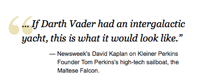
Larger quote styling from Digital Daily.
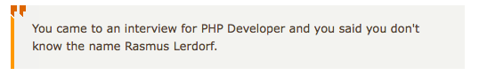
Quote styling from Chris Shiflett’s blog.

CNET’s block quote styling.
Keeping it Simple
It is, however, possible to keep things nice and simple, stupid—as the maxim goes. A lot is possible with a bit of clever CSS to spice up blockquotes.
For instance, we can automatically add quotation marks to our quotations with CSS using pseudo-selectors:
blockquote:before { content: "“"; }</code>

<code>blockquote:after { content: "”"; }
Note, you will need to ensure your document is using the UTF-8 character encoding for these characters to render properly. Set it with a
meta element in the header:<meta http-equiv="Content-Type" content="text/html; charset=UTF-8" />In addition, we can fake hanging punctuation at least with the opening quotation mark using a negative text indent:
blockquote { text-indent: -0.4em; }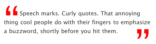
Larger double quotation marks, without the use of images as detailed on 24ways.org by Simon Collison.
And Something for the Advanced…
The blockquote element allows for a number of attributes and variables to be defined. The interesting ones are:
- the
citeattribute, allowing us to reference the source of the quote - the
langandxml:langattribute, to define the language of the quoted text - the
dirattribute, in which the language directionality is noted, e.g. rtl (right-to-left) and ltr (left-to-right)
With a bit of neat CSS we can automatically pull the value of the cite attribute and display it below the blockquote to reference the source:
blockquote[cite]:after {
display: block;
text-align: right;
content: "2014 " attr(cite);
font-style: normal;
font-size: 1.2em;
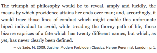
}Here we call upon the contents of the
cite attribute of the blockquote
element and display it after the element, with the prefix of what is defined in content: "";, in this case an em dash. For example the following markup with the above styling applied—<blockquote cite="de Sade, M. 2009, Justine, Modern Forbidden Classics, Harper Perennial, London. p. 1.">
<p>The triumph of philosophy would be to reveal, amply and lucidly, the means by which providence attains her ends over man; and, accordingly, it would trace those lines of conduct which might enable this unforunate biped individual to avoid, while treading the thorny path of life, those bizarre caprices of a fate which has twenty different names, but which, as yet, has never clearly been defined.</p>
</blockquote>would render as such—
Further Reading
- Smashing Magazine: Block Quotes and Pull Quotes: Examples and Good Practices
- SitePoint CSS Reference:
quote - SitePoint CSS Reference:
blockquote - Wikipedia: Quotation mark
- Wikipedia: Non-English usage of quotation marks
- Wikipedia: Quotation mark glyphs
Errata
Florent Verschelde kindly noted that cite should only be used to point to the URI of the source, not to reference the source semantically. Further, many browsers do not make variables pulled from the cite attribute selectable and thus copy-able, and you can’t wrap it as an anchor to make it a link if you wanted to link to the source.
With regards to correct usage including changes to blockquote, q, and cite elements (and cite attribute) in HTML5 check out HTML5Doctor.com’s article on quoting in HTML. The article is a comfortable read and covers the topic very well — highly recommend having a look.
Frequently Asked Questions on Typography of Quotations and Citations
What is the importance of typography in quotations and citations?
Typography plays a crucial role in quotations and citations. It helps in enhancing readability, providing emphasis, and creating a visual hierarchy. Good typography can make a significant difference in how the quoted text is perceived and understood. It can highlight the importance of the quote, draw attention to key points, and make the text more engaging. Moreover, it can also help in distinguishing the quoted text from the rest of the content, making it easier for readers to identify and understand the context of the quote.
How can I improve the typography of my quotations?
Improving the typography of your quotations involves several factors. Firstly, consider the font style and size. Choose a font that is easy to read and complements the overall design of your document or webpage. The size of the font should be appropriate, not too large or too small. Secondly, pay attention to the spacing. Proper line spacing and letter spacing can significantly enhance readability. Lastly, consider using different styles such as italics or bold for emphasis.
What are some common mistakes in typography of quotations?
Some common mistakes in typography of quotations include using too many different fonts, incorrect use of punctuation, improper alignment, and inconsistent formatting. Using too many fonts can make the text look cluttered and confusing. Incorrect use of punctuation can change the meaning of the quote. Improper alignment and inconsistent formatting can make the text difficult to read and understand.
How does typography affect the readability of citations?
Typography greatly affects the readability of citations. A well-designed citation makes it easy for readers to identify the source of the information. It should be clear, concise, and consistent. The font style and size, spacing, and alignment all contribute to the readability of citations. A poorly designed citation can be confusing and difficult to read, which can detract from the overall quality of the document or webpage.
What are some best practices for typography of citations?
Some best practices for typography of citations include using a consistent and readable font, proper spacing, and correct alignment. The font should be clear and easy to read. The spacing should be appropriate, not too tight or too loose. The alignment should be consistent throughout the document or webpage. Additionally, it’s important to follow the specific citation style guide (such as APA, MLA, or Chicago) for correct formatting and punctuation.
How can I use typography to emphasize a quote?
Typography can be used to emphasize a quote in several ways. You can use a larger font size, a different font style, or a different color to make the quote stand out. You can also use italics, bold, or underline for emphasis. However, it’s important to use these techniques sparingly to avoid overwhelming the reader.
What is the role of color in typography of quotations and citations?
Color plays a significant role in typography of quotations and citations. It can be used to highlight a quote, differentiate the quoted text from the rest of the content, or emphasize a particular point. However, it’s important to choose colors that are easy on the eyes and complement the overall design of the document or webpage.
How can I use typography to create a visual hierarchy in my document or webpage?
Typography can be used to create a visual hierarchy in your document or webpage by differentiating the quoted text from the rest of the content. You can use different font styles, sizes, and colors to distinguish different levels of information. This can help guide the reader’s eye and make the content more digestible.
What are some good resources for learning more about typography of quotations and citations?
There are many resources available online for learning more about typography of quotations and citations. Websites like Typography Guru, Typewolf, and Inkbot Design offer a wealth of information on the subject. You can also find books on typography at your local library or bookstore.
How can I practice and improve my skills in typography of quotations and citations?
The best way to practice and improve your skills in typography of quotations and citations is by doing. Try experimenting with different font styles, sizes, and colors. Pay attention to the details, like spacing and alignment. Look at examples of good typography and try to replicate them. Over time, you’ll develop a better understanding of what works and what doesn’t.

