
Web designer folk often discuss new year web trend predictions but what about logo trends? As the saying goes, ‘the devil is in the details’ and even seemingly small changes to your logo can make a big impact on the growth of your brand.
While few of these forecasted trends are entirely new, here are 5 specific looks that we’re already seeing more of in 2016.
Key Takeaways
- Monoline logos, created from a single line that doesn’t deviate in weight, have gained popularity for their clean, artisanal look. These logos work best in industries such as food and beverage trade, small boutiques and salons.
- Wordmarks, typographical designs that work as visual symbols for a brand, offer a timeless and minimalistic approach to logo design. They can increase brand recall by keeping the design content within the text.
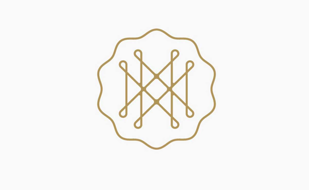
- The use of negative space has been a growing trend in logo design. It establishes balance and harmony between design elements and can create memorable optical illusions.
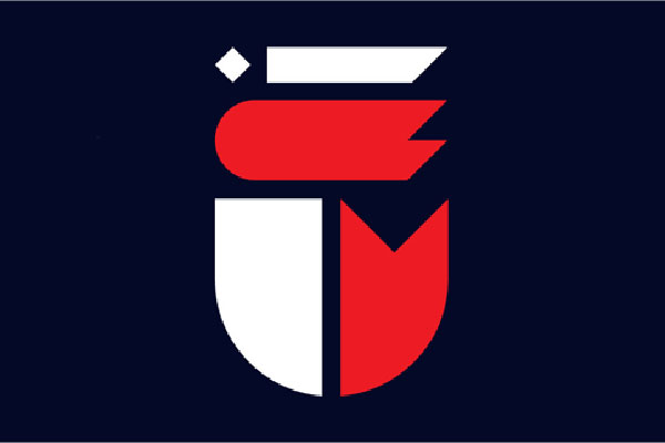
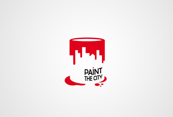
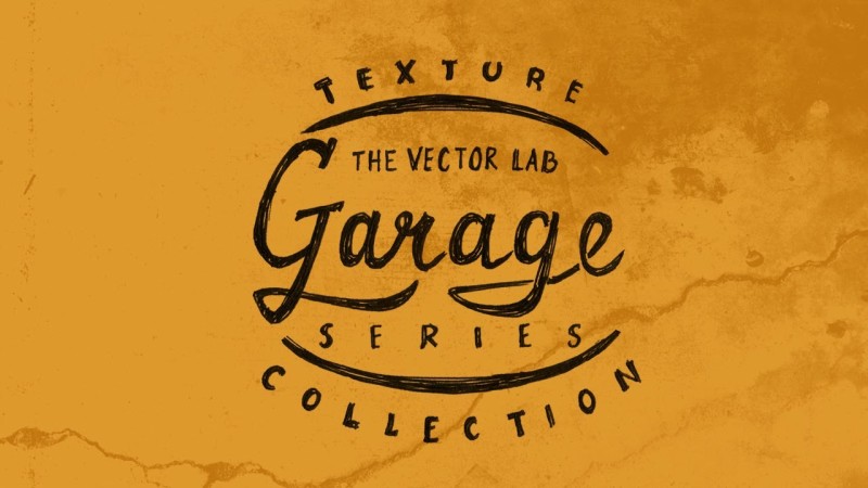
- Duotones and handmade looks are also trending in 2016. Duotones, using two colors, allow logos to speak for themselves and can be easily identified by targeted markets. Handmade looks, on the other hand, make designs seem more personable and authentic, but are best suited for more artistic fields and blogs.
The Monoline
Last year we started seeing line art take shape thanks to designers still embracing flat design and it looks like that will be carrying over to logo design.
Monoline logos are exactly how they sound. They are logos crafted from a single line that doesn’t deviate in weight – it looks like it could be fabricated from a single strand of wire. The monoline provides a stripped down, bare bones look while giving a nod to the popular iconography of the web.
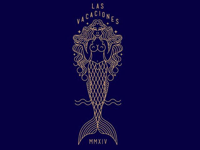
Single line work is usually monotone too, so it gives your design a crisp, artisanal look without the clutter. The monoline lends itself beautifully to helping you create intricate design work that can really make your brand pop yet remain legible.
Of course, the monoline isn’t for everyone, some niches can work this look in better than some. There are always limitations to how small you are able to scale these fine-lined designs. The piece above is not going to work on a button.
I’ve noticed the food and beverage trade and small boutiques and salons adopting this look, but it’s versatile enough to fit a much wider market.
Wordmarks
As the 100-year old design above attests, creating your logo as a wordmark is nothing new. Besides Coca-Cola, notable examples include CNN, McDonalds, and Disney.
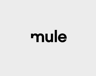
Wordmarks are typographical in design that works as a visual symbol for your brand. They are minimalistic by nature but are typically creative when it comes to placement, type shape, color and other design factors.
The great thing about wordmarks is that even if every single company decides to adopt the trend, each look will be uniquely different as they are designed to present a visual identity.
Compared to traditional graphical logos, the wordmark can help increase brand recall by keeping the design content within the text. This reduction in focal points diminishes the chances of clutter.
The wordmark can be used for most niches but it requires a lot of thought and creativity to pull off due to its type only format. If the above-mentioned examples are anything to go off of, the wordmark is virtually timeless.
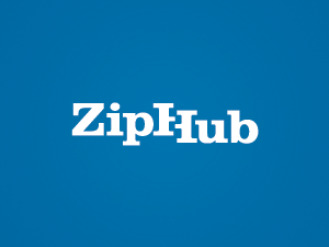
Negative Space: Don’t be Afraid to be Negative
The use of negative space has been in trend for some years now especially when it comes to web design as a whole so it isn’t a surprise that it is in trend for logos.
Using negative space in design helps establish balance and sets harmony between your used elements which is especially helpful in logos that use multiple shapes and type. Negative space adds “more” to your design even though you are actually using less.
It can also help create cool optical illusions.The experienced designer can use negative space to not only keep their logo clean but also to design a memorable look that can set their brand apart from the next guy.
Like wordmarks, your brand doesn’t really matter when it comes to utilizing the negative space trend. It is all about your creativity and willingness to experiment that will make this trend work for you.
Duotones
For 2016’s web design trends, duotones was on the list and is now crossing over to this year’s logos, even though we have seen some popular companies already do this.
Originally dual coloring was predominately seen used on sites that featured large photographic backgrounds but that soon moved over to colorful branding identities. Using two colors allows you to really let your logo “speak” for you and with bold colors being in trend now there is no better time to try your hand at dual coloring your logos.
While your logo design will play a factor, keeping your logo at two colors will keep it from getting too busy. Targeted markets will be able to identify with the design quicker, plus the unique look is a nice refresher compared to monotone logos.
Aside from the color limit there really isn’t a real downside to dual coloring as far as your brand is concerned. Businesses that have compound names or even have a logo composed of two shapes can really take advantage of this trend.
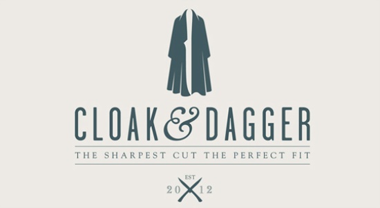
Handmade Look
With this year seemingly focusing on more unique and authentic designs for a better user experience, it comes to no shock that logos will also be hit with this as well.
Yes, technically logos are sketched out in concept but instead of going for the sleek, clean sophisticated end result, designers will be embracing a more playful dynamic and with reason. The handmade or hand-drawn look makes your designs seem more personable which is always a good thing.
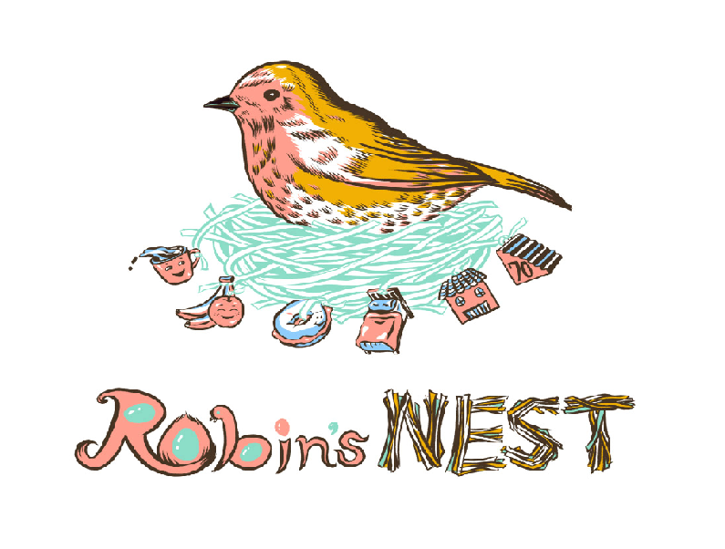
There are lots of options as far as how you want your logo to look. You can go for a rough illustration with jagged edges. Perhaps whimsical soft lines – like the ‘Robin’s Nest’ example above – or variable brushstrokes are also some other options that you might want to consider. You can even experiment with mono coloring, dual coloring or add multiple colors along with textures for a creative final look.
Opting for the handmade look can potentially give your brand some flare with a quasi-vintage look without going overboard with the bells and whistles we often attribute with digital art.
The Handmade approach has the ability to create a strongly masculine or feminine aesthetic depending on how you draw them out which makes it an accessible option for experimenting designers. There is also the bonus of being able to implement more than one trend with your handmade logo allowing it to look artistically intentional instead of too busy.
The handmade look needs to be used with some discretion. It is best suited for those more artistic fields and blogs. Formal businesses may want to stay away from this trend to avoid brand miscommunication with their targeted audience.
The Wrap Up
Of course, sometimes the best way to get a memorable design is to take the hottest design trends and then do the exact opposite. Even then, it’s important to understand what is ‘on-trend’ first, and today I have presented you five options that I’m seeing more and more consistently.
If you are in the process of updating your logo or even designing a new one for yourself or a client you may want to take one of these (or mix them up) for a spin. Who knows what you might create as the possibilities are endless.
Do you have a favorite logo trend for this year? Will be using any of these or another one?
Frequently Asked Questions about Logo Design Trends
What are the key logo design trends of 2016?
The key logo design trends of 2016 included minimalism, negative space, line art, and vintage-inspired designs. Minimalism was all about simplicity and functionality, with clean lines and a limited color palette. Negative space was used to create clever and unique designs, often incorporating hidden images or messages. Line art was popular for its simplicity and versatility, allowing for a wide range of creative interpretations. Vintage-inspired designs brought a sense of nostalgia and authenticity, often using hand-drawn elements and traditional typography.
How do logo design trends evolve over time?
Logo design trends evolve over time in response to cultural, technological, and market changes. For example, the rise of digital technology has led to a greater emphasis on simplicity and scalability in logo design, as logos need to be easily recognizable on a variety of screen sizes. Similarly, cultural shifts can influence design trends, such as the recent trend towards more inclusive and diverse imagery.
How can I incorporate these trends into my own logo design?
Incorporating these trends into your own logo design requires a careful balance between staying current and maintaining a timeless quality. It’s important to understand the principles behind each trend and how they can be applied to your specific brand identity. For example, if you’re aiming for a minimalist design, focus on simplifying your logo to its essential elements. If you’re drawn to the vintage trend, consider how traditional typography or hand-drawn elements could enhance your brand’s authenticity.
What are some examples of successful logo designs that have used these trends?
There are many examples of successful logo designs that have used these trends. For instance, the Airbnb logo is a great example of minimalism, with its simple, geometric design. The FedEx logo uses negative space to create a hidden arrow between the ‘E’ and ‘x’, symbolizing speed and precision. The Starbucks logo uses vintage-inspired elements to convey a sense of tradition and quality.
How can I stay updated on the latest logo design trends?
Staying updated on the latest logo design trends can be achieved by following design blogs, attending design conferences, and keeping an eye on the work of leading design agencies. Websites like Behance and Dribbble also showcase the latest work from designers around the world, providing a wealth of inspiration and insight into current trends.
How important is it to follow logo design trends?
While it’s important to be aware of logo design trends, it’s equally important not to follow them blindly. Trends can provide inspiration and help you stay current, but they should never dictate your design decisions. The most effective logos are those that accurately represent the brand’s identity and values, regardless of current trends.
What are some common mistakes to avoid when designing a logo?
Some common mistakes to avoid when designing a logo include overcomplicating the design, following trends too closely, and neglecting to consider how the logo will look in different contexts. A good logo should be simple, versatile, and timeless, effectively communicating the brand’s identity at a glance.
How can I ensure my logo design is effective and impactful?
Ensuring your logo design is effective and impactful involves a combination of strategic thinking, creative insight, and technical skill. It’s important to have a clear understanding of your brand’s identity and values, and to translate these into a visual form that is simple, memorable, and versatile.
What are some resources for learning more about logo design?
There are many resources available for learning more about logo design, including online courses, design blogs, and books. Websites like Coursera and Udemy offer a range of design courses, while blogs like Logo Design Love and books like “Logo: The Reference Guide to Symbols and Logotypes” provide a wealth of information and inspiration.
How can I get feedback on my logo design?
Getting feedback on your logo design can be invaluable in refining and improving your work. Consider sharing your designs with fellow designers, either in person or through online communities like Behance or Dribbble. You can also seek feedback from potential customers or users, as they will ultimately be the ones interacting with your logo.