Happy St. Valentine’s Day to all. Because of the day that’s in it, I thought it might be interesting to look at a brief overview of one of the world’s most recognizable logos which contains the heart symbol of love. I refer, of course, to the I♥NY or “I Love New York” created by designer Milton Glaser. The logo was designed as part of an advertising campaign to promote tourism in New York City and later to promote the whole of New York State.
In relation to the popularity of the logo, Milton Glaser said in an interview he is astonished at “why it has persisted in people’s consciousness for such a long time” finding it “totally miraculous”.
 As with all the best logos, this one works because
a) It’s simple (almost deceptively simple)
b) It’s eye-catching
c) It conveys a BIG concept with just a symbol and a few letters
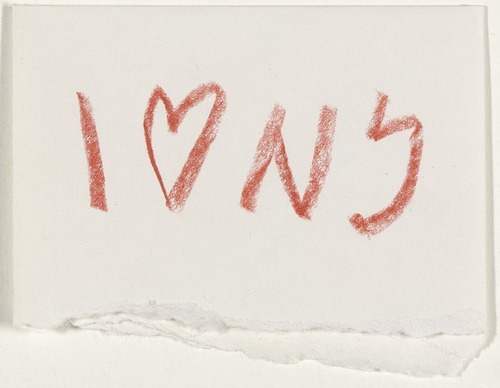
Below you can see an original sketch of the logo in red pencil from 1976, proof for anyone who thinks their initial sketches are worthless because they’re “not good at drawing”, that all sketches are potentially very valuable and not just in a monetary sense.
 Image from MOMA, found via David Airey’s Logo Design Love.
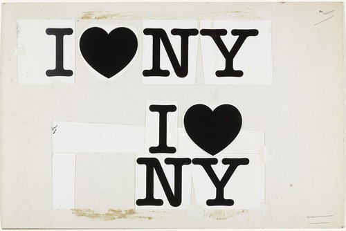
Another image from MOMA shows two layout concepts.
 The typeface used is a slab serif called appropriately American Typewriter (which you can buy and download here). The boldness of the letters fit beautifully with the red heart shape to produce something unique, yet simple which looks at home in a huge city. This logo was the forerunner to a host of identities and slogans using the heart symbol to represent the word love, all over the world.
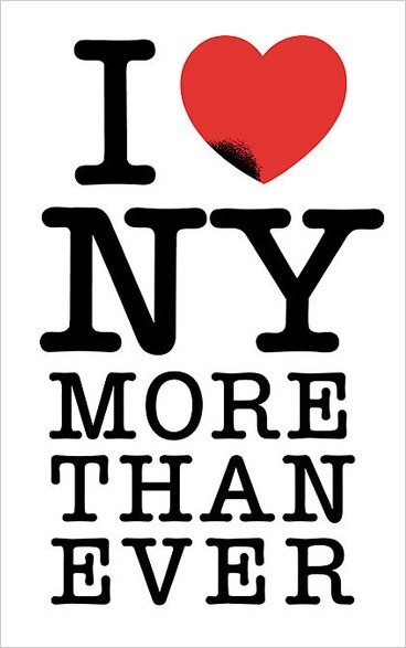
Glaser has said that the purpose of design is to “inform and delight.” He created the logo as a Pro-bono project and unbelievably has not received a cent from it, but undoubtedly has received many non-financial rewards as its creator. Following the September 11 terrorist attacks, Glaser created a second modified version of his famous logo which said “I Love NY More Than Ever”. A small black spot on the heart symbolizes the World Trade Center and its location on Manhattan. You can buy it as a poster here.
 What do you think about this famous logo?
Frequently Asked Questions about Love Logos
What are the key elements to consider when designing a love logo?
When designing a love logo, it’s important to consider the message you want to convey. Love logos often incorporate heart shapes, warm colors like red and pink, and soft, rounded fonts to evoke feelings of affection and warmth. However, it’s also crucial to consider the brand’s identity and target audience. The logo should reflect the brand’s personality and appeal to its intended audience. For instance, a love logo for a children’s brand might be playful and colorful, while one for a luxury brand might be more sophisticated and minimalist.
How can I make my love logo unique?
Making your love logo unique involves incorporating elements that are specific to your brand. This could be the brand’s initials, a unique color scheme, or a distinctive design style. You could also consider using less common symbols of love, such as a pair of lovebirds or a love knot, to make your logo stand out.
What are some examples of successful love logos?
Some examples of successful love logos include the iconic “I ❤ NY” logo, which uses a simple heart shape to represent love, and the LoveFilm logo, which cleverly incorporates a heart into the letter ‘o’. These logos are memorable and instantly recognizable, which are key factors in their success.
Can I use a love logo for any type of business?
While love logos are often associated with businesses in the romance or relationship industry, such as dating services or wedding planners, they can be used for any type of business. The key is to ensure that the logo aligns with the brand’s identity and message. For instance, a love logo could work well for a charity or non-profit organization that wants to convey a message of compassion and care.
How can I incorporate a love theme into my existing logo?
Incorporating a love theme into your existing logo can be as simple as adding a heart shape or using a warm color scheme. However, it’s important to ensure that any changes still align with your brand’s identity and don’t confuse your audience. It might be worth consulting with a professional logo designer to ensure the changes are effective and well-executed.
What colors are typically used in love logos?
Red and pink are the most commonly used colors in love logos, as they are traditionally associated with love and romance. However, other colors can also be used depending on the brand’s identity and the message you want to convey. For instance, purple can represent passion and luxury, while blue can represent trust and loyalty.
How can I design a love logo that appeals to a diverse audience?
Designing a love logo that appeals to a diverse audience involves understanding your audience and their preferences. This might involve conducting market research or using analytics to gain insights into your audience’s demographics and interests. The logo should be inclusive and not exclude any potential customers.
Can I design a love logo myself, or should I hire a professional?
While it’s possible to design a love logo yourself, especially with the many design tools available online, hiring a professional can ensure that the logo is well-designed and effective. A professional designer can bring expertise and creativity to the project, and can help ensure that the logo aligns with your brand’s identity and appeals to your target audience.
What are some common mistakes to avoid when designing a love logo?
Some common mistakes to avoid when designing a love logo include making the logo too complex, not considering the brand’s identity, and not considering how the logo will look in different contexts. The logo should be simple and versatile, and should work well both in print and online.
How can I test the effectiveness of my love logo?
Testing the effectiveness of your love logo can involve conducting market research, such as surveys or focus groups, to gather feedback from your target audience. You can also use analytics to track how the logo affects your brand’s visibility and recognition. This can help you make any necessary adjustments to improve the logo’s effectiveness.
Jennifer Farley is a designer, illustrator and design instructor based in Ireland. She writes about design and illustration on her blog at Laughing Lion Design.


