

Key Takeaways
- Piktochart is an online tool that simplifies the process of creating visually appealing infographics, offering an array of customization options and a user-friendly interface.
- The creation process in Piktochart includes choosing a theme, setting up the document, assigning backgrounds, adding content, and tweaking elements. The tool also supports uploading your own graphics and offers a variety of fonts and colors.
- While the free plan of Piktochart offers a sufficient range of features for basic infographic design, the pro plan provides more flexibility and tools for individuals who require advanced features and high-resolution downloads.
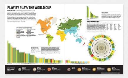
We all love infographics — those big, colorful graphics designed to distill big, complex ideas into a more digestible, compelling visual story.
We encounter them on websites and in print, and they’ve become a major weapon for everyone from designers to journalists to marketers to PR companies.
They all understand that a well-designed infographic can not only change hearts and minds — but purchasing decisions, government policies and even election results.
The demand for infographics has increased rapidly in recent years, with entire sites now dedicated to crowd-sourcing their design. It’s a powerful medium for translating ideas, while remaining visually informal, and in some cases, even delivering your message with a healthy dose of humour.
This can lead to readers absorbing a message they might not have otherwise paid any attention to in other media.
However, creating your own high quality infographics with classic design tools is often time-consuming. The usual designer toolbox can be ‘over featured’ for this kind of simplified visual storytelling.
![]()
Happily, there are now a few specialist infographics creations tools out there aimed at precisely this market. Today, we’re going to take one of them — Piktochart — for a test-drive, and see what kind of result we get.
Piktochart.com is an online tool for creating visually-appealing, fully-customizable infographics, yet that remains straightforward to use, even for non-designers.
Let’s take a look at it and create our first infographic.
Create your first infographic
Piktochart offers a Pro pricing plan and a free plan. For now, let’s start with the free plan. This allows you to accomplish quite a lot, and you can always decide later if you would like to upgrade.
For this test-drive, I thought we’d have some fun. I’ve set myself the challenge of producing an infographic that explains the steps you need to accomplish to become a genuine superhero!
After you’ve created your account you can log in (Google+ or Facebook are login options) and we’ll get started.
Select your theme
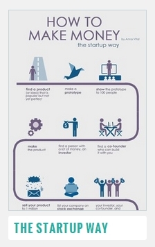
You have a selection of themes and templates to choose from. The Piktochart pro plan currently offers over 500 templates, while the free options offers a much smaller subset. For this introduction, I’ve chosen “The Startup Way” template by Anna Vital.
It’s an excellent template for illustrating the various steps of a particularly linear process.
Don’t worry about the colors or any specific imagery — we are going to change that.
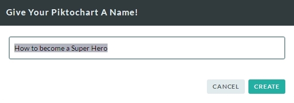
Next, we will title our infographic document. I’m naming mine ‘How to become a SuperHero‘
Setup your document
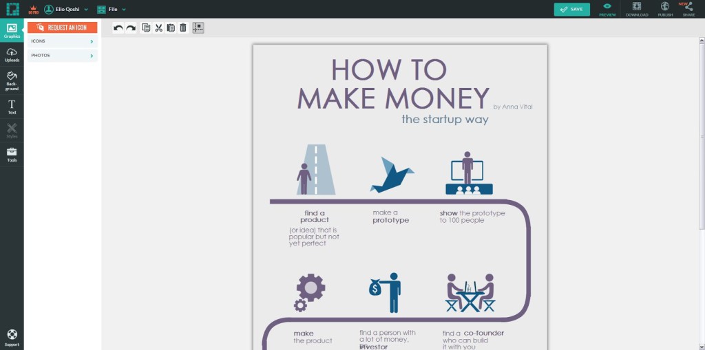
Now the document view appears — this is where you will create your magic!


![]()
On the left, you can find the core tools for inserting new elements, text, graphics and more. Piktochart also lets you upload your own graphics, so you will probably take use of that feature.
Bear in mind that Piktochart supports SVG upload, so try to make use of that option whenever it is practical.
At the top you can find the transform tools, which you can use to transform single elements, give them colors, group multiple elements, and change their styles.
There is also the document setup panel, on the left of the canvas, where you can add, edit, remove and tweak content blocks, and also change the dimensions of the infographic.
But for now, we will use the default dimensions.
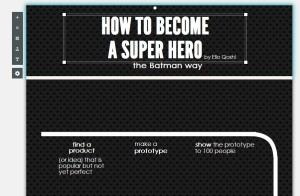
When you have your document opened, it should look something like this:
Let’s clean it up a bit so it’s ready for some customization.
Delete the existing icons, as they aren’t relevant to our purpose.
Blocks & Main Elements
Let’s assign a different background now. I’ve chosen here a dark background for some nice contrast.
Piktochart infographics are made out of blocks, so you can resize their height and change their background to your liking. I gave all the blocks the same black background pattern in this example here.
If you choose a pattern, you will notice that it will create seams between the blocks.

To get rid of these joins, align the height of the blocks by clicking on the bottom borders of the specified block and drag it up and down until you see that the seam is not noticeable anymore.
You will need probably need to give it a few tries, but once you get the hang of it, it should be really easy for you later.
-
Note: You can also resize the block by clicking on the small cog wheel on the left when the block is selected. 352 px worked for me without creating any seams between the blocks.
Once you have set up the background, tweak the different elements so they should fit with whatever you have in mind.
In this case, I have made the lines follow the canvas white, in order to have enough contrast with the black background. Same goes also for the text.
I’ve used the Gothic Pro and League Gothic fonts, as it’s just right for a stylish Batman & Gotham Theme.
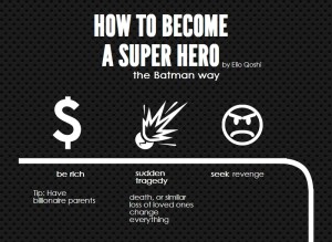
After these little cosmetic changes, we should have a pretty good starting point:
Adding content
Let’s fill it up with some content now.
On the left toolbar you can insert preset graphics and icons, as well as also upload your own images.
The Search Bar will help you find the desired graphics, which in my case here is a dollar sign and an angry emoticon. I also uploaded an explosion icon to use here ( as I didn’t find one in the Piktochart library)
-
Note: You can change the color of icons and graphics imported from the built-in Piktochart libraries, but you cannot do the same with imported images, so make sure to give them the right colors in the external image manipulation program you use.
After updating the text, it should look like this:
Tweaking and adding more content
Let’s do the same for the next elements. You will probably need to import images, so take advantage of that to customize your infographic.
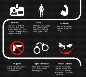
Also be careful with the lines. They can be very annoying to align, as the corners are technically images, while the horizontal and vertical lines are dynamic elements. You can tweak their appearance and thickness on the transform tools toolbar at the top.
As you can see, it’s starting to take shape:
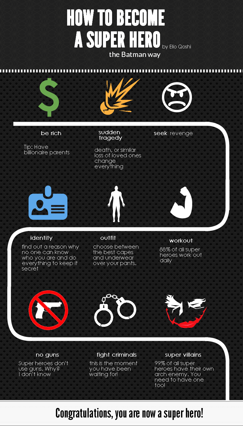
I noticed that it still lacked color and variety, so I changed one or two background colors, added some lines and spiced it up with some more muted colors.
I also added a block at the bottom, together with a final text.
And here’s the final result
Conclusion
Making infographics has never been easier, Professionals will find themself a home straight away, and newcomers will get around the editor without too many hassles.
I personally relate to it as a little design toy box. It feels very informal and relaxed, yet very powerful.
Even with asset limitations, the free plan might give you enough stuff to finish your small infographic daily needs. If you need more flexibility and tools though, you can always consider the pro plan.
Now, go forth and master the art of the infographic. It will be worth it.
Frequently Asked Questions about Creating Infographics with Piktochart
How can I customize my infographic on Piktochart?
Piktochart offers a wide range of customization options. You can choose from a variety of templates, or start from scratch. You can add images, icons, charts, and maps, and customize their colors, sizes, and positions. You can also add text and customize its font, size, color, and alignment. You can even add interactive elements like videos and hyperlinks. The drag-and-drop interface makes it easy to arrange and rearrange elements until you’re satisfied with your design.
Can I collaborate with others on Piktochart?
Yes, Piktochart supports collaboration. You can invite others to view and edit your infographics. This is particularly useful for team projects, as it allows everyone to contribute their ideas and expertise. You can also share your infographics on social media, or embed them on your website or blog.
What kind of data can I visualize with Piktochart?
Piktochart is versatile enough to visualize a wide range of data. You can create bar charts, pie charts, line charts, area charts, and scatter plots. You can also create maps to visualize geographical data. You can import data from Excel, Google Sheets, or CSV files, or enter it manually.
Can I use Piktochart for free?
Yes, Piktochart offers a free plan. However, the free plan has some limitations. It offers a limited number of templates and does not include some advanced features like high-resolution downloads and password protection. If you need these features, you can upgrade to a paid plan.
How can I learn to use Piktochart?
Piktochart is designed to be user-friendly, even for beginners. It offers a variety of resources to help you learn how to use it. These include tutorials, webinars, and a blog with tips and inspiration. You can also contact their support team if you have any questions or problems.
Can I use my own images and fonts on Piktochart?
Yes, Piktochart allows you to upload your own images and fonts. This allows you to create infographics that match your brand’s style and personality. You can also choose from a library of stock images and fonts.
Can I print my infographics?
Yes, you can download your infographics as PDF files and print them. You can also download them as PNG or JPEG files for digital use. The quality of the downloads depends on your plan.
Can I create interactive infographics with Piktochart?
Yes, Piktochart allows you to create interactive infographics. You can add hyperlinks, videos, and hover effects. This can make your infographics more engaging and informative.
Can I use Piktochart on my mobile device?
Currently, Piktochart is only available as a web app. This means you can use it on any device with a web browser, but it may not be as convenient on a small screen.
Can I use Piktochart offline?
No, Piktochart is a cloud-based tool, so you need an internet connection to use it. However, you can download your infographics and work on them offline.