In the first part of this article, we saw how an accessibility technique intended to benefit low-vision users, also has a host of other uses, like providing for handheld devices, serial devices, print media, older computers, and legacy browsers like IE5:
Making it happen…
So what do we need to do to make this happen? It all comes down to two simple things:
- a fundamental division of CSS — with rules that define the structural layout in one stylesheet, and everything else in another
- a switching mechanism for controlling whether the structural styles are enabled
Dividing the CSS
This division of CSS would be difficult to retro-fit onto an existing site, but if you do it right from the start then it isn’t a problem at all. You simply write the structural styles in one stylesheet (floats, fixed widths, things like that), and everything else in the other; test with both enabled, but then switch the structure off from time to time, to make sure the page still works without it.
There might be some situations where you need to define special rules in the design stylesheet, which are then overridden in the structural stylesheet. But for the most part it will simply be a case of defining structural rules, that are either enabled, or not.
Once we have the stylesheets we can get to the really interesting bit — implementing the switch!
Implementing the switching mechanism
The mechanism Joe Clark proposed for implementing the switch between standard and zoom layouts, is to add rev="zoom" to the design stylesheet’s <link> element, to indicate that it only contains the zoom layout rules (and therefore, any include without that rel can be considered a structural stylesheet). Browser-tools, and ultimately browsers themselves, could utilize those semantics to provide a UI switch — Jeremy Keith wrote a bookmarklet for it, and there used to be a Greasemonkey extension.
But these never caught-on in a big way, and are possibly part of the reason why the use of zoom layouts is not as prevalent as it should or could be; that, and the fact that they’ve always been painted as a pure-accessibility enhancement, when in fact — as I hope I’ll ultimately demonstrate — they are far, far more useful than that. Even if they offered no accessibility benefit at all, I would still recommend them.
Anyway — ordinary users are never going to benefit from something that requires a geek-only Firefox add-on to make the damn thing work! What we need is a way of implementing the switch which hooks into existing browser mechanisms, and even if possible, something which turns itself on when appropriate.
And that we can do with CSS media queries.
CSS media queries
Media queries are a CSS3 mechanism that extends the basic media attribute, so that as well as specifying media types, you can further specify features of the media environment; things like the width of the window, the screen resolution, aspect-ratio, or whether the medium is color or black-and-white.
This is the mechanism Apple recommends for targeting mobile Safari, so you can target (or hide) CSS rules for iOS devices like the iPhone and iPod touch. For example, you can use the following query to hide a set of rules:
@media screen and (min-width:481px)
{
}
Apple describe this a mechanism for adding iOS-specific style sheets
— which isn’t what it is at all! Because it won’t just target iOS devices, it will target any device which matches the media profile. In other words — any screen-media device with a page-width of 480 pixels or less, won’t apply the rules inside that condition.
But of course in this case, that’s exactly what we want.
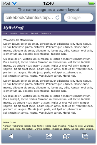
Since the latest versions of all the major browsers support media-queries, they’ll all implement this switch, and the end result will be: when you resize the window to 480 or less, the structural styles will disappear and the zoom layout will prevail.
Applying the media query switch
So with our styles split into two different stylesheets, we apply them with two different <link> includes.
The first contains the design styles which implement the zoom layout, and is applied to "screen", "print", "projection" (used by some browsers in full-screen mode) and "handheld" (so that it’s used by conformant handheld-media devices):
<link rel="stylesheet" type="text/css"
      href="design.css" media="screen,print,projection,handheld" />
The second contains the structural styles, and is applied to "screen" with a "min-width" media query, so it only applies when it has enough space:
<link rel="stylesheet" type="text/css"
      href="structural.css" media="screen and (min-width:481px)" />
Additional user control
Wouldn’t it also be nice if we could extend the switch to user control, and do so in a way that the browser already implements? Well in fact we can, in some browsers at least, by taking advantage of alternate stylesheet semantics. If we add a title attribute to the structural stylesheet, then browsers which have a built-in stylesheet switching mechanism (Opera, Firefox and Konqueror), will make that stylesheet available for the user to disable at will:
<link rel="stylesheet" type="text/css"
      href="structural.css" media="screen and (min-width:481px)"
      title="Large-screen layout" />
In Opera, for example, it will show up in the “View → Style” menu, named as whatever you put for the title (in this case, “Large-screen layout”). In Firefox, it will be ratified in the “View → Page Style → Basic Page Style” menu-item, which will now control the structural stylesheet and let you to turn it off:
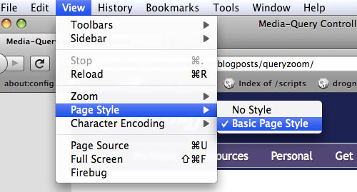
Controlling the structural stylesheet using Firefox’s “Page Style” menu.
Just for good measure, let’s also apply the rev semantics to the zoom stylesheet, so that anyone whose already using a compatible switching tool, will be able to control our zoom layout with that:
<link rel="stylesheet" type="text/css"
      href="design.css" media="screen,print,projection,handheld"
      rev="zoom" />
We could even add a manual stylesheet-switcher into the mix. Page-based switchers can’t really be considered reliable accessibility tools, because you never know whether a site will have one or not. But it doesn’t do any harm to throw one out there as a bonus, and that’s what I’ve done on my site.
Gotchas and device-quirks
We’re almost finished, but there’s a couple of device-quirks to consider.
 The first is the issue of how the iPhone returns its screen size — as its actual screen resolution is far higher than its apparent dimensions. By default, the higher metrics are used to calculate page dimensions, so that Safari is able to render, in tiny detail, complete pages that were designed for desktop devices.
 But if you’re designing specifically for mobile Safari, I reckon it’s better to use the lower metrics, so it renders the page like a handheld device and gives you content which is actually readable — with text that’s a comfortable size and a page-layout that fits. You can make that change simply by adding this meta-tag to the page:
<meta name="viewport" content="width=device-width" />
The other gotcha is (yeah you guessed it) older versions of Internet Explorer. IE9 supports everything we’ve done just fine, so no worries there, but IE8 and older versions don’t support media queries. Of course older versions of Firefox, Webkit, and very old versions of Opera don’t support them either, but since they do understand the "screen" declaration they’ll still apply the stylesheet. Not so Internet Explorer — IE8 and earlier will baulk over the whole thing, and therefore won’t apply the structural styles at all, if left unchecked.
So to fix this we need to re-implement the structural stylesheet, inside a conditional comment that targets the errant IE versions. We can also take the opportunity to add some minimal JavaScript, that re-creates the query switch when scripting is available:
<!--[if (IE 7)|(IE 8)]>

   <link rel="stylesheet" type="text/css" href="structural.css" media="screen" />

   <script type="text/javascript">

      var structure = document.styleSheets[document.styleSheets.length - 1];
      function doQuery()
      {
         structure.disabled = document.documentElement.offsetWidth < 481;
      }
      window.attachEvent('onresize', doQuery);
      doQuery();

   </script>

<![endif]-->
I’ve used internal scripting there, so you can see what’s what, but in practice (and in the final demo) I would use an external script; this code also relies on the fact that the <script> comes directly after the structural stylesheet <link> (because of how it’s referred to in the document.styleSheets collection). If scripting is unavailable it will show the large-screen layout all the time, but that’s undoubtedly preferable to showing the zoom layout all the time.
Also note how I’ve only included IE7 and IE8 — for IE6 I’m letting it degrade as an older browser, so it only ever gets the zoom layout, same as IE5. You can change that if you need to, by editing the conditional comment:
<!--[if (IE 6)|(IE 7)|(IE 8)]>The final implementation
That’s it! With everything done and dusted, here’s the final implementation:
<meta name="viewport" content="width=device-width" />
<link rel="stylesheet" type="text/css" href="design.css"
media="screen,print,projection,handheld" rev="zoom" />
<link rel="stylesheet" type="text/css" href="structural.css"
media="screen and (min-width:481px)" title="Large-screen layout" />
<!--[if (IE 7)|(IE 8)]>
<link rel="stylesheet" type="text/css" href="structural.css" media="screen" />
<script type="text/javascript" src="min-width.js"></script>
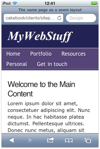
<![endif]-->And here’s the final demo page that shows it all in action:
And with that you can tell your clients that you’ve improved, not just the accessibility of their site, but also its appearance in mobile devices, serial devices, print media, older machines and legacy browsers …. and all of it came for free!
Hey — nobody ever got fired for doing stuff free!
Thumbnail credit: Kyle May
 James Edwards
James is a freelance web developer based in the UK, specialising in JavaScript application development and building accessible websites. With more than a decade's professional experience, he is a published author, a frequent blogger and speaker, and an outspoken advocate of standards-based development.