If I were to point at a page and describe it as a zoom layout — would you know what I was talking about?
The term was popularized by Joe Clark, one the foremost advocates of accessible web development, to describe a page that’s been formatted (or re-formatted) to make it easier for low-vision users — people who navigate with extremely large text, or using magnifying software.
The key feature of a zoom layout is that it formats the page into a single column, rather than two or three floated columns, so that the text has more room to scale, without creating horizontal scrollbars. Such layouts may also feature simplified navigation, larger default fonts, or a variation on the color-scheme that provides higher contrast.
Here are two examples of the same page design:
There’s more to this than zooming!
Another way of describing these layouts is to call them linearized or serialized pages. They’re similar to how a page is seen by CSS-capable serial-access devices (like browser-based screenreaders), as well as by devices which don’t apply CSS at all (such as text-only browsers and search-engine robots). They’re also pretty similar to the briefly-encouraged but ultimately-dismissed concept of ‘text-only’ versions, in that they emphasise readability of content over finer design aesthetics.
The point is, it doesn’t take too many stretches of the imagination to think of a whole bunch of different uses for a simpler, linear page layout:
- it’s better for small-screen devices such as iPhones, smartphones, and the browsers built into gaming devices.
- it’s better suited to print since it isn’t trying to fit a fixed, wide layout into a narrow, flexible space.
- it plays nicer with older browsers like IE5 or even Netscape 4! These early CSS implementations are usually quite happy with the basic colors, fonts and backgrounds that implement the core design; if we can split those styles off from the advanced layout and box-positioning styles that tend to make those browsers choke, then we can still give them something attractive and branded, as an alternative to either a mess on one hand, or no styles at all on the other.
- it’s better for older computers that have a low screen-resolution, in exactly the same way as it benefits those with smaller screens.
- it’s a helpful analogy of what serial-access devices see, helping you to understand and relate-to how your page is viewed by screenreaders, and to a lesser extent, by search-engine robots (the key distinction being that robots don’t parse CSS, whereas screenreaders do).
So what we’re really talking about is not just a way of enhancing accessibility, it’s a way of fundamentally dividing your audience into two distinct use-cases — providing a layout for small-screen and linear devices on one hand, and a layout for large-screen desktop and laptop devices on the other:
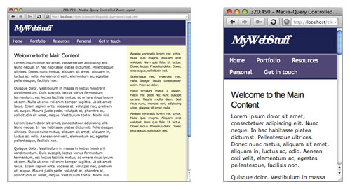
Large and small-screen layouts as they apply to different window sizes.
Making it happen…
So what do we need to do to make this happen? All is revealed in the concluding part:
Thumbnail credit: Kyle May
 James Edwards
James is a freelance web developer based in the UK, specialising in JavaScript application development and building accessible websites. With more than a decade's professional experience, he is a published author, a frequent blogger and speaker, and an outspoken advocate of standards-based development.