Information graphics or infographics are graphic visual representations of information and data. Successful infographics display information clearly and quickly in an eye-catching manner (just like successful web designs). In the past couple of years there has been a dramatic increase in the awareness and number of designers working in the field with some absolutely beautiful design work produced.
This week I’ve been looking back at CSS-based designs and Flash-based designs and today I’m casting an eye over some of the fabulous information graphic designs of 2010.
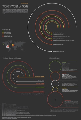
The BP oil spill was huge and devastating news earlier this year, but it wasn’t the biggest oil spill ever to occur.
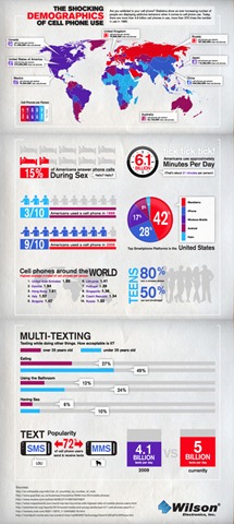
The shocking demographics of cell phone use, may or may not be shocking to some people but the graphic looks great and provides a lot of information.
As a commuter myself (in Ireland) I was interested to see this chart of best and worst commutes in the U.S.

Meet iPad’s Competition by Section shows how many devices are available.

“So you want to watch YouTube?” flowchart was created by design student Karen Kavett. Click here to see a much bigger version.

The YouTube chart above was inspired by another cool graphic called “So you need a typeface?” by Douglas Wood. See the big version here.

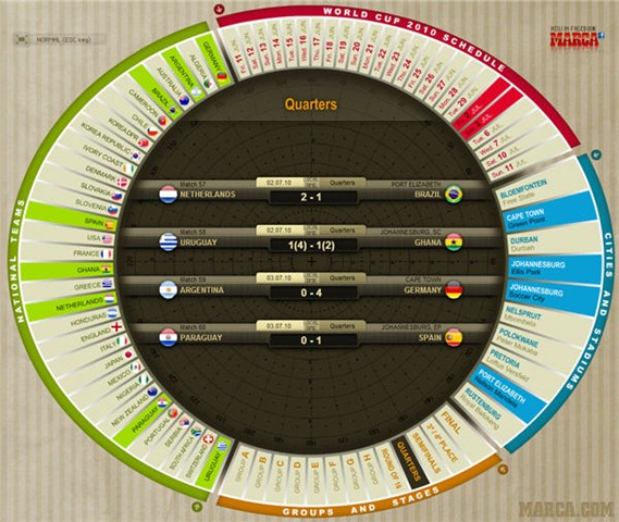
The World Cup took place in Africa this year and Marca.com had a superb interactive match schedule (which you can still visit here).
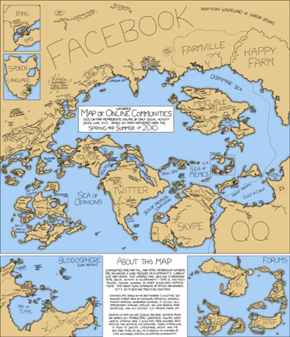
A handrawn map of online communities by XKCD.
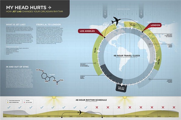
This set of elegant graphics from Matt Kursmark, a graphic design student shows how the circadian rhythm works and how jetlag adversely affects it.
And finally, this graphic got quite a bit of attention this year, “The Best Beer In America” infographic. Click here to see full size.

What do you think of these information graphics? Is this an area of design that you are interested in?
 Jennifer Farley
Jennifer Farley is a designer, illustrator and design instructor based in Ireland. She writes about design and illustration on her blog at Laughing Lion Design.