

 What makes a good web site for an art museum? Having looked through quite a few recently, my answer is a site that grabs a visitor’s attention, encourages them to look around as if they were in the physical museum, inspires learning and makes you want to come back for more.
There are literally thousands of Art Museum web sites to look at, so why did I choose the following ten? As a designer, I have to admit that how the site looked was a major consideration. Some sites just grab you with their choice of artwork and color schemes. Their presentations of current exhibitions that make you want to go and visit and, of course, the usability of the site were important factors. Each of these web sites was easy to use, and easy to find information on.
Many of the sites listed below also had great online learning sections, where you can find out about pieces in their collection and learn more about current exhibitions. Some are certainly embracing new media and offer podcasts and widgets to download. Several of the web sites had museum guides that you can download before you visit.
This post took a long time to put together because I spent a lot of time on each site, really enjoying the art and the extra features some of these sites have. I hope you find them interesting too.
Tate Museum: British and International Contemporary Art

Van Gogh Museum Netherlands

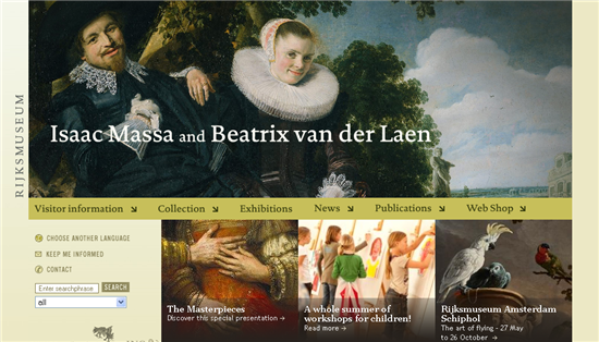
Rijksmuseum Netherlands
Guggenheim International

National Portrait Gallery, Canberra Australia

Museum Of Fine Arts, Boston

MoMA: Museum of Modern Art, New York

The Smithsonian Museum site, is absolutely vast and has many different sections within Art and Design. One section that I thought was particularly nice was the “Arago” postage stamp collection, which includes a history of U.S. stamp design.

Joan Miro Foundation, Spain

Munch Museet, Norway

Have you come across any art museum web sites have impressed you with their design and content?
Frequently Asked Questions about Beautiful Art Museum Websites
What makes a museum website beautiful and engaging?
A beautiful and engaging museum website is one that effectively combines aesthetics, functionality, and content. It should have a visually appealing design that reflects the museum’s brand and exhibits. The website should be easy to navigate, with clear menus and intuitive layouts. High-quality images and videos of the exhibits can greatly enhance the user experience. Additionally, the website should provide comprehensive information about the museum, including its history, collections, events, and visitor information. Interactive features such as virtual tours and online exhibits can also make a museum website more engaging.
How important is the user experience in a museum website?
User experience is crucial in a museum website. A website with a poor user experience can deter visitors, while a website with a good user experience can attract more visitors and encourage them to spend more time exploring the museum’s collections and services. Factors that contribute to a good user experience include fast loading times, mobile-friendly design, easy navigation, and accessible content.
What are some examples of beautiful art museum websites?
Some examples of beautiful art museum websites include the Metropolitan Museum of Art, the Museum of Modern Art, and the Web Gallery of Art. These websites stand out for their stunning visuals, user-friendly design, and rich content.
How can a museum website enhance the visitor experience?
A museum website can enhance the visitor experience by providing useful information and interactive features. For example, the website can provide details about the museum’s collections, exhibitions, and events. It can also offer online ticketing, which can save visitors time and hassle. Interactive features such as virtual tours and online exhibits can allow visitors to explore the museum from the comfort of their own homes.
What are the key elements of a successful museum website?
The key elements of a successful museum website include a visually appealing design, user-friendly navigation, comprehensive content, and interactive features. The design should reflect the museum’s brand and exhibits. The navigation should be intuitive, making it easy for visitors to find the information they need. The content should provide detailed information about the museum and its collections. Interactive features such as virtual tours and online exhibits can make the website more engaging.
How can a museum website attract more visitors?
A museum website can attract more visitors by offering unique and engaging content, such as virtual tours, online exhibits, and educational resources. It can also use SEO strategies to improve its visibility in search engine results. Social media integration can help the museum reach a wider audience and encourage more people to visit the website.
What role does technology play in museum websites?
Technology plays a crucial role in museum websites. It enables museums to offer interactive features such as virtual tours and online exhibits. It also allows museums to provide online ticketing and other convenient services. Furthermore, technology can help museums reach a wider audience through SEO and social media integration.
How can a museum website reflect the museum’s brand?
A museum website can reflect the museum’s brand through its design, content, and tone of voice. The design should be consistent with the museum’s visual identity, while the content should reflect the museum’s mission and values. The tone of voice should be appropriate for the museum’s target audience.
What are the benefits of having a mobile-friendly museum website?
Having a mobile-friendly museum website is beneficial because it allows visitors to access the website from their smartphones or tablets. This can increase the website’s reach and accessibility. A mobile-friendly website can also improve the user experience, as it is designed to be easy to navigate on a small screen.
How can a museum website support the museum’s educational mission?
A museum website can support the museum’s educational mission by providing educational resources such as articles, videos, and interactive exhibits. It can also offer online learning programs and workshops. Furthermore, the website can provide information about the museum’s educational initiatives and partnerships.

