

With Apple’s Watch announcement earlier in the week, the smart-watch UI design sector is certainly heating up. It’s clear that we’re still in the early stages of discovering what actually works in this very tiny, personal form factor.
It’s an area that encompasses two very different design legacies. It brings with it:
- the long history of computer OS design
- the even longer history of watch design
I think you could characterize the current smartwatch UI design wars as an ongoing battle of ‘circles versus squares’. Let me explain.
Watches: Wheels within Wheels
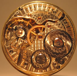
For more than 1000 years, the story of mechanical timepieces — from village clocktowers to marine chronometers to pocketwatches — has been a story of interlocking wheels and cogs. And when size matters — as it does with a watch — the most space-efficient way to contain a lot of circles is to place them inside another circle.
As a handy side-benefit, that circular case (i.e. pocketwatches and wristwatches) also has fewer hard, pointy edges to tear and poke at our skin and pockets.
A design win-win!
Computers: Grids & Rectangles
From the start, writing has taken a linear form, and when you take lines of text and stack them, you inevitably get a rectangle.
That has given us rectangular clay tablets, parchments, scrolls, books, computer screens and — eventually — smartphones. Look at any of today’s devices and you’ll find a strictly enforced grid of rectangles.
Circles Vs. Squares
A ‘smartwatch’ falls somewhere between these two formats. Tradition says we like the circular watch format on our wrist, but we also expect a smartwatch to present grid-based content to us.
So, what are the options?
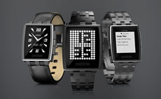
Pebble: Rectangles in a Rectangle
design that first emerged in the 1920’s.
The Pebble was arguably the first modern, viable smartwatch (apologies to my 1980’s Casio Calculator Watch). Both Pebble watches (versions 1 & 2) opted to prioritize their data presentation, and so based their industrial design on softened rectangles.
Though rectangular faces aren’t the native format for the wristwatch, they have been around since the 1920’s, so there has been plenty of time to refine both the styling and the functionality.
The Pebble has always needed to integrate with both iOS and Android, so their UI demands maximum flexibility. They simply don’t have the ability to ask the phone OS people to change things on their side.
Given those natural limitations, the Pebble Steel is a very clever blend of industrial design and functional UI.
Moto360: Rectangles in a Circle
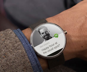
Google have taken an almost opposite approach with their Moto360. It seems the elegance of maintaining a classic, circular face was a non-negotiable for them.
Now, this was no trivial undertaking as it required Google’s Material Design team to completely refit strongly rectangular interface elements into a rounded setting.
I’m yet to actually use a Moto360, but it looks amazing and I think they’ve done a brilliant job.
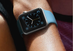
Apple Watch: Circles in a Rectangle
Apple waded into the design discussion yesterday with their Apple Watch launch. Like Pebble, they’ve opted for a broadly rectangular body with soft, 2001-Kubrick-esque rounded edges.
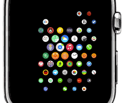
But to me, the most curious decision was Apple’s choice of rounded app icons (see illustration).
To operate, the Apple Watch needs to be paired with an iPhone, so they’ve decided to willingly break UI continuity between these two closely cooperating devices. In other words, the Facebook icon on the phone and on the watch will always be different in a very fundamental way.
The interesting question is why? As we know, boxes stack more efficiently than bottles, so round icons will always generate more wasted space.
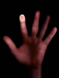
There is one other relevant circle we haven’t mentioned yet. When your fingertip touches a screen, it creates a circular touchpoint. Could it be that Apple believes the fingertip print is the most important circle when trying to hit small touch targets?
I honestly don’t know, but I’d love to hear Jonny Ives’ thinking.
Originally published in the SitePoint Design Newsletter.
Frequently Asked Questions on Smartwatch UI Design
What are the key differences between circular and square smartwatch UI designs?
Circular and square smartwatch UI designs differ primarily in their aesthetic appeal and functionality. Circular designs are often considered more traditional and elegant, resembling classic wristwatches. They offer a unique design challenge as developers must ensure that all elements are visible and accessible within the round screen. On the other hand, square designs provide more screen real estate, making it easier to display more information and navigate the interface. However, they may lack the classic appeal of circular designs.
How does the shape of a smartwatch affect its user interface?
The shape of a smartwatch significantly impacts its user interface. A circular smartwatch requires a UI design that can accommodate the round shape, ensuring that all elements are visible and accessible. This often means that information must be arranged in a radial pattern. Conversely, square smartwatches allow for a more traditional grid layout, which can display more information and make navigation easier.
What are the challenges in designing a UI for a circular smartwatch?
Designing a UI for a circular smartwatch presents unique challenges. The round shape means that information must be arranged in a radial pattern, which can limit the amount of information that can be displayed at once. Additionally, developers must ensure that all elements are visible and accessible within the round screen, which can be a complex task.
Are there any advantages to a square smartwatch UI design?
Yes, there are several advantages to a square smartwatch UI design. The square shape provides more screen real estate, allowing for more information to be displayed at once. This can make navigation easier and more intuitive. Additionally, the square shape allows for a more traditional grid layout, which many users may find familiar and easy to use.
How does the choice of smartwatch shape affect the user experience?
The choice of smartwatch shape can greatly affect the user experience. A circular smartwatch may offer a more traditional and elegant look, but its round shape can limit the amount of information that can be displayed at once. Conversely, a square smartwatch can display more information and make navigation easier, but it may lack the classic appeal of a circular design.
What factors should I consider when choosing between a circular and square smartwatch UI design?
When choosing between a circular and square smartwatch UI design, consider factors such as aesthetic appeal, functionality, and user experience. If you prefer a more traditional and elegant look, a circular design may be the best choice. However, if you prioritize functionality and ease of navigation, a square design may be more suitable.
How can I optimize the UI design for a circular smartwatch?
To optimize the UI design for a circular smartwatch, consider arranging information in a radial pattern to accommodate the round shape. Ensure that all elements are visible and accessible within the round screen. Additionally, consider using a minimalist design to avoid cluttering the screen.
Can the same UI design be used for both circular and square smartwatches?
While it’s possible to use the same UI design for both circular and square smartwatches, it may not provide the best user experience. Each shape has its own unique advantages and challenges, and a UI design should be optimized for the specific shape to ensure the best functionality and user experience.
What are some examples of successful circular smartwatch UI designs?
Some examples of successful circular smartwatch UI designs include the Samsung Galaxy Watch and the Moto 360. These smartwatches have UI designs that effectively accommodate the round shape, ensuring that all elements are visible and accessible.
What are some examples of successful square smartwatch UI designs?
Some examples of successful square smartwatch UI designs include the Apple Watch and the Fitbit Versa. These smartwatches have UI designs that take advantage of the square shape, displaying more information and making navigation easier.