


Key Takeaways
- Velocity, in Scrum, is a measure of the amount of work a team can complete in a typical sprint, providing a reliable and predictable sense of how long it will take to complete new stories. It is not a KPI, but a tool for estimation, and its chart should trend towards a horizontal average, not a constant increase.
- A burndown chart shows the team’s progress towards completing all of the points they agreed to complete within a single sprint, providing a visual representation of work left to do versus time. Regular updates of the burndown chart allow for real-time tracking of project progress and early detection of any deviations from the planned schedule.
- Velocity and burndown charts are both essential tools in Scrum for tracking and forecasting project progress. While velocity measures the amount of work a team can handle in a sprint, a burndown chart visually represents the work remaining over time. Together, they provide a comprehensive view of the team’s performance and project progress.

The following is an extract from our book, Scrum: Novice to Ninja, written by M. David Green. Copies are sold in stores worldwide, or you can buy it in ebook form here.
Velocity Chart
Velocity is how a scrum team measures the amount of work they can complete in a typical sprint. Velocity is measured historically, from one sprint to the next. By tracking the number of story points the team can complete according to their own definition of done, they can build up a reliable and predictable sense of how long it will take them to complete new stories based on their relative point value.
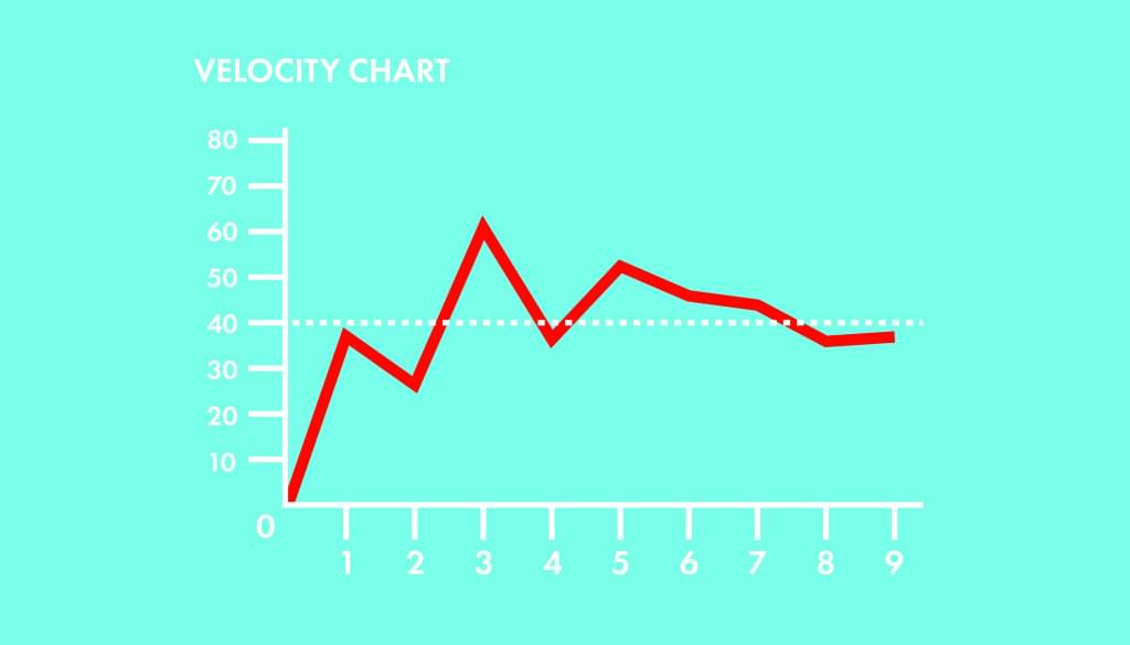
Keeping track of the velocity is the responsibility of the scrum master. At the end of each sprint demo, the scrum master should calculate the number of points that were estimated for the stories that were accepted as done during that sprint. This number should be added as a data point on the velocity chart for that sprint.
Velocity charts tend to start out jumping around from very high numbers to very low numbers, as the team learns how much work they can do in a sprint, and how to estimate stories. The longer a team works together, the better they get at estimating stories consistently relative to each other. That skill leads to a better sense of how many stories, and how many points, the team can accomplish in a single sprint.
Over time, if the composition of the team stays consistent, a velocity chart that started off very erratic will start to find itself averaging toward a consistent value. Unlike many charts in a business environment, the point of the velocity chart isn’t to see a constant increase, but rather to see the values converging around a consistent horizontal line. That line represents the amount of work the team can realistically and sustainably accomplish in a single sprint.
Note: Velocity is a Tool for Estimation, not a KPI
People outside the scrum process may be confused about the nature of the velocity chart. From a management perspective, there may be an impulse to favor an increase in the amount of work a team is doing, and look for velocity to grow over time. But a velocity chart is intended to trend toward a horizontal average. You may hear executives talking about trying to increase the team’s velocity, or celebrating a sprint in which the velocity was higher than typical sprints. Get ahead of these conversations by reminding everyone that the point of velocity tracking is to improve the team’s ability to estimate how much work they can get done consistently and reliably. A velocity chart that shows a constant increase (or decrease) over time usually reflects a problem in the process.
Burndown Chart
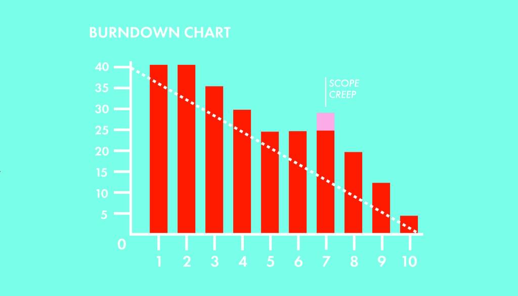
A burndown chart shows the team’s progress toward completing all of the points they agreed to complete within a single sprint. This chart starts with the total number of points the team has taken on for the sprint, and tracks on a day-to-day basis how many of those points have been completed and are ready for the sprint demo.
The burndown chart is usually maintained by the scrum master, and may be updated on a daily basis, perhaps after the daily stand up, or on a continuous basis if it’s generated automatically by the tools the team is using to maintain the scrum board. The primary audience for a burndown chart is the team itself, although there may be data points on a burndown chart that could be relevant to people outside the scrum team.
A typical burndown chart starts with a straight diagonal line from the top left to the bottom right, showing an “ideal” burndown rate for the sprint. In practice, the point is not to match that ideal, but rather to keep in mind how much of the sprint is left at any point in time, and how much effort the team expects to be able to put toward the development of the product on any particular day of the sprint.
Lines or columns on the burndown chart may be used to represent the number of points of effort actually remaining in the sprint from day-to-day, starting with the number of points the team has committed to at the sprint planning. As work is completed, these columns should become shorter until they reach zero.
Some teams also choose to track the daily work completed, either in story points or in individual tasks toward completing stories. This can be done with a line or stacked columns, tracking these daily metrics against the burndown chart so they can be viewed in context.
There are very few legitimate reasons for a column to be taller on one day than it was on the previous day. If a bug is discovered before the end of the sprint, and a story that was marked as done or ready to demo needs to be worked on again, columns may increase in size from one day to the next. New stories introduced after the sprint has started may also cause one day’s column to be higher than the previous day’s. A pattern of rising columns on a burndown chart may indicate that the scope of the work is exceeding the originally agreed sprint backlog, which is definitely an anti-pattern in scrum.
Warning: Beware Scope Creep
The scope of the sprint backlog should be respected by everyone. If new stories are regularly being added to the sprint after the sprint has started, the columns that reflect the amount of work left to be completed in the sprint on any given day may rise above the level of the previous day. This pattern is sometimes represented in a contrasting color, to highlight the fact that the originally agreed to scope may be creeping upward. If this happens frequently, it may reflect problems in the process that are worth addressing in a sprint retrospective.
Frequently Asked Questions (FAQs) about Scrum Artifacts, Velocity, and Burndown Charts
What is the significance of velocity in Scrum?
Velocity in Scrum is a critical metric that helps teams estimate the amount of work they can complete in a given time frame, typically a sprint. It is calculated by adding up the estimates of the work (usually in story points) completed in the last sprint. This provides a useful benchmark for planning future sprints. It’s important to note that velocity is a unique measure for each team and should not be used to compare different teams’ productivity.
How do burndown charts aid in project management?
Burndown charts are visual representations of work left to do versus time. They provide a quick overview of the project’s progress and the amount of work remaining. This helps teams and stakeholders understand if the project is on track to meet its deadlines. If the chart shows a deviation from the expected progress, teams can take corrective actions to get back on track.
How are velocity and burndown charts related?
Velocity and burndown charts are both essential tools in Scrum for tracking and forecasting project progress. While velocity measures the amount of work a team can handle in a sprint, a burndown chart visually represents the work remaining over time. Together, they provide a comprehensive view of the team’s performance and project progress.
Can velocity change during a project?
Yes, velocity can change during a project. It’s a measure of a team’s capacity based on past performance, so it can fluctuate as the team’s efficiency improves or if there are changes in team size, work complexity, or other factors. Regularly reviewing and adjusting velocity ensures more accurate sprint planning.
What should I do if the burndown chart shows we’re not on track?
If the burndown chart indicates the project isn’t on track, it’s crucial to identify and address the issues causing the delay. This could involve re-evaluating task estimates, removing blockers, increasing resources, or adjusting the scope of work. Regularly reviewing the burndown chart allows for early detection and resolution of such issues.
How can I improve my team’s velocity?
Improving a team’s velocity involves enhancing their efficiency and effectiveness. This could be achieved through regular retrospectives to identify and address issues, providing necessary training and resources, improving communication and collaboration, and fostering a supportive work environment.
How often should I update the burndown chart?
Ideally, the burndown chart should be updated daily. This allows for real-time tracking of project progress and early detection of any deviations from the planned schedule.
Can velocity and burndown charts be used in other project management methodologies?
While velocity and burndown charts are commonly associated with Scrum, they can be adapted for use in other project management methodologies that involve iterative work cycles. They provide valuable insights into team capacity and project progress, regardless of the specific methodology used.
What are some common mistakes to avoid when using velocity and burndown charts?
Some common mistakes include using velocity to compare team productivity, not updating the burndown chart regularly, not adjusting velocity based on changes in team or project conditions, and relying solely on these tools for project management without considering other factors like quality and customer satisfaction.
How can I effectively use velocity and burndown charts in my project?
To effectively use these tools, it’s important to understand what they represent and how to interpret them. Regularly update and review them to track project progress and team performance. Use them as a guide for sprint planning and to make informed decisions about resource allocation and schedule adjustments. Remember, they are tools to aid project management, not definitive measures of success.

