Generating Responsive Image Assets with Photoshop CC 2014

This article was sponsored by Adobe. Thank you for supporting the sponsors that make SitePoint possible!

Key Takeaways
- Photoshop CC 2014 provides a suite of tools for generating responsive image assets, including the use of SmartObjects, Layer Comps, and the ‘Extract Assets’ function. These tools allow for efficient resizing, transforming, and exporting of images without loss of quality.
- SVG (Scalable Vector Graphics) should be used when possible due to its ability to deliver small files that instantly rescale without loss of image quality. This is particularly useful in responsive design as it means managing a single file for all resolutions.
- Adobe’s new online services, Creative Cloud Assets, allow for easy sharing and collaboration on PSD comps. This includes the ability to share PSDs with clients for review, distribute PSDs to external contractors, and provide colleagues with access to extract assets, all without needing their own Photoshop install.
The right assets for the right devices
Five years ago the web was a more predictable place, wasn’t it?
As web developers, we could reasonably expect web browsers no narrower than 640 pixels, and no wider than 1240 — it was as if our ‘internet super-highway’ was trafficked only with family sedans.
Our current reality is a very different picture.
Today, mobile users often make up more than half of our traffic. The truth is, in 2014 there are as many motorbikes on ‘our super-highway’ as there are sedans and trucks.
So, why are we still loading the same ‘family-sized’ images onto all these wildly different devices?
But does it really matter?
Last month Tammy Everts published some very sobering figures on the effects of site performance on user behaviour. They include:
- Slow web pages correlate to more than $3b lost sales annually
- 44% of shoppers interpret slow performance as ‘something went wrong’
- A 2-second delay during a transaction = 87% shopping cart abandonment rate
Tammy’s numbers tell us that sending slow, family-sized images to baby-sized devices isn’t just bad manners — it’s actually costing us customers and money. By tailoring our images to the limitations of the each device, we can deliver pages faster while saving bandwidth costs – a win for everyone.
Delivering the right images
There are already a number of established methods for delivering adaptive image content to devices. The current best options are:
- Adaptive-images.com: Matt Wilcox’ solution is a current favorite of many developers. It’s device-agnostic and mobile-first, although it does usually requires some Apache and PHP setup knowledge.
- Squeezr.it: Squeezr is heavily inspired by adaptive-images, but favors a client side strategy for determining and reacting to breakpoints.
Have no fear: these are both excellent solutions, but we’re not going to focus on them today. Instead I’d like to look at the other part of the problem: the image assets.
How do we generate all these different image assets?
Adobe has put a lot of thought into this problem and it shows in Photoshop CC 2014. They offers a suite of tools – some new, some older – designed to help.
Here are some tips to get started with responsive images.
Tip #1: Embed All Images as SmartObjects
SmartObjects are nothing new – they’ve existed in Photoshop since 2005 – but they’ve become a central tool in responsive design. SmartObjects always keep a reference link to their original image state, even after we’ve applied destructive transformations to them.
For instance, in most situations, re-scaling an image multiple times would degrade the image at each iteration. However SmartObjects apply each new transformation to the original image state, with no image quality loss.
This makes it almost a no-brainer to begin your project by converting all your high resolution image resources — avatars, backgrounds, photos and the like — into a SmartObjects, allowing you to resize, rotate, transform and reposition them without fear.
Converting any layer to a SmartObject is as simple as right-clicking it and selecting ‘Convert to SmartObject‘.
Tip #2: Take Advantage of Layer Comps
In the era of responsive design, ‘THE layout‘ has become ‘the LAYOUTS’. We need a way to manage the SAME page elements in two, three or more positions and sizes.
That’s precisely what ‘Layer comps’ are designed for. Think of a each new ‘Layer comp’ as a ‘snapshot’ of your layers panel at a particular moment in time. You can then return to that snapshot state at any time with a single click in your layers comp panel.
In practice, this usually means building your mobile layout (mobile first), and then capturing it as a new layer comp. You can then begin re-engineering the layout for tablets, and once again capturing this to another layer comp.
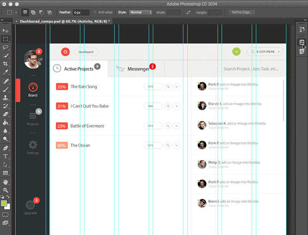
The layers comp panel allows you to instantly switch between any of these states with a click. Layer comps reduce duplication in your layers panel, and simplify your project file as a whole.
Tip #3: Forget ‘Save for web..’ – Use ‘Extract Assets’
I must admit, I always liked Fireworks’ image export panel. Photoshop had Image Ready as a separate application, and its own built-in ‘Save for Web’ function, but for me neither was as simple, powerful or fast as Fireworks.
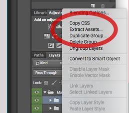
Photoshop CC 2014 takes a fresh, much-improved approach to image export – a new ‘Extract Assets’ function. Let’s take a closer look.
The Extract Assets panel will target whatever layers you have selected in the Layers panel. In theory, that could be a single layer, all layers, or any combination in between.
You can launch this new panel from two places:
- By right-clicking on any layer/s and selecting ‘Extract Assets’
- Or by selecting ‘Extract Assets’ from the File Menu
Let’s take a look at the new Extract Assets panel.
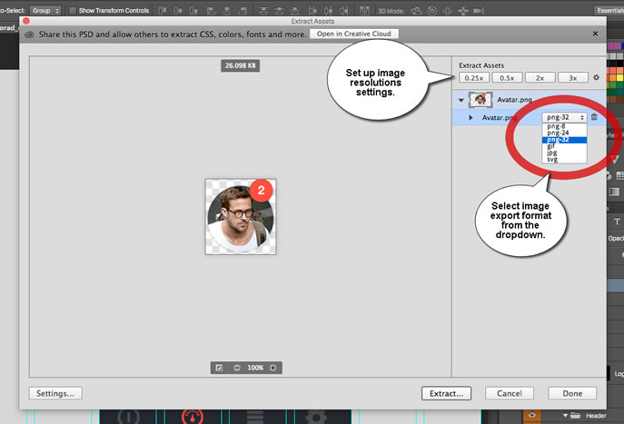
Layers can be exported in any one of six image formats:
- PNG8
- PNG24
- PNG32
- JPG
- GIF
- SVG (Yes. More on that later)
You can also choose to simultaneously generate images in up to eight different resolutions — ranging from 25% up to 400%. Photoshop also makes it easy for you to automatically prefix each filename and export to sensible folder names.
You can even set it to automatically re-generate the entire set of files any time you update the original document. It’s not hard to see what a huge timesaver this could become.
Note that if you are comfortable with your current workflow, the classic ‘Save for web’ option is still available. However, I suspect most will see the power and flexibility of the new functionality.
Tip #4: Use SVG When Possible
SVG has been one of the hot web design trends of 2014, so it’s exciting to see SVG support come to Photoshop. Vectors are uniquely well-suited to responsive design as they deliver tiny files that instantly re-scale with no loss in image quality.
In purely practical terms, using SVG (where practical) means you only need to manage a single file for all resolutions (not including fallbacks for older clients).
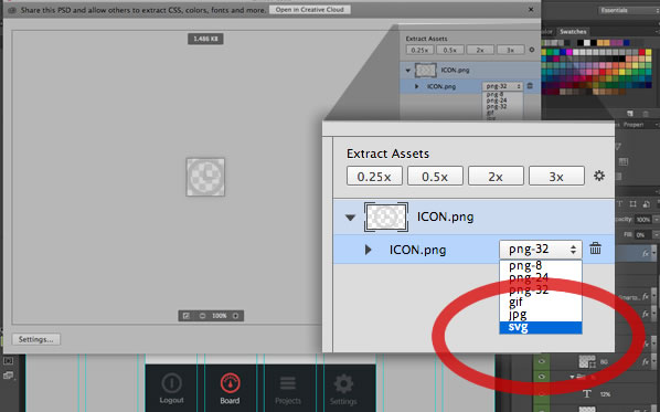
Although Photoshop will allow you to export any layer/s to SVG, pixel-based image elements are unlikely to deliver good results. Any path-based graphics — including logos, icons, masks and other shapes — will likely be ideal candidates for SVG export.
Tip #5: Don’t Forget Creative Cloud Assets
One of the new side-benefits of working with PSD is Adobe’s new online services. Syncing your PSD comps to Creative Cloud unlocks a raft of handy tricks. I covered this in more detail in my last article, but the headline points are:
Share your PSDs with clients easily
Forget about sending JPEG comps for client review. Creative Cloud lets them view and comment on your PSD comps live in the browser. That’s correct — they no longer need Photoshop to review PSDs.
Distribute PSDs to external contractors
External contractors can work directly with the latest versions of assets, exporting assets directly using the browser.
Provide colleagues with access to extract assets
You now have an easy way to share version-managed PSDs with your team. They can even extract CSS, images and other assets from you PSD without needing a their own Photoshop install.
This service is available to anyone with a free Adobe account.
The Wrap-up
Biodiversity is a good thing! Our browser ecosystem — phones, tablets, laptops, desktops, even TVs — is rich and varied, and it’s only going to get more diverse in the years to come. This makes our job both harder and more interesting.
Responsive Web Design has taught us that ‘the page’ has actually become a ‘family of pages’ – a papa page, a mama page and some baby pages. For the same reasons ‘the image’ has become a ‘family of images’ too.
Photoshop CC 2014 now provides a relatively painless and fast workflow for generating those ‘image families’.
Check it out.
Frequently Asked Questions (FAQs) on Responsive Image Assets in Photoshop and CSS
What are the best practices for exporting SVG files from Photoshop?
Exporting SVG files from Photoshop can be done in a few simple steps. First, open the file you want to export in Photoshop. Then, go to the “File” menu and select “Export”. Choose “Quick Export as SVG” or “Export As” to choose SVG as the file type. Before exporting, you can adjust the image size and quality. Remember to name your file appropriately and save it in the desired location. It’s important to note that not all Photoshop features are supported in SVG format. Therefore, it’s best to keep your design simple and avoid using features like Photoshop effects.
How can I optimize my SVG files for web use?
Optimizing SVG files for web use involves reducing the file size without compromising the image quality. This can be achieved by simplifying your design, removing unnecessary metadata, and using SVG compression tools. Additionally, you can use CSS to control the appearance of your SVG files on the web, such as colors and dimensions. This allows you to reuse the same SVG file with different styles, reducing the number of files you need to load.
Why are my exported SVG files not displaying correctly on the web?
There could be several reasons why your SVG files are not displaying correctly. One common issue is browser compatibility. While SVG is widely supported by modern browsers, some older versions may not render SVG files correctly. Another issue could be the use of unsupported Photoshop features in your design. As mentioned earlier, not all Photoshop features are supported in SVG format. Therefore, it’s best to keep your design simple and avoid using features like Photoshop effects.
How can I use CSS to control the appearance of my SVG files?
CSS can be used to control various aspects of your SVG files, such as colors, dimensions, and positioning. To do this, you first need to embed your SVG file in your HTML code. Then, you can use CSS selectors to target your SVG file and apply styles to it. For example, you can change the color of your SVG file by using the “fill” property in CSS.
Can I animate my SVG files using CSS?
Yes, you can animate your SVG files using CSS. This can be done using keyframes and animation properties in CSS. For example, you can create a spinning animation by rotating your SVG file around its center. However, keep in mind that complex animations may increase the load time of your web page, so it’s best to keep your animations simple and efficient.
How can I make my SVG files responsive?
Making your SVG files responsive involves ensuring that they scale properly on different screen sizes. This can be achieved by using CSS media queries and the “viewBox” attribute in SVG. The “viewBox” attribute defines the aspect ratio and coordinate system of your SVG file, allowing it to scale smoothly on different screen sizes.
What are the advantages of using SVG over other image formats?
SVG has several advantages over other image formats. First, SVG files are vector-based, meaning they can be scaled without losing quality. This makes them ideal for high-resolution displays. Second, SVG files are typically smaller in size compared to other image formats, which can improve the load time of your web page. Lastly, SVG files can be styled and animated using CSS, providing more flexibility and control over the appearance of your images.
Can I use Photoshop to create SVG files from scratch?
While Photoshop is primarily a raster graphics editor, it does support basic vector graphics features. This means you can use Photoshop to create simple SVG files from scratch. However, for more complex vector graphics, a dedicated vector graphics editor like Adobe Illustrator may be more suitable.
How can I ensure that my SVG files are accessible?
Ensuring that your SVG files are accessible involves providing alternative text for screen readers. This can be done by using the “title” and “desc” elements in SVG. The “title” element provides a short description of your SVG file, while the “desc” element provides a longer description. Additionally, you can use ARIA attributes to further enhance the accessibility of your SVG files.
Can I use SVG files in email marketing?
While SVG files offer many advantages, they are not widely supported in email clients. Therefore, it’s generally recommended to use other image formats like JPEG or PNG for email marketing. However, you can use SVG files in your email templates if you provide a fallback image for email clients that do not support SVG.
Alex has been doing cruel and unusual things to CSS since 2001. He is the lead front-end design and dev for SitePoint and one-time SitePoint's Design and UX editor with over 150+ newsletter written. Co-author of The Principles of Beautiful Web Design. Now Alex is involved in the planning, development, production, and marketing of a huge range of printed and online products and references. He has designed over 60+ of SitePoint's book covers.