In his new book, Sexy Web Design, Elliot Jay Stocks shares the methods he uses to create stunning web interfaces – and one of the most important steps is to do some research. In this sample from the book, Elliot explores different ways to gather inspiration and cool ideas for your next project.
We’ve been hired by an events promoter to build a website for an upcoming event for Web industry professionals. The goal is for the visitor to buy an “access all areas” ticket for the event; the design should have a huge impact on users when they visit, the interface should be usable and clutter-free, and they should be really impressed by what they see. But before we even think about touching Photoshop, we need to do some research.
Let’s begin with the first logical step, and analyze the brand values associated with the event. These in turn will be the core messages that the site needs to convey. Let’s imagine we ask our client for some brand values, and they give us the following ideas to work with:
- fun and exciting: more than just a conference
- credibility: advice from the absolute experts
- inventive and innovative: a group of creative people open to new ideas
Already that might start conjuring up some stylistic ideas in our minds, but let’s leave that for the moment. We should be asking ourselves: what makes up an event site? Our client has yet to specify the actual pages they want, so we’ll help them out by brainstorming:
- Home: an introduction to the event; leads people into other parts of the site
- Bookings: to sell the ticket types
- Schedule: for details about the event
- Speakers: an easy glance at the experts involved
- Venue: where the event is located and the facilities available
- Sponsors: may appear in the sidebar or footer, rather than a page of its own
- Community: parties, links to social networks, photos, and so on
Let’s take a look some of the values we want to convey with our site, and take a peek at how other event web sites go about it.
The Element of Fun
Events – or, more specifically, the kind we like to have in the web community – tend to emphasize the convivial aspect. Who would’ve thought that people like to hang out with their friends and colleagues for a social drink?
With the fun element being such an important selling point, it makes sense for us to give this a lot of prominence on our web site. Although it’s important to stress the knowledge that can be gained at such events, we all know that we’re just as interested in the parties! That’s why we’ll suggest to our client that a whole page should be dedicated to social gatherings happening around the event, with the imagery of the site portraying a fun, party-like atmosphere.
Gravitas and Authority
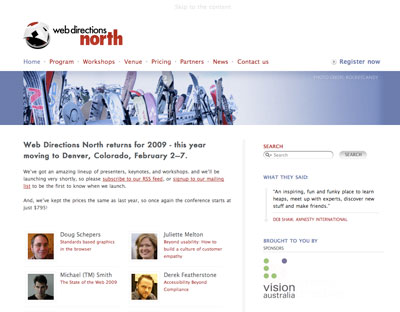
But we mustn’t get carried away with all this fun malarkey. We need to make it clear that this is a credible, serious event, too. Otherwise, how else are delegates going to convince their bosses to pay for this out of their training budget? The web site for Web Directions North, shown below, is neat, clean, and means business.
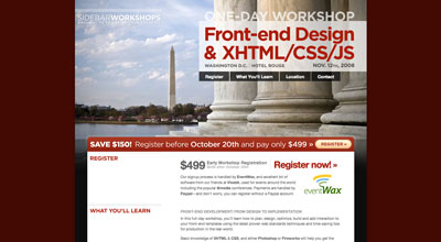
Going to an event is meant to be an educational experience, especially when a workshop is involved. The Sidebar Workshops site we see in the figure below does this well by explicitly stating What You’ll Learn right near the top of the page, and again right underneath the registration information. As well as the prominent position, the text is short and easily digestible: a nice, memorable chunk to take away.
Inventive and Innovative
Our client also wants us to ensure that the design suggests a feeling of invention and innovation. One way to present this idea with the most impact will be to create a design that breaks the rules slightly, whether that’s in terms of color, layout, or type. As we look around for inspiration for our design, we’ll be sure to keep our eyes out for examples that exemplify this goal. The real opportunity for trying something new will come later, however, when it’s time to plan the aesthetics of the design.
Achieving a Balance: Information and Atmosphere
Balancing the display of information while conveying the right atmosphere is a huge challenge.
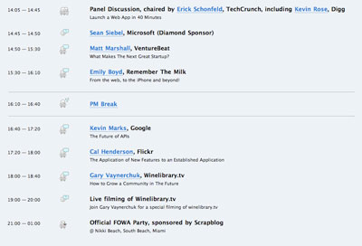
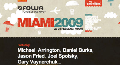
When I designed the Future of Web Applications (FOWA) Miami 2008 site, I attempted to get the best of both worlds by giving the site a fun kind of feel with the beach in the background, but keeping the information neatly organized in the foreground. You can see this on the schedule page in Figure 1.3, with the clear separation of time slots and information. We decided that it would be more helpful if I designed some icons to visually indicate each type of session; that way, users could clearly see if it was a presentation, a lunch break, or a party, and so on. This allowed for the opportunity to throw a bit more of the playful feeling into the mix, so I threw in some little dudes.

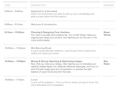
The Sidebar guys kept the schedule looking fairly businesslike on their Workshops site, seen in Figure 1.4, but it still looks terrific, and is a great example of attention to detail.
What Matters the Most?
If you think about what might be the most important information relating to an event, you might say date, location, and price – but in all likelihood there are other elements that entice potential attendees.
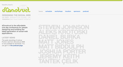
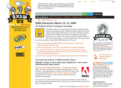
Most events’ web sites recognize celebrity appeal and make their big-name speakers as obvious as possible, like dConstruct, shown in the figure below. The reverse is also true: if the event lacks many web personalities, they’ll play down the speaker list. Sometimes the speaker list is so unwieldy that they choose to exclude it from the homepage altogether, and instead focus on more general information, as demonstrated by the South by Southwest Interactive homepage below.
Venues and locations can sometimes be a drawcard for delegates. And when the location is also a popular holiday destination like Miami, then you should really shout about it.
Brand Consistency
Brand consistency is the goal of keeping a consistent look, feel, and message across all of a company’s communications, including its web site. Depending on the project, you could find yourself in one of a number of potential situations. Let’s take a look.
From Scratch
If the brand for the event is yet to exist, then our site will be providing the beginnings of a defined experience and acting as a style guide for other events to follow. Be mindful that limits may still apply, though: this might be the first event, but it should probably tie in with already established concepts by the company. That might translate to a simple action like incorporating the parent company’s logo into the footer, or it may be more complex: there could be a particular set of style guidelines that we have to follow, such as a color scheme or font.
Redesign
If previous site designs exist, then you should maintain consistency, but each event could have its own voice, or theme. You can use previous versions of the site as a guide to design elements you could reuse. Perhaps you could use a different color palette, yet still maintain a similar design template.
Tie-ins
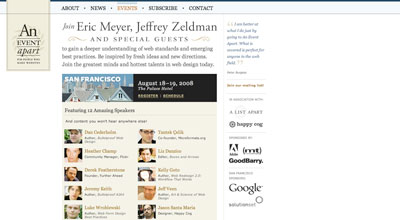
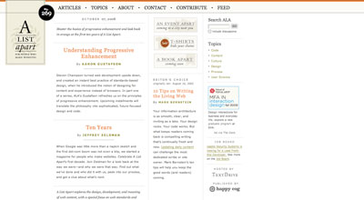
You may need to create a design that closely ties in with a previously established identity. The An Event Apart web site seen below has its own branding, but incorporates the exact same look and feel of its sister site, A List Apart. Rather than taking only small elements of the design patterns as you might find when a child site is borne of a parent company, the two are treated as equals: two sides to the same coin.
For our project, we’ll need to incorporate the company logo of the organization running the event – but we’ll have free rein when it comes to the actual event branding, since it’ll be the first of its kind (that is, the first scenario – From Scratch – above). This will demonstrate how you can be creative while still operating within a few guidelines. Guidelines are good, by the way: they take away some of the scare factor of a completely blank canvas!
Inspiration Resources
So far we’ve been looking to other events’ web sites for inspiration, but we don’t have to stick to that niche. It’s become quite popular to collect examples of first-rate design and archive them as sets on Flickr, an image-sharing service. To start off, check out Patrick Haney’s massive collection, and the Web Design Inspiration Flickr pool which he administers. For even more Flickr sources, check out Vandelay Design’s list of 99 Flickr groups for design inspiration. And numerous web sites exist, such as Smashing Magazine and UI Pattern Factory, that are excellent sources of interesting design examples.
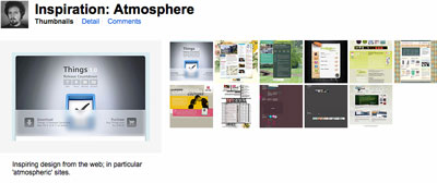
Atmosphere Inspiration
Let’s get an idea of the kind of atmosphere we’d like our site to have – the feeling we evoke through color, subject matter, and texture. You may be familiar with the concept of a mood board, which describes a general collection of images, textures – almost anything that conveys the same mood you want to achieve. Let’s take the term wooden: a traditional mood board might entail, for example, cutting out images of wooden furniture from catalogs or photographs of trees from magazines, and then laying them down on a canvas to make a montage.
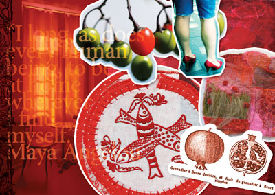
Oh, and by the way, it’s unnecessary to use an actual board – any surface (physical or virtual) will do! There is even a variety of software tools available to help you create your own mood boards if you want to do so digitally. The figure below shows a mood board created in Photoshop from public domain and Creative Commons-licensed images found on the Web.
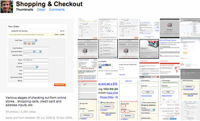
Collating a photo set on Flickr is akin to the action of creating a mood board, particularly when researching atmosphere. I’ve collected some, which you’ll see below.
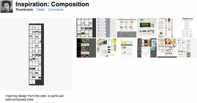
Composition Inspiration
We aim to create a unique and interesting web site, setting it apart from the kind of site you see every day. A noteworthy way to stand apart from the other sites is to think of an unusual composition or layout. We’ll need to take a few risks in the interests of originality, so I’ve been collecting design examples which follow the same mantra. Of course, we’ll still be mindful of the site’s usability – it’s important to stick with what users will understand – but you’ll see that even a little thinking outside the box can go a long way. Here’s my composition set on Flickr:
Functionality Inspiration
Our site will contain a number of functional elements, like navigation mechanisms, a ticket purchase form, a schedule, and plenty more. It’s useful to look at all the different ways other designers have chosen to implement each of these elements.
Chris Messina has been collecting examples of user interface (UI) design on Flickr for years now, and his collections go beyond pure inspiration into the realm of an indispensable resource. You’ll also find a wealth of UI examples collected at Pattern Tap, where users have collected, tagged and commented on widgets from all over the Web.
Look Outside the Web
I’m a keen believer in the idea that if you only use web sites for inspiration, you’ll only ever build a web site that looks like other web sites. Of course there’s nothing wrong with that – it’s essential that a web site looks and behaves like one – but you risk your design growing stale if you search for stimuli in only one place.
There’s a whole world out there full of outstanding design – architecture, fashion, product, packaging … why confine yourself to one medium and limit your creative potential? Take your trusty camera and go for a walk – collect photos of signs, textures, anything that grabs your fancy. Doodle in a notebook whenever you have an interesting idea. Before you know it, you’ll have a huge collection of inspiring material from the real world.
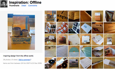
If you look at the world of print design in particular, you’ll see most of the same principles of web design at work. After all, the new discipline of web design is derived from years of print design tradition, but with a few of the limitations and freedoms reversed. So there’s still plenty of inspiration we can take from the print design world to better inform what we can achieve on the Web. I’ve collected some offline examples in – you guessed it – another Flickr set, shown below.
Collection Tools
I’ve been saving interesting and inspiring snippets in my Flickr profile, but it’s not the only way.
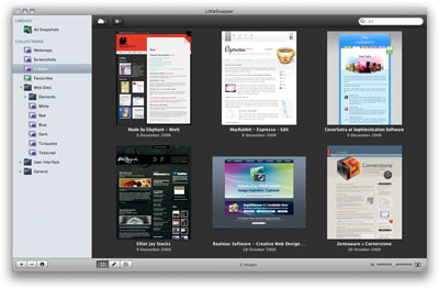
RealMac Software – the team behind web development application RapidWeaver – have recently released LittleSnapper, a Mac application that allows you to collect sources of inspiration from the Web and share them with your peers. It’s a nifty new tool for Mac-based designers, and one I’d heartily recommend.
For Windows users, TechSmith’s Snagit application captures screenshots and screen images, with a library you can use to organize your screenshots by tags, URLs, and date.
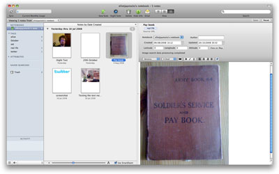
Then there’s Evernote, suitable for both Mac and Windows, an all-encompassing note-keeping application that you can access from just about everywhere, thanks to versions for your desktop, phone, and web browser. You can create, upload, and save images, text and audio, and if there’s text contained within the image, Evernote’s optical character recognition (OCR) engine will identify it and make it searchable. That’s very handy for when your notes archive becomes rather large!
Research: an Ongoing Process
Research is one of the most valuable ways to spend your time as a designer. Keep your eyes and mind open, and let yourself be influenced as much as possible. Ultimately, the more research you do, the more likely your design will be a success.
If you’ve enjoyed this excerpt from Sexy Web Design by Elliot Jay Stocks, then you’ll love the complete sample chapter. Even better, buy the book and begin creating stunning web interfaces today.
 Elliot Jay Stocks
Always aspiring to create a unique look that's out of the ordinary, Elliot Jay Stocks's design is frequently featured in online and offline publications. His work is showcased on various design inspiration web sites, where it's used as an example of how accessible web design can still look beautiful. Elliot is also known to write about design trends, issues, and techniques for industry-leading publications such as Practical Web Design and Computer Arts Projects. He can be seen regularly at design conferences around the globe, taking to the stage as both a speaker and a workshop host.