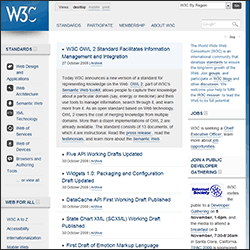
 Following requests for feedback in April, the W3C finally launched their sparkly new website on 13 October.
The World Wide Web Consortium (W3C) is an international community of organizations, full-time staff, and public members who work together to develop web standards and technology specifications (HTML, XML, CSS, DOM, RDFa, SOAP, SVG, semantic web, etc.).Until recently, those of a polite disposition would describe the website as functional rather than usable or attractive. The W3C hope the redesign will make the site easier to navigate and more pleasant to use.
The new site is undoubtedly an improvement. The design is clearer, far more attractive, and works on all modern browsers (as well as IE6). A flexible layout is used which switches to a “mobile view” single column when the browser viewport width is reduced below 481 pixels. It’s a nice touch, although I’m not convinced many mobile users have an urgent need to access the site?
The content is as thorough as ever, although it’s evident some pages are incomplete. The first sections I visited were browsers and authoring tools — these are of significant interest to developers, yet no content is available? It’s understandable that the site and specifications will evolve, but why provide a home page link to missing content?
Behind the scenes, the site uses XHTML 1.0 strict throughout and every page I tested passed validation. Ironically, the CSS does not validate primarily because of numerous IE6 hacks. Neither does the site pass automated accessibility validation: form controls have missing labels, there are linking issues, and descriptive meta tags are not used.
The “view: desktop, mobile, print” control at the top of the page is powered by JavaScript. Unfortunately, it lacks progressive enhancement: the control never appears if JavaScript is disabled or unavailable in your browser. That strikes me as slightly bizarre: a control which benefits mobile users will probably fail on many mobile devices?
The view control is the only JavaScript functionality I could find. So why does the site require the full jQuery library and a cookie plugin? I’ve nothing against jQuery, but a better standalone widget code could have been developed which was a fraction of the download size and supported more browsers.
Perhaps I’m being a little overly-critical, but shouldn’t the W3C lead by example? I like their new site, but it would be better if the developers had followed the guidelines they were publishing.
What do you think of the new W3C site? Should they fix the validation and accessibility problems? Or are they simply using the hacks and shortcuts many web developers use on a daily basis?
Links:
- https://www.w3.org/
- W3C home page XHTML 1.0 validation report
- W3C home page CSS validation report
- Progressive enhancement techniques: HTML, CSS and JavaScript
- The W3C Want Your Feedback
Craig is a freelance UK web consultant who built his first page for IE2.0 in 1995. Since that time he's been advocating standards, accessibility, and best-practice HTML5 techniques. He's created enterprise specifications, websites and online applications for companies and organisations including the UK Parliament, the European Parliament, the Department of Energy & Climate Change, Microsoft, and more. He's written more than 1,000 articles for SitePoint and you can find him @craigbuckler.

