

Film has inspired everyone from fashion designers, video games and even music videos. Website design is no different, with film lending its techniques to establish a particular look or mood.
Following on the heels of Bauhaus, we’re going to explain film noir, its history, its key players, and how you can bring it to your designs.
Let’s get started.
Key Takeaways
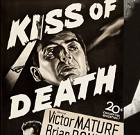
- Film Noir, literally meaning “black film” in French, is a cinematic genre characterized by the use of black and white film, vignettes, high and low key lighting, cynical characters, and is often associated with crime dramas set in the timeline of WWI and WWII.
- The rise of Film Noir was influenced by German Expressionism and crime fiction publications such as Série Noire. Notable directors of the genre include Fritz Lang, Alfred Hitchcock, and Orson Welles, whose works often dealt with themes of paranoia, madness, inner conflict, and morality.
- Key elements of Film Noir style include low-key lighting, unusual camera angles, complex narratives, morally ambiguous characters, and the use of stark contrast to emphasize characters and objects. The genre also often features female characters known as ‘femme fatales’ who are mysterious, manipulative, and deceitful.
- Film Noir style has had a significant influence on modern cinema, with many contemporary filmmakers drawing on its aesthetics and themes. The style’s emphasis on visual storytelling, complex narratives, and morally ambiguous characters can be seen in a wide range of modern films, from crime thrillers to psychological dramas.
- Film Noir style can also be incorporated into website design, logos, and other web elements. Examples include the Noir City Film Festival website, Belief Skateboards website, Juzzy Bunni’s logo design, and SLP Catalyst’s black and white icons.
So, what is Film Noir?
The term literally means “black film” in French, but in the cinematic world it has come to encompass certain aesthetics and tropes.
These including the use of black and white film, vignettes, high and low key lighting, along with the presence of cynical characters. The genre is usually associated with crime dramas, or those fitting in the timeline of WWI and WWII, but film noir has often branched out from these “stereotypes”.
Films like “It’s a Wonderful Life” and “Vertigo” defy many of the classic noir films memes, but still managed to fit in the category.
In ‘It’s a Wonderful Life’, the protagonist is suicidal and the mood of the film is dark, while Vertigo, though not a black and white film, features class film noir themes — a tortured anti-heroe, a post-war timeline and, of course, a complex plot.
The Beginnings
German Expressionism
Before we can go into detail about film noir, let’s talk a little about its forefather, ‘German Expressionism’.
Characterized by the use of abstract imagery, unconventional camera angles, stark contrast in lighting, overly-styled sets and characters as well as an over-theatrical approach, German Expressionism shares a host of similar techniques with film noir.
The Expressionist movement saw artists voicing their dissatisfaction through their work — often channelling the feelings of a scared and broken nation.
The Rise of Film Noir
While the German Expressionism movement is credited as having a strong influence over the birth of film noir, it was the crime fiction publication Série Noire, founded by Marcel Duhamel in 1945, that inspired the French critic Nino Frank to coin the term.
The Série Noire collections depicted the work of private detectives, the central character in a lot of films categorized as film noir.
When the ban on the export of Germany films ended, it allowed German filmmakers to reach a global audience. However, it didn’t stop the rise of the Nazi Party, which led to the emigration of many of it’s greatest filmmakers to America.
Here many notable directors of the German Expressionism movement like Fritz Lang, Karl Freund and Michael Curtiz brought over their sense of dramatic lighting, anti-heroes and of course a focus on the ever important mise-en-scène.
Hollywood began to actively accept these film techniques as they too began to tire of “happy-ending” cinema. They began to exchange the lighthearted for a moody atmosphere, a psychological take on feelings of alienation, and other nightmarish thoughts of the modern sensibility.
Universal Studios adopted this type of dark and stylized look to give birth to such films as Dracula, Frankenstein, and the Mummy (all released in 1931).
From there, crime thrillers and detective films found immense success, giving us iconic figures like Humphrey Bogart, Alan Ladd and Veronica Lake.
Key Players of Film Noir
Fritz Lang
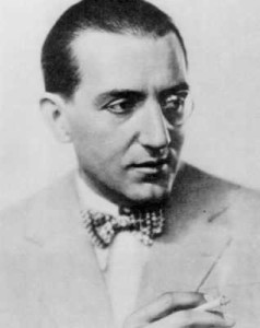
Born Friedrich Christian Anton “Fritz” Lang of German and Austrian descent, Lang is one of the most notable filmmakers of the school of German Expressionism.
With iconic films like Metropolis (1927) and M (1931), Lang brought a new, dark approach to cinema which helped give birth to film noir.
Lang’s body of work served as the template for future filmmakers of the noir genre. His films dealt with central noir themes — paranoia, madness, broken dreams, inner conflict and morality.
The cynical and brutal side of the genre reared its head more often in some of Lang’s later works like The Big Heat (1953), While the City Sleeps (1956) and Beyond a Reasonable Doubt (1956).
These films all featured the a pessimism typical of the genre, that was even more exaggerated by Lang’s own pessimistic view of the world.
His style became simplified but still held fast to the characteristics in film noir.
Alfred Hitchcock
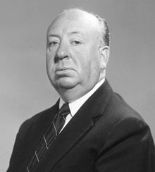
Sir Alfred Joseph Hitchcock, KBE (13 August 1899 – 29 April 1980), an Englishman famous for his films and production, was just one of the many directors influenced by German Expressionism. He later went on to produce some of the classic film noir thrillers.
In films like The Lodger (1927), he implemented techniques seen in expressionist films like obscured camera angles and different lighting, despite objection from his studio.
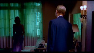
This German influence can be seen in the majority of his films, even those not considered film noir, including Psycho where he blurred the image of Norman Bates through the shower curtain to mimic a technique used in Nosferatu (1922).
Hitchcock experienced incredible success with his work, especially those of the noir genre including Notorious (1946), Strangers on a Train (1951), Rear Window (1954), and Psycho (1960).
Hitchcock transformed the genre into his own style, making his work distinguishable amongst his contemporaries as he went on to influence others with his body of work.
Orson Welles
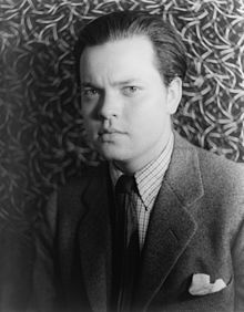
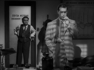
George Orson Welles (May 6, 1915 – October 10, 1985) probably most famous for works like Citizen Kane (1941), The Lady of Shanghai (1947) and Touch of Evil (1958). Welles was an American actor, director, writer and producer. His work has been known to feature many qualities of film noir propelling them into some of the more famous works in the genre.
These three films covered all the classic film noir tropes.
In ‘Citizen Kane’ the use of high and low key lighting help set the tone, with dark pools of shadow in contrast to light. Subjective and low angle shots were also utilized.
‘The Lady of Shanghai’ kept to Welles’ use of the film noir technique by introducing mystery and a complex plot featuring a femme fatale, Rita Hayworth, in a tale of deceit and murder.
‘Touch of Evil’ embodied the film noir genre as a whole.
While Orson Welles’ work was considered commercial failures, he is still credited as the “ultimate auteur” with his distinctive techniques and innovative use of camera angles, chiaroscuro lighting and nonlinear storytelling.
Nailing the Film Noir Look
Rule #1: Lighting is Everything
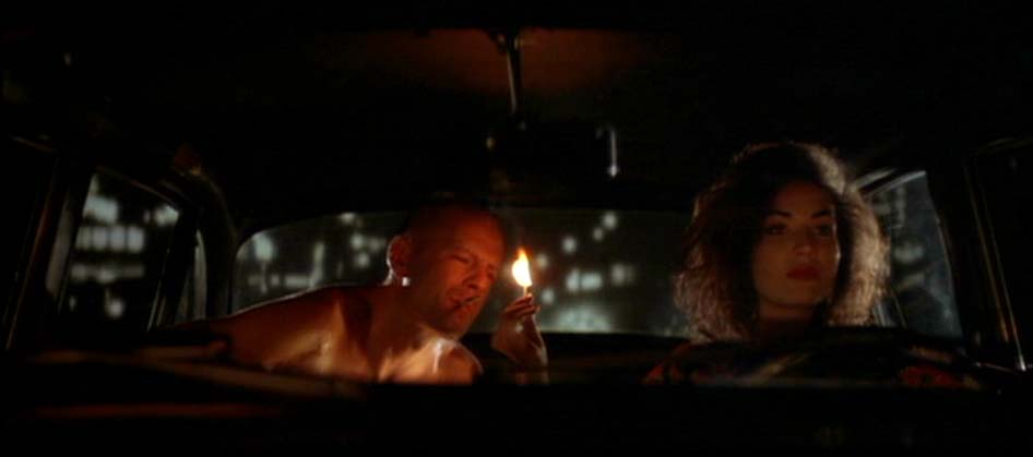
Lighting — and by extension, your tonal range — is the biggest factor in the film noir look.
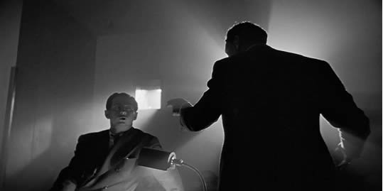
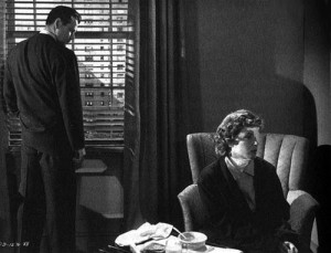
The use of contrast is essential in emphasizing characters and objects. Dark pools of shadow and scattered spots of light are not only used to “highlight” but were also used symbolically.
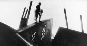
In films like ‘The Cabinet of Doctor Caligari (1920)‘ the use of canted angles in an already moody and dark atmosphere, highlighted the character’s descent into madness.
Film noir worlds aren’t just places that drama happens. The dark, gritty environments mirror the internal lives of the characters that live there. It is another character.
Soft lights were used on female characters to give them a gentle and non-threatening look, even on the seemingly non-threatening vixen who would turn out to be the film’s femme fatale.
Lighting in the film noir genre was also used to set the mood or heighten mounting tension.
Rule #2: Type – Make it Blocky and Luminous
The gritty gloom of noir dictates that your text will be lighter tones on dark. More often than not, this will be narrow, block sans-serif fonts — but there is plenty of room for variation.
Faux-3D text treatments are common on headings, but movies like ‘The Big Sleep’ show that even a classic roman serifs can work in a film noir environment.
Some fonts well-suited to Film Noir treatments include:
Liberator
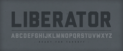
Ryan Clark’s describes Liberator as a war era font, inspired by text markings on bombers.
It’s a masculine, newspapery block font that looms beautifully out of shadows of a noir-inspired design.
Francois One

Francois One is another substantial block font, but with an edgy feel. The slightly angles stroke finishes make it look amiable but slightly anxious.
Francois One is available as a free download via Font Squirrel or as an embedded web font though Google Fonts.
Bree Serif

While sans-serif fonts are the norm, serif and even brushscript styled fonts can have been used to great effect in the past.
Bree Serif is block serif that lends itself well to 50’s faux 3d effect. It too is available though good web font library.
Rule #3: There Are No Heroes in Noir — Only Shades of Gray
The film noir genre threw a wrench into people ideas of what a ‘heroes’ was. In the world of noir, no-one is pure and good, and even the villains have their reasons.
Even the female characters broke away from the typical. For the first time, ‘femme fatales’ appeared on the screen, channeling mystery and behaving in manipulative and deceitful ways — all with an air of control and solidarity.
It wasn’t just the characters that were atypical but the story-lines as well. Plots were more complex, the mood more dark and brutal, and with endings that strayed from the fairy tale endings.
So, what does this mean to a design?
with a noir-esque flavour
Don’t think ‘superman’ when you compose your ‘hero shots’ — whether that is a product or people.
Portraits are about mood and subtext — rather than smiles and flirting.
Products aren’t so much objects, but surfaces to catch light shadow and texture. On the Curadmir Cycles website, you can barely see the bikes, but the grainy images and dark tone sets a memorable mood.
Rule #4: Stylize it – Use Shape, Shadows and Silhouettes
Borrowing from its predecessor, film noir strived for stylistic works of art within cinema. German Expressionism embraced the abstract and the dream-like, and in a sense so did film noir.
German art director Hermann Warm once said “The film image must become graphic art”, and in essence that is what both German Expressionism and Film Noir did.
Chiaroscuro lighting techniques were used to achieve a dramatic shadow patterning along with cutting light to make hard and sharp lines of light.
Such techniques can be seen in the more detective based films where pools of light shine through an open venetian blind cutting the characters face with lines of light.

Canted, wide, skewed and low camera angles also became a staple in noir films. Film sets were treated with an expressionistic style as well, featuring hard lines opposed to soft ones.
Vignettes have also been used in these type of films including submerging a characters face mostly with shadow — a trick that is still used to this day.
Where do you see Film Noir Today?
Noir City
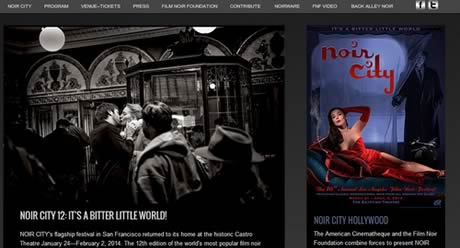
It is no surprise that the designer of the website for the Noir City Film Festival created the site in line with the genre’s conventions.
Featuring a predominantly dark color palette, aside from the colored posters, the website channels what film noir is all about. The site’s placement of posters and white text keeps the site readable, while keeping its moody edge.
Belief Skateboards
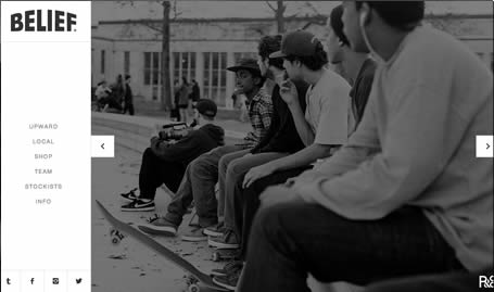
Belief Skateboards mixes some classic noir elements in with some cool modern twists.
The inner-urban scenes, gritty black & white imagery and hard-bitten faces are copybook film noir.
While the daylight photography and light backgrounds break the mold, they still manage to get an austere, almost bleak look to the site.
S4C Logo
![]()
Even logos can get the film noir treatment, as Juzzy Bunni shows in her design, channeling the styles of film noir into something that looks like it was lifted right out of a classic film.
The use of texture and gradient for the background gives you that really gritty feeling. The hard lines featured in the typography really call attention to the logo itself as well as the added treatment done inside each individual letter.
Noir Icons
![]()
It is also possible to bring film noir aspects in your web elements like icons. SLP Catalyst was inspired directly by 1940’s crime dramas to create a set of black and white icons using graphics of items that could be found during that time period.
The designs are simple enough but still match the style attributed to film noir.
That’s all for today. I hope this gives you some ideas for how to add some gritty drama to the next project that fits.
Frequently Asked Questions about Film Noir Style
What are the key elements of film noir style?
Film noir style is characterized by a number of key elements. These include low-key lighting, which creates stark contrasts between light and dark areas, and often gives scenes a gloomy, shadowy appearance. The use of unusual camera angles and compositions is another hallmark of the style, often used to create a sense of disorientation or unease. The narratives of film noir are typically complex and convoluted, often involving crime, corruption, and moral ambiguity. The characters are often flawed and morally compromised, with the protagonists frequently being anti-heroes.
How did film noir style evolve?
Film noir style evolved from a variety of influences, including German Expressionism, hard-boiled detective novels, and the socio-political context of the time. The style emerged in the 1940s and 1950s, a time of great uncertainty and change in the world, which is reflected in the themes and aesthetics of film noir. Over time, the style has been adapted and reinterpreted by various filmmakers, leading to the emergence of neo-noir and other sub-genres.
What is the significance of the femme fatale in film noir?
The femme fatale is a key figure in film noir, often serving as a catalyst for the narrative. These characters are typically beautiful, seductive, and dangerous, using their allure to manipulate men and often leading them into dangerous situations. The femme fatale represents a challenge to traditional gender roles and societal norms, embodying a form of female power and independence that was often seen as threatening in the context of the time.
How does film noir style influence modern cinema?
Film noir style has had a significant influence on modern cinema, with many contemporary filmmakers drawing on its aesthetics and themes. The style’s emphasis on visual storytelling, complex narratives, and morally ambiguous characters can be seen in a wide range of modern films, from crime thrillers to psychological dramas. The influence of film noir can also be seen in the rise of neo-noir and other sub-genres, which reinterpret the style for a modern audience.
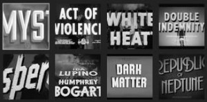
What are some iconic examples of film noir?
Some of the most iconic examples of film noir include “The Maltese Falcon” (1941), “Double Indemnity” (1944), and “The Big Sleep” (1946). These films are renowned for their distinctive visual style, complex narratives, and memorable characters, and have had a lasting impact on the genre. Other notable examples include “Touch of Evil” (1958), “Chinatown” (1974), and “Blade Runner” (1982), which demonstrate the evolution and enduring influence of the style.
How is film noir style used in other forms of media?
Film noir style has also been used in other forms of media, including television, literature, and graphic novels. The style’s distinctive aesthetics and themes lend themselves well to these mediums, creating a unique and immersive storytelling experience. Examples include the television series “Twin Peaks”, the graphic novel “Sin City”, and the video game “L.A. Noire”.
What is the role of the city in film noir?
The city plays a crucial role in film noir, often serving as a character in its own right. The urban setting is typically depicted as a labyrinth of danger and corruption, reflecting the moral ambiguity and existential dread that are central to the genre. The cityscape also provides a backdrop for the style’s distinctive visual aesthetics, with its dark alleyways, neon lights, and imposing architecture.
How does film noir style reflect the socio-political context of its time?
Film noir style is often seen as a reflection of the socio-political context of its time. The style emerged in the aftermath of World War II, a time of great uncertainty and disillusionment, which is reflected in its dark themes and pessimistic outlook. The genre often deals with issues of corruption, crime, and moral ambiguity, reflecting societal anxieties and fears.
What is the difference between film noir and neo-noir?
While both film noir and neo-noir draw on similar themes and aesthetics, there are some key differences between the two. Film noir refers to a specific period of film history, from the 1940s to the 1950s, while neo-noir is a more contemporary genre that draws on the style and themes of film noir but updates them for a modern audience. Neo-noir films often incorporate elements of other genres, and may use color and modern filmmaking techniques in ways that classic film noir did not.
How can I incorporate film noir style into my own filmmaking?
Incorporating film noir style into your own filmmaking involves more than just replicating its visual aesthetics. It also involves understanding the themes and narrative structures that define the genre. This might involve creating complex, morally ambiguous characters, crafting a narrative that involves crime or corruption, and using lighting and composition to create a sense of unease and disorientation. It’s also important to consider how you can reinterpret these elements in a way that is relevant and engaging for a modern audience.

