

Today’s article is going to be the first in new series called ‘Dial-a-Style’.In coming weeks we’re going to pick a famous ‘style’ or ‘design movement’, tell you a little about it’s history and where it fits in.
Then we’re going to try to help you incorporate that look into your web design.
Today we’re starting with Bauhaus!
Key Takeaways
- The Bauhaus design movement, originating in Germany in the early 20th century, focused on the unity of art and technology, functionality, and accessibility for all.
- Key figures in the Bauhaus movement included founder Walter Gropius, furniture designer Marcel Breuer, painter and photographer Laszlo Moholy-Nagy, and graphic designer Herbert Bayer.
- The Bauhaus movement ended due to political pressure in Germany in 1933, with the rise of the Nazi party, but its influence continues to be seen in modern design.
- Bauhaus design can be incorporated into homes through simplicity, functionality, and use of modern materials, with an emphasis on clean lines and minimal aesthetics.
- The Bauhaus movement revolutionized design by promoting the integration of art, craft, and technology, and championing the idea that design should be socially beneficial and accessible to all.
Let’s go back. Waaay Back..
To understand the Bauhaus movement, it helps to know a little about the time before it.
Throughout most of recorded history, every item we used — chairs, pots, hammers, fabric — was handmade, one-by-one, by a person in a shed somewhere.
While these items weren’t always beautiful, even the simplest of items was generally, at least ruggedly functional, because each had been individually crafted and considered by it’s maker.
However, by the mid-1800’s, the industrial revolution was really getting up a head of steam — literally! — and things had changed. Volume and production speed was the name of the game.

Photo: RightBrainPhotography
Everyday factory-produced items became cheap and plentiful, but, to keep costs down, they were also often poorly-designed, easily-broken and unattractive.
The Arts & Crafts movement (1860-1910) was the first kick-back against this tide of poor design. Their reaction was to emphasize detailed patterning and rich, time-consuming decoration — exactly the kinds of characteristics that factory-made goods could never reproduce.
A typical Victorian-era room looks incredibly cluttered to our modern eyes — a tornado of pattern, texture and color. But at the time, it declared ‘I don’t like nasty factory goods!’.
Enter the Bauhaus

The Bauhaus was a direct response to this Arts & Crafts approach. Bauhaus asked ‘Why can’t we design cheap stuff that’s nice too?‘.
Or more to the point: Why can’t we embrace cheaper materials, and limited factory processes, and work within these limitations to make cool stuff, anyway?
Kinda sounds like Web Design, right?
To me, this is an idea that resonates very strongly with Web Design.
A lot of front-end designers come from — or are at least very aware of — the print industry. A field where we’ve known how to control every hair’s-width of paper, every glyph, every color, every fold, every cut. We had 400 years to practice.
Then Web design came along, and swept away all that control.

working within limitations.
Until very recently, we had a strictly limited font choices, small, compressed imagery, buggy type controls, laughable layout tools.
We couldn’t even predict what size our design would be presented as — it could be any size from a sticky note to a wide-cover atlas format was possible. We had to learn to prepare for all sizes.
But, like the Bauhaus thinkers, we embraced the limitations, worked with the strengths of what we had, and made cool stuff anyway.
In fact, CSSZenGarden.com became influential in the early 2000’s by making a game out of embracing those limitations.
The Beginnings
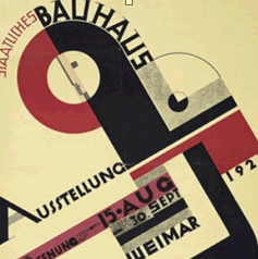
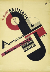
Das Staatliche Bauhaus was founded by Walter Gropius and operated in Germany from 1919 to 1933.
The school had to change its location two times. The offices were originally set in Weimar (1919-1925) and then moved to Dessau (1925-1932). Finally, they were placed in Berlin (1932-1933) before the Bauhaus was obliged to close by a Nazi regime that believed their ideas of “good objects for the people” were socialist, and didn’t suit “the demands of the new State”.
The Bauhaus was composed by several departments such as those of industrial design, art, typography, graphic design, photography and architecture.
Its mission was to provide a new, affordable, plain and utilitarian design that could be used by every kind of person and in every area. Thus, the school had such a huge influence on the history of design and style that easily discerned to this day.
The Characters
Johannes Itten

Johannes Itten (1888-1967) was a Swiss painter, designer, and one of the several teachers of the Bauhaus school. In this innovative and open-minded sphere, he was able to publish his essay, “The Art of Color”, in which he expressed his own theory about chromatic tones. Itten believed in the importance of conveying harmony through the use of colors: for this reason, he created a 12 hue color wheel that explained how to mix hues and shades.
Moreover, he was interested in discovering a social role of colors and in understanding how tonalities could affect people’s psychology. Indeed, Itten believed that “colors are forces, radiant energies that affect us positively or negatively, whether we are aware of it or not”.
Thanks to Itten’s studies, the Bauhaus school realized the importance of colors and students were encouraged to make their own experiments with the creation of palettes.
Herbert Bayer
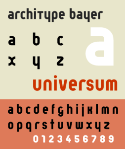
Herbert Bayer (1900-1985) was an Austrian-American painter, photographer and typographer. He firstly joined the Bauhaus as a student and, after some years, he was named director of the printing and advertising department.
In 1925, when Gropius instructed Bayer to create a new font, he started working on the creation of a new “Universal Typeface”. It wasn’t a typeface designed only for school appearances: Bayer actually wanted to make it useful for the whole society.
Even today, it still looks sharp and impossibly modern for it’s vintage and shows all the class Bauhaus type characteristics.
The font came together with the simplicity and linearity of geometric features and it was characterized by the lack of “serifs” and useless adornments.
Even if Bayer’s work remained incomplete, it laid the basis for the “Bauhaus” typeface, published in the second half of the 20th century.
Wassily Kandinsky
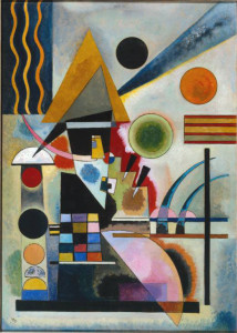
Wassily Kandinsky (1866-1944) is a Russian painter who joined the Bauhaus in quality of teacher in 1922. He taught in design classes as well as in painting and color ones.
In 1926, he published “Point and Line to Plane”. In his book, he explains some important geometrical elements. He proposed was that a dab of color on a canvas will assume different meanings, depending on it’s position on the plane — a radical idea for it’s time.
Kandinsky also showed the belief that a good design could only arise from the mutual cooperation of forms and colors. He thought that some shapes were completed by particular colors: the dynamism of a triangle, for example, was to be accompanied by the energy of yellow. On the other hand, the circle is a dull form and should go with a calming blue.
He expanded the theory also to lines, curves and angles: acute angles needed strong colors while obtuse ones were better with mild tonalities.
László Moholy-Nagy

Moholy-Nagy (1895-1946) was a Hungarian painter and photographer who started teaching at the Bauhaus school in 1923. He used to have a unitary vision of art and he thought that every artistic work should display the influence of several disciplines such as painting, typography, architecture or sculpture.
Moreover, Moholy-Nagy was also attracted by type and by photography, as a means to study time and space. He was able to mix words and images creating the so-called ”typophoto”, which he considered to be a new way to communicate concepts and instantaneous mass messages.
Indeed he referred to it as “ the visually most exact rendering of communication” or as “the new visual literature”.
Soon, “typophoto” became very popular and it was the base for the modern idea of advertising, and designers from Paul Rand to David Carson have riffed on his ideas.
Here’s an infographic showing the history of the movement.
Nailing the Bauhaus Look
Rule #1: Form follows function
“Form follows function” is a sentence coined by Louis Sullivan, an American architect, who wanted to express the futility in excessive ornamentations, and was central to thinking in the Bauhaus school.
Indeed, the Bauhaus’s final director, Mies van der Rohe, pledged the school to “honesty of construction, death to decoration”.
Professors strived to convey the idea that form had to reflect the function of the product. They thought that no message should be sacrificed in favor of design choices. Differently artistic devices were to be used to increase the utility of the work.
Living by this credo, the Bauhaus designer realized linear and geometrical works avoiding the use of floral or curvilinear (and useless) decorations.
Rule #2: Typography Matters

Bauhaus admirers.
One of the most important classes at the Bauhaus was typography. Indeed, several teachers soon realized the essential role of types in an effective visual communication. The Bauhaus concentrated on simplified fonts and avoided the much heavier renderings of the standard German typography of the time.
Designers started wrapping text around objects, and also learned to arrange type horizontally, vertically and even diagonally — which was not common at the time.
They also refused to combine lower and upper case types in a same work and preferred the use of sans-serif fonts.
The innovations introduced by the Bauhaus are still very effective nowadays.
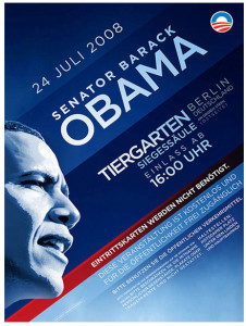
In 2008, during his presidential campaign, Barack Obama visited Berlin and his speech in the city was announced by a poster very similar to those of the German school. Indeed you can see that is characterized by diagonal words and by an upper case font without serifs and by. Also, there are no pointless decorations and simple lines prevail.
Rule #3: Geometry is King
The Bauhaus showed a deep love of simple geometry — another quality that makes it a great fit for web design.
Students were well-acquainted with paintings of contemporary Cubist artists, such as Picasso and Gris, and so they adopted the similar way of looking at reality.
They started breaking down objects into their rawest geometric shapes, as they considered this technique as the best way to create new, and more modern items.
Clean, abstract and geometric forms were constantly used to produce new common tools that could highlight the difference from the old trends of the Art Nouveau. An example?
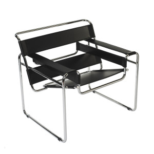
In 1925, Marcel Breuer, a member of the Bauhaus school, designed a new model of chair, later called “Wassily Chair”. It is composed by some metal tubes and by leather bands which give an idea of fluidity and flexibility.
The designer was able to realize a minimal and fluid design that lasted in years and that it is still loved today.
And Today..

identitydesigned.com
“Identity Designed” is a modern website that follows the Bauhaus style.
The site is minimal and simple in order to put the user experience in the middle of the project. The header only shows two letters, “ID”, then there is a clear menu bar that brings you inside the content.
Furthermore, following the Bauhaus trends, “Identity Designed” does not use serif or too complex typefaces.
SXSW 2014

South By Southwest’s branding has been text-centric and geometric for years, and this year’s is no exception.
The 2014 event branding uses blue triangles for the music festival, green arcs for the music festival and orange squares for the interactive component.
I wonder what Mr. Kandinsky would think?
‘Catch Me If You Can’ title sequence (2002)
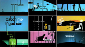
There is a whole genre of recognisably 1960’s movie title design that can be traced back to Bauhaus type stylings and shape.
Bauhaus’ strong focus on text made it a favourite style for movie title sequences from the start. Most of Saul Bass’s classic 60’s title sequences (e.g. Anatomy of a Murder, North by Northwest, Vertigo) used flat color panels, jaunty block text and simple cut paper-like geometry animation.
Later movies from ‘Catch Me If You Can‘ (2002) to ‘Up In The Air’ (2009) have riffed off both Bass’s work and the earlier Bauhaus designers he was inspired by.
That’s all for today, but keep an eye out for our next ‘Nailing the Detail’ soon.
Frequently Asked Questions about Bauhaus Design
What are the key principles of Bauhaus design?
The Bauhaus design movement, which originated in Germany in the early 20th century, is based on several key principles. These include the unity of art and technology, the importance of functionality, and the belief that design should be accessible to all. Bauhaus designers sought to create objects and spaces that were both aesthetically pleasing and practical, using modern materials and techniques. They also believed that good design should not be a luxury, but something available to everyone, regardless of their social or economic status.
How has Bauhaus design influenced modern design?
The influence of Bauhaus design can be seen in many aspects of modern design. Its emphasis on functionality and simplicity has been adopted by many contemporary designers, who strive to create products that are both useful and aesthetically pleasing. The Bauhaus movement also pioneered the use of new materials and technologies, a practice that continues to be important in modern design. Furthermore, the Bauhaus school’s interdisciplinary approach, which brought together artists, architects, and designers, has become a model for many design schools and programs today.
What are some examples of Bauhaus design?
Bauhaus design can be seen in a wide range of objects and buildings. Some of the most famous examples include the Wassily Chair by Marcel Breuer, which was one of the first pieces of furniture to be made from tubular steel, and the Bauhaus Building in Dessau, Germany, designed by Walter Gropius. This building, with its clean lines and functional design, is considered a classic example of Bauhaus architecture. Other examples include the geometric designs of Laszlo Moholy-Nagy and the typography of Herbert Bayer.
Who were some of the key figures in the Bauhaus movement?
The Bauhaus movement was led by a number of influential artists, architects, and designers. These include Walter Gropius, who founded the Bauhaus school; Marcel Breuer, a furniture designer and architect; Laszlo Moholy-Nagy, a painter and photographer; and Herbert Bayer, a graphic designer and typographer. Each of these individuals made significant contributions to the development of the Bauhaus style and philosophy.
Why did the Bauhaus movement end?
The Bauhaus movement ended largely due to political pressures in Germany. In 1933, the Nazi party came to power and viewed the Bauhaus school as a threat due to its progressive ideas and international outlook. The school was forced to close, and many of its members fled Germany. Despite its relatively short lifespan, however, the Bauhaus movement had a profound impact on the world of design and continues to be influential today.
How can I incorporate Bauhaus design into my own home?
Incorporating Bauhaus design into your home can be achieved by focusing on simplicity, functionality, and the use of modern materials. Choose furniture and decor that have clean lines and a minimal aesthetic. Opt for pieces that are not only beautiful, but also practical and well-made. Consider using materials like steel, glass, and concrete, which were favored by Bauhaus designers. Finally, don’t be afraid to mix different styles and periods – the Bauhaus movement was all about breaking down boundaries and embracing new ideas.
What is the significance of the Bauhaus movement in the history of design?
The Bauhaus movement is considered one of the most significant movements in the history of design. It revolutionized the way we think about design by promoting the integration of art, craft, and technology. It also championed the idea that design should be socially beneficial and accessible to all. The principles and practices of the Bauhaus movement continue to influence designers today, making it a pivotal moment in design history.
What was the teaching methodology at the Bauhaus school?
The teaching methodology at the Bauhaus school was unique and innovative. It was based on the idea of a comprehensive art education that integrated theory and practice. Students were taught a range of disciplines, from fine art and architecture to graphic design and typography. They were also encouraged to experiment with new materials and techniques. This interdisciplinary approach was designed to foster creativity and innovation, and it has been influential in shaping modern design education.
How did the Bauhaus movement influence graphic design?
The Bauhaus movement had a significant impact on graphic design. It introduced a new approach to typography, favoring sans-serif typefaces and clean, geometric forms. It also promoted the use of grids and asymmetrical layouts, which are now common in graphic design. Furthermore, the Bauhaus school was one of the first to recognize graphic design as a distinct discipline, paving the way for the development of modern graphic design.
What is the legacy of the Bauhaus movement?
The legacy of the Bauhaus movement is vast and enduring. Its principles of functionality, simplicity, and social responsibility continue to guide designers today. Its innovative teaching methods have influenced design education around the world. And its pioneering use of new materials and technologies has shaped the development of modern design. Despite its brief existence, the Bauhaus movement has left an indelible mark on the world of design.