 Mega drop-down menus are a relatively new phenomenon but I predict they will be everywhere within six months.
Mega what?
Navigating large websites has always been a design problem. You could create a huge sitemap-like menu with links to every page, but it would become impossible to scan and grow increasingly large as more pages are added.
In general, designers choose either:
- a small simple menu that links to pages with additional navigation as you delve deeper (Sitepoint is a good example). These are easy to use and accessible, but multiple clicks can be required to reach the content you want.
- dynamic drop-down or expanding menus that allow visitors to reach most pages no matter where they are. Whilst this provides quick navigation, accessibility can be poor and those without JavaScript might never see some pages*.
(* CSS-only drop-downs are possible, but they do not offer mouse over/out latency or work in every browser … guess which one!)
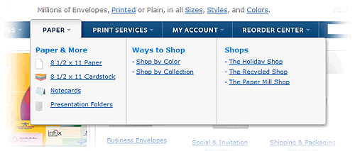
Mega drop-downs are half-way between the two concepts and similar to the ribbon introduced in Microsoft Office 2007:

(example from actionenvelope.com)
The features of a mega drop-down menu
Typically, a mega menu:
- is a single drop-down that appears on hover
- shows all the options in one large panel
- groups options into related categories
- uses icons or other graphics to help the user.
Why mega menus will become popular
There are several reasons why mega drop-down menus will become a mainstream feature of many websites:
- They offer a good compromise between simple and expanding menus.
- They are easy to use and should suffer fewer accessibility problems.
- They look great and give designers more scope to express their artistic creativity!
Perhaps the most compelling reason: Jakob Nielsen approves of mega menus! The web usability expert is usually critical of most design widgets, but he thinks mega menus are a great idea and suggests designers try them to improve their website’s navigation.
What do you think? Will mega menus become ubiquitous? Are you using them already? Will you try them on your sites?
Frequently Asked Questions about Mega Drop-Down Menus
What are the benefits of using mega drop-down menus in web design?
Mega drop-down menus offer several advantages in web design. They provide a clear, structured way to present a large amount of information without overwhelming the user. This is particularly useful for websites with extensive content or numerous categories. Mega menus also enhance the user experience by reducing the number of clicks needed to navigate the site. They allow users to see all available options at a glance, making it easier to find specific items or sections. Additionally, mega menus can improve SEO by providing more internal linking opportunities.
Are there any drawbacks to using mega drop-down menus?
While mega drop-down menus have many benefits, they also have potential drawbacks. They can be overwhelming if not designed well, especially for users on smaller screens or with slower internet connections. They can also be difficult to navigate using a keyboard, which can create accessibility issues. Furthermore, if a mega menu contains too many links, it can dilute the SEO value of the links.
How can I make my mega drop-down menu more user-friendly?
To make your mega drop-down menu more user-friendly, consider the following tips. First, organize your content logically and clearly. Use headings and subheadings to break up the content and make it easier to scan. Second, limit the number of items in your menu to avoid overwhelming users. Third, ensure your menu is responsive and works well on all devices. Finally, make sure your menu is accessible to all users, including those using assistive technologies.
How can mega drop-down menus impact SEO?
Mega drop-down menus can have both positive and negative impacts on SEO. On the positive side, they provide more opportunities for internal linking, which can boost your site’s SEO. They also improve user experience by making navigation easier, which can indirectly improve SEO. On the negative side, if a mega menu contains too many links, it can dilute the SEO value of the links. To maximize the SEO benefits of your mega menu, ensure it is well-structured, user-friendly, and doesn’t contain too many links.
Can mega drop-down menus be used on mobile devices?
Yes, mega drop-down menus can be used on mobile devices, but they need to be designed with mobile users in mind. This means ensuring the menu is responsive and works well on smaller screens. It also means considering touch navigation and making sure the menu is easy to navigate with a finger. Additionally, because mobile users often have slower internet connections, it’s important to ensure your mega menu loads quickly on mobile devices.
How can I test the usability of my mega drop-down menu?
There are several ways to test the usability of your mega drop-down menu. One method is to conduct user testing, where you observe real users interacting with your menu and note any difficulties they encounter. You can also use heat mapping tools to see where users are clicking on your menu. Additionally, you can use analytics data to see how users are navigating your site and whether they are using your menu effectively.
What are some examples of well-designed mega drop-down menus?
There are many examples of well-designed mega drop-down menus. Some notable examples include the menus on the Amazon, eBay, and Zara websites. These menus are well-structured, easy to navigate, and contain a manageable number of items. They also work well on both desktop and mobile devices.
How can I make my mega drop-down menu accessible?
To make your mega drop-down menu accessible, ensure it can be navigated using a keyboard. This means using proper HTML elements and ARIA roles. Also, make sure your menu is readable by screen readers. This may involve using alt text for images and providing clear, descriptive labels for links. Additionally, ensure your menu has sufficient color contrast to be readable by users with visual impairments.
Can mega drop-down menus be animated?
Yes, mega drop-down menus can be animated. However, it’s important to use animation sparingly and thoughtfully. Too much animation can be distracting and can slow down your site. When used well, animation can enhance the user experience by providing visual cues and making the menu more engaging.
How can I design a mega drop-down menu that aligns with my brand?
To design a mega drop-down menu that aligns with your brand, consider your brand’s visual identity and tone of voice. Your menu should reflect your brand’s colors, typography, and imagery. It should also be written in a tone that matches your brand’s personality. Additionally, consider your brand’s values and target audience when deciding what content to include in your menu.
Craig is a freelance UK web consultant who built his first page for IE2.0 in 1995. Since that time he's been advocating standards, accessibility, and best-practice HTML5 techniques. He's created enterprise specifications, websites and online applications for companies and organisations including the UK Parliament, the European Parliament, the Department of Energy & Climate Change, Microsoft, and more. He's written more than 1,000 articles for SitePoint and you can find him @craigbuckler.


