When we talked about Instagram recently, we looked at the elevator pitch they put on their home page. Mailchimp‘s got a similarly neat, clear service explanation. And, going one step further, the home page for Uber cabs uses three quick steps to explain its service.
Yet when you try to describe your service in snappy sentences for your home page, you end up with clunky paragraphs of blergh.
What gives? Do you need to be a superstar writer to make great copy? Well, it doesn’t hurt. But if you’re not a superstar writer, and you can’t afford to hire one, then what?
Today, I want to show you a quick and easy tool that can help. In the next minute or two, I’ll show you how it can:
- simplify the language you use
- talk about your product’s features and benefits
- talk to users in their own terms.
And we’ll get some extra bonuses along the way.
The tool
Really? A tool that does all that? What is it? I mentioned the tool when we talked about how SEO can help you communicate.
It’s readability scores.
If you have MS Word, you can access readability scores when you do a spell check. First, you’ll need to turn it on: got to Word > Preferences > Spelling and Grammar > Show readability statistics. Then, run a spell-check over some text. Once it’s finished, it’ll present a readability statistics dialog.

Don’t have Word? Do a search for online readability calculators and you’ll come up with a range of options, like this one, which lets you drop in your text and calculate a number of different readability scores instantly.
The ones I focus on mainly are the Flesch Readability Score (which shows what percentage of the population would be able to comprehend the text) and the Flesch-Kincaid grade level score, which reflects the typical grade in school a reader would need to have achieved to understand the text.
Easier reading = more meaning
So let’s see these readibility tools in action. As an example, we’ll look at the service information from the Flickr homepage.
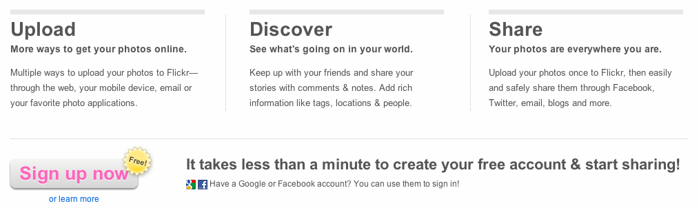
If you’re a writer, you’ll see that one of these sentences is ungrammatical. If you have a keen eye, you might be wondering about the mishmash of ampersands and the word “and”. (Why not pick one or the other? My guess is layout.) But let’s focus on how comprehensible this text is.
When I copy this content into Word and check its scores, we’re looking at readability score of 71.8 and a grade level of 6.0.
That’s not bad. But could we improve it? Let’s see. Here’s a revised version of that text.
Upload
Get your photos online fast.
Uploading photos to Flickr is quick and easy. Use the web, your mobile, email or your favorite photo apps.
Discover
See what’s going on in your world.
Add tags, locations and people to your photos. Use comments and notes to share your stories, and keep up with friends.
Share
Take your photos with you.
Share your photos through Facebook, Twitter, email, blogs and more. With Flickr, sharing’s easy and secure.
What do you think?
This text’s readability score is 83.8 and its grade level is just 3.5. That means it makes a lot more sense to a lot more people than the copy that’s online on Flickr’s homepage right now.
Grammar time
Readability tools work by encouraging us to use better grammar. If you hate grammar, don’t worry: the techniques you can use to improve the readability of what you write about your service are pretty basic.
- Break up sentences: Shorter sentences are easier to read. Here I’ve taken each point in the text and made it its own sentence—but be aware that this can change the shape of your message. That last sentence, for example, gives more weight to the ease and security of sharing than the original copy.
- Use shorter, more common words: The original text didn’t exactly contain outlandish language, but I did remove some of the longer words: multiple, applications, information, everywhere, upload.
- Avoid the passive voice: If you’re using “ing” words, you’re probably talking in the passive voice. This text didn’t have that problem, but making passive sentences (like this one) active is another easy way to improve readability. An easy way to do that is to put a person (your customer or user!) into the sentence: If you make passive sentences active, you’ll improve readability.
This isn’t the full gamut of techniques you can use to improve readability, but they’re easy ways for anyone—entrepreneur, developer-turned-writer-for-the-afternoon—to boost the readability of their words.
Brand messaging
It’s one thing to improve your writing. But you don’t want to dilute the brand messaging in the process, right? This is definitely something you’ll want to consider, so let’s see how it played out in the Flickr example.
On reading the original text, it seemed to me that it hadn’t been updated in a while. For example, even the least web-savvy person—my mum—unfailingly calls apps “apps” today. She may not have a cell phone, or often discuss apps, but when she does, that’s what she calls them.
Social media sites have made the concepts of tags, locations and people pretty much universal. Who calls this “rich information” now? No-one I know. Most of us see it—and being able to upload stuff to our accounts from anywhere—as basic product functionality, rather than a key selling point.
So my rewrites have changed the messages in this text slightly. I’ve made the first point about effortlessness, rather than the variety of options, since I don’t know that the variety of options is that much of a selling point for most people.
The second point contains the same messaging as the first, but puts the essential features first, before finishing on a heart-warming benefit. Awww.
The third point again replicates the messaging in the original version, but pulls the features (sharing techniques) and benefits (easy, secure) apart to make them clearer.
I did change the subhead on this point, and I can see that my new subhead might get marketing kickback (“we don’t want to suggest they’re going anywhere else, but that they’re already everywhere. This sounds too final”). But I’d argue that in this context, it’s fair to imply that people spend time on sites other than Flickr, and that the text makes logical and conceptual sense, neatly completing the messaging.
Features and benefits
Many entrepreneurs have trouble differentiating between features and benefits when it comes to talking about their products. We’ll look at this in more detail next week, but for now, I wanted to point out that as well as being easier to read and understand, the revised text makes features and benefits clearer than the original.
In the new text, each of the three points contains a sentence about features, and a sentence about benefits. The first point puts the benefits first; the second and third put the features first. In each case, the text makes it very clear what you get, and what it does for you.
What readability can do for you
Congratulations. We’ve just used readability tools to:
- simplify the language we use
- improve our grammar
- more clearly define product features and benefits
- update our text to reflect the competitive context in which we’re offering this service
- talk to users on—and in—their own terms.
They’re simple tools and simple techniques. But they can make a huge difference to how you communicate with your target users—on site, within your interface, in system emails and autoresponders, you name it.
Have you ever used readability tools? Do you think you might give them a try?
 Georgina Laidlaw
Georgina has more than fifteen years' experience writing and editing for web, print and voice. With a background in marketing and a passion for words, the time Georgina spent with companies like Sausage Software and sitepoint.com cemented her lasting interest in the media, persuasion, and communications culture.