
Last week I started a series looking at some of the trends that have been apparent in logo design over the past year. Although it’s interesting to look at trends, and the aim of this series is to be both educational and inspirational, it’s important to remember that trends come and go while good, classic design looks good forever. So learn from others but don’t forget to “plough your own furrow” as they say. We looked at “The Shift” last week, today let’s cast an eye over logo designs based on pixels.
Favicons on the web have given us a taste of what some well known images and symbols can look like when reduced down to tiny squares. Pixels (short for picture elements) are the smallest part of a digital image. A pixel is essentially a small square of color located at a specific part of an image. As an essential building block of a digital image, it is probably no surprise that designers are using what looks like giant pixels as building blocks in their logo designs.
By their nature, the symbols created using pixels tend to look quite basic and often quite abstract. The symbols are colorful, but often with a range of tints based around one single color. They convey the idea of elements coming together to create a recognizable icon. Pixel-style designs require skill to pull off effectively, or they can appear to give the impression of a badly drawn (on the computer) image.
So now for your viewing pleasure and inspiration, here’s a small collection of logos using pixels as a major design element. (It’s probably no coincidence that a few of these businesses have Pixel or Pix in their names.)
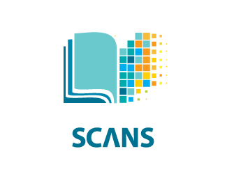
Scans by HelloUriah

433 by Mister Jones

PyxPox by Bit Hoang

Digitweet by John Boerckel

Interoute by Jesse Higgins
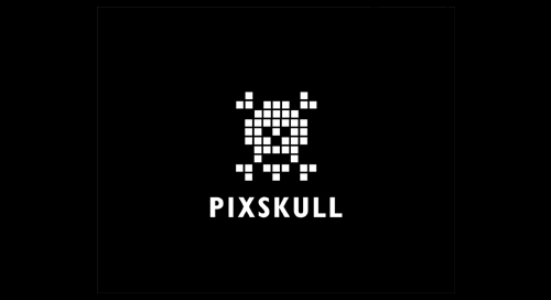
Pixskull by Mike Erickson
![]()
Pixlance by Mike Cresk
What do you think of these logo designs? Do you like the “pixel” concept?
Frequently Asked Questions on Pixel Logo Design Trends
What are the latest trends in pixel logo design?
The latest trends in pixel logo design are a blend of creativity, innovation, and technology. They include the use of vibrant colors, geometric shapes, and minimalist designs. The trend is also leaning towards the use of 3D effects, gradients, and animations. These trends are not only visually appealing but also help in creating a strong brand identity.
How does pixel logo design impact brand identity?
Pixel logo design plays a crucial role in creating a strong brand identity. It helps in making the brand memorable and easily recognizable. A well-designed pixel logo can convey the brand’s message, values, and personality effectively. It can also help in differentiating the brand from its competitors.
What are the benefits of using pixel logo design?
Pixel logo design offers several benefits. It provides a unique and distinctive look to the brand. It is versatile and can be used across various platforms and mediums. Pixel logo design is also cost-effective as it does not require high-resolution images. Moreover, it can be easily updated or modified as per the changing trends and requirements.
How to choose the right colors for pixel logo design?
Choosing the right colors for pixel logo design is crucial as colors can evoke emotions and influence perceptions. It is advisable to choose colors that align with the brand’s personality and message. One can also consider the psychology of colors while making the selection. For instance, blue signifies trust and reliability, while red signifies energy and passion.
What are the key elements of a successful pixel logo design?
The key elements of a successful pixel logo design include simplicity, relevance, versatility, and uniqueness. The design should be simple yet impactful. It should be relevant to the brand and its target audience. The logo should be versatile enough to be used across various platforms and mediums. Lastly, it should be unique and distinctive to stand out from the competition.
How to create a pixel logo design that stands out?
To create a pixel logo design that stands out, one needs to think out of the box and experiment with different design elements. It is important to understand the brand, its target audience, and its competitors. The design should be unique, creative, and relevant. Using the right colors, fonts, and shapes can also help in creating a standout pixel logo design.
What are the common mistakes to avoid in pixel logo design?
Some of the common mistakes to avoid in pixel logo design include overcomplicating the design, using too many colors, and copying the designs of competitors. The design should be simple, clear, and easy to understand. It is also important to choose colors wisely and create a unique design that reflects the brand’s identity.
How to keep the pixel logo design relevant with changing trends?
To keep the pixel logo design relevant with changing trends, it is important to stay updated with the latest design trends and technologies. One can also consider redesigning or updating the logo as per the changing trends and requirements. However, it is important to maintain the core elements of the logo to ensure brand consistency.
Can pixel logo design be used for all types of businesses?
Yes, pixel logo design can be used for all types of businesses. It is versatile and can be customized as per the business type, industry, and target audience. Whether it is a tech startup, a fashion brand, or a food business, pixel logo design can help in creating a strong brand identity.
How to choose the right designer for pixel logo design?
Choosing the right designer for pixel logo design is crucial. One should consider the designer’s experience, portfolio, and understanding of the brand. It is also important to discuss the design process, timeline, and budget beforehand. One can also consider taking references or reading reviews to make an informed decision.