One of the many very cool features of Macromedia Fireworks MX is that it gives you the ability to place an image inside a shape, like this:

You’ve probably seen these images around the Web — the effect is called “paste inside.”
Paste inside is a very neat little effect that you can use to spice your images up a bit, and give them a more professional appearance. You can paste any image you want into any shape you can create in Fireworks MX: ellipses, circles, rectangles, rounded rectangles — anything!
In this tutorial, I’ll show you how to create images similar to the one below. Notice how the image appears to be inside of the shape. Let’s learn how to create this very neat effect.
First, you’ll need an image. Below you’ll find the image I originally started with. You can download this image and use it for this tutorial if you wish, or you can use your own if you have an image you like handy.

Step 1
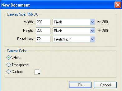
Launch Macromedia Fireworks MX, and create a new file by selecting FILE >> NEW.

Make the new Fireworks file 200×200 pixels with a white background.
Step 2
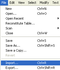
Now we will need to import the image we’ve decided to use into the new Fireworks file. Choose FILE >> IMPORT, and locate the image you want to use. Import it into the new Fireworks file (see below).
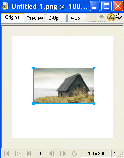
Once you’ve clicked the Import button, move your mouse over the blank fireworks file you created in step 2, and left click. The image you’re trying to import will appear in the blank fireworks file – it’ll look like this:
Step 3
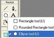
Now that we’ve imported our image into our fireworks file, we’ll need to create a shape to place our image into. I’m going to use an ellipse. Go to the fireworks tool bar, left click and hold the shapes button. A box will appear. Left click the ellipse button, and release, as shown here:
Draw an ellipse over the image you imported in step 3, making the shape slightly smaller in width and height than the image. Your work thus far should look similar to this:
Step 4
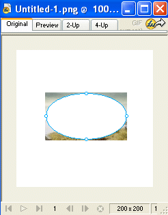
We need to move the ellipse behind the image so that we can continue. Select MODIFY >> ARRANGE >> SEND TO BACK. The ellipse should now be behind the image, as shown below.

Step 5
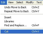
Left click on the image to select it, then choose EDIT >> CUT as shown here:
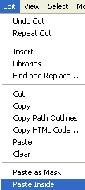
Left click on the ellipse to select it, then go to EDIT >> PASTE INSIDE.
Step 6
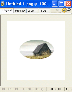
You should now have your image pasted inside of your ellipse. Pretty cool isn’t it?
Step 7
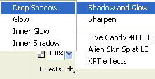
Now let’s incorporate a few effects to the image to add some finishing touches. First we’ll add a drop shadow. Left click on the image to select it, then select EFFECTS >> SHADOW AND GLOW >> DROP SHADOW.
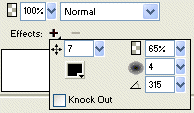
I set the distance of the drop shadow to 7 and used black for the color, like this:
Step 8
Next let’s add a glow to the image. Left click on the image to select it, then go to EFFECTS >> SHADOW AND GLOW >> INNER GLOW.

I’ve set the halo offset to 4 and the color to #66CCCC.

Step 9
We need to do one last thing before the image is complete. We’ll need to trim the canvas and get rid of all that extra white space. Select MODIFY >> CANVAS >> TRIM CANVAS.

Your image should now look like the one shown below.

You can use the method detailed in this tutorial to place any image inside any shape you can create in Macromedia Fireworks MX. Good luck with your future creations!
Frequently Asked Questions about Paste Inside in Fireworks MX
What is the Paste Inside feature in Fireworks MX?
The Paste Inside feature in Fireworks MX is a unique tool that allows you to paste an image or graphic inside another object or shape. This feature is particularly useful for designers who want to create complex designs without having to manually cut and fit images into specific shapes. It essentially acts as a mask, allowing the pasted image to take the form of the selected shape.
How do I use the Paste Inside feature in Fireworks MX?
To use the Paste Inside feature, first, select the object or shape you want to paste an image into. Then, copy the image you want to paste. Go back to your selected shape, right-click, and select ‘Paste Inside’. The image will then be pasted into your selected shape, taking its form.
Can I adjust the image after pasting it inside a shape?
Yes, you can adjust the image after pasting it inside a shape. You can resize, reposition, or even rotate the image to fit your design needs. Simply select the image and use the transform tools available in Fireworks MX.
Is the Paste Inside feature available in other Adobe software?
The Paste Inside feature is unique to Fireworks MX. However, similar effects can be achieved in other Adobe software like Photoshop and Illustrator using the Clipping Mask feature.
Can I use the Paste Inside feature with text?
Yes, you can use the Paste Inside feature with text. This allows you to create text filled with images or patterns, adding a unique touch to your designs.
What file formats are supported by the Paste Inside feature?
The Paste Inside feature supports all image file formats that are compatible with Fireworks MX. This includes JPEG, PNG, GIF, and more.
Can I undo a Paste Inside action?
Yes, you can undo a Paste Inside action. Simply use the ‘Undo’ command in the ‘Edit’ menu or press Ctrl+Z (Windows) or Command+Z (Mac).
Can I save a design with a Paste Inside effect as a template?
Yes, you can save a design with a Paste Inside effect as a template. This allows you to reuse the design in future projects without having to recreate the effect.
Can I use the Paste Inside feature to create a collage?
Yes, the Paste Inside feature is perfect for creating collages. You can paste different images inside various shapes to create a unique and creative collage.
Are there any limitations to the Paste Inside feature?
The Paste Inside feature is a powerful tool, but it does have some limitations. For instance, it can only paste an image inside a single shape at a time. Additionally, the pasted image cannot extend beyond the boundaries of the shape.
Josh studies computer science and, as a freelance Web designer, designs Websites for businesses locally and abroad. He has a strong interest in Web design, graphic design, and computer programming. You can visit him at http://www.joshssite.com.

