


Orientation and Device Orientation. What’s the Difference?
Before we start, I think it would be useful to clarify that “orientation” is not the same as “device orientation.” Orientation by itself simply involves the proportions of the browser window, allowing you to assign different properties to “portrait” and “landscape” mode through CSS media queries.
Orientation:
- recognizes only two angles (landscape and portrait),
- distinguishes the two “orientations” fairly easily,
- detects “orientation” without requiring a lot of processing resources,
- looks quite static, but is useful for traditional websites.
Device Orientation is vastly different; it involves accessing the motion data of the hosting device on a much deeper level. Device orientation allows you to create real-time 3D orientation functionality. We’ve seen this in many native games (such as Jenga for iOS, demonstrated by Steve Jobs) where you can control events by changing the angle of the device. Device orientation capabilities now available as part of the HTML5 specification. Device orientation:
- recognizes all angles,
- requires advanced coding skills,
- requires more processing resources,
- has a dynamic look,
- is useful for special functionality.
In this post, I am sticking to the traditional use cases, highlighting some of the great opportunities offered by CSS orientation media queries.
It’s About Enhancements
There has been a lot of discussion about responsive design that enables optimized experiences for all different screen sizes. The most important tools for achieving a responsive design are relative values and screen-width media queries. But, there’s a bit more to it!
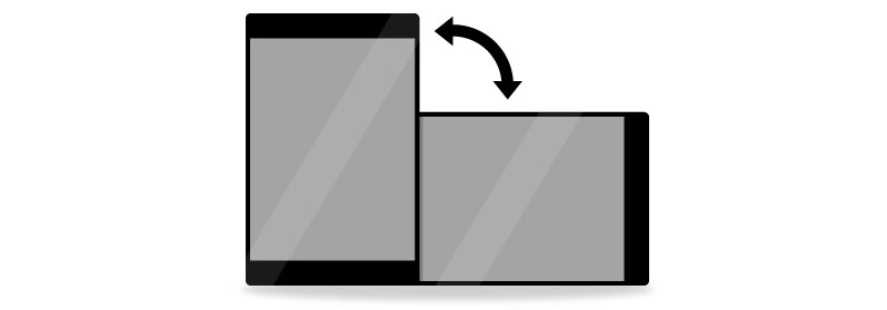
When a user is browsing on a tablet or mobile device, you can never be 100% sure what the physical position of the device is. Landscape and portrait view are different from each other in many ways. One could be better than the other in certain situations, but it’s up to the visitor’s to choose. In many cases, a user can even lock the orientation on their preferred landscape or portrait setting. If you want to provide the best possible user experience, you will need to cater to both orientations.
How To Start Using Orientation
Before moving on to the use cases, here’s the basic CSS you will need to begin orientation media queries.
/* Portrait */

@media screen and (orientation:portrait) {

.yourclass { property: value; }

}

/* end of Portrait */
/* Landscape */

@media screen and (orientation:landscape) {

.yourclass { property: value; }

}

/*end of Landscape*/
Navigation
Vertical scrolling seems to be natural to portrait mode, but it’s not as natural for landscape mode. You might want to consider using a vertical content layout, adding a content slider or implementing auto-scrolling functionality.
Tailor-Made Elements
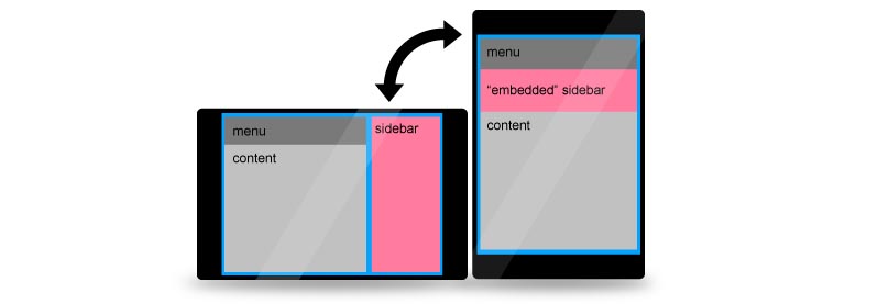
Relying only on screen-width media queries, there might be a few layout elements that you need to shift downwards or disappear if the proportions of the screen are no longer in your favor. Using orientation, you can simply adjust the size or appearance of a single element to fit the given orientation better. Create alternatives to the sidebar, re-scale your ads or even recolor elements if they work better in different surroundings.
Menus
You might want to re-think your menu layout for both orientations. Menu items are more accessible in a horizontal layout when it comes to landscape mode. Portrait view might provide you with a little less of screen width, so just go ahead and place the menu items underneath each other. Maybe even in two columns, as long as your fingers can aim at them comfortably.
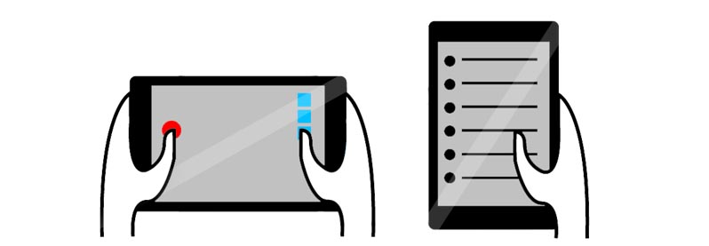
One Thumb, Two Thumbs
While holding a device in portrait position, the visitor is likely to be using just one thumb to navigate. Landscape is more welcoming for two hands at the same time. You can take advantage of this prediction by adding relevant navigation and functionality that anticipates hand positioning. If your site functions as a web app, adding multi-touch enhancements could be especially exciting.
Guiding The User
If you are pretty sure that a certain piece of content is more enjoyable in either landscape or portrait orientation (like a widescreen video), you might want to guide the user to the optimal position. Sending a friendly fade-out message to the user, advising to turn the device to the correct position can be a benefit for both of you.
Images
By images, I am referring to the ones that are constant, perpetual part of your layout. Your design could be easier on the eyes if you keep the proportions of the screen in mind. When selecting your image material, you could assign a photo of the Eiffel Tower to portrait mode and another one of London Bridge to landscape view. So, they both compliment the selected orientation well without having to compromise the layout much.

Support
Orientation is recognized by the latest versions of most mobile browsers, including: Opera, Safari, Firefox, Dolphin, and the native Android browser. It is pretty solid mobile browser coverage. Strangely enough, some desktop browsers also recognize it, including the latest versions of Safari, Firefox and Chrome. In some cases, it’s better to exclude non-handheld devices through CSS assignment or specific media queries.
Do you make the most of CSS media queries to design proper orientations? Do you have any examples of well-designed orientation to share?
Frequently Asked Questions (FAQs) about Mobile Site Orientation
What is mobile site orientation and why is it important?
Mobile site orientation refers to the way a mobile website is displayed on a device, either in portrait (vertical) or landscape (horizontal) mode. It’s crucial because it affects the user experience. A well-optimized site will adjust its layout, images, and other elements to fit the screen’s orientation, ensuring that content is easy to read and navigate. This can lead to increased user engagement and satisfaction.
How can I detect the orientation of a mobile device?
Detecting the orientation of a mobile device can be done using JavaScript’s window.orientation property. This property returns the angle of the device in degrees. For instance, 0 means portrait orientation, 90 means landscape orientation to the left, and -90 means landscape orientation to the right.
What are the challenges in designing for different orientations?
Designing for different orientations can be challenging due to varying screen sizes and aspect ratios. Elements that look good in one orientation may not work well in another. Designers must ensure that content is flexible and responsive, adjusting appropriately for different orientations. This often involves careful planning and testing.
How can I make my mobile site responsive to orientation changes?
You can make your mobile site responsive to orientation changes using CSS media queries. These allow you to apply different styles depending on the device’s orientation. For example, you can specify one set of styles for portrait mode and another for landscape mode.
What is the difference between landscape and portrait orientation?
Landscape orientation refers to when the device is held horizontally, with the width being greater than the height. This is often used for viewing videos or playing games. On the other hand, portrait orientation refers to when the device is held vertically, with the height being greater than the width. This is commonly used for reading or browsing.
How does orientation affect the usability of a mobile site?
Orientation can significantly impact the usability of a mobile site. For instance, in landscape mode, there’s more horizontal space, which can be useful for displaying wide content like images or tables. However, it also means less vertical space, which can lead to more scrolling. Designers must balance these factors to ensure a good user experience in both orientations.
Can I lock the orientation of my mobile site?
Yes, you can lock the orientation of your mobile site using the screen.orientation.lock() method in JavaScript. However, this should be used sparingly, as it can disrupt the user’s experience if they prefer a different orientation.
How can I test my mobile site’s responsiveness to orientation changes?
You can test your mobile site’s responsiveness to orientation changes using device emulators in web development tools like Chrome DevTools. These allow you to simulate different devices and orientations, helping you identify and fix any issues.
What is the role of CSS in managing mobile site orientation?
CSS plays a crucial role in managing mobile site orientation. It allows you to define different styles for different orientations using media queries. This can include changes in layout, font size, image size, and more, ensuring that your site looks good and functions well in both portrait and landscape modes.
How can I handle orientation changes in JavaScript?
You can handle orientation changes in JavaScript using the window.orientation property and the orientationchange event. The window.orientation property lets you know the current orientation of the device, while the orientationchange event is fired whenever the orientation changes. You can use these to adjust your site’s functionality and appearance when the orientation changes.

