At some stage in your internet surfing career you will have landed on a web page that says Error 404 Page Not Found. It can be annoying for visitors, but with a bit of care and attention, you can create a page that may intrigue your visitors and make them like you even more!
What is a 404 Page?
A 404 page is a HTTP standard response code indicating that the client was able to communicate with the server but the server could not find what was requested. This can happen for several reasons;
1. The page has been moved
2. A link from another site is incorrect
3. The visitor may have made a mistake typing in a URL
You can find a very thorough article on how the 404 works here on Sitepoint.
What Makes a Good 404 Error Page?
Think of the 404 as taking your lost visitor’s hand and guiding them gently to another part of your site.
1. Explain what the page is. Don’t assume that everyone is familiar with the term 404. The average lay person might think something has gone dramatically wrong (and I’m thinking of my parents here) when they see ERROR 404 in big letters on their screen.
2. Don’t let the visitor feel like it’s their fault that the page can’t be found, and don’t just tell them to correct their spelling. Odds are they won’t be back.
3. To improve their experience you should always allow them to go somewhere other than back using the browser Back button. Do not create dead ends.
4. Include links to other parts of your site.
5. Offer visitors a way to contact the webmaster to let them know a link is broken. Visitors are more likely to do this if offered a form.
6. Use Search boxes
7. An interesting or humorous graphic goes a long way towards creating goodwill.
By customising your 404 Error Page using some or all of these tips, you are going a long way towards keeping people on your site.
Some Examples
There are some wonderful showcases of 404 Pages on the web. I’ve picked out 10 examples that I felt were eyecatching and useful.
Unfinity Design gives a short explanation that the page can’t be found and a number of links back to various parts of their site.

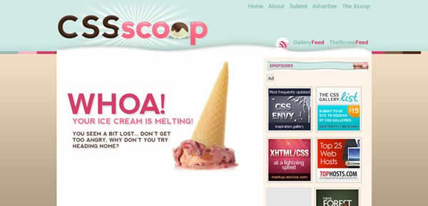
CSS Scoop serves up a melting scoop of ice-cream which is a link back to the homepage. The navigation bar at the top allows visitors to jump to those sections of the site.
DigiGuru has a very interesting 404 page, which transitions through a number of pictures, whilst giving links back to the main site, his email and phone number, AND information about a walk through the South Pole.

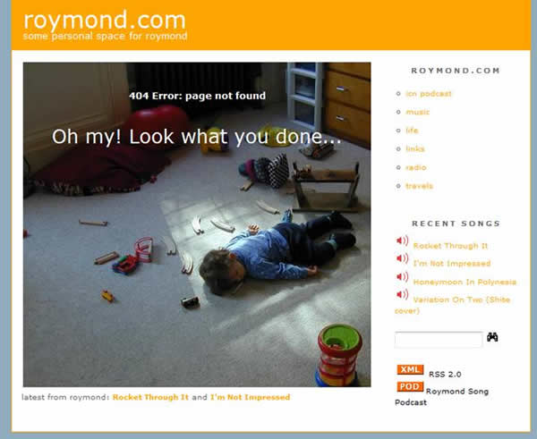
Roymond.com – I have to admit I included this one because it made me laugh. As well as displaying a humorous (in a slightly twisted way) image on the 404 page, there are a full set of links back to the main site.
Ultrapop shows a nice image with an order to return to base.

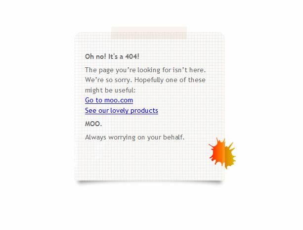
Moo has a simple and “caring” message with links to its products and to the homepage.
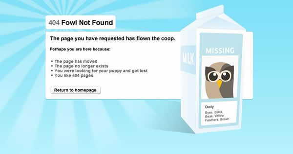
Hootsuite.com has a missing fowl theme with a brief explanation of why the page was not found and a link back to the homepage.
As well as sharks with lasers, on the Renkoo Error Page you get links back to various parts of the site.
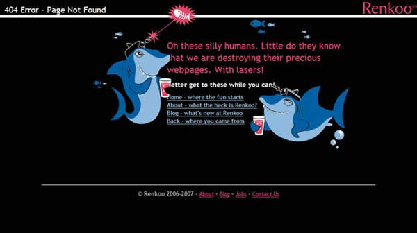
Clean, witty and offering lots of ways out of the 404 page including the search box, the Tinted Pixelsite also adds a nice little touch saying “It’s most certainly not your fault”

The 404 page for Blue Daniel is exceptional. While it only offers one link back to the main site, It’s made in Flash and is very imaginative.

Out of interest, when you accidentally land on a 404 Error page, do you hit the back button without thinking any more about it? Or do you try some of the suggested links? Which 404 pages have you seen recently that impressed you?
Jennifer Farley is a designer, illustrator and design instructor based in Ireland. She writes about design and illustration on her blog at Laughing Lion Design.
