
Key Takeaways
- EnjoyHint is a tool for creating interactive hints on a website, helping users understand the features of a web application. It is free to use, supports different shapes of highlighted areas, allows for hint delay, and offers cross-browser support.
- To use EnjoyHint, it needs to be installed and included in the HTML file of your web page. Then, a new EnjoyHint instance is initialized and the hints are described. Once everything is set, the script can be run.
- Hints can be created individually or in a sequence. They can be customized with different properties such as shape, radius, and the text of the hint. Callback functions can also be executed using the onStart, onEnd, and onBeforeStart properties.
- EnjoyHint is versatile and can be used with any web framework, making it a useful tool for web development projects. It also allows for HTML in the hint’s description, enabling further customization of its appearance.
The aim of this article is to cover the process of creating hints for a website. Firstly, we’ll take a look at how we can create a single hint for a proper website element. Then, we’ll create a sequence of hints to make a guided tour of a website. To create the hints I’ll use EnjoyHint. As an example, I’ve made a simple demo using the Bootstrap framework.
EnjoyHint depends on jQuery and it requires a version of the library greater than or equal to version 1.7. Another dependency is KineticJS v5.1.0 which is already included into EnjoyHint, so there’s nothing to worry about.
If you want to check out the source code of the demo, you can visit this GitHub repository.
Why Use EnjoyHint?
EnjoyHint’s main goal is to give you an opportunity to help a user in finding his way through your web pages features. It can be pretty useful in case of a big web application with tons of elements.

You can highlight a single element and add a description to it, or take a user by the hand to show him all the available features one by one. With this library is also possible to change the shape of the highlighted area or to use your own style for the hint text. Here’s a list of its key features:
- Free to use
- Automatic focus and highlighting of the area related to the hint
- Different shapes of the highlighted area
- Hint delay property
- Possibility to resume the interrupted hint sequence
- Cross-browser support
- Support for Android, iOS, and Windows touch screens
With this in mind, it’s now time to write some code to see this library in action.
Creating a Hint
I’ve created this tiny model of a search engine as an example:
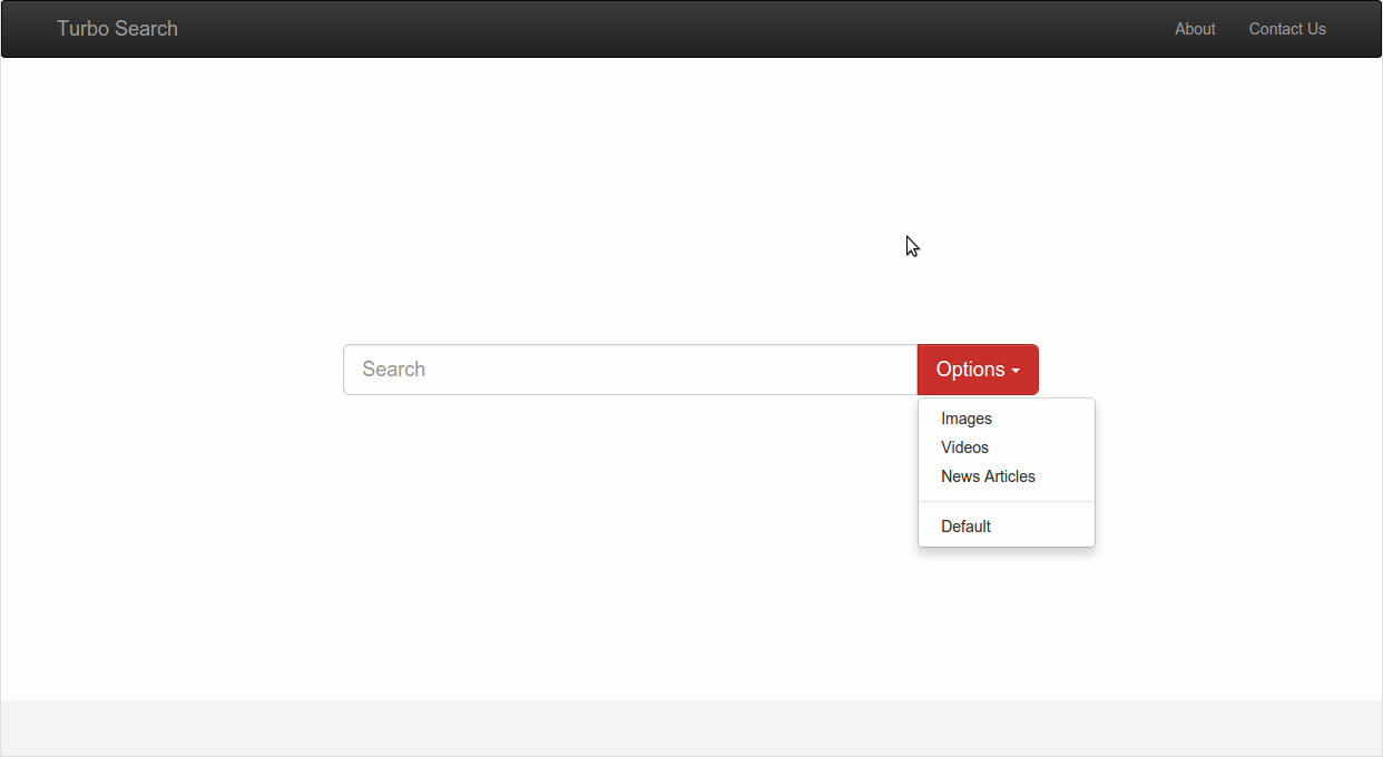
It contains the header, the search field, and the Options button which helps to switch between different types of search results. The development of the website is very simple and it’s also outside the scope of this tutorial, so I won’t describe the details. However, you can check the source code if you want.
Once we have a basic web page in place, we can start using EnjoyHint. The first step to perform is to install it by using Bower:
bower install enjoyhint
Alternatively, you can download it from its GitHub repository.
After downloading and extracting the package, you can include it into your HTML file. As we said, this library depends on jQuery, so you have to include the latter before EnjoyHint. If you don’t want to host jQuery locally, you can use the jQuery CDN, as shown below:
<script src="https://code.jquery.com/jquery-1.11.3.min.js"></script>
<script src="enjoyhint/enjoyhint.min.js"></script>

<link href="enjoyhint/enjoyhint.css" rel="stylesheet"/>
EnjoyHint Initialization
To initialize a new EnjoyHint instance you can write:
var enjoyhint_instance = new EnjoyHint({});
Now you can describe your first hint:
var enjoyhint_script_steps = [{

    /*hint code goes here*/

}];
Or if you want to create a sequence of hints:
var enjoyhint_script_steps = [{

    /*first hint code*/

}, {

    /*second hint code*/

}];
The next step is to set the description of hints as the instance config:
enjoyhint_instance.set(enjoyhint_script_steps);
Everything is ready and we can run our script now:
enjoyhint_instance.run();
Hint Definition
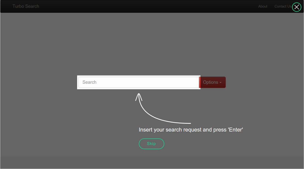
As our first example, let’s add a new hint that will describe the Options button purpose:
'click .btn' : 'This button allows you to switch between the search results'
The result is shown below:
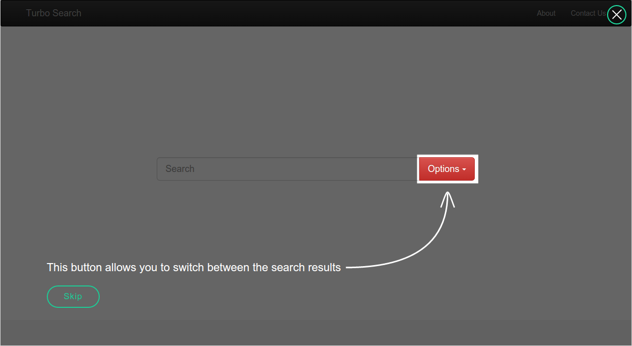
click is an event that will run the next hint. In our case the event is the click of a button. .btn is the selector of an element we want to highlight (that is the Options button with the class of btn in our example). Then, after the colon, we should define the text of our hint.
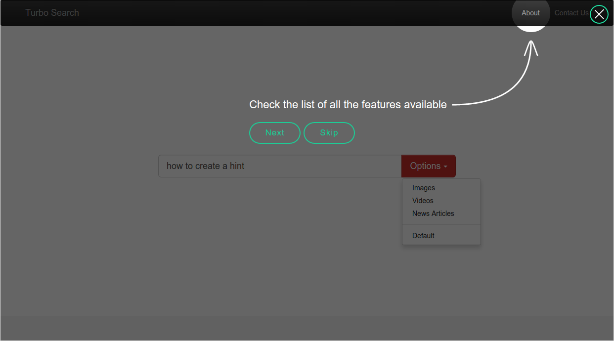
Since there’s only one hint in our script, when we click the Options button or the Skip button this hint will disappear. The Skip button appears by default. EnjoyHint allows you to apply your own CSS classes and names for its built-in elements, which can be helpful if you want to describe a single element of your page.
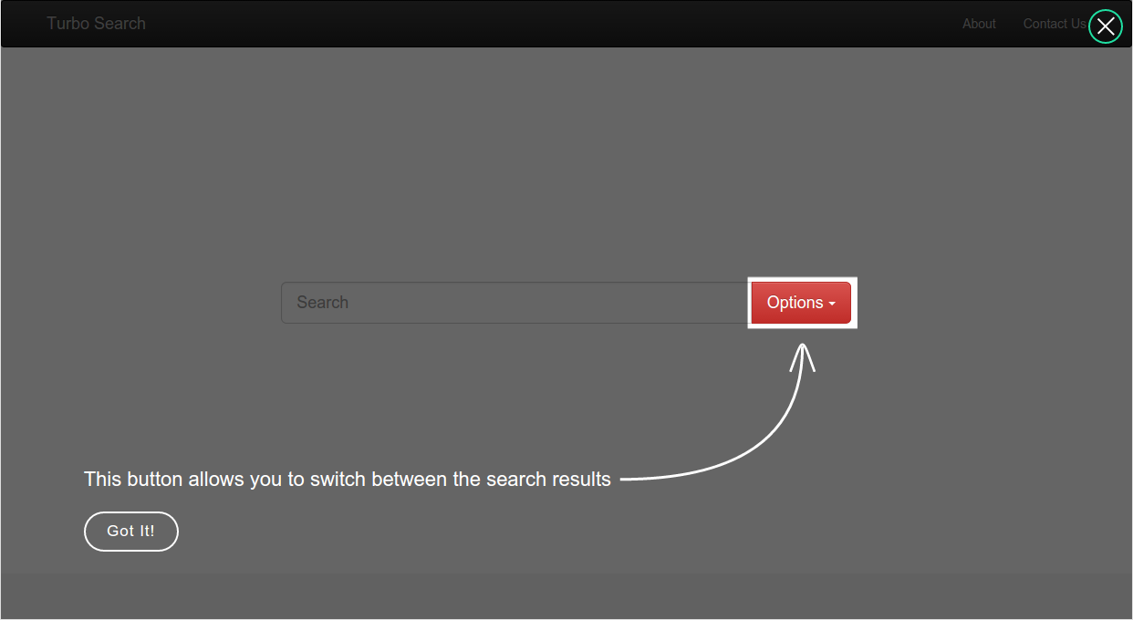
You can change the button’s label with the skipButton property:
'click .btn' : /*hint text*/,

'skipButton' : {className: "mySkip", text: "Got It!"}
This code also adds the mySkip CSS class to it. For example, using this CSS code:
.mySkip {

    color: white;

    border-color: white;

}
You can get this result:
You can even remove the Skip button by specifying showSkip: false.
Now that you know how to create a single hint, it’s time to create a couple of them. They will run one after another creating a guide.
Hint Sequence
In order to start creating a sequence of hints, we should rewrite all the code of hint definition from the beginning.
Hint one. The “next” event
The first hint will be specified as follows:
'next .navbar-brand' : /*hint text*/
This time I’ve used the next event and here’s what I’ve got as a result:
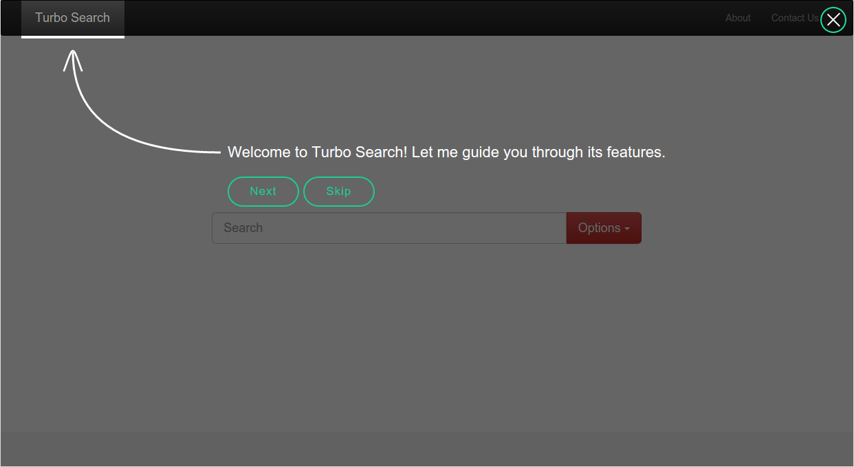
As you can see, our website title is highlighted now. Now, we have two buttons. The Next button will run the next hint and the Skip one will abort the script. You can change the Next button in the same way we did with the Skip button in our previous example:
'nextButton' : {className: "myNext", text: "Sure"},

'skipButton' : {className: "mySkip", text: "Nope!"}
Here’s how these buttons look like now:

Hint two. The “key” event
The next hint will tell a user how to use the search field. We’ll use the key event for this purpose. It will run the next hint after we push a certain key:
'key #mySearch' : /*hint text*/,

'keyCode' : 13
Note that this time we’ve used the ID as a selector. The keyCode property defines the code of a button which triggers the next hint. In this case it’s equal to the Enter button.
Let’s check how it looks like:
After the Enter button is clicked, the next hint will be invoked.
Hints Three and Four. Changing the Shape
In this third step we’ll use the previously defined hint for the Option button (see the “Hint Definition” section for details):
'click .btn' : /*hint definition*/
When you click this button, the fourth hint will run. And now we’ll change the default highlight shape, using the shape property for that purpose:
'next .about' : /*hint definition*/,

'shape': 'circle'
This code will highlight the About section as it’s shown below:
The Final Step
If the default circle size is not big enough for you, you can change its size using the radius property. We’ll now create the last of our hints using this feature. Since this is the final step of our guide, we don’t need the Skip button anymore and we can disable it using the showSkip property.
So, here’s my code for the final hint:
'next .contact' : 'Your feedback will be appreciated',

'shape': 'circle',

'radius': 70,

'showSkip' : false,

'nextButton' : {className: "myNext", text: "Got it!"}
And the result:
As you can see, the radius of the highlighted area is bigger this time.
Callbacks
The last feature I want to discuss is the possibility to execute callback functions. EnjoyHint provides you with the onStart and onEnd properties to run callbacks. The first is executed before the first hint starts and the second is executed after the last one is finished. The following is an example of use:
var enjoyhint_instance = new EnjoyHint({

    onStart: function () {

        // runs before the first hint

    },

    onEnd: function () {

        // runs after the last hint

    }

});
There is also another property to run a callback called onBeforeStart. This one fires before the certain hint is started:
var enjoyhint_script_steps = [{

    /* hint description */

    onBeforeStart: function () {

        // runs before the hint

    }

}];
Conclusions
EnjoyHint allows you to create step-by-step guides by adding hints to your website step by step. This tool provides you with additional useful features, such as custom event creation. You can use HTML in the hint’s description, which allows you to change its appearance the way you need.
If you want to check out the source code, you can visit this GitHub page. Here’s the demo page.
Frequently Asked Questions (FAQs) about EnjoyHint
What is EnjoyHint and how does it work?
EnjoyHint is a web-based tool that allows developers to create interactive hints and tips for their website or application. It works by overlaying a series of hints or tips on your website, guiding users through the various features and functionalities. These hints can be customized to match the look and feel of your website, and can be triggered by various events such as clicking a button, hovering over an element, or loading a page.
How can I customize the hints in EnjoyHint?
EnjoyHint provides a variety of customization options. You can customize the color, size, position, and content of the hints. You can also control the sequence in which the hints appear, and the events that trigger them. This allows you to create a unique and personalized user experience.
Can I use EnjoyHint with any web framework?
Yes, EnjoyHint is a framework-agnostic tool. This means it can be used with any web framework, including but not limited to Angular, React, Vue, and jQuery. This makes it a versatile tool for any web development project.
How do I install EnjoyHint?
EnjoyHint can be installed using npm, a popular package manager for JavaScript. Simply run the command ‘npm install enjoyhint’ in your project directory. Once installed, you can import it into your project using the ‘require’ function.
Can I use EnjoyHint for mobile applications?
While EnjoyHint is primarily designed for web applications, it can also be used for mobile applications with some limitations. The hints may not display correctly on smaller screens, and some touch events may not trigger the hints as expected.
Is EnjoyHint free to use?
Yes, EnjoyHint is an open-source tool, which means it is free to use and modify. However, if you find the tool useful, consider supporting the developers by making a donation or contributing to the project.
How do I contribute to the EnjoyHint project?
As an open-source project, EnjoyHint welcomes contributions from the community. You can contribute by reporting bugs, suggesting new features, improving the documentation, or submitting pull requests with code improvements.
Can I use EnjoyHint for commercial projects?
Yes, EnjoyHint can be used for both personal and commercial projects. However, as with any open-source tool, it is recommended to thoroughly test it in your specific environment before deploying it in a production setting.
How do I troubleshoot issues with EnjoyHint?
If you encounter issues with EnjoyHint, you can start by checking the documentation and the GitHub issues page for similar problems. If you can’t find a solution, you can submit a new issue on GitHub detailing the problem and the steps to reproduce it.
Can I integrate EnjoyHint with other tools?
Yes, EnjoyHint can be integrated with other tools and libraries. For example, you can use it with a testing framework to create interactive tests, or with a user analytics tool to track how users interact with the hints.