
While there are many arguments for and against using SVG gradients over CSS gradients, for this article we will focus on how to get started with SVG gradients if this happens to best suit your needs.
Using SVG gradients allows us to almost effortlessly fill in a complex shape with custom gradients and has the advantage over CSS gradients of living in the DOM. This approach especially comes in handy when, for example, a gradient is essential to your artwork. While our CSS styling will constantly evolve and change, our core artwork will generally remain the same, so we want the code for this artwork to live within the SVG itself, within the DOM.
Also, if you decide later that you want to animate your gradient you can add that right into your SVG element as well.
Key Takeaways
- SVG gradients offer a robust method for filling complex shapes with custom gradients directly within the DOM, providing advantages over CSS gradients in certain scenarios.
- Two primary types of SVG gradients are available: linear and radial, each defined within a `
` element and utilized through `fill` or `stroke` attributes. - Linear gradients transition colors along a straight line defined by attributes like `x1`, `y1`, `x2`, and `y2`, allowing for horizontal, vertical, or angled gradients.
- Radial gradients spread color outward from a central point, with attributes such as `cx`, `cy`, and `r` dictating the gradient’s scope and focal point.
- Attributes like `spreadMethod` and `gradientTransform` provide additional control over how gradients are applied and displayed, enhancing the flexibility and creative potential of SVG styling.
Establishing a Foundation
SVG provides for two types of gradients, linear and radial. The details for both linear and radial gradients reside inside of a <defs> element. The <defs> element contains identifiable instructions that can be used multiple times throughout the document; it establishes a definition that will not display until it is called on. Defining the gradient elements inside of a <defs> element enables understanding of the SVG content and enhances accessibility.
SVG uses the general notion of a paint server, which is a method that allows for the “fill” or “stroke” of an object to be defined by a resource found elsewhere. Gradients are one of many paint options that we have available to call on to fill the “background” and “border” of shapes and text.
A very simple linear gradient is structured like this:
<svg>

    <defs>

        <linearGradient id="gradientName">

            <stop offset="<%>" stop-color="<color>" />

            <stop offset="<%>" stop-color="<color>" />

        </linearGradient>

    </defs>

</svg>
Once a gradient is built and assigned an ID, it can be called through the “fill” and/or “stroke” attributes within the SVG. For example, fill= "url(#gradientName)".
Linear Gradients
Linear gradients change color evenly along a straight line. The gradient is defined by an axis, conveniently called the gradient line, and any specified angles.
Each point (stop) defined on this line will represent the correlating color within the <linearGradient> element. At each defined point the specified color is at 100% saturation, and the space in between represents a transition from one color to the next. Color distribution consists of a single defined color running at a perpendicular line to the gradient line at the stop point, ensuring complete coverage of the target shape.
Using additional color stops allows for the use of more colors at specific moments on this line, which we will discuss further in the following sections.
Let’s take a look at SVG code for a simple linear gradient with two color stops and then walk through available attribute options.
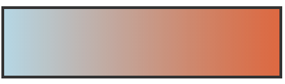
<svg>

    <defs>

        <linearGradient id="Gradient-1"

             x1="0" y1="0" x2="100%" y2="0">

            <stop offset="0%" stop-color="lightblue" />

            <stop offset="100%" stop-color="#ef5b2b" />

        </linearGradient>

    </defs>

    <rect x="450" y="10" width="200" height="100" fill= "url(#Gradient-1)"                          stroke="#333333" stroke-width="4px" />

</svg>
Linear Gradient Attributes
As mentioned, gradient details are defined within a <linearGradient> element. Within this element we can use a number of attributes for further customization.
ID
Gradient elements require unique IDs so that they can be assigned to fill our SVG shapes or text.
x1, y1, x2, y2
The x1, y1, x2, and y2 attribute values represent the start and end points onto which the gradient stops (color changes) are mapped. These percentages will map the gradients respectively along the appropriate axis. If left unspecified these values default to “0”, except for the x2 value which defaults to 100%; if they all defaulted to “0” it would have nowhere to go!
Within these x and y values we can define whether or not we want our gradients to run completely horizontal or vertical, or at a specific angle. For example, a y value of “100%” and an x value of “0” will produce a horizontal gradient, while the reverse will produce a vertical one. Having both values set at “100%” (or any value outside of 0) will render an angled gradient.
gradientUnits
The gradientUnits attribute defines the coordinate system for the x1, x2, y1, y2 values. The two value options here are “userSpaceOnUse” or “objectBoundingBox”. userSpaceOnUse sets the gradient coordinating system in absolute units, while objectBoundingBox establishes this system within the bounds of the SVG shape itself.
If left unspecified, this attribute’s value defaults to objectBoundingBox.
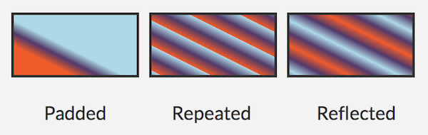
spreadMethod
The spreadMethod attribute’s value specifies how the gradient will spread out through the shape if it starts or ends inside the bounds of the target (the SVG). Basically, if the gradient is set to not fill the shape, how should it go about covering that empty space? There are three options here: pad, repeat, or reflect.
A value of pad directs the first and last colors of the gradient to spread out over the remainder of the uncovered target region. A value of repeat directs the gradient to repeat the pattern from the beginning continuously until the entire target region is filled. A value of reflect will reflect the gradient pattern alternating from start-to-end, end-to-start continuously until the target is filled.
If left unspecified, this value defaults to “pad”.
The image below shows how different spreadMethod values visually impact the same gradient. It is important to note again that these attribute values would have no impact on a gradient that was already set to fill the entire target (which would be its default action).
The start and end point for the gradient below is: x1="20%" y1="30%" x2="40%" y2="80%".
gradientTransform
The gradientTransform attribute is optional and allows us to further transform the gradient before it is applied, as with CSS transforms.
xlink:href
Within this attribute you can call on the ID of another gradient from which this gradient should “inherit”. In the above speadMethod image there are three rectangles. These rectangles all call on the same specified gradient color stops, but then also call on a different set of spreadMethod values that reside with a special ID inside additional <linearGradient> elements.
Here’s a look at the code for these gradients:
<defs>

    <linearGradient id="Gradient-1"

    x1="20%" y1="30%" x2="40%" y2="80%">

        <stop offset="0%" stop-color= "#1cb98f" />

        <stop offset="50%" stop-color= "#f99450" />

        <stop offset="100%" stop-color= "#876fc3" />

    </linearGradient>
    <linearGradient id="pad"

                    xlink:href="#Gradient-1"

                    spreadMethod="pad" />
    <linearGradient id="repeat"

                    xlink:href="#Gradient-1"

                    spreadMethod="repeat" />
    <linearGradient id="reflect"

                    xlink:href="#Gradient-1"

                    spreadMethod="reflect" />

</defs>
Each rectangle calls on specific IDs with an altered spreadMethod, all of which have inherited the same color stops defined within “#Gradient-1”.
Here’s how these gradients are called on within three different rectangles:
<rect x="10" y="10"

      width="200" height="100"

      fill= "url(#pad)"

      stroke="#333333"

      stroke-width="4px" />
<rect x="230" y="10"

      width="200" height="100"

      fill= "url(#repeat)"

      stroke="#333333"

      stroke-width="4px" />
<rect x="450" y="10"

      width="200" height="100"

      fill= "url(#reflect)"

      stroke="#333333"

      stroke-width="4px" />
The Stop Nodes
Now that we have a basic understanding of the <linearGradient> attributes we can move on to the good stuff, the attributes within the <stop> nodes.
Color stops for gradients are defined within the <linearGradient> element. What color do we want to see at a certain point? There are three attribute options here: offset, stop-color, stop-opacity. The stop offset tells the gradient at what point to assign the correlating stop-color. You can also include a stop-opacity value which would set an opacity of the color at the stop point.
<defs>

    <linearGradient id="Gradient-2">

        <stop offset="0%"

              stop-color="purple"

              stop-opacity=".3" />

        <stop offset="100%"

              stop-color="blue"

              stop-opacity=".5" />

    </linearGradient>

</defs>
The completed gradient is then called on with the “fill” or “stroke” attributes within the <svg> element based on its ID. For example, fill= "url(#Gradient-2)".
More Linear Gradient Examples
Here’s a look at a couple of demos to bring this all together.
For the “Apple” text demo there is a <text> element within our <svg> element. The gradient definitions reside in a <defs> element that is also within the <svg>.
See the Pen SVG Linear Gradient Example by SitePoint (@SitePoint) on CodePen.
To get a different perspective of how to use these gradients let’s look at a few icons in the demo below. Each fruit SVG has its own defined <linearGradient>. Fills and strokes can consist of the same or different gradients, or one can be a solid color, etc.
See the Pen SVG Linear Gradient Icons by SitePoint (@SitePoint) on CodePen.
Radial Gradients
Radial gradients are both very similar and very different from linear gradients. Instead of running across a straight line, radial gradients change color circularly. The stops begin within the center of the circle and distribute outwardly.
Radial Gradient Attributes
Most of the attributes for a <radialGradient> are the same as those of <linearGradient> except you will be working with a different set of coordinates.
cx, cy, r
The cx, cy, and r attributes define the outermost part of the circle for the gradient. The 100% stop-color of the gradient to follow will be mapped to the perimeter of this value. If left unspecified, the values default to 50%. While cx and cy are center coordinates, r represents the radius, or length, of the gradient. An r value of “0” will result in the shape being painted as a single color defined by the last gradient stop.
fx, fy
These attributes represent the coordinates of the gradient’s focal point, or innermost circle.
The demo below shows a radial gradient within SVG text. This first example has a focal point of fx="45%" fy="45%":
See the Pen SVG Radial Gradient example by SitePoint (@SitePoint) on CodePen.
This next example has a focal point of fx="90%" fy="70%", which demonstrates the impact of how the gradient is mapped:
See the Pen SVG Radial Gradient with different focal point by SitePoint (@SitePoint) on CodePen.
The focal point (a teal color) has shifted to the right. To even the stop distribution out on the second example we could simply change the cx, cy values to a matching percentage.
Radial Gradient Example
Here is a look at the fruit icons used earlier with different radial gradients applied.
See the Pen Icons with Various SVG Radial Gradients by SitePoint (@SitePoint) on CodePen.
Browser Support
Browser support for SVG is strong across desktop and mobile browsers, going two versions back across the board for desktop (meaning it’s supported everywhere including IE9+). So while basic support is there, you will inevitably run into cross-browser issues depending on your project, be it with SVG in general or SVG gradients specifically.
For example, Firefox and Safari seem to have issues with a spreadMethod that is not set to the default “pad” value. This can be avoided by simply making sure your gradient fills the shape completely, unless a partially filled gradient is your intent. More info on MDN’s articles covering SVG linear and radial gradients.
Conclusion
There is a lot of customization and unique design to be had with gradients. By writing gradients within SVG we can easily access it and maintain separation from our CSS.
Happy color-stopping!
This article is also available in French over at La Cascade. Thank you for the translation, Pierre!
Frequently Asked Questions about SVG Gradients
How can I create a radial gradient in SVG?
Creating a radial gradient in SVG involves defining a <radialGradient> element within the <defs> element. The <radialGradient> element is used to define a radial gradient. The <stop> elements are used to specify the color stops, the offset attribute is used to define the location along the gradient line where the color stop is placed. Here’s a basic example:<svg height="200" width="200">
<defs>
<radialGradient id="grad1" cx="50%" cy="50%" r="50%" fx="50%" fy="50%">
<stop offset="0%" style="stop-color:rgb(255,255,0);stop-opacity:1" />
<stop offset="100%" style="stop-color:rgb(255,0,0);stop-opacity:1" />
</radialGradient>
</defs>
<ellipse cx="100" cy="100" rx="85" ry="55" fill="url(#grad1)" /></svg>
How can I apply a gradient to a stroke in SVG?
Applying a gradient to a stroke in SVG is similar to applying it to a fill. You simply use the stroke attribute instead of the fill attribute. Here’s an example:<svg height="200" width="200">
<defs>
<linearGradient id="grad1" x1="0%" y1="0%" x2="100%" y2="0%">
<stop offset="0%" style="stop-color:rgb(255,255,0);stop-opacity:1" />
<stop offset="100%" style="stop-color:rgb(255,0,0);stop-opacity:1" />
</linearGradient>
</defs>
<line x1="50" y1="50" x2="150" y2="150" stroke="url(#grad1)" stroke-width="10"/></svg>
How can I animate a gradient in SVG?
Animating a gradient in SVG can be achieved using the <animate> element. This element allows you to animate different attributes of SVG elements over time. Here’s an example of how you can animate a linear gradient:<svg height="200" width="200">
<defs>
<linearGradient id="grad1" x1="0%" y1="0%" x2="100%" y2="0%">
<stop offset="0%" style="stop-color:rgb(255,255,0);stop-opacity:1">
<animate attributeName="stop-color" values="red;blue;red" dur="5s" repeatCount="indefinite" />
</stop>
<stop offset="100%" style="stop-color:rgb(255,0,0);stop-opacity:1">
<animate attributeName="stop-color" values="blue;red;blue" dur="5s" repeatCount="indefinite" />
</stop>
</linearGradient>
</defs>
<rect width="200" height="200" fill="url(#grad1)" /></svg>
How can I create a gradient that changes direction in SVG?
The direction of a gradient in SVG is determined by the x1, y1, x2, and y2 attributes of the <linearGradient> element. By changing these values, you can change the direction of the gradient. Here’s an example:<svg height="200" width="200">
<defs>
<linearGradient id="grad1" x1="0%" y1="0%" x2="100%" y2="100%">
<stop offset="0%" style="stop-color:rgb(255,255,0);stop-opacity:1" />
<stop offset="100%" style="stop-color:rgb(255,0,0);stop-opacity:1" />
</linearGradient>
</defs>
<rect width="200" height="200" fill="url(#grad1)" /></svg>
How can I create a gradient with more than two colors in SVG?
Creating a gradient with more than two colors in SVG involves adding more <stop> elements to your <linearGradient> or <radialGradient> element. Each <stop> element represents a color stop along the gradient line. Here’s an example:<svg height="200" width="200">
<defs>
<linearGradient id="grad1" x1="0%" y1="0%" x2="100%" y2="0%">
<stop offset="0%" style="stop-color:rgb(255,255,0);stop-opacity:1" />
<stop offset="50%" style="stop-color:rgb(0,255,0);stop-opacity:1" />
<stop offset="100%" style="stop-color:rgb(255,0,0);stop-opacity:1" />
</linearGradient>
</defs>
<rect width="200" height="200" fill="url(#grad1)" /></svg>
How can I create a gradient that repeats in SVG?
Creating a repeating gradient in SVG involves using the <repeatingLinearGradient> or <repeatingRadialGradient> element instead of the <linearGradient> or <radialGradient> element. Here’s an example:<svg height="200" width="200">
<defs>
<repeatingLinearGradient id="grad1" x1="0%" y1="0%" x2="100%" y2="0%" repeatCount="3">
<stop offset="0%" style="stop-color:rgb(255,255,0);stop-opacity:1" />
<stop offset="50%" style="stop-color:rgb(255,0,0);stop-opacity:1" />
</repeatingLinearGradient>
</defs>
<rect width="200" height="200" fill="url(#grad1)" /></svg>
How can I create a gradient that fades to transparency in SVG?
Creating a gradient that fades to transparency in SVG involves using the stop-opacity attribute of the <stop> element. This attribute determines the opacity of the color at the color stop. Here’s an example:<svg height="200" width="200">
<defs>
<linearGradient id="grad1" x1="0%" y1="0%" x2="100%" y2="0%">
<stop offset="0%" style="stop-color:rgb(255,255,0);stop-opacity:1" />
<stop offset="100%" style="stop-color:rgb(255,0,0);stop-opacity:0" />
</linearGradient>
</defs>
<rect width="200" height="200" fill="url(#grad1)" /></svg>
How can I create a gradient that changes color abruptly in SVG?
Creating a gradient that changes color abruptly in SVG involves placing two color stops at the same location along the gradient line. Here’s an example:<svg height="200" width="200">
<defs>
<linearGradient id="grad1" x1="0%" y1="0%" x2="100%" y2="0%">
<stop offset="50%" style="stop-color:rgb(255,255,0);stop-opacity:1" />
<stop offset="50%" style="stop-color:rgb(255,0,0);stop-opacity:1" />
</linearGradient>
</defs>
<rect width="200" height="200" fill="url(#grad1)" /></svg>
How can I create a gradient that spreads beyond the bounds of the object in SVG?
Creating a gradient that spreads beyond the bounds of the object in SVG involves using the spreadMethod attribute of the <linearGradient> or <radialGradient> element. This attribute determines how the gradient is spread beyond the gradient line. Here’s an example:<svg height="200" width="200">
<defs>
<radialGradient id="grad1" cx="50%" cy="50%" r="50%" fx="50%" fy="50%" spreadMethod="reflect">
<stop offset="0%" style="stop-color:rgb(255,255,0);stop-opacity:1" />
<stop offset="100%" style="stop-color:rgb(255,0,0);stop-opacity:1" />
</radialGradient>
</defs>
<ellipse cx="100" cy="100" rx="85" ry="55" fill="url(#grad1)" /></svg>
How can I create a gradient that changes color in a non-linear fashion in SVG?
Creating a gradient that changes color in a non-linear fashion in SVG involves using the gradientUnits attribute of the <linearGradient> or <radialGradient> element. This attribute determines the coordinate system for the gradient. Here’s an example:<svg height="200" width="200">
<defs>
<linearGradient id="grad1" x1="0%" y1="0%" x2="100%" y2="0%" gradientUnits="userSpaceOnUse">
<stop offset="0%" style="stop-color:rgb(255,255,0);stop-opacity:1" />
<stop offset="50%" style="stop-color:rgb(0,255,0);stop-opacity:1" />
<stop offset="100%" style="stop-color:rgb(255,0,0);stop-opacity:1" />
</linearGradient>
</defs>
<rect width="200" height="200" fill="url(#grad1)" /></svg>