

Previously we took a look at how using contrast in typography ensures that a web page is actually legible. Today, we’re taking a look at the idea of hierarchy in Typography. By varying the size of type, you can differentiate sections of content.
This concept is something that we’re all familiar with, and see on a daily basis, but may not be aware of the term. Hierarchy leads us through an article, or across a web page. It shows us where we start reading, what’s the most important part of the page, what’s the next most important part of the page and so on. The most obvious offline example of this is the newspaper – big headline at the top of the first page, sometimes followed by a byline, followed by the main copy. The smaller less important stories have a smaller headline. So you can use this theory, to guide your visitors around your page. The main headline is (nearly) always at the top, but you may also have important information in your sidebar, so use a large headline to set apart that section.
Of course you can always use colours, or background box colours to achieve this effect, but if you’re consistent with the size and weight of the type on your headings, sub-headings and copy, you are letting people know about the relative significance of the elements on your page.
Hierarchy is not something that exists in isolation and it is very much related to the fundamental we’ll talk about tomorrow, namely font size. Here are few examples from around the web.
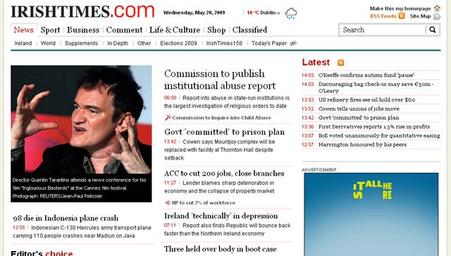
The Irish Times, like many newspaper sites follows a fairly standard hierarchy.
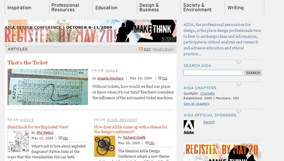
AIGA
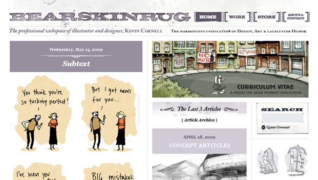
Bearskin Rug
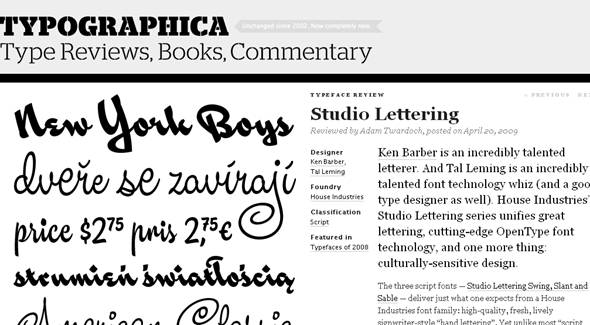
Typographica
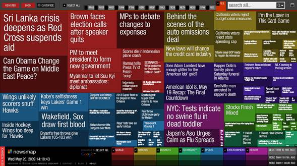
Newsmap. I wanted to include this one because I think this is really an atypical hierarchy as sections are demarcated by colour as well as the size of the headline.
Tomorrow, we’ll continue the series by look at how the size of type is also an important function of legibility.
Related Reading:
Frequently Asked Questions on Typography Hierarchy
What is the importance of typographic hierarchy in web design?
Typographic hierarchy plays a crucial role in web design as it guides the reader’s eye to different parts of the text, making the content more readable and accessible. It helps in organizing information in a clear and logical manner, allowing users to understand the message quickly and easily. By using different font sizes, weights, and styles, designers can create a visual guide for readers, highlighting important points and making the text more engaging.
How can I create a strong typographic hierarchy?
Creating a strong typographic hierarchy involves using different font sizes, weights, and styles to differentiate between elements of text. Start by deciding which elements should be the most prominent, such as headings or important points, and use larger font sizes or bold weights for these. Use smaller font sizes or lighter weights for less important elements, such as body text or captions. Consistency is key in maintaining a strong hierarchy, so make sure to use the same styles for similar elements throughout your design.
What are the different levels of typographic hierarchy?
The different levels of typographic hierarchy typically include primary, secondary, and tertiary levels. The primary level usually includes the most important elements, such as the main heading or title. The secondary level includes subheadings or key points, while the tertiary level includes body text or additional information. Each level should be clearly distinguishable from the others through the use of different font sizes, weights, and styles.
How does color affect typographic hierarchy?
Color can greatly affect typographic hierarchy by adding another layer of differentiation between elements. Using different colors for different levels of hierarchy can help guide the reader’s eye and highlight important points. However, it’s important to use color sparingly and ensure that the colors you choose are accessible and easy to read.
What is the role of white space in typographic hierarchy?
White space, or negative space, plays a crucial role in typographic hierarchy. It helps to separate different elements, making the text more readable and less cluttered. By using white space effectively, you can guide the reader’s eye and create a more balanced and harmonious design.
How can I use alignment to enhance typographic hierarchy?
Alignment can be used to enhance typographic hierarchy by creating a clear and organized layout. By aligning elements in a consistent manner, you can create a sense of order and make the text easier to read. For example, left-aligned text is often easier to read than centered text, especially for longer paragraphs.
What is the difference between font size and line height in typographic hierarchy?
Font size and line height are both important elements in typographic hierarchy. Font size refers to the size of the characters, while line height refers to the space between lines of text. By adjusting these elements, you can create contrast between different levels of hierarchy and improve readability.
How can I use typographic hierarchy to improve accessibility?
Typographic hierarchy can greatly improve accessibility by making the text easier to read and understand. By using different font sizes, weights, and styles, you can differentiate between elements and guide the reader’s eye. Additionally, using accessible colors and sufficient white space can make the text more readable for people with visual impairments.
Can I use multiple typefaces in typographic hierarchy?
Yes, you can use multiple typefaces in typographic hierarchy, but it’s important to do so carefully. Using too many different typefaces can make the design look cluttered and confusing. It’s generally recommended to use no more than two or three different typefaces in a single design.
How does typographic hierarchy affect the overall user experience?
Typographic hierarchy greatly affects the overall user experience by making the content more readable and understandable. It guides the reader’s eye and helps them navigate the text, improving their overall experience. A strong typographic hierarchy can make the content more engaging and enjoyable to read, leading to a better user experience.

