Flash Interface Design Made Simple
Key Takeaways
- Flash interface design can be complex and overwhelming, but with proper planning and the use of external graphics packages, the process can be simplified and made more efficient.
- Wireframing is a crucial step in planning out the design. It involves creating tangible skeleton structures that act as placeholders for content, helping to identify what works and what doesn’t.
- The integration between Flash and Fireworks is highly beneficial. Designs can be created in vector format in Fireworks, and then easily copied and pasted into Flash for fine-tuning, maintaining the integrity of the imagery.
- The effective use of gradients, drop shadows, and layer ordering can significantly enhance the visual appeal of the interface. Fireworks MX 2004 is particularly suited for creating complex and easily controlled gradients.
Many people have tried to create interfaces in Flash, but have become overwhelmed by the whole process and never come back to it. That’s a real shame. This article outlines tips and methodologies for creating Flash interfaces using graphics applications, good planning and simple logic.
The Flash drawing tools have been around since the earliest versions of the software, and have not progressed a great deal over the past few years. The creation of an effective interface using only the tools in Flash can be painstaking, difficult and downright frustrating for newbies and hardened professionals. This is why most people tend to develop their graphics in external graphics packages and then import them into Flash for fine-tuning.
Interface design for any end medium can be a tricky business; finding an effective balance between usability, functionality and aesthetics is the Holy Grail for designers. There are several different platforms for which you might create a design, but none is as tricky to design for as the Flash Player.
I don’t know how many times I’ve seen a good concept let down by poor execution and hap-hazard interface planning, but both issues can easily be remedied if you follow a few simple rules of thumb. These rules aren’t set in stone, but they will help you along the path to designing effective interfaces in Flash.
I’ve packaged up the files we’ll use in the tutorial — download the working files here.
Planning the Interface
There’s an old maxim that my father used to tell me: ‘Prior Planning Prevents Poor Performance’. It’s so true! If your interface design is poorly planned (or largely unplanned), it will take much longer to create, and you’ll undoubtedly introduce flaws that will require additional work to fix.
If you take time to plan the interface — the way it looks and the way it will function — you are already most of the way to an effective design.
What’s the simplest way to plan out a design? Well, for me, its either old fashioned paper and pencil or, if I’m at my computer, my tablet and pen. I usually start by sketching out the interface, its components, menu system and content areas. I then create extra sketches for each section, as can be seen below.
This process may take several iterations before I’m happy with the plans, but, being a bit of a hoarder, I never throw anything away. This way, I can always refer to interface ideas and sketches I made years ago (though my office does tend to become a bit of a maelstrom of paper during my design phases).
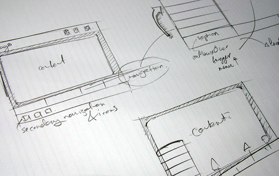
Once I’m happy with the initial layout, I move into a digital format — usually Fireworks or Illustrator — to create a compositional interface.
Wireframing Your Design
The concept of wireframing may already be familiar to many of you. You may already wireframe your designs subconsciously without realising it.
To put it simply, wireframing involves creating tangible skeleton structures that acts as placeholders for content. For example, if your design will hold a lot of text, you may need to consider a scrolling design rather than a paging design (in which content is held on different pages).
There are many points to consider during the creation of a layout for your designs. These issues are outside the scope of this article, but once you start to layout your designs in this manner, you’ll soon see what works and what doesn’t.
You can create your interfaces using any of the wide range of tools that are now available; I usually plump for Fireworks MX 2004. This program makes it easy to create interface prototypes, then resize and repurpose elements quickly using Flash’s vector tools. Everyone has their favourite application, but Fireworks MX 2004 really does make the creation of complex vector graphics a painless exercise.
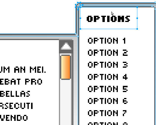
Consider the following interface. While it may seem simple, it was created from a series of rounded rectangles that were aligned and joined using the Union tool (Modify > Combine Paths > Union). Standard vector and text tools were then used to create the composition as a usable interface.

At first glance, it doesn’t appear complex, yet the creation of this type of interface using Flash’s standard tools would be a daunting task. Just look at the number of curves and control points that are present in this close-up of the design.
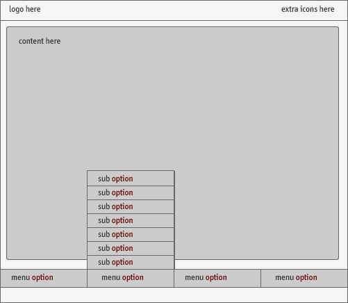
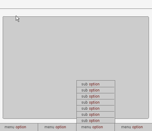
In the below design (source PNG files can be found in the code archive), I have create a series of simple rounded and non-rounded rectangular boxes. The content areas in which the logo, extra icons and main content areas are to be positioned are clearly noted, as are the main and sub-menu options.
Creating this design with a series of solid fills and simple strokes took about 15 minutes from start to finish and, because Fireworks MX 2004 makes it so easy to group interface components (such as each main menu), I could fine tune the attributes and positioning until I was happy with the final design.
One of the beauties of the Macromedia range of products is their tight integration, and the integration between Flash and Fireworks is no exception.
From the initial concept (and using the relevant layer structure within Flash), I can copy and paste quickly between applications. Because the design was created in vector format (and provided no live effects, such as drop shadows or glows, are applied to the items), integrity is maintained between the applications, and vector format imagery is imported successfully into Flash.
Understanding Layer Ordering
To pull into Flash the interface elements we created in the external application, we need to understand how the individual interface elements fit together.
In the following diagram, you can see how the interface constituents layer on top of each other to create the interface. From the header bar forwards, items are stacked on top of each other to produce the final effect.
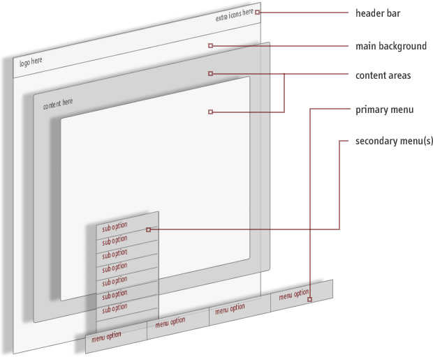
Depending upon how you work in Flash, the easiest way to create an interface rapidly is to import integral parts of the design as single components, arranging the items in separate layers within the stage. Not only does this make your design more scalable and easier to manage, it also gives you much more control over the position of each individual part of the interface relative to the others.
Note in the above diagram how the sections of the interface sit atop each other; this is called the stacking order of the layers. Those that appear at a lower point in the stacking order will essentially be hidden from view if a larger object is placed in a higher layer. This can be a useful concept – you can use the layers to mask other layers without changing layer types or using complex masking techniques. This ability can allow you to create an interface rapidly.
Naming and Arranging Layers
Because Fireworks and Flash support layers, we can migrate content from Fireworks to Flash easily. By recreating the layers in Flash and placing the content into each subsequent layer, we can mirror the design we created in Fireworks with a minimum of fuss.
Take a look at this exploded view of the interface we saw above.
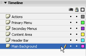
We can create these layers, from the top down, in Flash. We can then begin to import and lay out each element relative to the others.
The following diagram outlines the simple process flow. Once we’ve created the interface in Fireworks, we then create the layers to hold the structure in Flash. From this point, it’s simple to copy content from Fireworks and paste it into Flash.
Once the content is in Flash, we can fine-tune the attributes and position of the imported graphics. Once we’re satisfied with our work, we can go back to Fireworks and repeat the process until all the integral elements are in Flash.
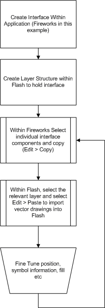
Note that, when you’re importing directly from Fireworks to Flash, objects are imported as Movie Clips or bitmaps and are placed in a folder called ‘Fireworks Objects’. The naming of the imported objects leaves a little to be desired (‘Symbol 1’, ‘Symbol 2’ etc.), so, after you import each element, it’s a good idea to give the item a more descriptive name for the sake of scalability.
This procedure also makes the files more usable in the event that you return to the project at a later date.
We can name the instances of any of the clips we’ve added to the stage for manipulation via ActionScript. In the following example, after we name the movie clips in the Primary Menu and Secondary Menus layers, we simply add the ActionScript to the Actions layer, and away we go!
Note that, in the included example (contained in the article code archive), no control code is present for the sub-menu items; it’s provided for example only.
Effective Use of Gradients
Using Flash to create gradients for your interfaces can be a tiresome and long-winded process and, while Illustrator is good at some things, nothing is as suited to creating complex and easily controlled gradients as Fireworks MX 2004.
With Fireworks MX 2004, you can rapidly create compelling interface elements. The program offers a series of simple gradients, with different colors and opacities, which can be overlaid to create subtle effects.
These creations can then be imported into Flash either by a simple copy and paste, or by export as an Illustrator format file that’s subsequently imported into Flash.
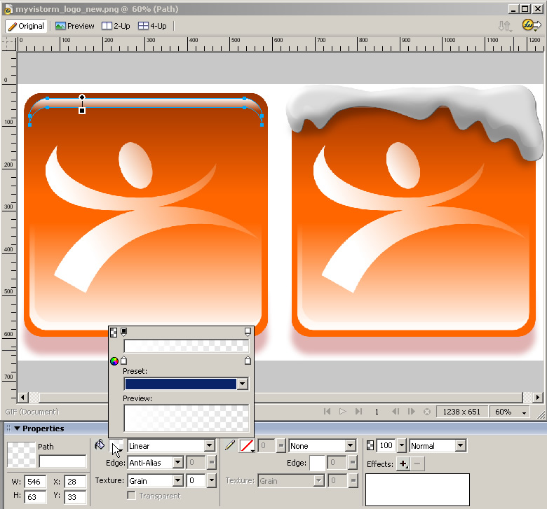
The difference between a design that works and one that doesn’t usually lies in its subtleties. Use subtle gradients as the fill type for vector paths fading from 100% opacity to 0% opacity and alter the drag handles for the gradient to produce very interesting and subtle effects.

Experimenting with the opacity markers for the gradient fill type, as well as the color and Blend mode, can help you achieve realistic effects, whatever the design.
Creating Drop Shadows
If you import bitmap-based drop shadows into Flash, they can look grainy at best — dreadful at worst! While it may take a few minutes to create a vector-based alternative, the benefits far outweigh this extra investment in time.
The quickest way to create a vector drop shadow in Flash is to make a solid fill (e.g. black) duplicate of the shape to which you want to add a shadow, then place it on a layer beneath the original object
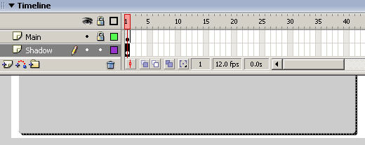
Then, select the shape, select Modify > Shape > Soften Fill Edges, and select the following settings:

This produces a clean gradated shadow, instead of a hard solid vector line, but play around with the settings to create a look that suits your project.
Once you’re happy with the effect, select all the objects you’ve just created with the ‘Soften Fill Edges’ command. Group them together and convert the resulting group to a movie clip, altering the opacity of the clip to around 40% for a soft effect.

That’s it! While we’ve only scratched the surface of interface design in this article, hopefully it has given you a taster — and a few shortcuts for creating interfaces and getting objects into Flash. For more shortcuts and tips, look out for the next instalment!
Frequently Asked Questions about Flash Interface Design
What is Flash Interface Design?
Flash Interface Design refers to the process of creating interactive and dynamic user interfaces using Adobe Flash. This technology allows designers to incorporate multimedia content such as animation, video, and sound into their designs, enhancing the user experience. Flash Interface Design is often used in web design, game development, and multimedia presentations.
How does Flash Interface Design differ from traditional web design?
Traditional web design primarily uses HTML, CSS, and JavaScript to create static pages. On the other hand, Flash Interface Design allows for the creation of dynamic, interactive content. This can include animations, video, and audio, which can be integrated seamlessly into the design. However, it’s important to note that Flash is not as widely supported as it once was, with many modern browsers no longer supporting it.
What are the advantages of using Flash Interface Design?
Flash Interface Design offers several advantages. It allows for the creation of rich, interactive content that can enhance user engagement. It also supports vector graphics, which means that designs can be scaled without losing quality. Additionally, Flash can be used to create complex animations and multimedia presentations that would be difficult to achieve with traditional web design techniques.
What are the disadvantages of using Flash Interface Design?
While Flash Interface Design has its advantages, it also has some drawbacks. One of the main disadvantages is that it’s not supported by all web browsers. This means that users may not be able to view your content if they’re using a browser that doesn’t support Flash. Additionally, Flash content can be more resource-intensive, which can lead to slower load times.
Is Flash Interface Design still relevant today?
While Flash was once a popular tool for web design, its use has declined in recent years. This is largely due to the fact that many modern web browsers no longer support Flash. However, the principles of Flash Interface Design, such as the focus on interactive, multimedia content, are still relevant and can be applied using other technologies.
What has replaced Flash in modern web design?
HTML5 has largely replaced Flash in modern web design. HTML5 supports multimedia content without the need for a plugin, making it more accessible and user-friendly. It’s also supported by all modern web browsers.
How can I learn Flash Interface Design?
There are many resources available for learning Flash Interface Design, including online tutorials, courses, and books. However, given the decline in Flash’s popularity, it may be more beneficial to focus on learning more widely used technologies such as HTML5.
Can I use Flash Interface Design for mobile applications?
While it’s technically possible to use Flash for mobile applications, it’s generally not recommended. This is because Flash is not supported by many mobile devices, including iPhones and iPads. Instead, technologies like HTML5 and CSS3 are typically used for mobile app development.
What tools do I need to create a Flash interface?
To create a Flash interface, you’ll need Adobe Flash (now known as Adobe Animate). This software allows you to design and animate your interface, and then export it as a SWF file for use on the web.
What is the future of Flash Interface Design?
The future of Flash Interface Design is uncertain. Adobe has announced that it will stop supporting Flash at the end of 2020, and many web browsers have already stopped supporting it. However, the principles of Flash Interface Design, such as creating interactive, multimedia content, will continue to be relevant and can be applied using other technologies.
Steven is cofounder of phireworx.com, a Fireworks resource site, and contributing author of Fireworks MX Magic (New Riders), Special Edition Using Fireworks MX (Que), and Fireworks MX Fundamentals (New Riders). Steve wrote SitePoint's The Flash Anthology: Cool Effects & Practical ActionScript
