Ferrari’s New Formula 1 Logo Removes Tobacco Relationship
Earlier this month, Ferrari revealed its new logo, which will appear on the Formula 1 car, drivers and staff uniforms from January 1 2011. The new logo is replacing the current, somewhat controversial logo which features a barcode which some have said subliminally advertises Marlboro cigarettes. The driving team is officially called Scuderia Ferrari Marlboro and the changes made to the logo were done in conjunction with Philip Morris, the giant tobacco company. Formula 1 cars cost huge amounts of money to develop and run and essentially require sponsorship from big companies to stay on the road. Ferrari is the only Formula One team with a tobacco brand in its title.
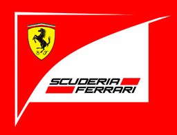
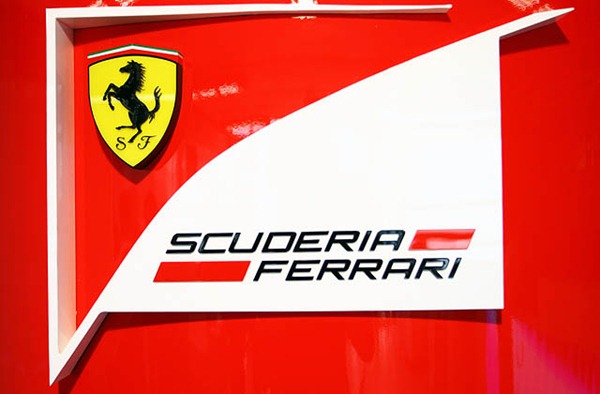
The iconic prancing horse remains in place and there is an angular white shape featuring the name of the team. There is no visual or text reference to Marlboro.
The new Ferrari Formula 1 logo.
Ferrari team boss Stefano Domenicali said
All the activities related to the activities of the racing department will use this logo. It will be on top of the cars, on the uniforms, on the drivers’ overalls, on the Ferrari Driver Academy activities, and all the other things that we will do in the future through the racing department of F1. This belongs to our team and is a trademark of Scuderia Marlboro Ferrari.
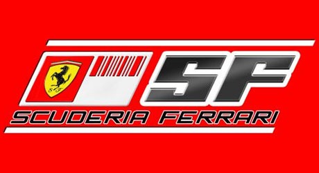
The current 2010 logo was thought to contain elements, namely the barcode, that are too similar to the Marlboro cigarette branding. The European Union has banned cigarette advertising in print media, advertising and on the internet and prohibits sponsorship of sporting events.
The 2010 Ferrari Formula 1 logo.
The barcode livery on the back on the car was considered to look too Marlboro-esque.
Graphicology have an excellent post from April of this year about how the barcode design comes very close to the bone in terms of sneaking in under the tobacco advertising ban.
What do you think of the new logo? Does the current barcode logo and livery remind you of Marlboro?
Frequently Asked Questions about Ferrari’s New Formula 1 Logo
What is the significance of Ferrari’s new Formula 1 logo?
The new logo of Ferrari’s Formula 1 team, Scuderia Ferrari, signifies a significant shift in the brand’s identity. The new design is a departure from the previous logo, which had a strong association with tobacco sponsorship. The new logo is a reflection of Ferrari’s commitment to promoting a healthier image, free from the controversial ties to the tobacco industry. It’s a bold move that aligns with the global trend of sports teams distancing themselves from unhealthy sponsorships.
How does the new logo differ from the old one?
The new logo retains the iconic prancing horse, a symbol synonymous with Ferrari. However, it removes the barcode design that was often associated with Marlboro, a tobacco brand. The new logo is simpler, cleaner, and more modern, reflecting Ferrari’s forward-thinking approach and commitment to innovation.
Why did Ferrari decide to change its logo now?
Ferrari’s decision to change its logo comes at a time when the brand is looking to redefine its image and align itself with healthier lifestyle choices. The move is also in line with the global trend of sports teams distancing themselves from controversial sponsorships, particularly those related to tobacco and alcohol.
What has been the public reaction to the new logo?
The public reaction to the new logo has been largely positive. Many fans appreciate the cleaner, more modern design, and the brand’s commitment to promoting a healthier image. However, some fans have expressed nostalgia for the old logo, which had become a familiar sight in Formula 1.
How does the new logo reflect Ferrari’s brand values?
The new logo reflects Ferrari’s brand values of innovation, excellence, and a commitment to health and wellbeing. By removing the controversial barcode design, Ferrari is making a clear statement about its stance on health and wellness.
Will the new logo affect Ferrari’s performance in Formula 1?
While the logo is an important part of a team’s identity, it does not directly affect the team’s performance on the track. Ferrari’s performance in Formula 1 will continue to be determined by the skill of its drivers, the quality of its cars, and the strategies it employs during races.
What does the new logo mean for Ferrari’s sponsors?
The new logo signifies a shift in Ferrari’s sponsorship strategy. By removing the barcode design associated with Marlboro, Ferrari is likely to attract sponsors who align with its commitment to promoting a healthier image.
How does Ferrari’s new logo compare to those of other Formula 1 teams?
Ferrari’s new logo is unique in its simplicity and modern design. While other Formula 1 teams also have modern logos, Ferrari’s stands out for its bold decision to remove any association with tobacco sponsorship.
What is the history behind Ferrari’s logos?
Ferrari’s logos have evolved over the years, reflecting the brand’s growth and changing values. The prancing horse, a symbol synonymous with Ferrari, has been a constant feature. The recent change is another chapter in the brand’s rich history.
What is the future of Ferrari’s branding strategy?
While it’s hard to predict the future, the new logo suggests that Ferrari is committed to promoting a healthier image and aligning itself with modern values. This could mean more changes in the future as the brand continues to evolve and adapt to changing societal norms.
Jennifer Farley is a designer, illustrator and design instructor based in Ireland. She writes about design and illustration on her blog at Laughing Lion Design.


