
Icons are nothing new when it comes to web design, but that doesn’t mean selecting the right icons to use is an easy task.
Like anything else when it comes to your website, careful thought is required to determine the use and need for each component. Whilst sprinkling your pages with decorative icons may give your site a unique feel, it’s rarely the wisest of choices.
In today’s article, we’ll look at some tips to keep in mind when selecting an icon set, and then we’ll run through a shortlist of some of my current favorites.
Universal Symbolism and Shape
First and foremost, your icons need to be easily and instantly recognizable. Don’t try to get too clever.
At times, it can be easy to become enchanted by a particularly beautiful icon set — despite the fact the icons available may not be suited to your intended messages.
Other times, it can be tempting to try to be particularly original or clever in your icon choices. Why not make the submit button a rocket, eh?
Rule of thumb: If you have to think about the choice, you’ve more than likely made a bad decision.
Mondrian.io is an raw, open-source, browser-based vector application that looks very promising — but I think it illustrates this icon selection dilemma very well.
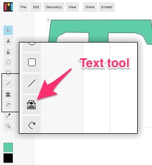
The current version of Mondrian uses a typewriter icon to denote the text tool (see diagram).
At first glance, this might not seem like an unreasonable choice. After all, typewriters are real-world text tools, right?
However, ask yourself:
- How many people do you know that actually own a typewriter?
- Could the average primary school kid identify one?
- Besides movies, when was the last time you even saw one?
Formally a symbol of writing, technology and the modern office, the typewriter has been gradually losing its meaning to us for 30 years — and that continues everyday.
MacPaint,Freehand and Photoshop
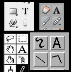
Luckily, there’s already a well-established history — dating back to the earliest 80’s GUIs — of graphics apps using either a capital ‘T’ or ‘A’ as their text tool icon. Everyone from secretaries using MS Word, to architects using Autocad, to high-end 3d modellers understands this idea.
In short: if you get a chance for a ‘free ride’ on an established idea, don’t be too proud to take it.
Like poor color decisions, bad iconography can ruin your site. Do note however, that some icons can have more than one meaning in different contexts.
If you are unsure of your choice, don’t be afraid to test it: Ask friends and family for feedback and if all else fails, include text to inform the visitor what it is they are seeing.
Remember, the sole purpose of the icon is to convey its meaning through its imagery.
Choosing Size and Placement
The size of your icons is an important factor when you’re picking icons to insert into your project. Typically in web design you will want to establish a visual hierarchy — from largest to smallest — by u sizing web elements to create easier readability.
For items like logos and headings, this helps create balance and harmony.
However, with your icons it’s important to remain consistent with your size as to not leave your page looking disorganized.
Overall sizing is also an important decision. Icons that are too large will crowd your page and interfere with reading flow, while too small will be hard to decipher. User test your sizing to find a workable middle ground.
Ultimately this will ensure that the eye of the viewer flows from element to element without having to pause. Proper size choices will keep the eye from becoming strained and will increase the speed of the viewer comprehending each icon.
Color and Consistency
As designers, we’re all well aware how important color is.
Color is generally used to evoke emotion and the same goes for your icons. If your icons are needed to cause urgency or inspire action, then make sure you colors support that task.
Also keep in mind that icons serve a very different purpose to illustrations or diagrams — they are a ‘visual shorthand’ for communicating, rather than either instructional images or decorative touches.
This means neither detail nor color accuracy are your priority.
Seriously question how many colors you need to accomplish your goals — or if, indeed, you need color at all. A good icon is a visual note, not a painting.
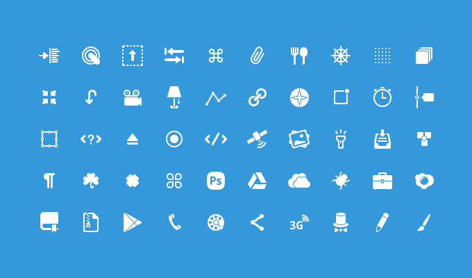
So, now that we’ve have looked at how to choose your icons, here are ten of my favorite (and free_ icon sets for your downloading pleasure.
50 Glyph Icons
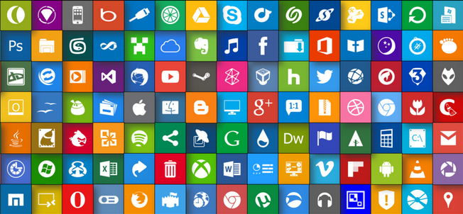
Metro UI Icon Set
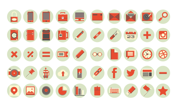
Flat Red Icon
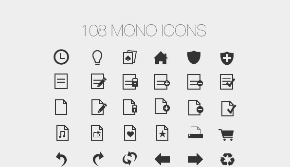
108 Mono Icons
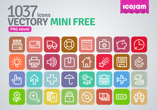
Vectory Mini
Socialico
Mono Social Icons Font
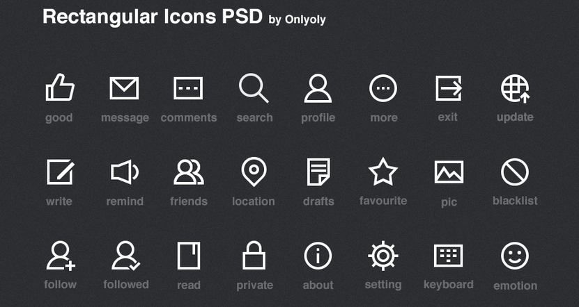
Rectangular Icons
Softies
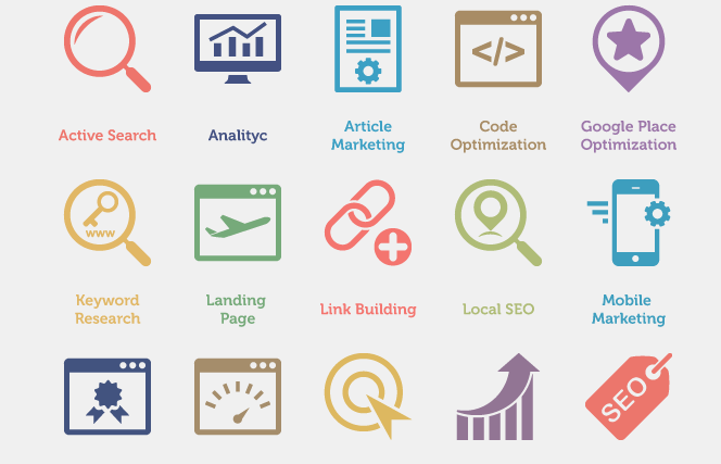
60 SEO Services Icons
Frequently Asked Questions (FAQs) about Choosing the Right Icons
What factors should I consider when choosing icons for my website or app?
When choosing icons for your website or app, it’s important to consider several factors. Firstly, the icon should be visually appealing and easy to understand. It should represent the function or content it’s linked to clearly. Secondly, consider the style and color scheme of your website or app. The icons should match this to ensure a cohesive look and feel. Lastly, consider the size of the icon. It should be large enough to be easily clickable, but not so large that it dominates the page or screen.
How can I ensure my icons are user-friendly?
To ensure your icons are user-friendly, they should be simple and intuitive. Avoid using overly complex designs that may confuse users. Also, ensure they are large enough to be easily clickable, especially for mobile users. Consistency is also key – use a consistent design style for all your icons to help users quickly recognize them.
Can I use different icons for different platforms?
Yes, you can use different icons for different platforms. However, it’s important to maintain consistency in the design and function of the icons across all platforms. This helps users quickly recognize and understand the icons, regardless of the platform they are using.
How can I test the effectiveness of my icons?
You can test the effectiveness of your icons by conducting user testing. This involves observing how users interact with your icons and gathering feedback. You can then use this feedback to make any necessary adjustments to improve the usability and effectiveness of your icons.
What are some common mistakes to avoid when choosing icons?
Some common mistakes to avoid when choosing icons include using overly complex designs, not considering the size of the icon, and not maintaining consistency in the design and function of the icons across all platforms. Also, avoid using icons that are too similar to each other, as this can confuse users.
How can I choose icons that represent my brand?
To choose icons that represent your brand, consider your brand’s personality and values. Choose icons that reflect these. For example, if your brand is modern and innovative, choose sleek, minimalist icons. If your brand is more traditional, choose classic, timeless icons.
Can I customize icons to fit my needs?
Yes, many icon libraries allow you to customize icons to fit your needs. You can often change the color, size, and sometimes even the design of the icons. However, be sure to maintain consistency in the design and function of the icons across all platforms.
How can I use icons to improve the user experience?
Icons can greatly improve the user experience by making your website or app easier to navigate. They provide visual cues that help users quickly understand the function or content they’re linked to. To maximize their effectiveness, ensure your icons are simple, intuitive, and consistent.
What are some good resources for finding icons?
There are many online resources for finding icons. Some popular ones include Flaticon, Freepik, and The Noun Project. These sites offer a wide range of icons in various styles and sizes, many of which can be customized to fit your needs.
How often should I update my icons?
There’s no set rule for how often you should update your icons. However, it’s a good idea to review them regularly to ensure they’re still effective and relevant. If you notice that users are having difficulty understanding or using your icons, it may be time for an update.