

When designing your application, website or form UI, one of the things you will think about is placement of various commands and buttons. This might be menu items, a toolbar, some buttons, text links, drop-downs, hover menus, and any actionable, clickable elements such as resize bars.
SitePoint has a wealth of info about UX design, they have a whole section about it! This post is merely a list of things to keep in mind when designing which particularly bug me.
Key Takeaways
- When designing a user interface, pay careful attention to the placement of various commands and buttons, especially those that perform opposite functions. Avoid placing “OK” and “Cancel” buttons side by side without adequate sizing and white space, to reduce the risk of accidental clicks.
- Consider the impact of muscle memory and visual cues in your design. Users often click the wrong thing more often than not when elements are out of place due to muscle memory. Similarly, visual cues such as color can influence user behavior. For example, red usually signifies something will be deleted or data changes will be canceled.
- Use your app extensively and consider the user’s experience. Remove annoyances, balance visual conformity against muscle memory, and avoid unnecessary extra dialogs, settings, warnings, and popups. Also, follow the UI/UX traditions that have come before you, as muscle memory matters. Look for design specifications and guidelines for the platform you are building for.
Issues
Here is an example: I use Photoshop a lot, which has many menus with dozens of options, but like many PS users, I learn a lot of shortcuts and avoid the menus when possible. One thing I do very frequently is export a graphic for the web, which is in the ‘File’ menu. I don’t know why I do this but 5 out of 10 times I go to that menu, I overshoot the option and click ‘Revert’ which is right under it.
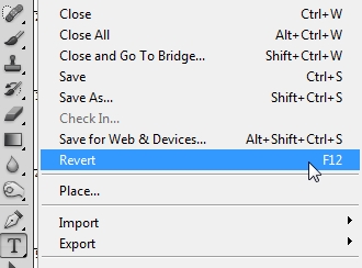
Surprisingly, I almost never have this issue with any other menus in PS, but this one happens all the time. Part of the problem is that I do this so often, it’s muscle memory, I don’t spend seconds of my time properly positioning the cursor before clicking. The other part of the problem is that Adobe has decided to put an option like ‘Revert’ next to an option like ‘Export’.
They pretty much do the opposite things!
My point is to watch out for these opposites, placing your “OK” and “Cancel” buttons side by side without adequate sizing and white space. Or Yes/No, Save/Close, Minimize/Exit, and so on.
Microsoft Windows has always had the frustration of minimize, restore, and Close next to each other on all their Windows, and I have, as I’m sure most of you have, closed Windows when you wanted to restore them.
My wife has nightmares of the time she was writing a paper for a final and had a simple accident of closing before saving. I don’t know about you but my social feeds have shown me dozens of posts over the years from friends who have lost their work on “accidental clicks”.
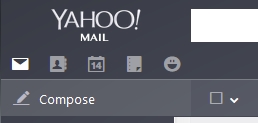
Another issue is useless drop-down menus when there is clearly enough space to provide the options without a menu. Gmail comes to mind. Notice in Gmail I get a menu just to select TWO other options! In Yahoo, they elegantly place all selections as icons with no menu. One click beats two clicks in most cases. Clearly balance is needed, but in the case of Gmail, there are only 2 other options in the menu, not 15, so just put them side-by-side!

A Concept
The best way to handle opposite functions is to think of muscle memory, separation and white space, then colors and visual cues.
Muscle memory bites us in the butt every time some application changes things and we continue to try and click where we’ve normally clicked before. Imagine if Windows suddenly moved the Start button from the left side to the right side. Muscle memory alone would cause people to go nuts and beg for the previous position, and yet there is nothing inherently different about something being on the left or right, top or bottom.
Here are some common muscle memory design features:
- The “Exit” command in most File menus is usually the last option.
-
The ‘About’ dialog is almost always in a ‘Help’ menu at the bottom. In Chrome the About screen is not on the bottom, unlike Firefox, Internet Explorer, or 99% of every other applications. This causes me to lose one or two seconds to properly find and click it to avoid an accident. Adobe Reader is the worst, putting About in the 2nd from top position while the bottom is used for purchasing the full version!
-
Use of ‘Tools’ or ‘Edit’ menu to find the program options and settings. And the use of a ‘gear’ icon for settings fits in here.
People get used to where things are, and muscle memory makes them click the wrong thing more often than not when elements are out of place.
Along with muscle memory you will be dealing with visual cues. The issue of red versus green colored buttons comes to mind as Kerry Butlers wrote about recently.
When a user is trying to do something in your app, typically red means something will be deleted, or data changes canceled, or something else destructive will happen. In my opinion, every other color is up for grabs, but red tends to mean something will be lost or removed.
That being said, when a user thinks they are trying to do something such as delete a playlist, you might pop up a dialog with green and red buttons. Even without thinking they will likely jump to red and click because they think red means “danger, playlist will be deleted”.
In reality, the user is giving an explicit command to delete something, and green typically means ‘perform that thing I want to do’. So technically, when a user says ‘delete this playlist‘, it would be the green button to affirm what they want, while red would actually mean ‘cancel what I requested‘. If a user were working just on visual cues, and red means ‘destroy something‘, they may click red thinking the playlist would delete, but in fact it’s still there.
I know some have given up this battle and make all buttons the same color. I used to have a red ‘Delete’ button in my email app, but now all the buttons are the same color and style. I actually miss the visual color cues, now I waste a second making sure I’m clicking ‘Delete’ and not ‘Junk’ or something else.
Be careful you don’t make all your buttons/icons TOO similar because you only gain visual conformity at the expense of visual distinction. Visual distinction is better, as visual and muscle memory learn positions and colors before they learn to read text. It’s so much faster to whip up and click the red button than it is to try and pick the command I want among 10 other commands which all have identical icon colors and styles.
Another visual cue is common positioning, as mentioned earlier about the ‘Exit’ or ‘About’ commands. People are used to having minimize/maximize/close on the top-right of the app (in Windows). But ‘Close’ is on the top-left in ElementaryOS and Mac, but is on the right for Linux MINT and other distros. Notice, though, that in both Mac and Windows and Linux, ‘Close’ is the furthest option to the edges.
People are used to Okay/Confirm/Go/Yes to be on the left side of things, and Cancel/Delete/No to be on the right side. Or the Save/Confirm on top and Cancel on bottom.
There are exceptions, as there are to everything. Linux MINT Xfce puts the Cancel option on the inside, or leftmost position, the opposite of Windows. It’s probably one of the big reasons people love ‘their’ operating system of choice, and others seem so ‘foreign’ or ‘difficult to use’. I am a Windows user, so when I’m in my Linux laptop, I often go to click the outside button thinking it will be Cancel, then I have to double-take.
It is better to follow norms than upset the applecart. Does this limit some innovation? Probably a little, at the expense of not ticking off hundreds of thousands of users!
Design Specifications
I happened across the design specifications for ElementaryOS which you can find here. They define all the generalities they want you to adhere to when designing applications, it’s a pretty good read for UX nerds.
Points like these are raised:
- Speed of UX (fast startup, no popups and confirms).
- Use as few settings/options/configs as possible. Let the user make personalized configurations, but not design/engineering decisions.
- Let all actions be instant, but fully utilize an undo system.
- There should be no difference between minimize/maximize, and close/open. In other words, your app should return to nearly identical state when opened again, including previous undo states.
- Configuration changes should be applied and saved immediately, ‘Save’ buttons are a thing of the past!
- Communicate with the Operating System; don’t bother to ask them for their name if you can just get their name as set in the OS, etc.
Here are some guidelines for Windows 8 Store apps from MSDN: http://msdn.microsoft.com/en-us/library/windows/apps/hh465424.aspx
It is a good idea to look for design specs for the platform you need to build for, as they know what users are used to, where the software is going in the future, how to best integrate your look and feel into the environment, and have a consistent experience with other applications.

If you cannot find a design spec, just review how a few other similar but popular apps work. It might be important to know that in one operating system, ‘Cancel’ is on the inside versus outside! It’s the little things.
Here is a sad story of a design specification blunder when a woman died falling off a roller coaster which Six Flags built without seat belts:
“Six Flags ordered Gerstlauer not to put seat belts on the train,” the manufacturer’s filing says. “The trains were designed according to Six Flags” specifications. Six Flags expressly designed and specified in writing that there be no seat belts on the trains for the Texas Giant.”
Of course we won’t kill people with our software designs, but then again, people die all the time driving and using a device because interfaces are made such that they need to. This is not the designers fault, of course, but we should play our part in the ease-of-use department.
The Greater Meaning of it All
I strayed from the main issue of this article because I didn’t want it to be simply a rant against ill-placed menus and buttons. The greater theme here is to not annoy your users and make them waste time.

I recently started using Google Hangouts as my main messaging app on my phone, and they have a nice feature of swiping a conversation left or right to archive it. Good idea, except that a left swipe also brings out the right page for new conversations. I find myself frequently archiving conversations when I meant to open the other screen instead. It doesn’t put in the Avatars correctly either, and then will show a phone number or email instead of the person’s name.
This is where good beta testers are most valuable. One has to use the app for hours on end before little annoyances crop up. It is not uncommon for a person to quit using an application for just one annoyance. “Why does it ask this every time?!” and ‘when I do Y, Q happens!” or “it takes too long!”. Power users are especially touchy when it comes to how many extra clicks, extra screens, extra annoyances they have to go through on repetitive tasks. I’m already annoyed with three or four UX issues in Hangouts and will be switching to another client.
I don’t want to be annoyed by applications I use. I want them to work, work well, work fast, and make sense in the UI. Pretty doesn’t hurt either!
I remember testing a Linux distro once where the main menu button in the bottom left corner did not open when I clicked in the furthest pixel. In other words, I could not simply use the bottom left corner as a ‘hot spot’ for opening the menu. This little annoyance was a HUGE no-no! Who moves the cursor to the corner and then precisely centers it on the button?
No one does!
I bet we ALL use the corner of the screen itself as a hotspot for the menu. It is so much faster to throw the cursor into the corner blindly and click then to try and position it accurately.
Power users want to be fast, they don’t tend to tolerate super tiny precise movements that take time to perform. They don’t want to spend extra milliseconds to position the cursor over a tiny thing, or be super precise in finger placement for a swipe action, or get annoyed when they open a dialog and the part they need is just one inch out of view, requiring a scrolling operation every time the dialog is opened.
They hate seeing that an app has 30 menu operations but for some reason the engineers only gave 25 of them keyboard shortcuts and the command they use most is one without a shortcut.
These things annoy the living daylight out of me!
When you have a busy workday, thousands of lines of code to write, 10 applications to switch between all day long, then having two annoyances per app times dozens of uses per day times hours and hours, and you have a hint of madness forming within you by the end of the day!
Some Takeaway Points
- USE your app! Use it religiously, every day, hours on end, and as fast and as sloppy as you can.
- Remove annoyances. Avoid ill-fitting options that you have to scroll to see, and tiny things that will be frequently clicked on, and making it so that the user has to resize and adjust your interface to get anything done.
- Consider button size, placement, and color, and balance visual conformity against muscle memory.
- Consider menus, and grouping your options so that opposing commands are not in immediate proximity.
- Don’t forsake your forefathers! Follow the UI/UX traditions that have come before you, muscle memory matters!
- Look for design specifications and guidelines for the platform you are building for. Heck, read any such guidelines just for good education!
- Avoid unnecessary extra dialogs, settings, warnings, popups, “mother may I”s, configurations, and instead let your app work instantly with a robust Undo feature.
- Submenus, drop-downs, flyouts, and popups all require additional clicks and may not be intuitive for every input device, avoid additional clicks when possible.
Conclusion
Think about applications you hate using, and why you hate them. Think about the apps you love using every day, and why they are a joy. You might notice a balance between “it does the stuff I want”, “it solves my problem”, “it looks really pretty”, “it makes my job easier”, or whatever it may be; emulate the good, avoid the bad.
You might find many complaints revolve around simply be annoyed at the UX in general.
When there are many apps to solve the same problem, people may choose the prettier one, or the one that is simplest in nature, or the one that least annoys them and lets them work fastest.
The point is, try to solve problems first, let users do it conveniently and quickly next, then make it look like a million bucks last. Finally, test the usability of it like you’ve never done before and avoid ALL annoyances and destructive accidents. Think of power users AND the slow point-and-clickers both.
Name one awesome app you love and why you choose it above any alternatives. How much of why you love it is problem-solving and how much is convenience and how much is superior UX or looks?

